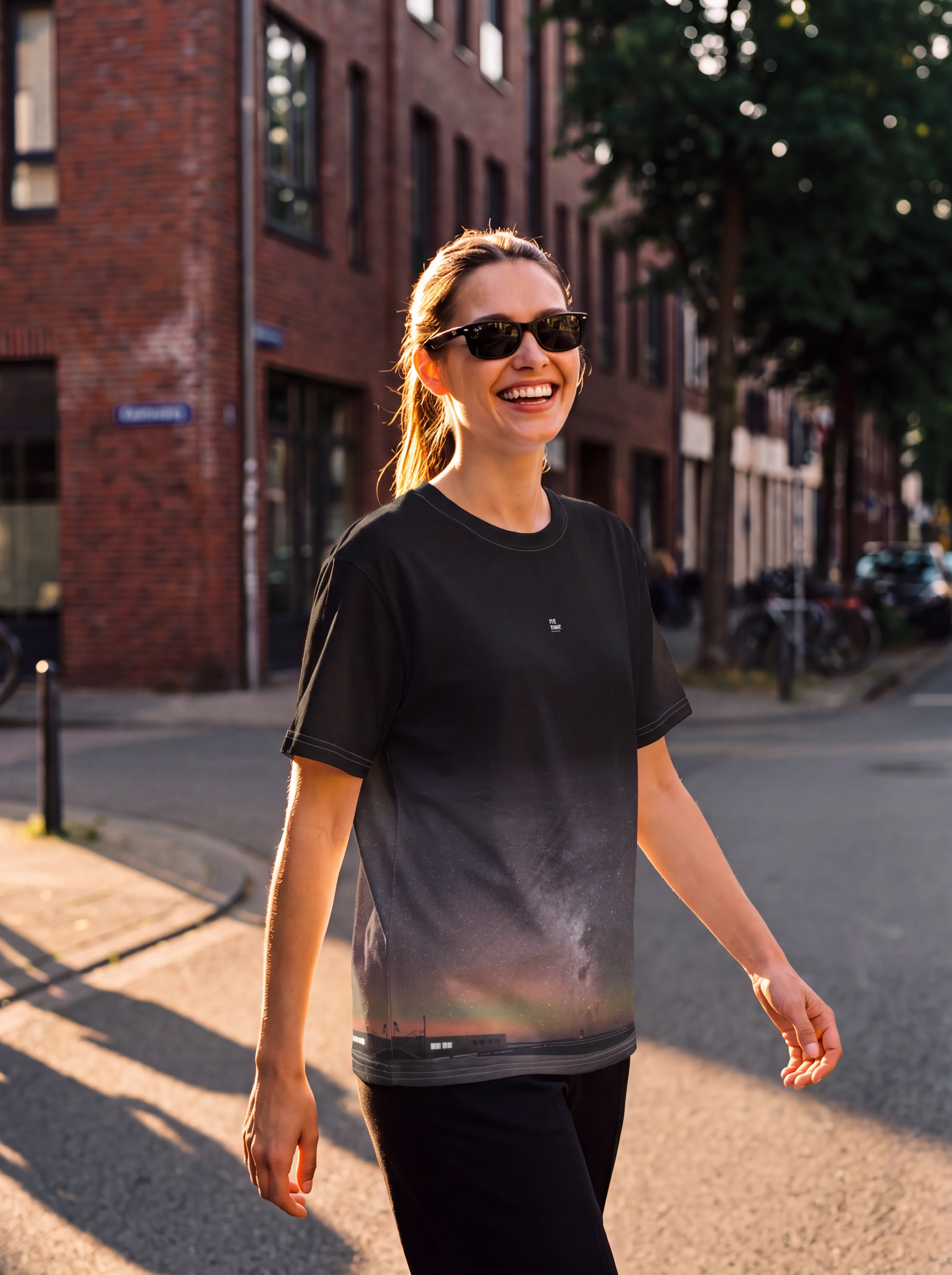
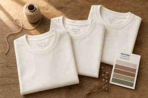


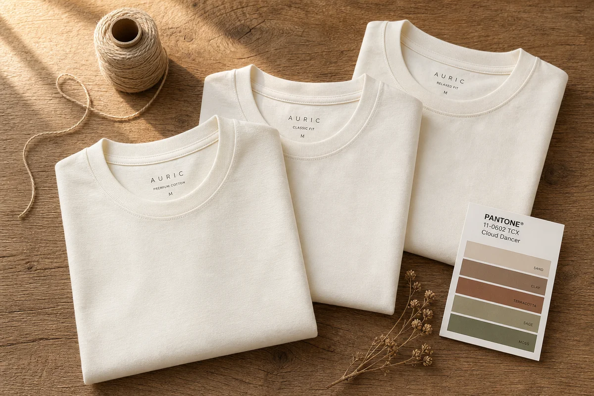
Cracked, distressed lettering in warm white ink on a bone-coloured Fear of God Essentials hoodie. Rick Owens sending head-to-toe “milk” colourways down a Paris runway two seasons running. Kith’s natural-dye tees selling out before the drop email even lands. This isn’t a fringe moment – it’s a slow-building consensus across streetwear and high fashion that’s now been rubber-stamped by Pantone.
1. Why Pantone Chose White for the First Time in 26 Years
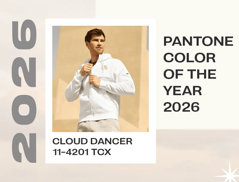
Image: Broken Arrow Wear Blog
Pantone’s choice reflects consumer fatigue with loud, overstimulating colour after years of neon drops and maximalist prints, and a pivot toward comfort, calm and purposeful simplicity. That’s the real story behind Cloud Dancer, officially Pantone 11-4201, and the first time white has topped the Colour of the Year list since the programme launched in 1999. Not eggshell. Not stark hospital white. A soft, barely-there white that reads more like a held breath than a blank page.
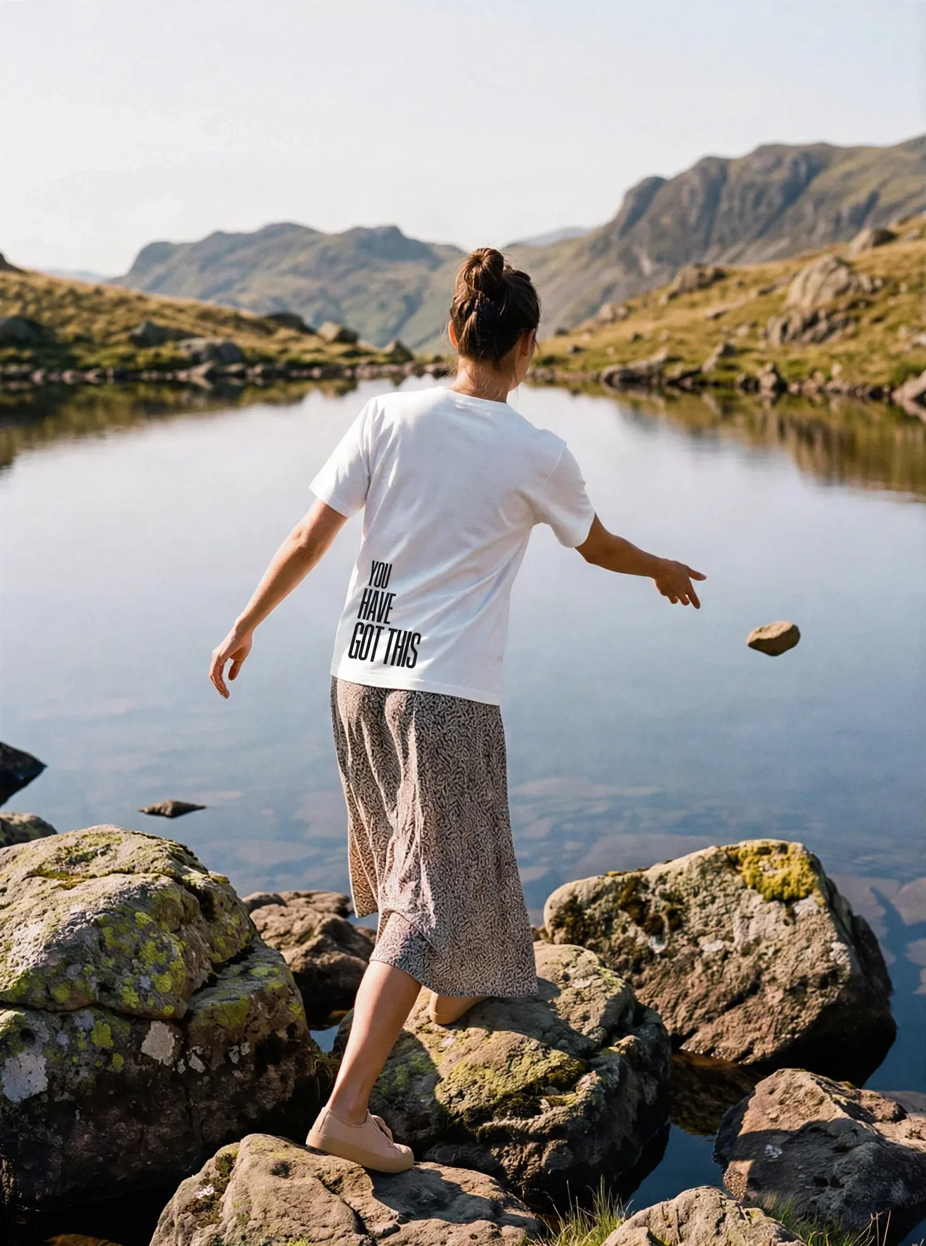
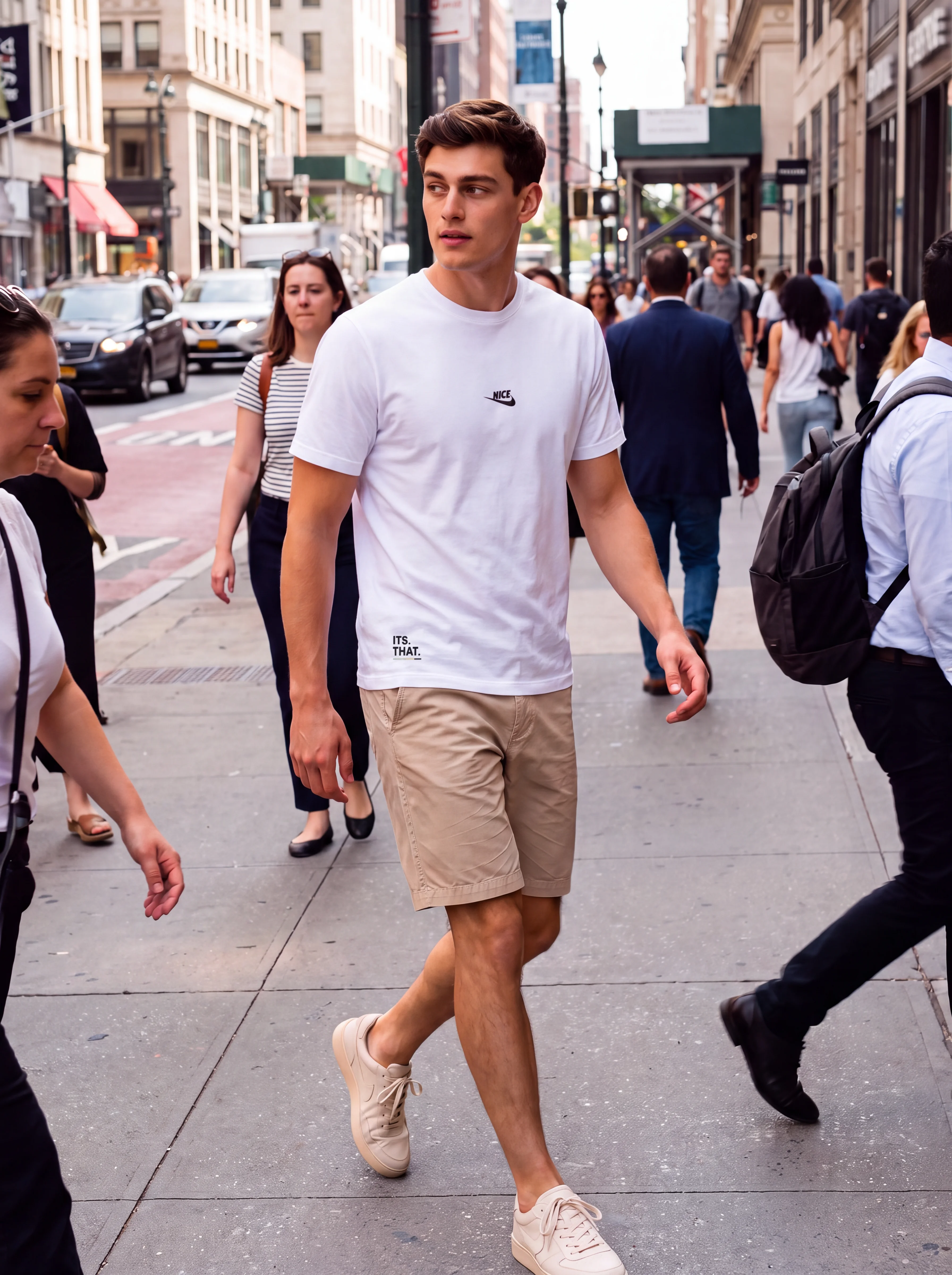
Walk any city block right now and you’ll catch it: oversized tees the colour of oat milk foam, hoodies that look sun-bleached on purpose, minimalist logos floating on fabric that photographs warm instead of clinical. This is the aesthetic Phoebe Philo-era Céline and now The Row have been quietly running for a decade, finally trickling down from quiet-luxury runways into graphic tees and merch drops. For anyone running a print-on-demand storefront, this is the signal to pay attention to warm white apparel printing before it’s everywhere instead of just arriving.
2. What Makes Warm White Different From Regular White Ink or Blanks?
Warm white swaps the cool, blue-undertone cast of standard white for a creamy, slightly yellow-warm tone that tends to photograph softer and less clinical under both studio lighting and phone cameras. It’s the difference between a tee that looks like it came off a factory line and one that looks like it’s been in your closet for a decade, in the best way. Brands like Broken Arrow Wear can print an ink formulated to approximate the Pantone Cloud Dancer shade (11-4201) on apparel – though it’s worth flagging that true Pantone-to-textile matching depends on the ink system, garment fibre content and dye lot, so treat any “exact match” claim from a supplier as a close calibration rather than a lab-certified guarantee. Ask for a printed swatch on your actual blank before committing to a bulk run.
That precision still matters, even with the caveat. A slightly-off white ink reads as a mistake. A well-matched Cloud Dancer print reads as intentional, elevated, boutique.
3. What Are the Best Shirt Colours for Printing Cloud Dancer Ink?
Cloud Dancer ink looks best on more saturated or darker garments, where the creamy white pops instead of disappearing. Think vintage black, charcoal, army green, olive, dusty blue, denim, forest green, maroon, wine, terracotta, clay, mocha and coffee brown. This is where the contrast pair really sings: high-fashion restraint printed on streetwear’s favourite earth tones – the exact palette Auralee and Yeezy Gap’s “shroud” era built entire collections around.
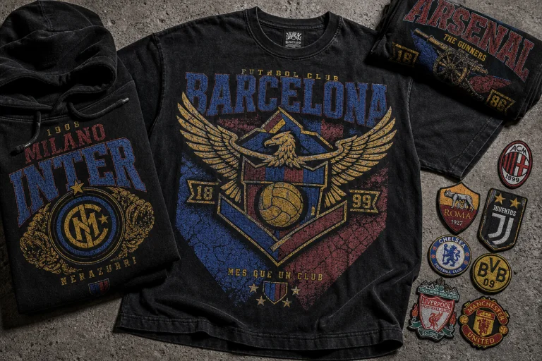
For pairing logic, lean into olive, vintage black, rust, navy or dusty rose as your base colours when Cloud Dancer is doing the printing. A cracked, distressed Cloud Dancer wordmark on vintage black hits like a reissued 90s tour tee – the kind of bootleg-band-shirt energy A$AP Rocky’s stylists have been putting back into rotation. A minimalist line-art logo in Cloud Dancer on olive or army green nods straight at the utility-core trend that’s been building since last year. This is exactly the kind of restrained, typography-first design lane covered in our minimalist typography tee drops, and it’s a direction worth studying if bold sans-serif type-tees are already in your catalogue.
One production note before you queue this up: printing a light ink on a dark garment usually needs an underbase (a white plastisol layer laid down first, then Cloud Dancer printed over it) to stop the dark fabric colour bleeding through and dulling the warm tone. Skip the underbase and you’ll get a muddy, greyed-out result instead of that clean, creamy pop.
4. What Ink Colours Work Best Printed on a Warm White Blank?
Flip the formula and start with a warm white shirt blank, then print any ink colour on top for a more grounded finish than standard white allows. Bella+Canvas 3001 in Vintage White, Gildan 5000 in Off White, a J-America 8871 Antique White hoodie, or a Bella 8803 White Marble tank are commonly cited as close to the Cloud Dancer family – but blank colours vary by dye lot and manufacturer batch, so order a sample run before you print at scale, especially if you’re matching across multiple garment styles. Layer on forest green, burnt orange, cocoa brown, sky blue or deep maroon.
This is the nature-inspired, retro-leaning lane. Picture a sun-faded forest green nature badge on an antique white hoodie, or a burnt orange bootleg-logo treatment stacked in a distressed arch across a warm white tee, the kind of design that looks like it survived a decade of laundry cycles on purpose. One real production risk here: dark or saturated inks on light, natural-fibre blanks can suffer dye migration, where polyester or dye-heavy fabric bleeds pink or red through the print over time, especially with heat curing. Ask your printer whether they’re using low-bleed or migration-blocking plastisol on poly-blend blanks before you commit.
5. How Should You Translate This Trend Into a Print-on-Demand Design?
Build around contrast pairs and rule-of-three ink palettes instead of single-colour prints, and let the warm white do the quiet work while a bolder ink carries the concept. A three-colour system – Cloud Dancer, one earth tone, one accent – gives you the retro-meets-minimal look without overdesigning it. This aesthetic sits comfortably alongside the trend research in 50+ T-Shirt Design Ideas That Actually Sell, and if you’re experimenting with mockups before committing to a print run, tools covered in AI fashion design visualisation can help you preview Cloud Dancer against different blanks before you spend on samples.
Bootleg logo treatments in Cloud Dancer ink on wine or terracotta. Chunky serif wordmarks in deep maroon on a warm white tank, in the same spirit as Frank Ocean’s Blonded merch runs. Distressed nature graphics in forest green on antique white hoodies. All three work because they borrow warmth from the fabric instead of fighting it with stark contrast, and all three are screen-print-friendly – no gradients or photographic detail that’ll fight you at the press.
6. Is Cloud Dancer a Trend That Will Fade Fast?
Pantone frames Cloud Dancer as grounding rather than a flash-in-the-pan seasonal colour, which is unusual for a Colour of the Year pick built for a 12-month news cycle. Stüssy’s undyed natural-cotton runs and Kith’s oatmeal basics have been proving the demand for this palette for several seasons already, well before Pantone made it official – which is a decent signal that this has staying power beyond a single hype cycle. For a print-on-demand brand, that’s the real opportunity: a palette shift you can build a permanent product line around instead of a limited drop.
So no, that quiet, cream-toned tee catching the light on the street corner isn’t a fluke. It’s the first white to ever win Pantone’s top spot, and it’s already rewriting what “basic” looks like on a hanger.
Frequently Asked Questions
Q: What is Pantone’s 2026 Colour of the Year?
A: Cloud Dancer, official Pantone code 11-4201, a warm white shade. It’s the first time white has been chosen as Pantone’s Colour of the Year since the programme began in 1999.
Q: Can screen printing exactly reproduce a Pantone colour?
A: Not guaranteed. Match accuracy depends on the ink system (plastisol, water-based or discharge), the garment’s fibre content and dye lot, and press calibration – always request a printed swatch on your actual blank before running a full batch.
Q: What shirt colours look best with Cloud Dancer ink?
A: Darker and more saturated garments work best, including vintage black, charcoal, olive, army green, dusty blue, denim, forest green, maroon, wine, terracotta and coffee brown – and they typically need a white underbase layer to keep the print from reading muddy.
Q: Does printing on dark garments risk dye migration?
A: Yes, particularly on polyester or poly-blend fabric, where heat curing can pull dye up through light ink and cause pink or red bleed-through. Ask your printer about low-bleed or migration-blocking ink for these jobs.
Q: Will the warm white trend last beyond 2026?
A: Pantone designed Cloud Dancer to be grounding rather than season-specific, and brands like Stüssy and Kith have been running natural, undyed palettes for several seasons already – positioning this as a lasting shift rather than a short-term trend.
This article was researched and written with AI assistance, then reviewed for accuracy and quality. Maya at Its.That. uses AI tools to help produce content faster while maintaining editorial standards.