

We start with two images, side by side. In the first, a face turns toward a single lamp and half of it vanishes, not into blackness, into suggestion, the cheekbone lit and the jaw dissolved into shadow. In the second, a walnut watch case sits under a pool of soft daylight, one gentle shadow falling to its right like a sundial marking noon. Neither scene relies on more than one working light source. Both depend entirely on where that light sits, how large it is relative to what it’s hitting, and how much shadow the photographer chooses to leave alone. That’s the whole craft, whether the subject breathes or sits still on a marble slab.
Portrait lighting and product lighting are usually taught as separate disciplines, but they’re built from the same three ingredients: a key light that does the storytelling, something to soften or fill the shadow it creates, and a decision about how much of that shadow we’re willing to keep. Learn the geometry once and it carries, from a headshot that needs to feel guarded and intense to a product listing that needs to feel honest and clean.
The shared physics: key, fill, diffuse

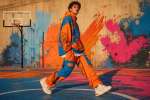
Image: AI-generated
Before splitting into faces and objects, it’s worth naming the three roles every lighting setup plays, because the vocabulary gets reused constantly below.
The key light is the main source, the one doing most of the describing. Its position relative to the camera determines what shape reads and what disappears.
Fill is anything that softens the shadow the key creates without replacing it: a second light at lower power, or more often, a reflector bouncing the key’s own output back into the dark side of the frame. A reflector isn’t a second light source; it’s a way of recycling the first one. Distance controls its strength. Closer means brighter fill; further back and the shadow reasserts itself.
Diffusion spreads a point source over a wider area so its shadows lose their hard edge: a softbox for a strobe, a bedsheet or shower curtain for a desk lamp, a sheet of diffusion material over a window. Think of it like a painter thinning oil paint with medium, same pigment, gentler application. It’s still directional light, just with a softer transition between highlight and shadow, the detail that often separates an amateur shot from one that looks retouched before it’s even been edited.
Everything below is a variation on how hard or soft we make that key, how much fill we allow back in, and where we place the whole arrangement relative to the lens. We won’t re-explain key and fill again from scratch; once this vocabulary is set, we’ll simply put it to work.
Split lighting: one light, one decision, a face divided
Picture this: a face turned fifteen degrees toward a single lamp, and half of it disappears. The cheekbone catches light, the jaw dissolves into shadow, and a straightforward portrait suddenly reads like a confession withheld. That’s split lighting doing its quiet work: one light, one 90-degree angle, a face divided cleanly down the middle.
What it is. Split lighting is a portrait technique where the key light sits at roughly a 90-degree angle to the subject, around 3 or 9 o’clock if the subject occupies 12, illuminating close to one half of the face while the other falls into shadow. Done cleanly, the result is a fairly hard-edged line running down the centre of the nose, light on one side, dark on the other, with minimal blending between them, though the exact hardness depends on the size and distance of the source. The subject typically faces the camera directly, head level, shoulders squared; symmetry helps produce a clean vertical division. The light itself usually sits at roughly face height.
Why it feels loaded. A softbox angled slightly off-centre gives us gentle, flattering illumination, pleasant, forgettable. Split lighting refuses pleasant. The eye tends to read shadow and light here as psychological information, not just exposure values. The lit side feels open, present, available. The shadow side reads as withheld, hidden, guarded, a little dangerous. That contrast is a large part of why the technique shows up so often in film noir cinematography, music promo stills, editorial fashion, and actor headshots built around moral ambiguity or intensity, and why most photographers would avoid it for a corporate headshot aiming for approachable warmth. It’s usually the wrong emotional register for that brief.
This isn’t a new discovery. Caravaggio built entire compositions around chiaroscuro, the violent collision of light and dark, to give ordinary figures the weight of martyrs. Rembrandt softened that harshness into something more intimate but kept the same principle: shadow as character, not absence. Split lighting is chiaroscuro’s direct descendant, just with a strobe, or a phone screen, instead of a north-facing studio window.
Ambient spill and separating the subject from the background. One detail that trips up a lot of first attempts: split lighting only reads cleanly when the background stays quiet. If ambient room light spills onto the shadow side of the face or lifts the backdrop to a similar tone as the shadow, the hard division softens into something muddier and less intentional. Turn off or dim any secondary lamps, overhead fixtures, or windows behind the subject that aren’t the key. A backdrop a stop or two darker than the shadow side of the face helps the lit cheekbone pop forward rather than blending into its surroundings; a plain wall, a dark curtain, or simply enough distance between subject and background so spill fades before it reaches it all work. If the shadow side and the background sit at the same brightness, the eye loses the edge that makes split lighting feel deliberate rather than accidental.
Building it from nothing.
Position and distance. Start the subject about two to three metres from the light, with the light itself roughly a metre or so away, close enough to be directional, far enough that it wraps slightly rather than slapping the skin. Camera sits directly opposite, level with the subject’s eyes.
Head angle as a dial, not a switch. The classic starting position is head-on, but small adjustments change how much the shadow side gives away. Turning the chin slightly toward the light widens the lit plane and brings more of the shadow-side eye into view; turning away narrows it and deepens the drama.
Modifier choice. A bare bulb or an undiffused window gives a harder, more graphic split, useful when the brief wants edge and grit, the kind of light a rock musician’s promo shot wants. A shoot-through umbrella, a softbox, or a diffusion sheet over that same window softens the transition line without sacrificing the shadow side’s depth. Starting soft and hardening later tends to be the easier route; it’s simpler to remove diffusion than to manufacture texture that isn’t there.
Exposure. Begin around ISO 100 to 200, f/4 to f/5.6, and a shutter speed appropriate to the source (1/125s for flash sync, whatever ambient reading suits a window). metre for the lit cheekbone and aim for middle grey there; let the shadow side fall two to four stops below as a rough starting point. That’s not gospel. Drag the shadow side up with a reflector or a dimmer second light if the eye needs to stay legible, or let it go darker for mood.
Protecting the shadow-side eye. This is often the detail that separates a moody portrait from a portrait that’s simply lost half its face. A small silver or white reflector angled into the shadow side, even a sheet of A4 paper held just out of frame, bounces enough light back to keep a catchlight in that eye and a hint of iris detail. Without it, the shadow eye can read as a black hole, and the emotional effect risks collapsing from “withheld” into “absent.”
On a phone. None of this needs a studio. Position someone near a single window on an overcast day, kill any secondary light sources in the room, and lock focus and exposure with a tap on the lit cheek. A phone’s screen, propped at an angle, or a second phone’s torch, makes a passable fill for the shadow eye in a pinch. The geometry stays the same, one light source, one 90-degree turn; the tool is just whatever’s in our pocket. This pairs directly with the natural-light reading skills covered in our guide to Portrait Photography Using Natural Light.
Editing. In Lightroom or Snapseed, nudge the shadows slider up marginally if the eye needs rescuing, add a touch of clarity to the lit side to hold texture, and resist lifting the whole shadow region evenly, since that flattens the split back into a gradient, the one thing we’re trying to avoid.
Matching the light to the face. Split lighting works better as a creative lever than a rule about face shape. Pushed hard, it can visually narrow a round or wide face, since one entire side falling into shadow tends to read as less width than most contouring products manage. On a narrower face, the same shadow can hollow out a cheek in a way that feels sculptural on one subject and gaunt on another; it has less to do with the face itself and more to do with how much fill we let back in and how the subject angles their chin. Testing it on the specific person in front of us beats ruling it out by shape alone.
Product lighting: precision, not spectacle
A single desk lamp and a sheet of white paper can, with the right angles, outperform lighting kits costing many times more. That’s the secret most sellers never learn: product lighting isn’t primarily about equipment budget, it’s about control. Get the geometry right and an inexpensive reflector does much of what a second strobe is bought to achieve.
That distinction matters more than most realise. Buyer research on e-commerce consistently points to image quality as one of the strongest influences on purchase confidence, and lighting is one of the biggest factors behind what shoppers perceive as “quality” in a product photo. Not resolution. Not props. Light.
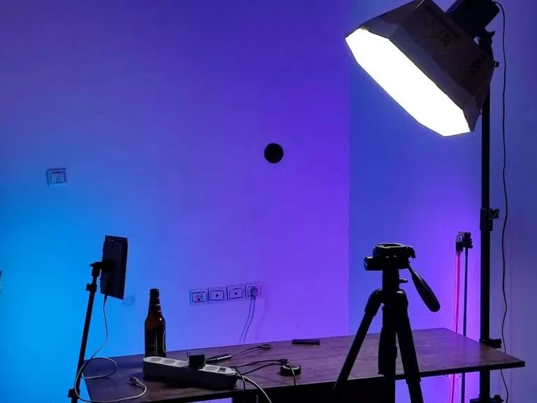
Step 1: Choose the key light. Place it at roughly 45 degrees to the camera, a position photographers have used since Rembrandt worked out how a single window could sculpt a face. That angle creates enough shadow to describe shape without hiding detail. Size and distance matter as much as position: a light source large relative to the product produces soft, wraparound shadows; a small, distant one produces harder, more graphic ones. That’s why photographers move a light closer to a small product rather than cranking the power; proximity is what makes a source “larger” in relative terms. Start roughly one to two product-widths away and adjust by eye. Shooting with natural light, a window with consistent, indirect daylight (north-facing in the northern hemisphere, south-facing below the equator) tends to give softer, more even output through the day than one that catches direct sun, though it still shifts with weather and time of day, so treat it as a starting position rather than a fixed rule. With artificial light, a single continuous LED panel around 5600K is one of the easiest entry points: cheap, always-on, what-you-see-is-what-you-get for anyone still learning to read shadows.
Step 2: Add a reflector to fill shadow. A reflector doesn’t add drama, it removes some of the shadow the key light creates, recycling the same light rather than introducing a second source. Bounce it back onto the shadow side using a white foam board or collapsible reflector, and the contrast softens without buying anything else. Distance controls strength here too: closer means brighter fill, further back and the shadow reasserts itself.
Step 3: Diffuse the light, don’t just soften it. A diffuser sits between the light and the product, spreading a harsh point source over a wider area so its shadows lose their hard edge. Softboxes do this for strobes; a bedsheet or shower curtain does it for a desk lamp. A safety note worth repeating: improvised diffusers such as bedsheets, baking paper, or shower curtains are only safe at a distance from hot continuous lamps, particularly older tungsten or halogen fixtures. Keep fabric well clear of the housing, never drape it directly over a lamp, and favour LED panels, which run far cooler, if diffusing close to the source.
Step 4: Choose lighting direction with intent. Where the light hits the product changes what the photo says. Side lighting rakes across texture, ideal for leather, fabric, wood grain, anything with a surface story to tell. Backlighting pushes light through or around the product, conveying depth and transparency; glassware, liquids, translucent packaging all benefit. Front lighting flattens shadows for clean, no-nonsense e-commerce clarity, the look Amazon-style listings depend on. Picking the direction based on what’s being sold beats picking it out of habit.
Different surfaces need different treatment:
- Matte, textured products (leather, ceramics, fabric, wood) are the most forgiving. Side or 45-degree lighting with moderate diffusion reveals grain and weave without a fight; a single key and a reflector usually get us most of the way there.
- Reflective products (jewellery, glossy plastic, polished metal, glass with a shine) will mirror whatever’s in front of them, including the lamp, the diffuser’s edges, and us. A larger, closer diffuser, such as a light tent or diffusion dome, helps the reflection become a soft, even glow rather than a hot spot. Angling the light off-axis from the camera also helps avoid the shot catching its own reflection.
- Transparent products (glass, liquids, clear packaging) usually read best backlit or side-lit through a diffuser, so light passes through the material rather than bouncing off its surface. A white or black card behind the product, not the light itself, controls whether edges read bright or defined: white for an airy look, black for graphic contrast against glass edges.
Step 5: Set the camera, then lock the shot. On a mirrorless or DSLR, start around f/8 to f/11 for enough depth of field to keep the whole product sharp, ISO 100 to keep noise out of shadow detail, and a shutter speed matched to a tripod rather than a handheld guess, anywhere from 1/60s upward, since the camera isn’t moving. A focal length around 50 to 100mm (or the equivalent zoom on a phone, achieved by stepping back rather than digital zoom) keeps proportions natural and avoids the barrel distortion wide lenses introduce close-up. On a phone, tap to set focus and drag down to pull exposure back slightly, since phones tend to brighten shadows more than a “true” exposure would. Mounting the camera on a tripod helps every product in a catalogue sit at the same scale and angle; consistency reads as professionalism at a glance.
White balance and colour consistency across a catalogue. Nothing undercuts a product page faster than a run of listings that quietly shift colour temperature from one photo to the next. Lock white balance manually rather than leaving it on auto, since auto white balance will happily reinterpret the same lamp differently from shot to shot depending on what else is in frame. Pick one setting (daylight, around 5600K for most LED panels, or a custom reading taken off a grey card) and hold it for the whole session. Shooting RAW gives a safety net: if the temperature drifts, it can be corrected consistently across a batch rather than guessed at image by image. A grey card or colour checker, photographed once at the start of a session under the same light, gives a fixed reference point for correcting the whole batch in Lightroom or a similar editor, and it’s worth reshooting that reference any time the light source, room, or time of day changes. For catalogues shot over multiple sessions, keeping notes on the exact settings used (white balance, ISO, aperture, light position) makes it far easier to match a new batch to an older one months later.
Troubleshooting the product setup
Blown-out highlights on reflective products (jewellery, glass, glossy plastic): move the diffuser closer or add a second layer of diffusion material. Proximity tends to soften light faster than power reduction does.
Colour cast from mixed light sources: avoid mixing daylight and tungsten in one shot where possible. Pick one temperature and set white balance to match it, or shoot RAW and correct in editing.
Muddy or grey-looking shadows: the reflector is likely too close or too strong relative to the key. Pull it back a few inches until falloff looks gentle rather than flat and shadowless.
Equipment that supports both disciplines
Beyond the light itself, a handful of supporting pieces show up in most serious setups, portrait or product:
- A tripod, for consistent framing, close to essential for catalogue work where every item needs to sit at the same scale and angle, and useful in portraiture whenever the head angle needs to hold steady between takes.
- A distraction-free backdrop: seamless paper, muslin, wood, marble, or a plain colour for products; a plain wall or open shadow for portraits.
- Lighting supports: stands and boom arms to keep a key or fill exactly where it’s been placed, rather than balanced precariously on a stack of books.
- Props for context and scale, when a product benefits from being shown in use rather than isolated.
- Editing software, Lightroom, Photoshop, or Snapseed on a phone, treated as the final stage of the lighting workflow rather than a fix for a bad shoot. For products, this means balancing colour, contrast, and exposure against how the item actually looks in hand, not an exaggerated version of it; shoppers who receive something duller than the photo are more likely to return it. For portraits, it means rescuing shadow detail sparingly and resisting the urge to flatten contrast the lighting was built to create.
- Automated lighting systems, for anyone shooting at real volume. They remove most manual setup time and help keep results consistent across thousands of shots, a priority for e-commerce catalogues, less relevant for one-off portrait sessions where every frame is meant to look considered rather than repeatable.
None of this requires a studio to start. One light source, a window, a lamp, or a proper strobe, something to modify it, and a way to record the result cleanly, covers both the face and the object on the table.
Choosing the setup for the story being told
The through-line between a divided face and a lit watch case is the same question: what does this image need to say before we build the rig to say it? Split lighting exists to withhold, to make a viewer decide how much of a person they’re being shown. Product lighting exists to reveal, to remove every reason a shopper might have to distrust what they’re looking at. Both disciplines use identical tools bent toward opposite goals: one hides shadow to protect intimacy, the other kills shadow to protect trust.
Once the key-and-modifier logic is second nature, scaling up to a full catalogue gets a lot faster; our guide on building a catalogue that converts covers the next stage. And the natural-light reading skills that make split lighting work with nothing but a window are the same ones that make a north-facing room a perfectly good product studio; see Portrait Photography Using Natural Light for that overlap.
The desk lamp and sheet of paper from the opening, and the single strobe turned 90 degrees from a face, remain valid tools either way. The gear was never the barrier. The angles were.
Frequently Asked Questions
Q: What is split lighting in photography?
A: Split lighting is a technique where the key light sits at roughly 90 degrees to the subject, illuminating close to one half of the face while the other falls into shadow, creating a hard-edged line down the centre of the face.
Q: How do we set up split lighting on a budget or with a phone?
A: Position someone near a single window with the light hitting one side of their face, use a reflector or a second phone screen to keep a catchlight in the shadow-side eye, and lock exposure on the lit cheek. The geometry works the same whether the light source is a studio strobe or daylight.
Q: How do we protect the shadow-side eye from going completely black?
A: Bounce light back in with a small reflector, a sheet of white paper, or a dim secondary light, enough to hold a catchlight and a trace of iris detail without flattening the split.
Q: Does face shape determine whether split lighting works?
A: It’s more of a creative choice than a rule. The technique can narrow a wider face or hollow a narrower one, so it’s worth testing on the specific subject rather than ruling it out by shape alone.
Q: What is the minimum lighting setup needed for product photography?
A: A minimal setup needs one key light placed at roughly 45 degrees to the camera, plus a reflector to fill shadows and a diffuser to soften the source, both modifiers to the same light rather than additional light sources.
Q: Can a reflector replace a second light in product photography?
A: Yes. A reflector bounces existing light back onto the product to fill in shadows and add highlights, making it a low-cost alternative to a second light source for budget setups.
Q: How does light direction affect product photos?
A: Side lighting emphasises texture, backlighting conveys depth or transparency, and front lighting delivers the clean, shadow-free look typical of e-commerce listings.
Q: Do we need professional studio lighting to sell online?
A: No. A single desk lamp, a diffuser like a bedsheet, and a white-board reflector can produce studio-quality results when positioned correctly, with extra care around reflective and transparent surfaces.
Q: Why does editing matter if the lighting is already good?
A: Editing software balances colour, contrast, and exposure so the final image matches reality, a product’s true appearance, or a portrait’s intended mood, rather than fixing mistakes the lighting setup should have avoided.
This article was researched and written with AI assistance, then reviewed for accuracy and quality. Talulah at Its.That. uses AI tools to help produce content faster while maintaining editorial standards.