

Image: MyTeesUSA
We’re standing at a merch table outside a warehouse show, and every third person is wearing a shirt with a football crest that looks almost right – the proportions are off, the colours are bleeding, the type is cracked like it’s been through fifty washes. Nobody bought it by accident. That’s the whole point.
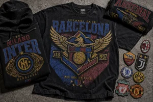
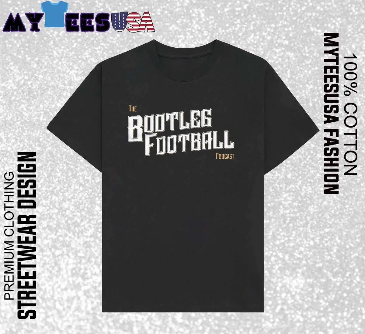
Bootleg culture used to be something you hid. Now it’s something you order in five sizes and three garment types. The Official Bootleg Football Logo T-Shirt from MyTeesUSA is the clearest proof yet: a deliberately distressed, unofficial-looking football crest, sold under a name that doesn’t pretend otherwise, sitting in the “Trending Shirts / New Arrivals” section with a Sale tag on it. This isn’t nostalgia dressed up as irony. It’s a bootleg football logo shirt built from the ground up as an intentional design language, and it’s reshaping what “sports merch” even means on a print-on-demand rack.
What is the bootleg football logo trend?
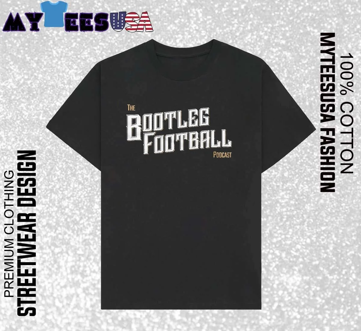
Image: MyTeesUSA
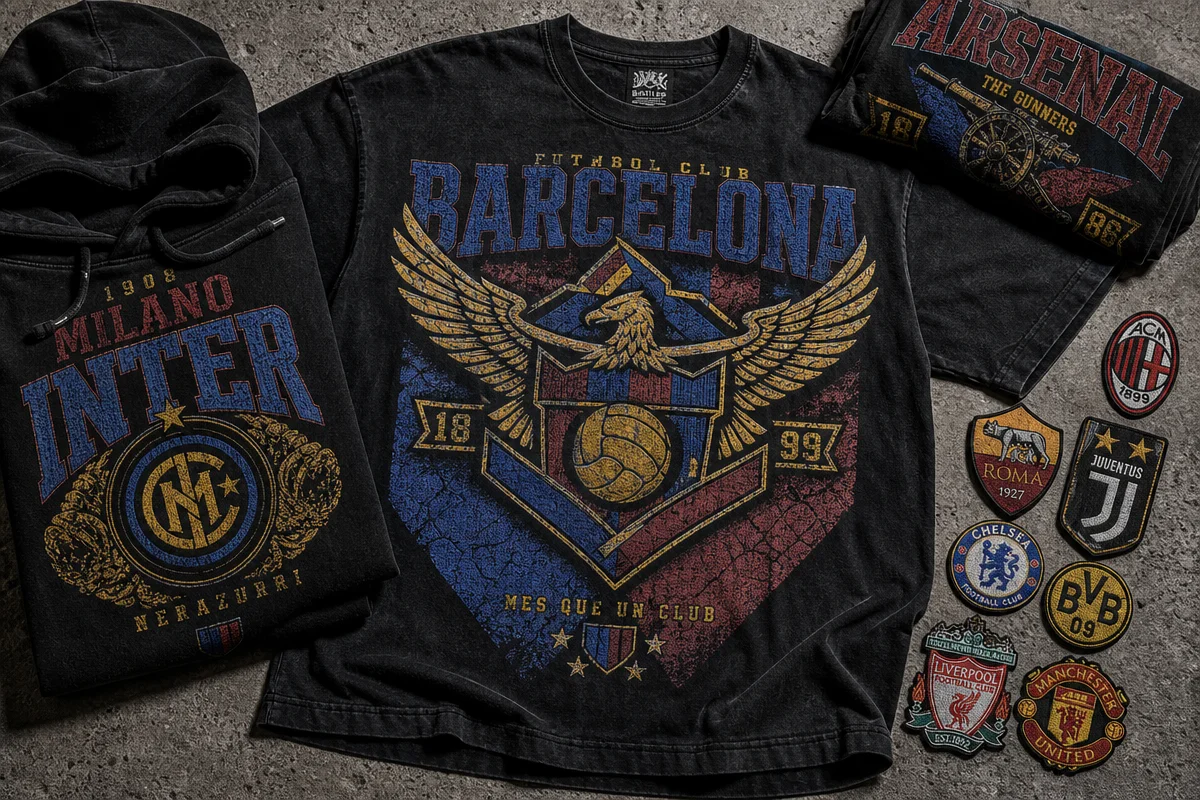
The bootleg football logo trend takes the unofficial, market-stall aesthetic of knockoff sports merchandise – cracked prints, off-register colours, near-but-not-quite crests – and turns it into a legitimate, purposefully designed look. Where a real club crest is clean vector work, the bootleg version is roughed up on purpose: faded ink, hairline cracks through the print, a slightly wrong typeface standing in for the “real” one.
This didn’t start in a design studio. It started on actual bootlegs – the dodgy market tees sold outside stadiums and on foreign package holidays, where a factory somewhere got the badge 80% right and called it a day. The reference points are specific, not vague. Think of the grey-market Champions League tees that used to circulate around Camden Market, or the way Corteiz has built an entire label out of guerrilla drops and logos that read as contraband on purpose. Palace’s earlier collections leaned on the same trick – crests and box logos that nodded at football and skate heritage without licensing either. What’s different now is that brands aren’t hiding the reference anymore. They’re naming it in the product title.
Why is bootleg sports merch resonating right now?
It’s resonating because it lets people wear sports culture without wearing a team. Football is huge, sponsorship is everywhere, and a real club kit ties you to one specific fandom. A bootleg-style crest gives you the energy of a terrace without the commitment – it’s sport as aesthetic, not allegiance.
Think stadium chants meets thrift-store graphic tee, or a Berlin techno crowd in washed-out ’90s kit colours that have nothing to do with the match on Saturday. That mashup is the engine of the whole trend: labels like Martine Rose and Aries have spent seasons running distressed, archival-look football graphics on the runway, while streetwear has always mined the low end of the market – counterfeit tees, festival merch, bootleg tour shirts – for texture real logos can’t fake. Drake wearing a scuffed, unlicensed crest on stage does more for this look than a clean official kit ever could, because the wrongness is the flex. Put a slightly-wrong football badge through a worn DTG print and you get both worlds in one piece of cotton. It also plugs into a wider appetite for “so wrong it’s right” design that’s been building across 50+ t-shirt design ideas that actually sell – buyers aren’t looking for polish, they’re looking for a story the shirt tells before you open your mouth.
How could this trend translate to a print-on-demand tee design?
The move is to treat the crest like a found object, not a fresh asset – design it to look printed twenty years ago, not twenty minutes ago. Start with a central emblem: shield or crest shape, a number or faux-club name, rendered in a slightly-off serif or collegiate block letter that almost matches a real kit typeface but doesn’t. Distress it hard – cracked overlay texture, faded colour drop-out at the edges, maybe a bleed line where the print looks mis-registered.
Palette matters as much as shape. Go for classic kit colours pushed through a washed-out filter: chalky red, faded navy, a yellowed off-white base instead of true white. Avoid anything that looks vector-clean – the whole appeal collapses if the print looks new. This is bootleg logo treatment as a genre, not a one-off graphic, and it scales: the same crest can carry a bold sans-serif back print, a small chest hit, or an oversized front placement depending on the garment.
One line worth drawing clearly here: there’s a real difference between inspired-by and infringing. A bootleg-style crest that invents its own shield shape, faux-club name and colourway is doing exactly what the fashion labels above do – borrowing a visual language, not a logo. Lifting an actual club badge, sponsor mark or federation crest and distressing it doesn’t make it legally distinct; it’s still trademark infringement with a filter on it. The whole appeal of this trend depends on building something that reads as bootleg without being one.
Why does this design work across a full apparel range?
Because the bootleg look isn’t a shirt graphic – it’s an outfit language. MyTeesUSA sells the same design across a genuinely wide range: classic men’s and women’s tees, a unisex V-neck, hoodie, long sleeve and sweatshirt, a tank top, youth and kids’ tees, plus premium Champion-branded tee, hoodie and cropped options. Sizing runs S to 5XL on the men’s and hoodie lines, S to 3XL for women’s, and down to 6M for toddlers. That’s the tell: this is being built as a wardrobe piece, not a novelty print. The hoodie and sweatshirt versions even carry their own sleeve-length specs, meaning the graphic was designed to sit right whether it’s on a short sleeve or running down a hoodie’s front pouch.
What should print-on-demand sellers know about sizing and print quality?
Garment measurements on DTG print-on-demand apparel come from the manufacturer, not the print shop, and MyTeesUSA states plainly that garments can run smaller or larger with a tolerance of ±2.5cm (1 inch). That’s worth stating on any product page using this approach – sizing will shift slightly between suppliers, and a bootleg-style crest with intentional distressing hides minor print variance far better than a clean vector logo would. It’s a genuinely forgiving aesthetic for the realities of on-demand production, similar to how a minimalist typography tee hides less and demands tighter registration.
Back at that merch table, the shirt that gets pointed at first still isn’t the official one. It’s the one that looks like it shouldn’t exist – cracked, faded, almost-right. That’s the whole appeal of the bootleg football logo shirt: it borrows the emotional shorthand of sport, strips out the sponsorship, and hands the story back to whoever’s wearing it. For a print-on-demand brand, that’s not a gap in the market. That’s a whole rack.
Frequently Asked Questions
Q: What makes a shirt design “bootleg style”?
A: A bootleg-style design deliberately mimics the look of unofficial, knockoff sports merchandise – distressed prints, cracked ink, slightly-off typography and crests that resemble but don’t copy real club logos.
Q: Why are bootleg football logo shirts trending in streetwear?
A: They let wearers tap into football’s visual culture and terrace energy without committing to a specific club, blending high-fashion distressed-graphic trends – seen on labels like Martine Rose and Aries – with the DIY texture of market-stall knockoffs.
Q: Is a bootleg-style football design legal to sell?
A: Only if it invents its own crest, name and colourway rather than distressing an actual club, sponsor or federation logo. Copying a real badge and roughing it up doesn’t remove the trademark – it’s still infringement.
Q: What garment types does the bootleg football logo design come in?
A: It’s available as men’s and women’s T-shirts, a V-neck, hoodie, long sleeve, sweatshirt and tank top, plus youth, kids’ and premium Champion-branded options, with adult sizing from S to 5XL.
Q: How accurate are print-on-demand garment sizes?
A: Manufacturer-supplied measurements typically carry a tolerance of ±2.5cm (1 inch), so sizing can vary slightly between suppliers even on the same listed size.
Q: How can I apply the bootleg trend to my own t-shirt designs?
A: Build a central crest-style graphic in a near-but-not-quite kit typeface with an invented club name, apply heavy distressing (cracks, fade, bleed), use washed-out classic kit colours, and carry the same treatment across a hoodie or long sleeve so it reads as a full look, not just one print.
Source: https://myteesusa.com/product/official-bootleg-football-logo-t-shirt/
This article was researched and written with AI assistance, then reviewed for accuracy and quality. Maya at Its.That. uses AI tools to help produce content faster while maintaining editorial standards.