


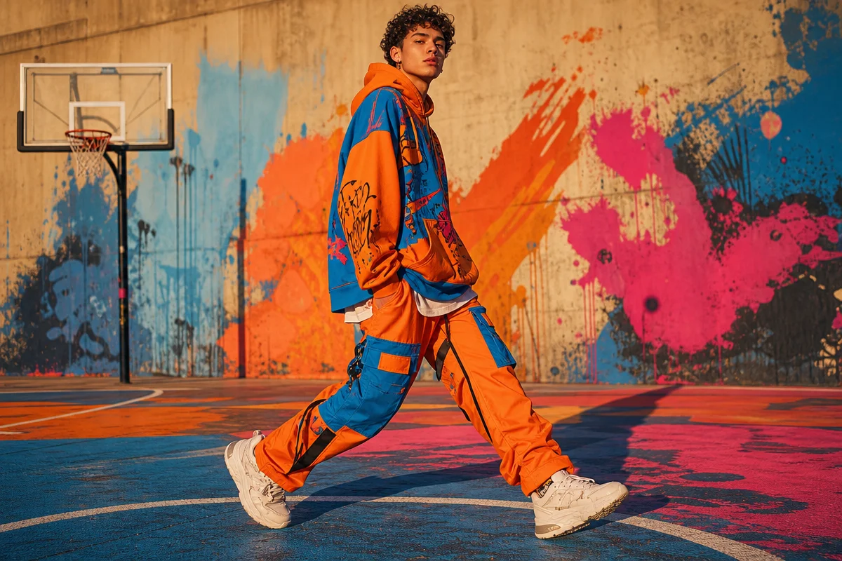
Drop-of-the-week fatigue is real, and it’s exactly why the corner-store hoodie caught our eye in the first place. We walk past the same corner store three mornings a week, and lately it’s the same story: someone in an oversized hoodie, sleeves pushed up, standing there like they’ve owned it for years – because they have. Not last week’s drop. Not something still stiff from the packaging. A hoodie that’s been through the wash a dozen times and still holds its shape at the shoulder. That’s the tell. That’s what pulled us into SB Studios streetwear in the first place – not the logo, not the hype cycle, just a garment that refused to fall apart on schedule.
What makes SB Studios different from typical streetwear brands?
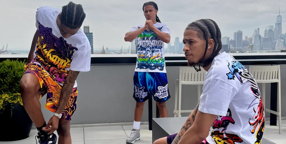
Image: The Action Elite
SB Studios builds construction-first, not logo-first. Heavyweight fleece, reinforced seams, mid-weight cotton tees – the branding is almost an afterthought stitched quietly into a hem rather than screamed across the chest.
That’s a deliberate swerve from the churn-and-burn model most of us grew up buying into. Micro-trend streetwear chases a colourway for six weeks and then dies in a clearance bin. SB Studios says its goal is fabric weight that holds shape after a dozen washes and colours designed to slot into a wardrobe that already exists, not fight it for attention. Think of it as the difference between a one-season crush and the jacket you actually reach for every single day. High fashion sells the moment; this sells the Tuesday.
For a print-on-demand brand, that’s the real lesson buried in the fabric spec sheet, not the logo placement.
What are the three aesthetics actually driving this right now?
Scroll any streetwear feed this year and three distinct moods keep resurfacing, and each one has a different job to do on a t-shirt.
Quiet-luxury basics are the direct descendant of that corner-store hoodie: stone, putty, sage, and washed black, nothing brighter than an oatmeal heather. Typography here is small and confident – a lowercase wordmark tucked at the hem, or a single embroidered initial where a big chest print used to sit. Think old-money tailoring meets skate-shop ease. For a POD range, this translates into tonal prints on heavyweight blanks: puff-ink text barely darker than the shirt itself, readable up close and invisible from across the room.
Bootleg-revival graphics pull from the 90s and 2000s counterfeit-tee tradition – Y2K racing fonts, distressed band-tee layouts, fake “world tour” dates lifted from nowhere in particular. Palette-wise, this is where colour gets loud: acid green, safety orange, and cherry red slammed against black or white. A bootleg logo treatment worked into a small chest hit, paired with a cracked-vinyl texture overlay, reads as intentional homage rather than knockoff – and it’s some of the easiest content to spot going viral on resale and thrift-flip accounts right now.
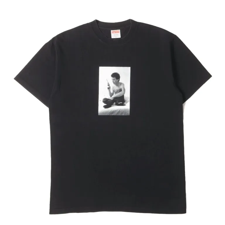
Utility-sport hybrids borrow from run clubs and gorpcore’s crossover into everyday wear: technical-looking colour blocking, reflective trim, numbers and coordinates as graphic elements instead of words. Navy, burnt orange, and reflective silver dominate. Typography leans condensed and all-caps, stencil-adjacent, like a race bib. A bold sans-serif text tee with a single stat or route number would sit comfortably in this lane.
All three share the same underlying cultural driver: a broader pullback from logo-flex dressing toward pieces that signal taste through fit and fabric rather than a brand name, a shift that’s shown up repeatedly in menswear commentary since the pandemic reshaped how people actually dress day to day.
Why has the SB Studios hoodie become a year-round staple?
Because it’s not being treated as a winter piece anymore – it’s a core layering item across three seasons for a lot of wearers. Under a shell jacket in January, worn completely solo on a cool September evening, it does the same job either way.
That versatility comes down to numbers most shoppers never check: a slightly dropped shoulder, a mid-to-heavy fleece weight commonly cited around 350-450 GSM, and a functional kangaroo pocket that actually holds a phone instead of just looking like it could. Logo placement matters less than all three of those combined – which is a genuinely useful filter next time you’re standing in front of a rack trying to separate the real thing from the knockoff. Tees follow the same logic: boxy cut, a slightly longer hem sitting at the hip, cotton commonly in the 180-220 GSM range so it drapes instead of clinging like an undershirt. Treat these figures as a starting benchmark rather than a hard rule – GSM varies by fabric blend and finishing, so always check a supplier’s actual spec sheet before locking in a print run.
Design-wise, this is a gift. A construction-first hoodie is the perfect canvas for a bold sans-serif text tee treatment on the tee side, or a bootleg logo treatment worked into a small chest hit on the hoodie – something that reads as intentional restraint rather than empty branding.
What does this mean for how we design and sell streetwear now?
It means matching sets are winning for a reason beyond aesthetics. Hoodie-and-jogger, tee-and-short – these have been among the categories getting the most attention across streetwear retail and social feeds lately, because they delete the outfit-coordination decision while still letting people split the pieces apart and remix them separately. That’s a print-on-demand opportunity sitting in plain sight: design in twos, sell as ones. Our call: lead with a quiet-luxury tonal set for the everyday buyer, then drop a limited bootleg-revival tee alongside it as the scroll-stopping upsell.
The durability gap shows up exactly where you’d expect – after the tenth wash, not on day one. Shape retention, prints that don’t crack, stitching that survives a dryer cycle instead of unravelling at the collar. A tight capsule of neutral basics plus one or two bold hero pieces, checked against GSM, seam placement, and stitching quality, is a method that transfers to evaluating literally any streetwear purchase, not just this one label.
So back to that corner store. The hoodie we noticed wasn’t loud. It wasn’t new. It was just still there, still holding its shape, three years into a wardrobe rotation that’s outlasted a dozen hype drops. That’s the whole pitch, really – not the flex of buying something, but the quiet flex of it still fitting right long after everyone’s forgotten what dropped that week.
Buying and design guidance
If you’re buying: check the fabric weight, seam placement, and stitching quality before the graphic – a mid-to-heavy fleece around 350-450 GSM and a cotton tee around 180-220 GSM are reasonable benchmarks, but confirm against the actual spec sheet rather than the marketing copy.
If you’re designing for print-on-demand: pick one aesthetic per drop instead of blending all three – a tonal quiet-luxury set, a loud bootleg-revival graphic tee, or a utility-sport hybrid with stencil type – because mixing palettes within a single collection dilutes the visual identity that makes each one recognisable on a feed.
If you’re building a matching set: design the hero graphic for the tee first, then pull a single tonal element (a small logo, a colour trim, a repeated number) onto the hoodie or joggers, so the pieces read as a set without needing identical prints on both.
If you’re chasing durability as a selling point: photograph and market the tenth wash, not the first – a worn-in flat lay or a customer restock photo does more to prove construction-first credibility than a fresh-off-the-press product shot ever will.
Source: https://theactionelite.com/sb-studios-clothing-the-2026-guide-to-streetwear-that-actually-works/
This article was researched and written with AI assistance, then reviewed for accuracy and quality. Maya at Its.That. uses AI tools to help produce content faster while maintaining editorial standards.