Last updated: August 3, 2026
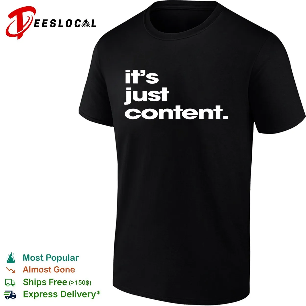
Image: Teeslocal
Picture the feed right now. Not a runway, not a lookbook – just someone’s grid. They’re standing outside a brutalist car park or a corner store, and the most interesting thing in the frame is a single phrase on their chest. No logo. No graphic. A clean sans-serif on black, white, or cream, sitting slightly left-of-centre at a size that makes you pause. You screenshot it. You come back to it. You’re not entirely sure why. That pull – quiet, deliberate, almost annoying in how effective it is – is exactly what the minimalist typography shirt is doing right now, and we think it’s worth understanding properly.
The irony is sharp: in an era of maximum visual noise, the most attention-grabbing move is restraint.
How Logo Fatigue Opened the Door for Minimalist Typography Shirts
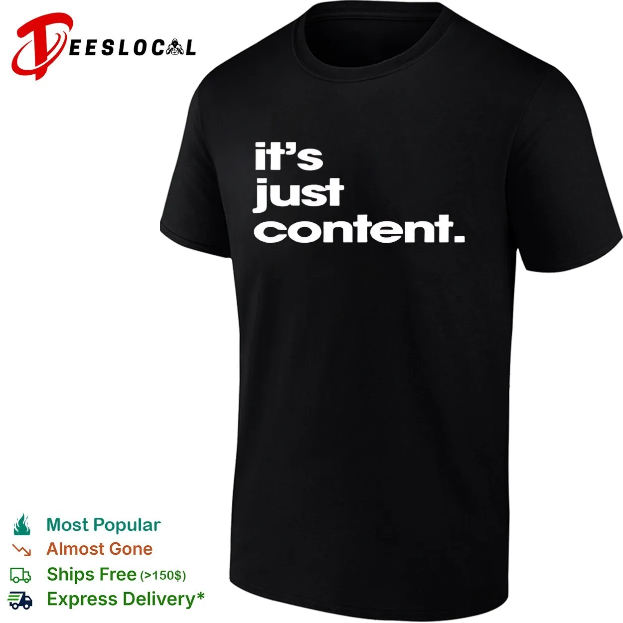
Image: Teeslocal
We’ve spent a decade drowning in oversized branding. Supreme box logos, Fear of God gothic text stacked three inches high, Balenciaga plastered across everything – it worked brilliantly, until it didn’t. By the mid-2020s a growing slice of the streetwear audience started quietly backing away from anything that felt like a walking billboard.
This tension isn’t new. Calvin Klein’s early-1990s minimalist campaigns – stark white backgrounds, spare typography, nothing but the name – felt revolutionary precisely because everything else was louder. That quiet luxury gave way to the logomania of the 2000s and 2010s. Now we’re cycling back, but with a twist: today’s restraint is anti-branding, not aspirational branding.
Our Top 10 Streetwear Brands Everyone Should Know in 2026 piece charts exactly this shift – the labels gaining ground right now are the ones whose pieces photograph quietly and wear loudly. The vibe is studied, not screamed.
When the Text Becomes the Design
Here’s the core revelation: the typography IS the design. When there’s nothing else on the garment – no graphic, no logo, no illustration – every decision about letterform, weight, spacing, and placement carries enormous visual weight.
The “It’s Just Content” shirt from Teeslocal is a clean example of what this looks like with intention behind it. Built reportedly out of exhaustion with loud prints, the execution shows – deliberate kerning, a matte finish that improves with washing rather than degrades. It covers a wide style range including hoodies, tank tops, and long sleeves.
From a POD design standpoint, this is the template: one idea, maximum typographic confidence, zero visual clutter. The constraint of “just text” is actually liberating. Try an ultra-condensed grotesque at 90% opacity on Sport Grey, or a variable-weight serif where letters shift from hairline to bold mid-word. Infinite moves within a tight brief.
For more applied direction, our Urban Typography T-shirt Designs: Streetwear Bundle breaks down the construction in detail.
The Specific Aesthetics Defining the Moment
We’re not talking about a monolithic “text tee” trend. There are distinct currents running through it right now, and each one translates to a different POD direction.
Condensed grotesques. Think Bebas Neue, Montserrat Condensed, Inter tight-tracked to near-zero. These are the workhorses – crisp, legible, architectural. The POD move here is oversized back text: a single phrase at 80pt-plus, full-bleed across the shoulders, on a washed black or slate blank. Placement is everything. It reads like a building sign, not a t-shirt.
Corporate grotesque and office-core wordmarks. One of the stranger corners of this trend is the pull toward type that looks like it belongs on a spreadsheet header or a 1994 corporate memo. Think Times New Roman set in all-caps, or a condensed sans with deliberately awkward tracking – the kind of thing that reads as accidentally institutional. Worn unironically, it’s deadpan and precise. The POD angle: micro-chest placement, left-aligned, small enough to make someone step closer. It rewards attention.
Euro-bootleg and luxury wordmark clash. There’s a whole lane of shirts riffing on misattributed luxury – a serif that looks vaguely like Celine or Loewe but says something completely different, or a heritage Italian label name replaced with a mundane English phrase. Think Garamond or Didot letterforms, cream on navy, set at exactly the proportion a real luxury label would use. The joke is in the execution. The POD direction here requires confidence: commit fully to the reference, then subvert one element cleanly.
Art-school serif clash. The noisiest end of the quiet trend. Two typefaces that have no business being on the same garment – a display serif from a 1960s magazine masthead colliding with a brutalist gothic – set in direct tension on a cream or natural blank. Highsnobiety and similar outlets are increasingly running editorial features built around exactly this kind of typographic friction. The washed blank is critical here; the slightly aged ground keeps it from reading as a production error.
What the Palette Is Telling Us
Colour choice in this trend is not incidental. Black, white, cream, and navy are carrying the heaviest cultural weight right now – not because they’re safe, but because they’re deliberate. Neutral grounds let the typography breathe and photograph cleanly across contexts. On-screen, especially in editorial and social settings, a tight black-and-white typographic piece reads better than almost anything graphic-heavy.
Sport Grey holds its own for a softer, vintage register – particularly when the typeface choice leans nostalgic. Bright grounds can work, but only when the type choice is equally considered. Royal Blue with a tight white grotesque reads collegiate, not chaotic. Anything less considered and the restraint collapses.
For POD: lean into washed or pigment-dyed blanks. The lived-in ground elevates the typographic intent – it signals that the garment was designed as a whole object, not a canvas with something applied to it.
What This Trend Signals for the Next Design Cycle
The minimalist typography movement is pointing somewhere specific: wearable pieces that photograph well in editorial contexts and disappear gracefully in everyday life. That’s a different brief from the statement-piece model that dominated the last decade.
The ripple effect for POD brands is real: if you’ve been chasing graphic complexity, the market is telling you to edit harder. The garments moving right now are the ones that commit to one clear idea and execute it with craft. Fashion editorial direction, as explored in pieces like Fashion Cinemagraph with AI-Assisted Art Direction, increasingly showcases spare, high-contrast typographic apparel because it reads beautifully on screen.
The direction for the next cycle: less illustration, more intention. Archival-style text blocks in forgotten typefaces, single declarative phrases in weights that feel almost architectural. Micro placements on the chest that make someone squint. Oversized back text that takes up the whole canvas. Corporate fonts used with enough irony to feel deliberate. The minimalist typography shirt isn’t a trend that’ll vanish in six months – it’s a recalibration of what “designed” means on a garment.
The person wearing the quiet text tee isn’t saying nothing. They’re saying everything – just at a volume that requires you to lean in to hear it.
Frequently Asked Questions
Q: What makes a minimalist typography shirt different from a plain text tee?
A: Intentionality. Every typographic decision – typeface, kerning, weight, placement – carries the full visual weight of the garment when there’s no supporting imagery.
Q: What colour grounds work best?
A: Black, white, cream, and navy are the strongest performers right now. Sport Grey works well for a softer, vintage feel. Washed or pigment-dyed blanks elevate the typographic intent further. Brighter grounds require a very considered type choice to avoid reading as chaotic.
Q: What typefaces are dominating this trend?
A: Condensed grotesques like Bebas Neue, Montserrat, and Inter are workhorses. Beyond those, the most interesting territory is in corporate sans-serifs used deadpan, luxury-adjacent serifs like Garamond or Didot applied with subversive intent, and art-school clashes between display serifs and brutalist gothics.
Q: Why are these shirts resonating so strongly in 2026?
A: Logo fatigue is real. After a decade of oversized branding dominating streetwear, the market is actively seeking garments that feel deliberate rather than promotional – the minimalist typography shirt signals taste through restraint rather than brand recognition. There’s also a cultural pull toward pieces that photograph well in editorial contexts without demanding attention in person.
Source: https://teeslocal.com/product/its-just-content-minimalist-typography-shirt/
This article was researched and written with AI assistance, then reviewed for accuracy and quality. Maya Sinclair uses AI tools to help produce content faster while maintaining editorial standards.