


\n
Last updated: July 25, 2026
\n
Here is the expanded, editorially sharpened article:
\n
 \n
\n
\nImage: Digital Synopsis (based on the Graphic Trend Report by Nandini Tiwari, Jumping Goose)
\n
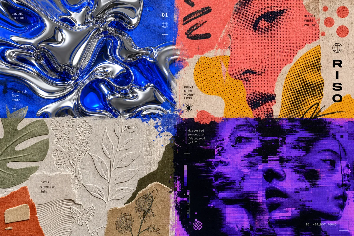
Walk past any pop-up in Shoreditch, scroll any streetwear feed out of Tokyo or LA, and something becomes clear: graphic design in 2026 is louder, stranger, and more deliberately imperfect than it’s been in years. Not loud for its own sake – loud in the way that genuine conviction gets loud. The stuff cutting through right now is raw, chromatic, dimensional, and built around what the Graphic Trend Report by Jumping Goose calls a shift from polish to presence. These are the graphic design trends 2026 is being defined by – and they translate directly to print-on-demand graphics that actually move.
\n
Chrome, Acid Colour, and the Futuristic Palette
\n
\n
\nImage: Digital Synopsis (based on the Graphic Trend Report by Nandini Tiwari, Jumping Goose)
\n
Chrome is the material of this moment, and it is not being used with any subtlety. Born in Stockholm’s 2026 futuristic fashion forecast puts the season’s palette in two distinct camps: monochrome metallics – silver, gunmetal, polished chrome – and high-impact neons – acid greens, hyper pinks, laser blues. Think Blade Runner meets a Harajuku vending machine. Think android aesthetics colliding with rave culture. Think the inside of a luxury spaceship fitted out at a surplus store in Akihabara.
\n
For POD, this is one of the most direct translations available right now. A bold chrome wordmark on a black tee – leveraging DTG’s capacity for near-metallic ink effects – is the front-hit version. Clean chest placement, large, nothing else on the shirt. The blank matters here: go black-on-black shimmer if you can, or a heavyweight charcoal as a fallback. Or invert it: full acid-green graphic on an off-white crisp base. The contrast is the whole statement, and off-white reads cleaner than stark white against neons. Do not try to make chrome feel minimal – commit to the excess.
\n
Neo-Brutalism: The Raw Layout That Stops the Scroll
\n
Neo-brutalism prioritises clarity and impact over refinement, and that is exactly why it works on garments. Oversized typography, intentional misalignment, clashing weights, layouts that look set in deliberate haste – this is not accidental roughness, it is authorial roughness. A tee does not need to be elegant. It needs to stop someone mid-scroll.
\n
The tourist tee moment has accelerated this. Ever since Chanel’s Métiers d’Art show put an I Heart NY tee on the runway [citation needed], the fashion crowd has been openly obsessed with the aesthetics of the gift shop – and neo-brutalism gives that instinct a design vocabulary. Clashing typefaces at extreme scale, deliberately mis-registered placement, a bootleg logo treatment that looks like it was photocopied in 1994. This is natural territory for the bootleg treatment – we explored that energy in depth in our piece on bootleg products that actually rock. For blanks, washed heavyweights carry this aesthetic better than crisp whites – the rough texture of a garment-dyed base makes the deliberate-chaos graphic feel like it belongs, not like a misprint.
\n
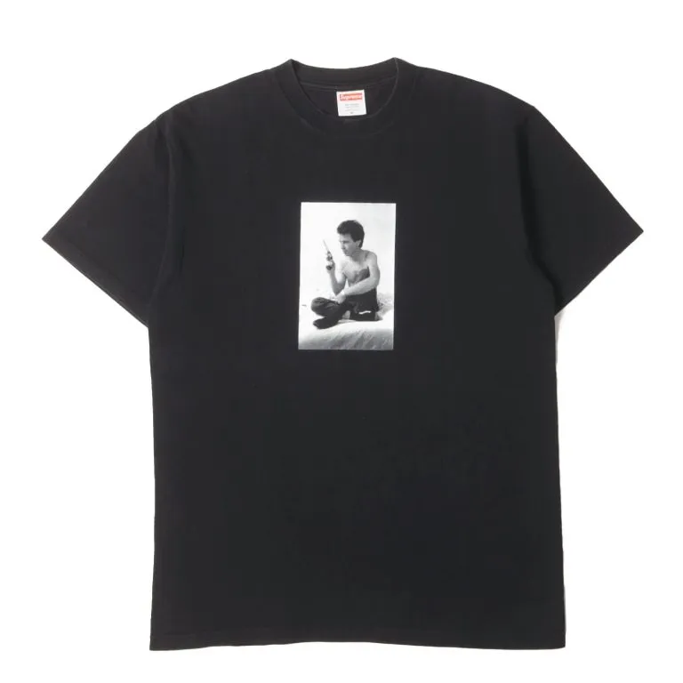
Retro bootleg photo shirts are having a particular moment right now: a bad scan of a concert photo, an overexposed portrait, text that is barely legible. Front hit, large. Not precious.
\n
Liquid Typography and Letterforms That Flow
\n
Letterforms in 2026 are stretching, softening, and flowing – suggesting movement even in still compositions. This is display-type territory: not body copy, but the single word or phrase that carries an entire graphic. The type looks like it is about to warp, melt, or exhale.
\n
Japanese-influenced distorted letterforms sit in the same aesthetic neighbourhood – our guide to Japanese-style fonts for 2026 covers the full typography landscape. Liquid type pairs naturally with high-contrast palettes: distorted chrome lettering on black for the front chest hit, a softened neon wordmark across the back yoke on a washed-out base. The back print is underused in POD right now – a full-back liquid type graphic at this scale reads as a proper statement piece rather than another chest logo tee.
\n
There is also a lower-fi end to this trend: wobbly doodle lettering, the kind of hand-drawn scrawl that looks like notebook margins. It is everywhere from streetwear capsules to stationery. On a tee it works best small and placed oddly – left chest, slightly too high, slightly crooked. The imprecision is the point.
\n
Mixed-Media Layering: The End of Flat
\n
Flat design had a long run. 2026 is its reckoning. Mixed-media compositions layer photography, illustration, typography, and texture within single pieces – collage energy with contemporary colour. Xeroxed photography overlaid with hand-drawn line work, overlaid with a distressed screen-print texture. Dimensional complexity as an aesthetic position.
\n
DTG printing has dominated custom apparel for years precisely because it handles this complexity without registration issues. A layered mixed-media graphic that would have required six-colour screen-printing a decade ago now prints in one pass. The AI-assisted design workflows documented in our AI fashion trends 2026 piece are making this kind of generative layering even more accessible – though authorship and creative direction remain the human side of the equation. The strongest mixed-media tees right now are the ones where the AI clearly had a collaborator who knew what they were editing, not just prompting.
\n
Organic Textures: The Counter-Note
\n
Organic shapes and muted, tactile palettes offer the antidote to all the chrome and acid colour. Nature-inspired design in 2026 favours materiality over symbolism – less leaf motif, more the rendered weight of stone, bark, or linen. Warm stone tones, off-whites, soft sage greens.
\n
For streetwear, this plays as a tonal graphic tee: understated, but with genuine visual depth. A single organic shape in warm stone on a sand-washed heavyweight blank, placed slightly low on the chest or centred on the back – this is the antidote tee for people who find the chrome-and-neon direction too much. It is also the blank that matters most here: a premium washed fleece or pigment-dyed canvas completely changes how a muted graphic reads. The texture of the garment becomes part of the design.
\n
What Already Looks Tired
\n
Call it now so you do not chase it into next year. Minimalist sans-serif logo tees with nothing else going on – they peaked in 2022 and they have been running on fumes since. Tie-dye in any form. Geometric grid graphics that look like a junior designer’s portfolio piece. Overly clean AI art on tees, the kind with the suspiciously perfect hands and no visible creative decision behind the output. And the word “vibe” as a graphic – that has been done.
\n
The streetwear market is also starting to tire of faux-vintage that is too polished. Real vintage-inspired graphics have grit and specificity: a fake band tee for a band nobody has heard of, a dodgy city skyline for a city that means something. Generic “distressed sans-serif + star” graphics that are technically vintage-adjacent but culturally empty – those are losing traction fast.
\n
Pick your lane this season, commit hard, and make something that looks like a decision was made. Chrome-on-black or tonal earth: those are opposite ends of the spectrum, and both are correct. What does not work is hedging between them.
\n
Source: https://digitalsynopsis.com/design/graphic-design-trends-2026/
\n
This article was researched and written with AI assistance, then reviewed for accuracy and quality. Maya at Its.That. uses AI tools to help produce content faster while maintaining editorial standards.
\n