

\n
Last updated: July 23, 2026
\n
Here’s the polished article:
\n
\n
 \n
\n
\nImage: theCHIVE / Luka
\n
Sunday morning at a vintage market. A chrome-effect slogan on a heavy black condensed tee. A fake sponsor grid referencing zero real brands. Cracked navy ink bleeding into a washed white base. Misregistered black and red sitting two millimetres off where it was supposed to land. None of it polished. All of it already gone by noon.
\n
Scroll TikTok’s fashion corner for thirty seconds and you’ll see the same thing: a font that’s slightly too bold, a logo that’s one degree off-centre, a slogan that makes you squint and then laugh. Bootleg t-shirt designs have always existed on the fringes. What’s changed is that the fringes are now the front row.
\n
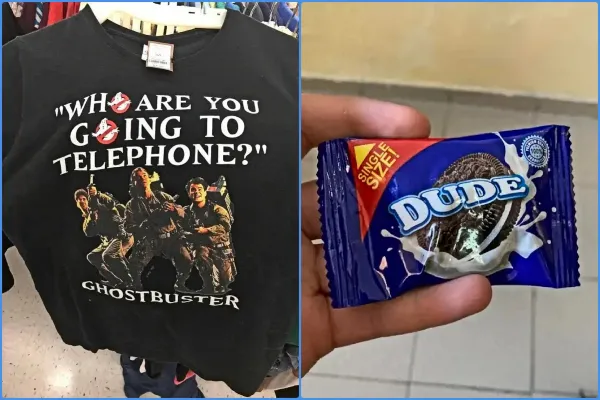
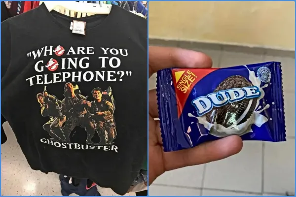
theCHIVE’s viral gallery “So Bad It’s Good: Bootleg Products That Kinda Rock,” published on 15 July 2026 by contributor Luka, crystallised something designers have been sensing for months. Some knockoffs are so audaciously wrong they loop back around to right. The “Nut Master” spread – a bootleg product so crude its branding becomes compelling – is the case study. We’re not here to defend bad design. We’re here to steal what bad design accidentally gets right.
\n
1. The Wonky Type Treatment
\n
 \n
\n
\nImage: theCHIVE / Luka
\n
Bootleggers can’t kern. That’s their gift to us.
\n
The slightly-too-wide tracking, the mismatched weights, the all-caps headline in a font that’s almost-Helvetica-but-not-quite – this reads as authentic in a way that polished typography never can. Gen Z is actively rejecting the AI-generated sameness now blanketing every print-on-demand marketplace, gravitating instead toward items that feel like a person made them. Wonky type signals exactly that. It’s the typographic equivalent of a crease in a leather jacket.
\n
Think greasy chrome lettering on a heavy black condensed face. Think a bold sans set slightly too tight, letters almost kissing. Think faded safety-orange type stamped at a half-degree tilt. The slight wrongness is the point.
\n
POD application: A bold sans-serif text tee with deliberate tracking errors – one word per line, maximum three lines, stacked slightly off-axis. Our guide to Best Fonts for T-Shirts: 14 Picks (2026) covers the base fonts that take bootleg treatment best. Grotesks and condensed display faces are where we’d start. Set the type correctly, then break one thing on purpose.
\n
2. Bootleg T-Shirt Designs That Own the Off-Register Look
\n
The off-register print is a bootleg signature: two colours that don’t quite align, creating a shadow that looks like a printing mistake. It is a printing mistake. It’s also the most-copied effect in independent streetwear right now.
\n
The palette running through the best work is deliberately limited and worn. Faded safety-orange. Concrete grey. Cracked navy that’s clearly survived forty washes. Misregistered black and red is the combination we keep seeing on market rails – it reads as screen-printed in someone’s garage, which in 2026 is an unambiguous compliment. Think the colour of a tee that already has a history.
\n
The 7 cool vintage t-shirt design styles POD sellers use in 2026 covers the heritage context; the bootleg angle adds grime and dark humour on top.
\n
POD application: A washed two-ink print – faded brick-red on cracked navy, or safety-orange on washed black. Overlay your artwork at 97% opacity, shift one colour layer two pixels left. That’s the whole technique. If your POD platform offers garment-dyed bases, use them. The substrate does half the work.
\n
3. Absurdist Branding as Charisma
\n
The bootleg world produces accidental poetry – product names that fail at sounding authoritative and succeed at sounding like a band you’d immediately want printed on a tee.
\n
Virgil Abloh built half of Off-White on this premise: tongue-in-cheek branding, quotation marks around obvious words, arrows pointing at things that need no signposting. “Nut Master” operates in the same register – branding that’s too much and not enough simultaneously.
\n
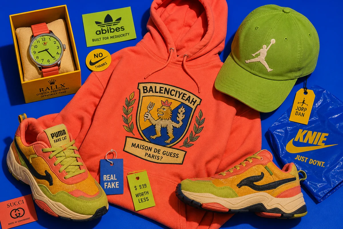
Current streetwear is running this in two specific formats right now. The fake sponsor grid: fictional brand names crammed into a motorsport-style sponsor block – all the visual authority of F1 livery, none of the licensing restrictions. And the bargain-bin logo flip: taking the structural shape of a recognisable logo category – sports lockup, fast-food wordmark, corporate certification seal – and replacing every identifiable element with invented content. The shape says “you know this.” The content says “you absolutely don’t.” Our own ADHDas tee follows that exact shape-swap, a familiar three-stripe layout carrying a completely different point.
\n
POD application: Build a bootleg sports lockup for a fictional team with an absurdist name. Or create a fake product seal – “Certified Genuine” in a circle badge, or an official-looking nutrition label listing emotional states instead of macros. Short. All-caps. One line. The underground streetwear brands you need to know in 2026 are pushing this furthest right now with zero irony detachment. They mean it.
\n
4. The Line That Matters: Original Bootleg vs. Brand Infringement
\n
This is where the aesthetic gets murky, so let’s be direct.
\n
Borrowing the visual language of bootleg culture – imperfect type, degraded palettes, fake authority marks – is entirely legitimate when applied to wholly original artwork and invented names. The problem starts when the reference is too close: a logo that’s unmistakably a modified Nike tick, a wordmark that’s clearly Adidas with one stripe removed, a font that’s the actual brand’s proprietary face with a letter swapped.
\n
The legally safe territory is wider than most designers assume. The structural codes of a genre – sports lockup, certification badge, energy-drink can layout – have no single owner. What matters is whether a reasonable person could be confused about a real brand’s involvement. A tee reading “NUT MASTER – OFFICIAL SPREAD” in a bold serif with a fake certification badge is bootleg aesthetic. A tee with a lightly modified version of an actual brand’s illustration is infringement.
\n
The most creative and the most legally sound path is identical: invent everything. It is the approach behind our own Bootleg collection: a recognisable shape, an entirely invented message underneath it. Fictional team names. Invented product categories. Made-up certification bodies. The visual codes are universal. The content is yours – and that’s the only version of this that scales.
\n
5. The Double-Take Design
\n
theCHIVE’s gallery is structured as a pure image scroll because bootleg aesthetics live and die by immediate reaction. Scroll past. Stop. Go back. That’s the mechanic – and it’s also the design brief.
\n
Build for the double-take. The t-shirt that reads wrong on first pass and right on second. The print that looks like a mistake until someone asks where you got it. Redbubble – the Melbourne-founded marketplace that’s given independent artists a platform since 2006 – is full of designers chasing exactly this quality. The ones breaking through aren’t polishing their work. They’re roughing it up.
\n
Stop trying to make something that looks finished. The bootleg tee we’d greenlight right now is specific: a fake sports lockup for a team that doesn’t exist, set in a condensed grotesk with deliberate tracking errors, printed in misregistered cracked navy and safety-orange on a garment-dyed black base. Heavy type. Loose registration. One invented slogan in all-caps beneath the lockup. Run a limited drop. Let the imperfection be the proof of authenticity.
\n
Frequently Asked Questions
\n
Q: What are bootleg t-shirt designs and why are they trending in 2026?\nA: Bootleg t-shirt designs are prints that replicate established brand aesthetics with visible imperfections – wonky type, off-register colour, crude branding. They’re trending because buyers are actively rejecting the AI-polished sameness saturating POD marketplaces, gravitating instead toward items that feel handmade and authentically human.
\n
Q: How can POD designers use bootleg aesthetics without copying existing brands?\nA: The goal is to adopt the visual language of bootleg culture – imperfect typography, limited faded palettes, fake sponsor grids, invented product-category branding – applied to wholly original artwork and slogans. Fake certification marks, fictional team lockups, and made-up product seals achieve the aesthetic without referencing any real intellectual property.
\n
Q: What’s the legal line between bootleg-inspired design and brand infringement?\nA: The structure of a visual genre – a sports lockup, a certification badge, a sponsor grid – has no owner and is fair to reference. The line is crossed when a design could plausibly be mistaken for a real brand: a modified version of an actual logo, the brand’s proprietary font, or an illustration that copies trademarked artwork. Invent every specific element and the territory is yours.
\n
Q: What colour palette works best for bootleg-inspired POD designs?\nA: A limited, faded palette of two or three flat colours works best. Faded safety-orange, concrete grey, cracked navy, and misregistered black-and-red are strong starting points. Overlaying artwork at slightly reduced opacity and shifting colour layers by a few pixels recreates the off-register printing effect that defines the style.
\n
Q: Which fonts suit a bootleg t-shirt aesthetic?\nA: Bold grotesks and condensed display faces take the aesthetic furthest. The technique is to select your base font correctly, then deliberately break one thing – off tracking, a misaligned baseline, or a weight that’s almost-but-not-quite right. It should look like someone set the type correctly and then something went slightly wrong in production.
\n
Q: Who legitimised ironic and bootleg-adjacent aesthetics in high fashion?\nA: Virgil Abloh, founder of Off-White, is widely credited with bringing tongue-in-cheek branding – quotation marks, directional arrows, deliberately obvious labelling – to the highest levels of fashion, demonstrating that bootleg-adjacent aesthetics can function as deliberate design commentary rather than mere manufacturing error.
\n
\n
This article was researched and written with AI assistance, then reviewed for accuracy and quality. Maya at Its.That. uses AI tools to help produce content faster while maintaining editorial standards.
\n