


\n
Last updated: July 27, 2026
\n
 \n
\n
\nImage: Advise Graphics
\n
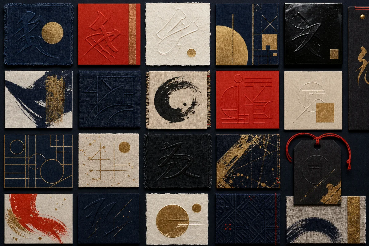
Open your feed right now. Kanji pressed hard into a chest panel. Angular Katakana cutting across a dropped shoulder. Brushstroke logotypes pulled straight from a Kyoto back street. Japanese typography is not arriving in streetwear – it has already been the visual language of every tee worth stopping on for the past twelve months, and in 2026 the conversation has sharpened considerably. The audience watching these feeds has grown up on anime, Harajuku-adjacent aesthetics, and Fragment Design. They can tell the difference between a considered choice and a copy-paste. We should be making considered choices.
\n
What’s changed is not the appetite – that has been building since early Supreme drops and Hiroshi Fujiwara was stamping Kanji on everything – it’s the specificity. Japanese script gives us three registers to work with: Hiragana for softness, Katakana for hard-edged technicality, Kanji for raw weight. These are not interchangeable. Dropping any vaguely Eastern-looking typeface on a tee is the visual equivalent of a bad accent. It breaks trust with anyone who has any cultural literacy at all.
\n
So let’s talk about the three moods actually worth building around.
\n
\n
Techno Katakana – The Hard Edge
\n
\n
\nImage: Advise Graphics
\n
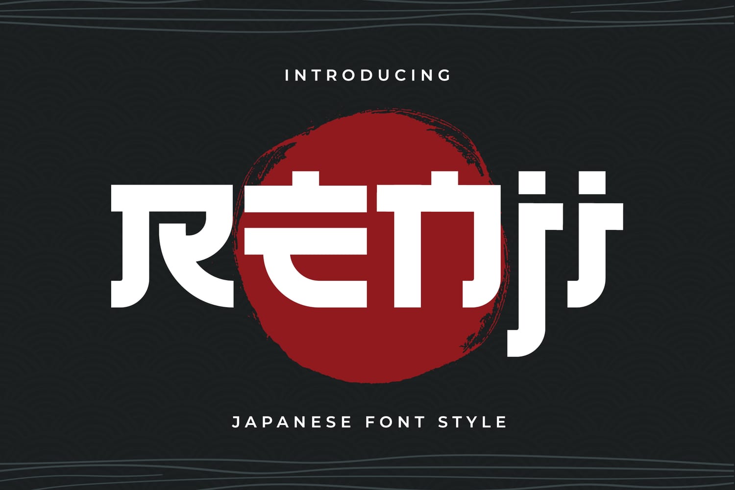
Think Balenciaga campaign meets Tokyo subway signage. That brutal, geometric tension – forms stripped back to pure angle and counterspace – is exactly what Katakana-led design delivers when done right.
\n
The font to know here is Kiyomori. Designers are calling its approach a ‘Black Katana’ edge: modular geometric construction, deliberately high-contrast strokes, a sharpness that reads brilliantly on camera and holds on heavyweight cotton. This is not decorative Eastern pastiche. It is a serious type decision that sits comfortably alongside the ‘Bold Minimalism’ direction dominating design right now. Think Mastermind Japan meets a Berlin techno poster. That is the exact energy.
\n
How to execute it as a tee. Oversized silhouette – nothing slimmer than a boxy dropped shoulder. Place the Katakana as a single large-scale chest hit, centred or slightly left-weighted. Screen print in puff or discharge on a faded black or cold-white base. No secondary graphics competing with it. If there is a brand wordmark, it goes small on the back collar or left hem, in Latin type – the Katakana does the talking. For colour, this mood lives in monochrome, metallics, or a single cold accent: electric blue, acid green. Keep the rest of the garment completely clean.
\n
The cultural energy is techno-futurist Japan – Akihabara, not Asakusa. It taps directly into the ‘Experimental Japan’ movement pushing POD designers toward specialised typeface weights that go beyond anything a system font can offer. Generic sans-serif is finished. This is what replaces it at the sharper end of the market.
\n
\n
Brushed Wabi-Sabi Calligraphy – The Artisan Signal
\n
Completely different register. The Hakio approach – typefaces that mimic the natural fraying of a physical brush, deliberately imperfect, visibly handmade – is the counter-move to all that hard geometry. In a market saturated with hyper-clean digital output, visible craft reads as premium. Full stop.
\n
This is wabi-sabi as brand positioning. The imperfection is the point. It communicates that a human made a decision, not an algorithm queuing up a font from a dropdown. For POD brands trying to position in the sustainable-lifestyle or organic-aesthetic space, this is your typographic equivalent of raw denim or deadstock fabric.
\n
How to execute it as a tee. Garment-dyed mid-weight tee in earth tones – raw umber, ash green, aged off-white, washed terracotta. The silhouette can run slightly slimmer here: this mood works on a relaxed-fit crew as well as an oversized boxy. Place the brushstroke calligraphy large across the chest or as a vertical stack running down the left side panel – that vertical orientation is culturally coherent and visually unusual enough to stop a scroll. Waterbased ink only: the slightly faded, soaked-in quality of waterbase on a garment-dyed blank mirrors the handmade texture of the type itself. Avoid hard plastisol prints – the contrast kills the mood. Logo treatment should be minimal, embossed or debossed at the hem if possible. This is not a piece that shouts a brand name.
\n
The cultural energy here aligns with the ‘Refined Maturity’ direction – the quieter, more considered end of the 2026 aesthetic conversation. It also overlaps directly with the bootleg-adjacent sensibility we covered in So Bad It’s Good: Bootleg Products That Kinda Rock: distressed calligraphy, faux-handmade script wrapping a Western logo, the lo-fi cultural remix. The appetite for that energy has not diminished – it has just matured.
\n
\n
Single-Kanji Minimalism – The Discipline Drop
\n
The tee that cuts through right now is not the loudest one. It is the most considered. One Kanji. Correct weight. Surrounded by space. On a fabric that earns the typography.
\n
This is the hardest mood to execute well, which is exactly why it signals authority when it lands. A single Kanji in a disciplined weight – not oversized, not crammed, just placed correctly with serious breathing room around it – communicates that the person who designed this tee knew exactly what they were doing. The audience knows when you do not. That has always been true in streetwear. It is especially true now that the cultural literacy around Japanese aesthetics has risen sharply across Western markets.
\n
How to execute it as a tee. Premium heavyweight cotton – 280gsm minimum, ideally a structured boxy blank that holds its shape after wash. The Kanji sits centred on the chest, printed at roughly 8-10cm, no larger. Discharge printing on black, or a single-colour screen on natural or stone. The garment does the rest of the work: quality of material, weight, cut. Back graphics are optional and should be typographic if they appear at all – a small Latin translation of the Kanji character at lower back, or nothing. Brand logo is sleeve-printed or woven label only. The front is the statement. Everything else is supporting cast.
\n
Think Comme des Garçons Play without the heart. That level of restraint. The cultural connection is the high-contrast compositional tradition that makes Japanese graphic design so distinct – negative space used with the same intentionality as the positive mark. It is the visual density of a Tokyo subway sign, resolved down to a single character. That tension, that compression of meaning into one mark, is what makes it land.
\n
\n
For where all of this sits in the broader type conversation, our Best Fonts for T-Shirts: 14 Picks (2026) covers the full landscape. And if you’re building around any of these aesthetics at the brand level, the 30 Best Streetwear Brands breakdown shows you who is executing Japanese typographic language most credibly right now.
\n
The tools to do this well are accessible. The typefaces exist. The blank garment quality is there. What remains scarce is the editorial judgement to pick one mood, commit to it fully, and resist the urge to over-explain. Japanese script on a tee is a commitment. In 2026, that commitment is visible from a feed thumbnail, and the audience has already decided whether you earned it before they read a single word.
\n
Source: https://www.advisegraphics.com/japanese-fonts
\n
This article was researched and written with AI assistance, then reviewed for accuracy and quality. Maya at Its.That. uses AI tools to help produce content faster while maintaining editorial standards.
\n