
Image: Fontfabric
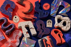
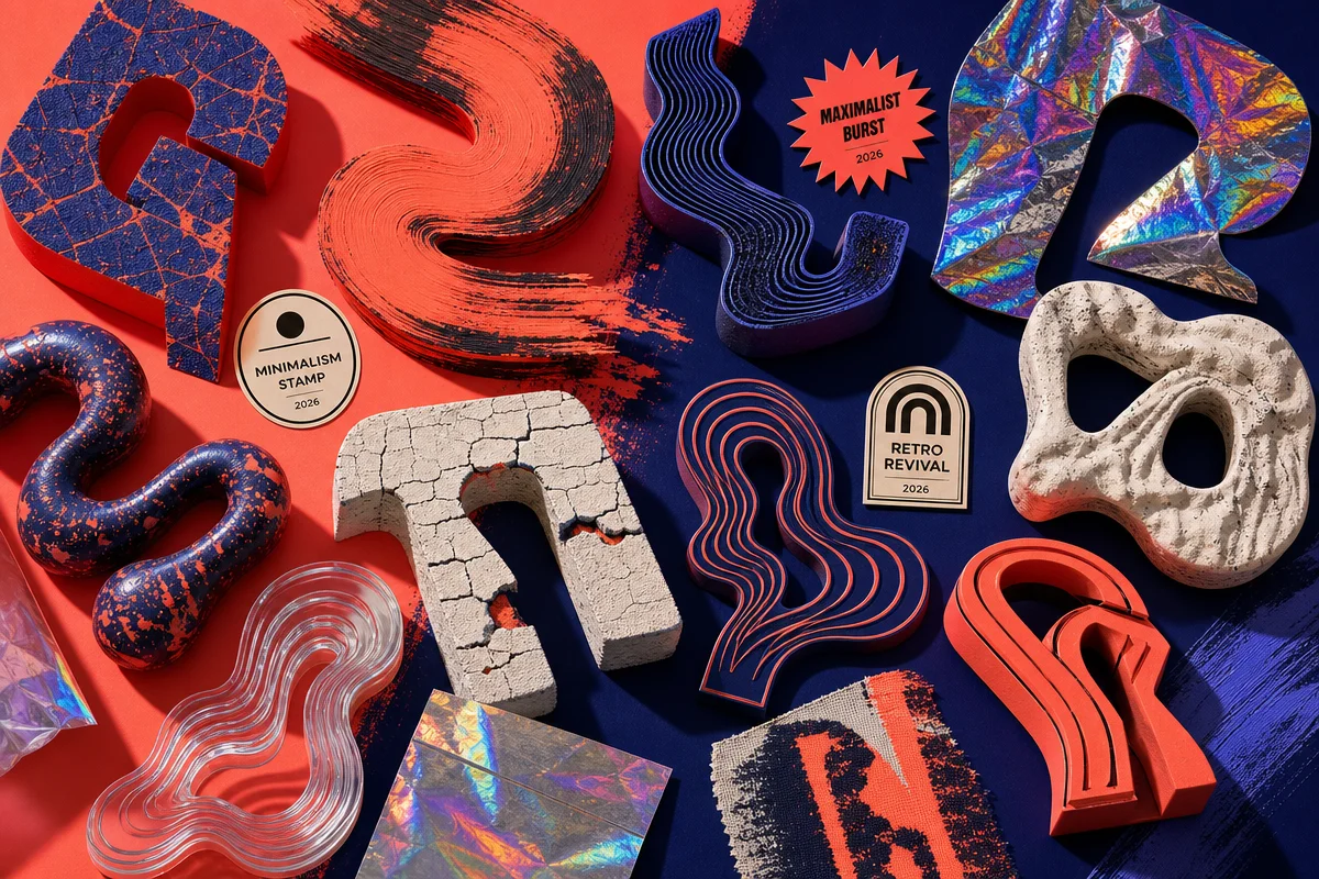
Scroll any moodboard right now and you’ll catch it mid-scroll: a hand-scrawled headline butting up against a razor-sharp AI-rendered gradient, letterforms stretched until they buckle, kerning that looks deliberately wrong. Nobody’s cleaning this up. That’s the point. Here’s the provocative bit – the dominant look of 2026 typography isn’t sleek, it’s messy on purpose, and if your t-shirt drops still look like a font-pairing tutorial from 2021, you’re already behind. 2026 typography trends aren’t about finding the “right” typeface anymore. They’re about collaging wrong ones together until something honest falls out – and, at the other end of the spectrum, about knowing exactly when to go dead quiet instead.
The common misconception is that AI design tools would make everything look more polished, more uniform, more machine-perfect. The reality, according to Fontfabric’s read on the year, is the opposite: type has gone louder, more performative, and more central to brand identity than ever. We’ve pulled ten calls worth building a print run around, from collage chaos to serif revival to type so restrained it reads as luxury by contrast.
1. Messy AI-human collage as the default aesthetic
Image: Fontfabric
The core trend for 2026 is a deliberately imperfect blend of AI-generated elements and human-made marks layered on top of each other. Fontfabric’s report frames this collage-driven language as the visual signature of the year – not clean AI output, but AI output that’s been drawn on, cropped wrong, and left slightly broken.
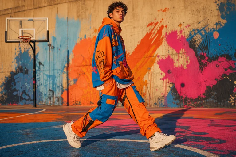
Palette: acid green and burnt orange against a desaturated, almost sepia photo backdrop. Type treatment: a hand-lettered Sharpie tag sitting directly on top of a glitchy Midjourney gradient, edges deliberately misaligned. Cultural reference: zine culture, mixtape covers, riot grrrl flyers. POD execution: a boxy oversized graphic tee with a torn-edge collage panel across the chest – one element too clean, one element too rough.
2. Bootleg imperfection as a strategic flex
Imperfection in 2026 design is chosen, not accidental – and nowhere is that clearer than in the bootleg revival. A wonky baseline or a deliberately botched letterform isn’t sloppy craft, it’s a credibility marker, and bootleg culture coded as “more real” than the brand it was ripping off decades before anyone called it a trend.
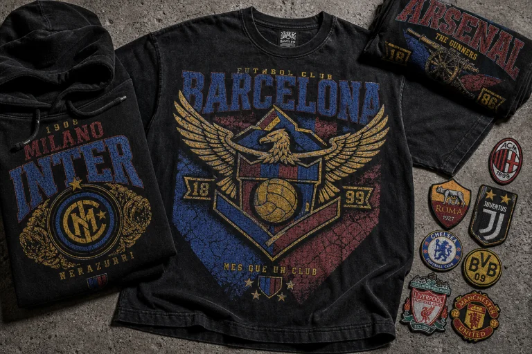
Palette: strict black-and-white, or one blown-out neon (think traffic-cone orange) against greyscale. Type treatment: uneven tracking, a slightly-off drop shadow, registration that looks one print pass out of alignment – classic counterfeit-merch logic. Cultural reference: 90s parking-lot bootleg tees, unlicensed band merch. POD execution: a bootleg logo treatment on a boxy fit, printed slightly off-register on purpose so it reads underground even at volume.
3. Kinetic type that behaves like motion graphics
Typography is being treated less like static text and more like a system that moves, stacks, and performs – even in a still image. Studio Dumbar’s identity work for enterprise software brand OutSystems is a widely cited reference point: letterforms stretched, rotated, and stacked until they function as UI elements, diagrams, even visual stand-ins for sound waves.
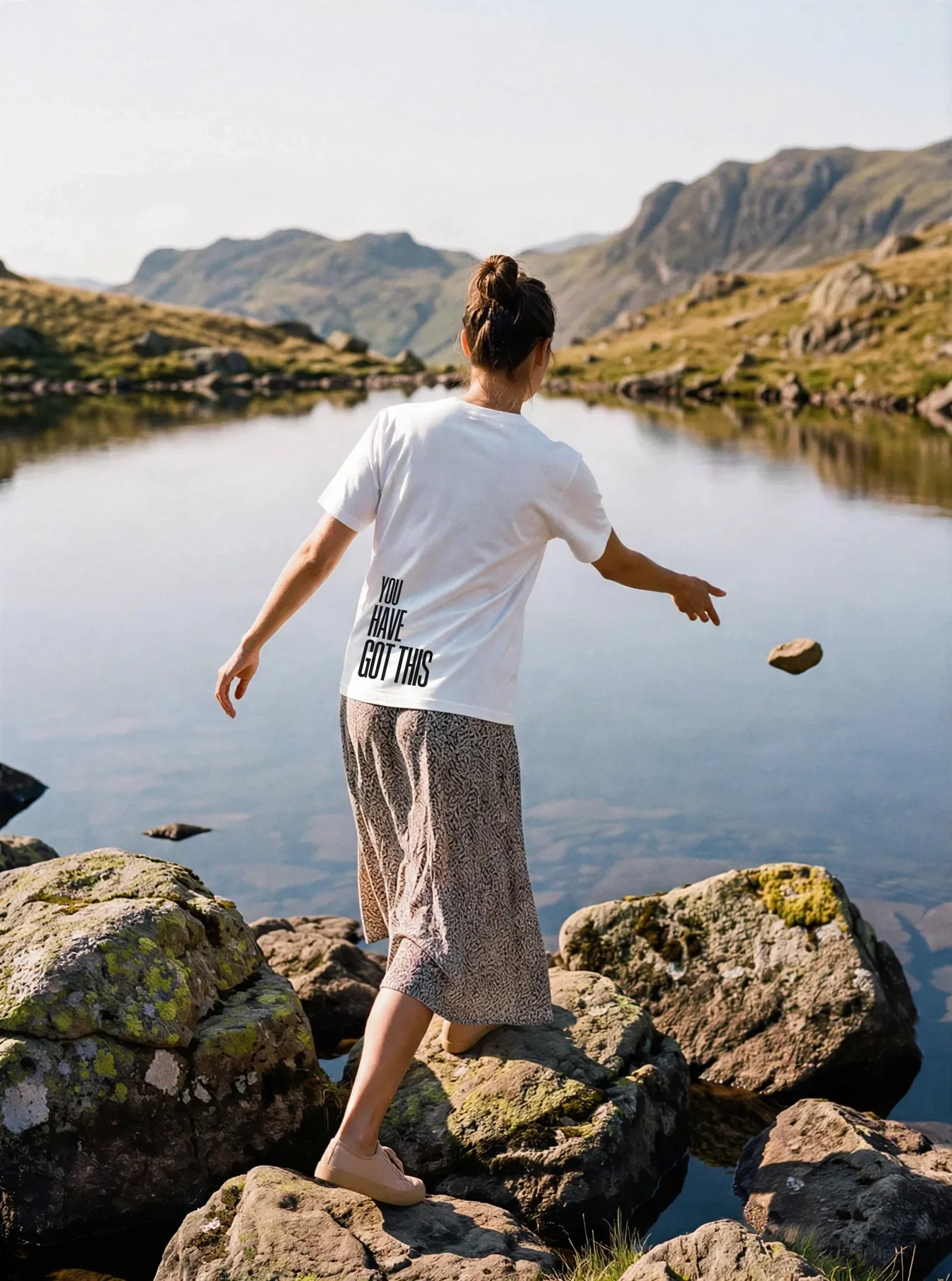
Palette: signal red on off-white, or full mono with one accent line. Type treatment: stack a word vertically with each letter rotated a few degrees off-axis, or stretch a wordmark until it warps like a soundwave across the chest. Cultural reference: editorial type-as-image meets rave flyer kinetics. POD execution: a bold sans-serif text tee where the type itself is the entire graphic – no illustration needed.
4. Type as the primary brand asset
Fontfabric lists typography as one of ten trends shaping the entire visual landscape for 2026 – not a supporting player under a logo, but the identity itself. Brands are building whole visual systems out of a single distinctive typeface treatment rather than icon-plus-wordmark combos, which changes how a drop gets designed from the start: the wordmark comes first, everything else gets built around it.
For merch, that means resisting the urge to add a graphic “just in case.” Palette: keep it to two tones max so the mark stays legible from across a room. Type treatment: one hero wordmark, oversized, filling the chest or back panel edge-to-edge. POD execution: a single-colour print on a heavyweight blank, sized so the type itself becomes the silhouette people recognise on the street.
5. Irregular letterforms over uniform ones
The convergence of generative tools with deliberate human curation is producing letterforms that prize character over consistency. Irregular x-heights, mismatched weights within one word, deliberately clashing serif-and-grotesk pairings – these read as considered now, not careless.
Palette: warm cream base with charcoal type, occasionally broken by one letter in a clashing accent colour. Type treatment: set a single word where every letter comes from a different weight or family, deliberately unresolved. Cultural reference: the same instinct that drives DIY flyer design, now formalised as a system. POD execution: works best on a front-and-centre chest hit rather than an all-over print – the eye needs room to register the mismatch.
6. Serif revival, gothic-editorial edge
Away from the collage chaos, a parallel current is pulling serifs back into brand systems – not the polite, corporate kind, but high-contrast, editorial-gothic serifs borrowed from magazine mastheads and old-world signage. It’s the counterweight to five years of geometric sans-serif dominance, and it lands as a signal of confidence rather than nostalgia.
Palette: blood red or deep bottle-green on black, or straight ivory-on-black for a masthead feel. Type treatment: a tall, high-contrast serif headline set tight, thick strokes against hairline ones. Cultural reference: broadsheet mastheads, old varsity letterman type, gothic horror-film title cards. POD execution: a back-print masthead tee, the serif wordmark run full-width like a newspaper nameplate.
7. Variable, fluid typography
Where static type feels flat next to kinetic branding, variable fonts let a single typeface morph in weight, width, and slant within the same word – a technical trend from web and motion design that’s migrating into print as a graphic device in its own right. Instead of one static logotype, brands are shipping type that visibly stretches from light to black, or condensed to expanded, across a single line.
Palette: gradient-mapped type – one word fading from cyan to magenta as the weight shifts. Type treatment: a wordmark that starts thin and finishes bold (or the reverse), simulating the animation frame-by-frame in print. Cultural reference: app-launch splash screens, generative art. POD execution: a gradient wordmark tee, printed as a single continuous fade so it reads as motion caught mid-frame.
8. Luxury minimalism as the contrast play
Against all that noise, a small, deliberate wordmark in a lot of negative space is starting to read as the loudest thing in the room – a direct response to feed fatigue with maximalist collage. This is minimalism repositioned: not safe, but expensive-looking by contrast with everything around it.
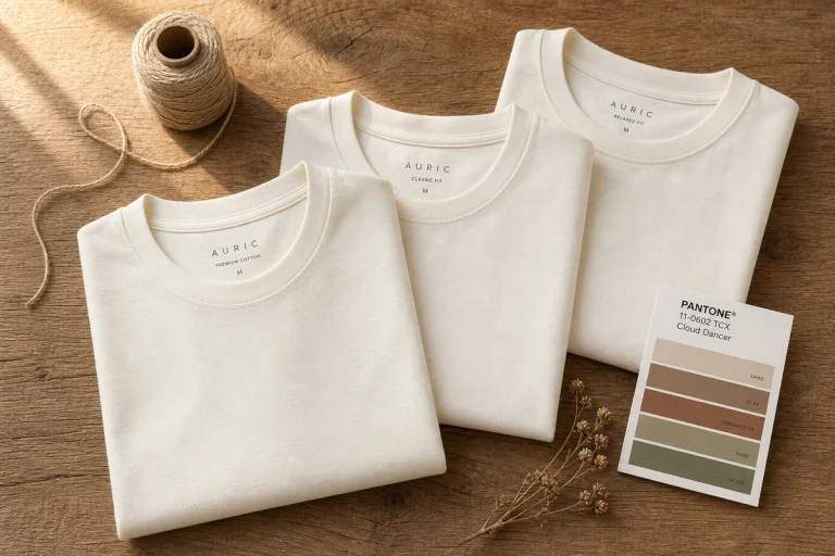
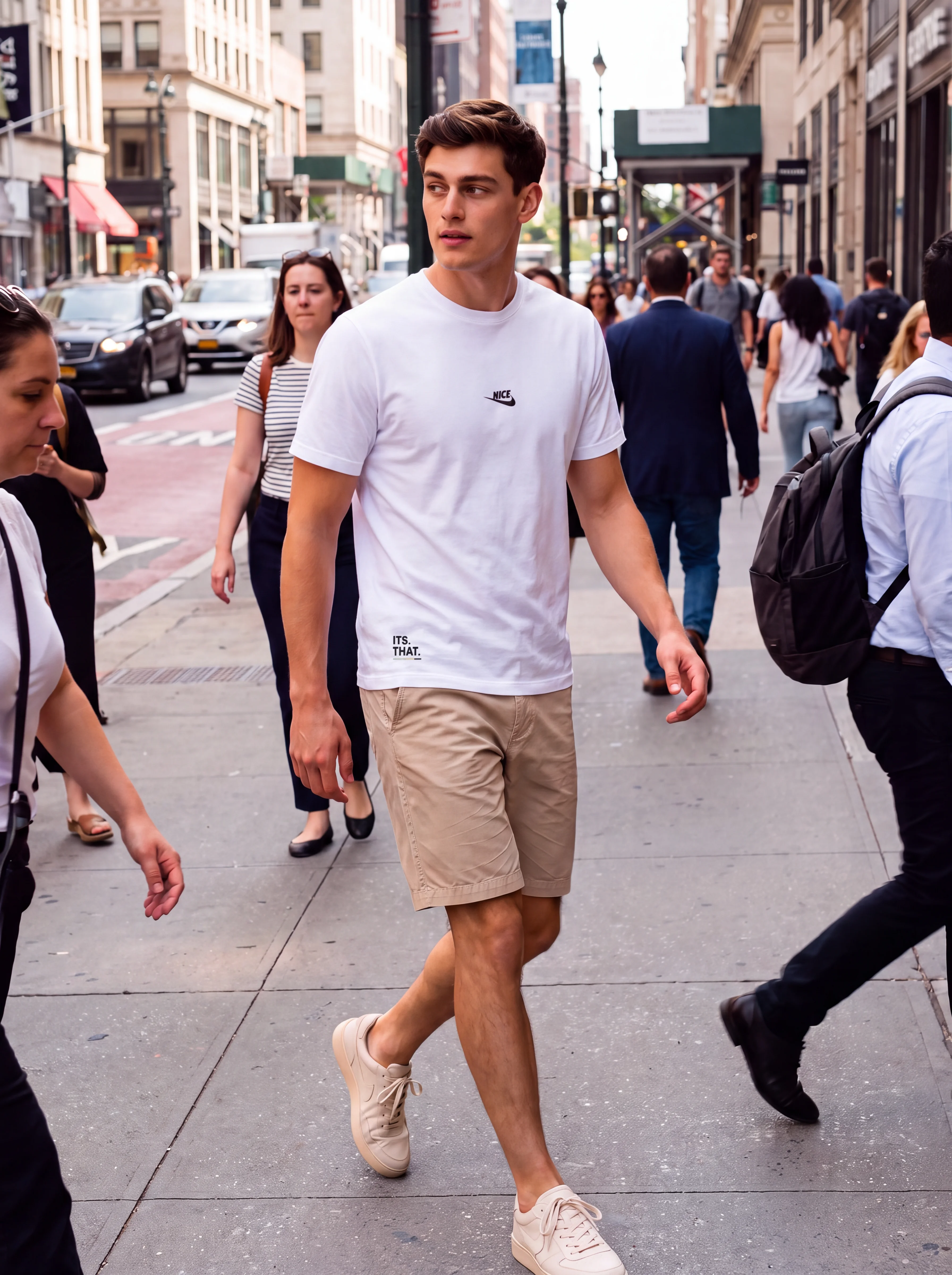
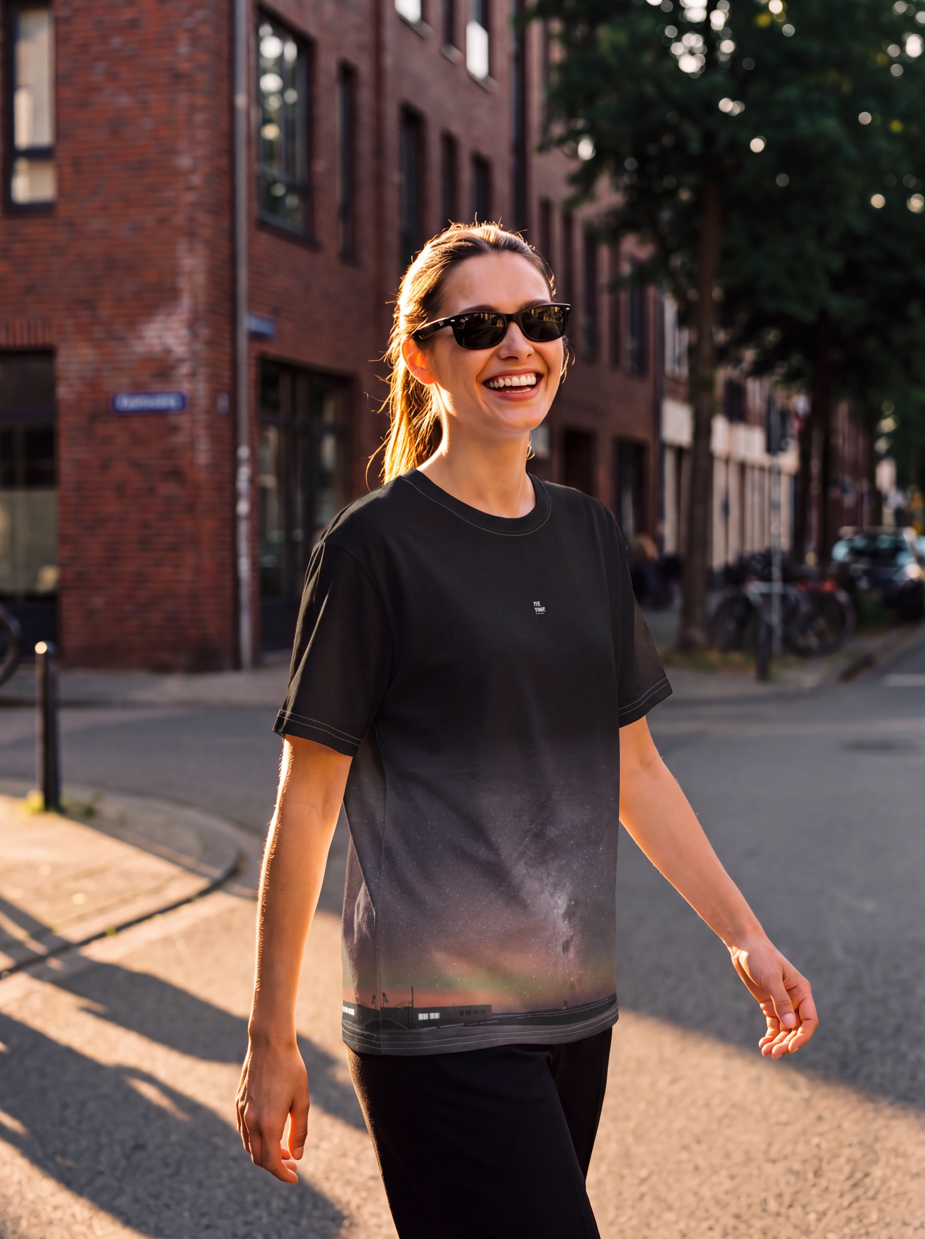
Palette: all-white or all-black, single tone, no accent colour at all. Type treatment: a tiny, precisely kerned logotype centred on an otherwise empty chest. Cultural reference: quiet-luxury fashion houses doing the opposite of hype-brand branding. POD execution: a premium minimal tee on the heaviest, best-finished blank in the range – the fabric has to do the work the graphic isn’t doing.
9. Brush lettering and the digital-analog hybrid
Hand lettering hasn’t disappeared under all the AI collage – it’s hybridising with it. The most-searched lettering styles for 2026 pair analog brush and marker scripts with digitally cleaned-up vector outlines, so a genuinely hand-drawn mark gets the crisp edges needed for screen printing without losing its handmade energy.
Palette: ink black on raw canvas or unbleached cotton, occasionally one warm accent (rust, ochre). Type treatment: a brush-script wordmark, digitally traced so the print registers cleanly but keeps every bristle mark and ink pool. Cultural reference: sign-painter and tattoo-flash lettering traditions, now vectorised. POD execution: a brush-script chest tee on undyed or garment-dyed fabric, leaning into the raw-canvas texture rather than fighting it.
10. Expressive display type replacing illustration
The last shift is the biggest structural one: display fonts built with enough personality – swash details, chunky slab serifs, deliberately clunky proportions – that they no longer need an illustration alongside them to carry a design. The letterforms are the artwork.
Palette: one saturated colour on a neutral ground, kept simple so the letterform detail reads. Type treatment: an oversized display word set alone, its swashes and quirks doing all the visual work. Cultural reference: 70s concert-poster lettering and skate-brand wordmarks that never needed a logo mascot. POD execution: a type-only statement tee, one word, full chest width, zero supporting graphic.
Building an actual drop around this
Don’t try to hit all ten trends in one release – that reads as indecisive, not versatile. Pick a spine and let two or three trends support it. A collage-and-bootleg capsule (#1, #2, #5) works as a four-piece drop built around one recurring character or tag, each shirt a different “state” of the same messy mark. A quieter capsule pairs luxury minimalism with serif revival (#6, #8) – two pieces, same fabric weight, one loud wordmark and one whisper-quiet logotype, sold as a set so the contrast does the selling.
Whatever the mix, commit to one dominant colour story across the drop rather than a different palette per shirt – that’s what makes a five-piece release photograph as a collection instead of five unrelated tees. And test the hero typographic mark at three sizes before locking artwork: chest-hit, back-print, and sleeve. A treatment that only works at one scale won’t survive a real product line. If you’re building out a t-shirt design list for what actually sells, this is the framework to run every new type idea through before it goes to print.
Frequently Asked Questions
Q: What is the biggest typography trend for 2026?
A: The dominant trend is a messy, collage-driven aesthetic that blends AI-generated elements with rough, human-made marks – but it sits alongside nine other clearly defined moves, from serif revival to luxury minimalism, that are reshaping brand type together.
Q: How can streetwear brands use 2026 typography trends in t-shirt designs?
A: Build designs around bold, oversized type treatments – bootleg-style logos, stacked or rotated kinetic lettering, brush-script hybrids, or a single restrained wordmark – rather than relying on separate illustration and logo elements, and keep the palette consistent across a drop.
Q: What is an example of kinetic typography in 2026 design?
A: Studio Dumbar’s identity work for OutSystems, where letterforms are stacked, stretched, and rotated until they function like UI components, diagrams, and even visual sound waves.
Q: Is minimalism still relevant in 2026, or has maximalist collage taken over?
A: Both are running at once. Minimalism has repositioned itself as the contrast play – a small, precisely kerned wordmark in a lot of negative space reads as expensive and deliberate specifically because everything else on the feed is loud.
Q: How many typography trends define 2026 design according to this list?
A: Ten distinct moves – collage aesthetics, bootleg imperfection, kinetic type, type-as-brand, irregular letterforms, serif revival, variable typography, luxury minimalism, brush-lettering hybrids, and expressive display fonts replacing illustration.
Source: https://www.fontfabric.com/blog/10-design-trends-shaping-the-visual-typographic-landscape-in-2026/
This article was researched and written with AI assistance, then reviewed for accuracy and quality. Maya at Its.That. uses AI tools to help produce content faster while maintaining editorial standards.