



\n
Last updated: July 7, 2026
\n
 \n
\n
\nImage: stabledifffusion.com
\n
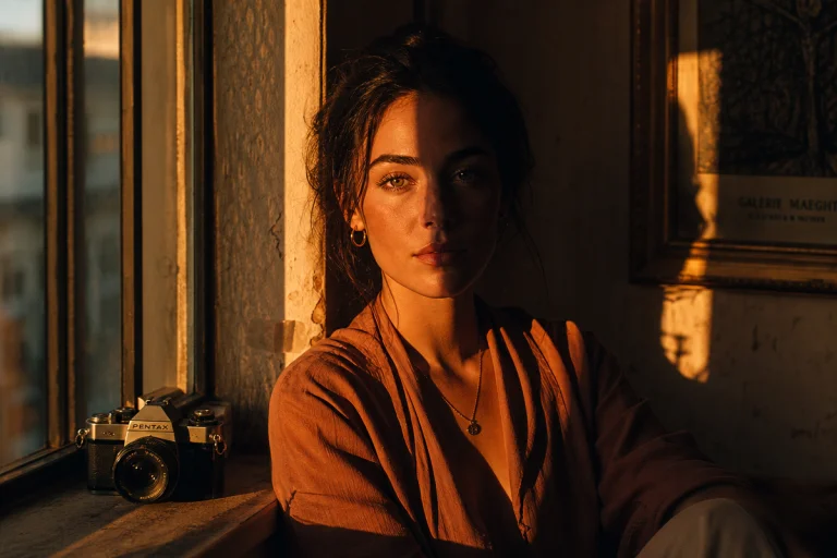
Picture this: a face emerging from darkness the way Rembrandt pulled his subjects from shadow – the left cheekbone catching a warm amber glow, the right side swallowed entirely by cool cobalt, the whole image grain-dusted as though it were pulled from a 35mm contact sheet printed decades ago. The background dissolves into an indistinct fog of gold and slate. The subject’s eyes carry weight without sentimentality. This is not a photograph, not yet. It is a brief – a creative intention – and we are going to build it from twelve words.
\n
This walkthrough is for photographers and visual designers who want to use Stable Diffusion Online the way a creative director uses a mood board: as a thinking tool, a production document, a way of communicating light before you’ve set a single stand.
\n
Building the Brief: Mood Before Everything Else
\n
 \n
\n
\nImage: stabledifffusion.com
\n
Before we write a single prompt, we establish the mood. This is how photographers work, and it is also how the model works best. Emotional register first, technique second.
\n
Our portrait is about tension – the intimate kind you feel in Caravaggio’s Boy Bitten by a Lizard, where vulnerability and drama coexist in the same frame. That establishes our tonal key: high contrast, warm against cool, subject pulled from darkness rather than illuminated uniformly. Caravaggio’s technique – chiaroscuro – is not just a visual style but a philosophical position: light is meaningful because of what it withholds.
\n
Write that down as a single sentence before you open a browser. “A portrait in the tradition of chiaroscuro – one source of warm light, deep shadow, the subject emerging rather than revealed.” That sentence is your north star. Every prompt decision we make will answer to it.
\n
Step One: Lighting Direction
\n
Rembrandt-like falloff comes from a specific geometry: a single light source positioned roughly 45 degrees to one side of the subject and slightly elevated, which creates a small triangular highlight on the shadowed cheek. When we describe this in a prompt, we do not say “Rembrandt lighting” as a shortcut – the model recognises that reference, but it is a broad instruction. We get more control by layering the description:
\n
“Single key light, warm amber, 45-degree angle camera-left, slight elevation, chiaroscuro falloff, deep shadow camera-right, cobalt ambient fill in shadow”
\n
That gives the model a spatial map. “Camera-left” and “camera-right” establish directionality. “Cobalt ambient fill” tells it the shadow is not empty black but a cool complementary colour – the thing that gives the image temperature contrast rather than flat darkness.
\n
Contrast this with what we do not want: “dramatic lighting, shadows, moody portrait.” Those words are present in thousands of images the model has processed. They produce results, but imprecise ones. Specific geometry outperforms atmospheric adjectives every time.
\n
Step Two: Lens Feel and Depth of Field
\n
Photography vocabulary translates directly. The model has been trained on enormous quantities of image metadata and photographic writing, which means lens characteristics – focal length, aperture, depth of field – carry genuine weight in prompts.
\n
For our portrait, we want the compression and intimacy of a short telephoto. Not the distortion of a wide lens – no bulging foreheads, no stretched peripheral features. Something in the range of 85mm to 135mm equivalent, which gives us a naturalistic rendering of the face with mild background separation.
\n
We also want shallow depth of field without bokeh that draws attention to itself. Irving Penn shot portraits on an 8×10 view camera with a slightly raised focus point [citation needed] – the eyes tack-sharp, the tip of the nose already softening – and that selective focus creates hierarchy without artifice. Prompt for that explicitly:
\n
“85mm portrait lens, f/2 equivalent, shallow depth of field, eyes in critical focus, gentle focus falloff toward nose and ears, background out of focus but not distracting”
\n
Notice the negation at the end. Telling the model what you do not want – “not distracting” – tends to suppress the exaggerated swirling bokeh that would otherwise pull focus.
\n
Step Three: Colour Palette
\n
Colour is not a finishing touch; it is a structural decision. Our palette has two poles: warm amber (think beeswax, antique gold, candle-lit skin) and a deep cobalt-to-slate shadow side. Between them, the skin tones sit in an earthy ochre-sienna range. There is no pure white in the frame – the brightest highlight stops just short of blown out, which keeps the image feeling painterly rather than clinical.
\n
Prompt the palette directly:
\n
“Colour palette: warm amber highlights, ochre midtones, cobalt-grey deep shadows, no pure white, no desaturated skin, muted saturation overall, analogue colour rendering”
\n
“Analogue colour rendering” is useful shorthand for steering the model away from the hyper-saturated, overly clean look that AI images default toward. It suggests a physical process – film, chemical development – rather than a digital one.
\n
For the background, we want something that does not compete. A blurred painterly plane of deep cobalt shifting toward warm smoke suits the chiaroscuro brief. Prompt: “Background: deep cobalt dissolving into warm grey, painterly, undefined”.
\n
Assembling the Full Prompt
\n
Here is the complete prompt we have built, assembled in logical order from subject to light to lens to colour to texture:
\n
“Portrait of a woman, chiaroscuro lighting, single warm amber key light camera-left at 45 degrees, deep shadow camera-right, cobalt ambient fill in shadow, Rembrandt triangle highlight on shadowed cheek, 85mm portrait lens, f/2 equivalent, shallow depth of field, eyes in sharp focus, focus falloff toward nose, painterly background deep cobalt dissolving to warm smoke, ochre-sienna skin tones, muted analogue saturation, fine film grain texture, no pure white, photorealistic, editorial portraiture”
\n
Use a photorealistic style preset on the platform. Select a 3:4 or 4:5 aspect ratio – portrait orientation not only matches the subject but shifts the model’s compositional defaults toward a tighter, more intimate framing. A 16:9 or 1:1 ratio will encourage it to leave breathing room around the subject, which works against the close intimacy we are building.
\n
Generate the first image. Then look at it as a creative director, not a customer. Ask three questions.
\n
The Critique and Refinement Loop
\n
First: Is the light doing what we said? If the shadow side is muddy rather than cobalt-tinted, we add “cooler blue ambient in shadows” and try again. If the highlight feels harsh rather than warm and raking, we add “soft wrap to highlight, no hard specular”.
\n
Second: Is the grain authentic or digital? AI grain often presents as a noise pattern rather than silver halide structure. If it reads as digital, add “Kodak Portra film grain, organic film texture, not digital noise”. Portra is a useful reference point because the model has encountered it in photographic discourse – the grain character, the skin rendering, the colour science are all embedded in that name.
\n
Third: Does the subject have presence or vacancy? AI portrait eyes sometimes feel glass-like. Add “eyes with depth and expression, natural gaze, not posed, not blank” and regenerate.
\n
The image-to-image tool earns real respect here. Once we have a base generation we are roughly satisfied with, we upload it as a source image and prompt only for the correction: “Shift shadow side more cobalt, preserve everything else.” The model will maintain the structural composition and subject consistency while adjusting the specific element we have described. This is not a workaround – it is a professional iteration workflow.
\n
Aspect Ratio as Compositional Language
\n
Aspect ratio is not a formatting decision. It is a compositional one. The 3:4 ratio we chose for our portrait mirrors the proportion of a medium-format negative – the ratio Avedon used for his large-format environmental portraits, the proportion that gives a standing figure room to breathe without losing intimacy. It says: this person matters, and we have given them appropriate weight.
\n
Had we chosen 9:16 (vertical full-frame for stories and short-form video), the model would push toward a tighter crop, often filling the frame with the face in a way that feels confrontational rather than painterly. That is not wrong – for beauty campaigns or editorial covers, that confrontation is the point. But for our Rembrandt-influenced portrait, the slight looseness of 3:4 is more accurate to the tradition. The compositional thinking behind visual framing goes deeper than ratio alone, but ratio is where the model’s defaults begin.
\n
From AI Comp to Real Shoot: The Production Document
\n
This is where the workflow earns its place in a professional photography practice. The generated image is now a brief – specific enough that everyone on a shoot can read it.
\n
Pull the colour palette from the generated image using the eyedropper in Lightroom or Photoshop. You now have hex values for the key highlight, the shadow fill, and the skin tone midpoint. Use those as targets when colour grading your actual capture.
\n
Set your key light to match the angle. In a small home studio or even a bedroom, a single LED panel or a window with a reflector card approximates this geometry well. Position the light, take a test frame with your phone or camera, and compare it against the AI reference on a second screen. The light falloff in the AI image tells you how much to flag the key source – if the shadow side in the reference is deep, block more of the spill.
\n
On location, you will not have that control. But you can read the light and choose where to place your subject relative to it. A north-facing window on an overcast afternoon gives you soft, directional light with a cool temperature – add a warm reflector or a gold bounce on the highlight side and you have the palette we built in the prompt.
\n
For phone photographers: this is not a genre that demands a camera bag. The portrait mode on a current iPhone or Android phone produces the depth separation we have described at close subject distances. Shoot in RAW or a flat profile, bring it into Lightroom Mobile, and use the colour grading panel (shadows, midtones, highlights) to move toward the palette targets you pulled from the AI comp.
\n
Post-Processing Toward the Reference
\n
AI-generated images tend to have strong inherent colour palettes – sometimes so strong that they tip into artificiality. When we use a generated image as a colour reference for a real photograph, we are not trying to replicate it exactly. We are triangulating toward its emotional register.
\n
In Lightroom, split-tone grading is the fastest route. Add warmth to the highlights (pull the hue toward amber, around 40-50 degrees), cool the shadows (pull toward blue-violet, around 220-240 degrees), and reduce the overall saturation so the colour reads as analogue rather than punchy. Reduce texture and clarity slightly to give the skin a painterly smoothness before adding film grain at a medium-low amount. The craft behind this – how to work with colour lookup tables and filmic colour grading – is covered in depth in How to Use Colour Lookup Tables, and the principles apply directly to matching your captures to AI-generated reference palettes.
\n
In Photoshop, a Gradient Map set to Multiply or Soft Light at low opacity over a warm amber-to-cobalt gradient will push the image toward the chiaroscuro split-tone without affecting midtones as aggressively. Dodge the highlight side gently with a large, soft brush. The image should feel like it has been lit and printed, not filtered.
\n
For users who want to push further into the technical architecture of these workflows – node-based pipelines, LoRA fine-tuning for consistent character generation, ControlNet for structural guidance – the Flux ComfyUI guide covers that territory in depth. It is a different kind of control: more granular, more demanding, and more powerful for repeated production use.
\n
The Portrait Exists Now
\n
Go back to the image we described at the opening: amber light pulling a face from cobalt shadow, fine grain, the background dissolving into indeterminate warmth. We built that image not from luck but from a sequence of specific decisions – light geometry, lens feel, colour temperature, tonal palette, aspect ratio. We critiqued it, refined it, and pulled its palette into a post-processing workflow.
\n
That is what the tool asks of us: fluency, not permission. The vocabulary of photography – chiaroscuro, focal length, film grain, colour temperature – is also the vocabulary of prompting. The photographers who use it well are the ones who can already see the image before they press the shutter. They are describing what they know.
\n
The camera can stay on the shelf until the brief is ready. Then pick it up.
\n
Frequently Asked Questions
\n
Q: How specific should prompts be for portrait photography?\nA: Specific enough to describe the light as though briefing a crew. Focal length, light angle, shadow temperature, skin tone range, and background description all belong in the prompt. Atmospheric adjectives without geometric specificity give inconsistent results.
\n
Q: Can I upload a phone photo to use as a base for AI portrait editing?\nA: Yes. The image-to-image tool accepts PNG, JPG, or WEBP files and will transform an uploaded source image while preserving subject structure and composition. Use it to test colour directions or lighting changes on an existing photograph before committing to a full regrade.
\n
Q: How do I stop AI portrait eyes from looking glassy or vacant?\nA: Prompt explicitly for it: “eyes with depth and expression, natural gaze, not posed, not blank.” Combine with a short-telephoto lens reference (85mm or 100mm equivalent) – the model tends to render eyes more naturally at these focal lengths than at wide or exaggerated super-telephoto prompts.
\n
Q: What is the difference between the standard model and the Turbo variant?\nA: The Turbo variant generates in significantly fewer steps and is faster – useful for rapid iteration when you are cycling through prompt variations. The standard model takes longer but tends toward higher detail and photorealistic fidelity. Start concept development on Turbo, then switch to the standard model for a final generation.
\n
Q: Do I need technical knowledge or software to use the platform?\nA: No installation or technical background is required. The workflow runs in a browser. The vocabulary that matters most is photographic, not technical – light direction, colour temperature, depth of field, film stock references. That is the language the model responds to.
\n
Source: https://stabledifffusion.com/
\n
This article was researched and written with AI assistance, then reviewed for accuracy and quality. Talulah at Its.That. uses AI tools to help produce content faster while maintaining editorial standards.
\n