


\n
Last updated: July 19, 2026
\n
Scroll Instagram right now and you’ll see it – a grainy, low-res photo of a queue snaking around a corner in Peckham, nobody smiling, everyone wearing something you can’t Google. No tags, no geotag, no brand handle in the caption. Just a community reference only insiders decode. That is where underground streetwear brands live in 2026, and if you’re designing print-on-demand tees without paying attention to this space, you’re already behind.
\n
How Underground Streetwear Brands Actually Build Their Followings
\n
 \n
\n
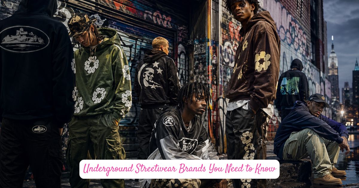
\nImage: It’s Mandy Style (itismandystyle.com)
\n
Here’s the myth: underground labels succeed by accident, stumbling into virality through one lucky TikTok. The reality is far more deliberate. The most compelling underground streetwear brands in 2026 operate through password-protected websites, voice-note marketing, and tightly policed communities. No content calendars. No influencer gifting. No paid reach. The friction is the product.
\n
This isn’t new territory. Supreme started as a skate shop on Lafayette Street [citation needed]. Stussy sold tees out of surf shops in Laguna Beach. The underground isn’t a developmental phase these brands passed through – it’s the foundation that gave them everything. When mainstream culture eventually absorbed them, the credibility had already been banked. That origin story can’t be faked.
\n
Fast-fashion imitators have collapsed the window between trend emergence and knockoff production to roughly two to three weeks. A TikTok-driven aesthetic can be replicated by a Shein factory before the original brand has even restocked. Which means the only currency that can’t be copied is authenticity – local identity, non-replicable brand codes, and community that genuinely polices access.
\n
Corteiz and Hellstar Are Rewriting the Design Rulebook
\n
London’s Corteiz, founded by Clint Ogbenna (known online as Clint419), is the clearest proof of concept. The brand launched through password-protected drops and built its audience through guerrilla pop-ups and stunts that read more like performance art than marketing. Clothes-swap campaigns on the street. Takeovers of New York subway cars and Atlanta clubs. A Nike collaboration delivered by drone. None of this lived on a content schedule – it happened, spread through word of mouth, and became mythology.
\n
The Alcatraz logo at the heart of Corteiz’s identity functions as what the brand calls a declaration of independence from the establishment. Central Cee and Dave appear in campaigns not as celebrity endorsers but as community peers. The design language is flags-and-bars graphic work – think prison break meets council estate pride. For our purposes? This translates directly into a bold stencil-font text tee with a single heavy graphic mark. No gradients. No flex. Just a symbol that means something to the people who know.
\n
Hellstar occupies different territory – apocalyptic imagery, celestial-destruction motifs, fire and distortion in the typography. According to Sneaker News, as of July 2026 Hellstar has become one of adidas’ most important new collaborators, pulling a younger audience who want punk energy with premium construction. Think Nine Inch Nails meets skate graphics. Think bootleg logo treatment with intentionally broken letterforms. The distressed typeface trend running through Hellstar’s releases is something we can adapt immediately – oversized, degraded, printed heavy on a heavyweight tee in a single colour. Bone white on black. Washed red on cream.
\n
The New Era Streetwear Design conversation has been pointing here for a while – away from maximalism and toward marks that function almost like coats of arms for micro-communities.
\n
What This Means for Your Next Design Drop
\n
The lesson for anyone producing print-on-demand work is sharp. Scarcity of meaning beats scarcity of units. A design that looks like it belongs to a specific world – even an invented one – carries more weight than a design that’s simply limited. Build a visual language before you build a collection.
\n
Colour-wise, the underground is running earthy military tones alongside bleached-out neutrals. Khaki, stone, washed black, off-white. Accent colours are minimal and loaded – a single red hit, a single gold element. Typography is either brutalist sans-serif, slab serif with attitude, or intentionally corrupted display fonts. McDonald’s Pokes Fun at Branded Fashion – and the fact that a fast-food chain felt confident enough to parody streetwear tells you everything about how far the codes have travelled into mainstream consciousness. Which means the underground has already moved on.
\n
Back to that queue in Peckham. The people in it didn’t find out about the drop through an ad. Someone sent a voice note. That’s the distribution model and the design philosophy in one gesture – intimate, specific, earned. Our job is to make graphics that feel like they belong to a world like that. Start there.
\n
Frequently Asked Questions
\n
Q: What makes underground streetwear brands different from mainstream streetwear labels?\nA: Underground labels prioritise community access controls – password-protected drops, voice-note marketing, and invite-only events – over conventional retail and content calendars. The barrier to entry is the point; it creates genuine belonging rather than purchased belonging.
\n
Q: How did Corteiz build its reputation without traditional marketing?\nA: Corteiz, founded in London by Clint Ogbenna (Clint419), built its following through guerrilla pop-up events, street clothes-swap campaigns, subway takeovers in New York, and stunts like delivering Nike collaborations by drone – all spread through word of mouth rather than paid promotion.
\n
Q: What aesthetic defines Hellstar’s design approach?\nA: Hellstar works with apocalyptic and celestial-destruction imagery, fire motifs, and deliberately distorted typefaces. The overall effect is punk-leaning and confrontational, targeting bold individual expression – and it’s now reaching a wider audience through its collaboration with adidas.
\n
Q: Why can’t fast fashion simply copy underground streetwear brands?\nA: Fast-fashion imitators can replicate a visual aesthetic within two to three weeks, but they can’t copy local identity, community trust, or brand mythology. True underground labels make authenticity – not design alone – their core value proposition.
\n
Q: How can a print-on-demand brand apply underground streetwear aesthetics?\nA: Focus on building a coherent visual language before releasing individual designs. Use brutalist or corrupted typography, restricted colour palettes (earthy tones, single accent hits), and graphic marks that feel like they belong to a specific invented world – a stencil logo, a flags-and-bars motif, or a distressed slab-serif text tee.
\n
Source: https://itismandystyle.com/blog/underground-streetwear-brands-you-need-to-know-in-2026/
\n
This article was researched and written with AI assistance, then reviewed for accuracy and quality. Maya at Its.That. uses AI tools to help produce content faster while maintaining editorial standards.
\n