

Zoom into any city sidewalk this month and you’ll notice the graphics have gone quiet. No cracked-vinyl band logos, no oversized cartoon mascots screaming off the chest. Just a word. Maybe two. Tucked small, placed with intent, printed on cotton that’s been washed until it feels like a favourite you’ve owned for years. This is the shift Only Teez clocked in its August 2026 breakdown of the category: minimalist typography t-shirts have moved from niche to non-negotiable, split across seven distinct styles retailers need to be stocking right now. Restraint has become the flex, and it reads more expensive than anything with a slogan wrapped across the whole front panel.
How did minimalist typography t-shirts become the streetwear signal to watch?
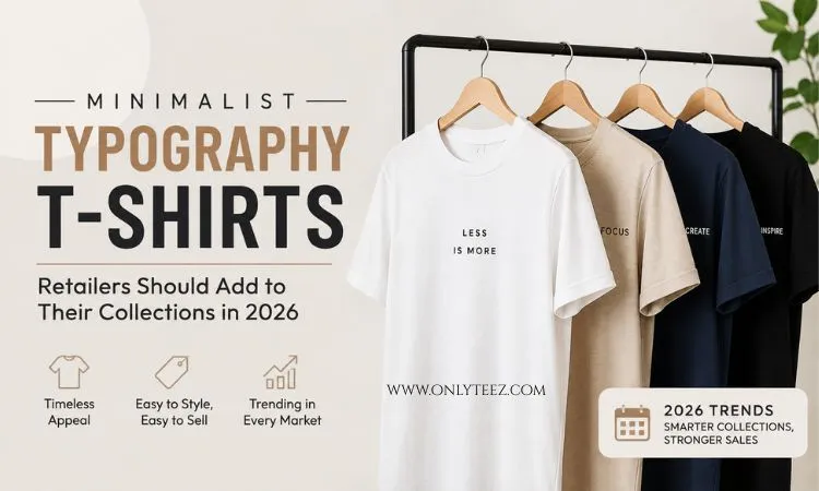
Image: Only Teez
They became the signal because the loud stuff stopped feeling exclusive. When every fast-fashion rail carries a bootleg-style graphic tee, the flex shifts to whoever’s wearing something quieter that only the trained eye catches.
Think of it as the natural comedown after a decade of maximalist merch culture – Y2K logos, oversized band tees, drop after drop of statement graphics competing for attention on the same feed. Customers got graphic fatigue. What replaced it wasn’t nothing – it was restraint used as a flex. A single word like ÉLAN or MUSE sitting small on a cream tee does more cultural work than a full-chest print, because it assumes the viewer already knows what they’re looking at.
That’s the quiet-luxury wordmark play, and it’s one of the seven categories Only Teez flags for 2026 collections. Palette matters as much as the word itself here: cream, faded black, stone, mocha, soft grey. Nothing that reads as obvious merch – everything that reads as premium basics with a whisper of branding. For a print-on-demand label, this is the easiest lane to enter and the hardest to get wrong, because the fabric and fit have to carry the weight the graphic isn’t providing.
What’s the turning point – and which typography styles matter most for 2026?
The turning point is that “quiet” has splintered into distinct, stockable micro-trends, each with its own vocabulary, customer and reason to exist on your shelf. Here’s how we’d rank the seven for priority, from broadest commercial appeal to most niche.
‘Off-Duty’ tees lead the pack, and they should lead your assortment too: small chest lettering – OFF DUTY, NO PLANS, OUT OF OFFICE – paired with oversized fits and washed cotton. It’s the celebrity-airport-run look, engineered for people who want to dress like they’re not trying, and it’s the one style that sells across genders and age brackets without needing much explanation. Stock this one deepest.
Quiet-luxury wordmarks come second in priority – not because demand is lower, but because the customer is pickier. This buyer already owns the premium basics; the tee has to earn its place next to them, which pushes the fabric and wash spend up front.
Then there’s the cheeky-phrase energy of ‘Good Luck, Babe’ tees and sporty celebrity-core pulling from collegiate numbering – phrases like ATHLETIC DEPT., CITY CLUB, or EST. 1998 kept restrained rather than plastered edge to edge. This is your impulse-buy tier: cheaper to produce, faster to trend-cycle, ideal for testing new phrases without committing to a full colourway run.
City-girl typography rounds things out with small city names – NEW YORK, PARIS, LONDON, MIAMI – or invented club names set in serif or varsity lettering, placed on the chest, upper back, or sleeve like a passport stamp. Treat this as a travel-retail and gifting play rather than a core line – it converts hardest around airports, tourist neighbourhoods, and seasonal gift pushes. And after dark, there’s after-hours typography: AFTER HOURS, MIDNIGHT CLUB, LATE CHECKOUT, NO RESERVATIONS, printed slightly imperfect – a touch off-register, a touch worn – in black, charcoal, washed brown, off-white. This is a nightlife and younger-demographic bet; keep it in smaller runs until you see which phrase actually moves.
Three moods, three wardrobes, three reasons a retailer needs more than one typography lane in the collection: the off-duty customer, the after-hours customer, and the quiet-luxury customer rarely overlap, but they all want text tees right now.
For design direction, this is where a brand earns its keep. OFF DUTY on a boxy, oversized silhouette in washed grey reads completely different from the same three words in tight varsity serif on a fitted crop – one’s a lazy-Sunday flex, the other’s a city-girl souvenir. Bootleg logo treatment still has a lane too, but it needs restraint now: think small-scale, single-colour, placed like an afterthought rather than a headline. If you want the fuller 2026 picture beyond typography, The 9 Hottest Men’s T-Shirt Trends For 2026 maps where these quiet-text pieces sit against the louder trends still holding shelf space.
What does this mean for retailers building out 2026 collections – and what does production actually look like?
It means fabric and finish now do the job graphics used to do, so sourcing decisions matter more than design decisions. Only Teez’s guidance is blunt: heavyweight or organic cotton, washed finishes, custom fits – and a manufacturing partner who can build the whole thing end to end, labels and packaging included, not just print on a blank. A quiet tee with a cheap hand-feel gives the whole game away instantly.
That principle gets more specific once you’re actually in production, because small text prints punish sloppy technique in a way big graphics never do. At this scale, discharge or water-based screen printing on a fine mesh (110-156 count) holds crisp serif and varsity letterforms far better than plastisol, which tends to sit proud of the fabric and flatten fine strokes into a blob. If you’re chasing the “slightly off-register” after-hours look, that’s easiest to fake reliably with a deliberate two-pass misprint on a dark garment rather than leaving it to production variance – controlled imperfection, not actual defects. For embroidery on chest lettering (a strong option for the quiet-luxury lane), keep stitch counts low and thread tone-on-tone; a contrast thread on a two-word wordmark tips it straight back into merch territory. Placement discipline matters as much as the mark itself – left-chest for wordmarks, centred-small for Off-Duty phrasing, sleeve or upper-back for the passport-stamp city names – because a print that’s a centimetre too large or too centred stops reading as considered and starts reading as a shrunk-down big-graphic tee.
Colour strategy is where a lot of POD lines leave money on the table. Building the core around cream, stone, washed black, mocha and soft grey keeps the range wearable and stackable – customers buy two or three in rotation rather than committing to one loud piece. But a range of neutrals only, season after season, goes flat on a product page. Run one sharper seasonal accent – a burnt orange for autumn, a washed cobalt for spring – through just one or two styles, most sensibly the impulse-buy cheeky-phrase tier where the cost of being wrong is lowest. That accent colour does the scroll-stopping work the neutrals can’t, without dragging the whole collection out of its quiet-luxury lane.
For a print-on-demand brand, that’s the real opportunity and the real risk. The design is small, but the tee can’t be. Every seam, wash, and weight choice has to justify why this piece deserves shelf space next to the loud ones.
Walk that same sidewalk again next month and the graphics still won’t be shouting. But look closer – OFF DUTY on a sleeve, MUSE across a chest, MIDNIGHT CLUB in slightly cracked ink – and you’ll see the whole conversation happening in a font size most brands are still too loud to notice.
Frequently Asked Questions
Q: What are minimalist typography t-shirts?
A: They’re tees that swap large front graphics for small, precisely placed text – single words, short phrases, or subtle wordmarks – printed on premium fabric so the design reads as understated rather than obvious merch.
Q: What are the main minimalist typography tee styles for 2026, and which should retailers prioritise?
A: Only Teez identifies seven: Off-Duty tees, quiet-luxury wordmarks, cheeky-phrase tees, sporty celebrity-core typography, tiny chest text, city-girl typography, and after-hours typography. Off-Duty and quiet-luxury wordmarks have the broadest appeal and should anchor the range; cheeky-phrase and sporty celebrity-core work well as lower-cost testing tiers; city-girl and after-hours suit smaller, occasion-led runs.
Q: What’s the best print method for small typography text on t-shirts?
A: Discharge or water-based screen printing on fine mesh (110-156 count) keeps small serif and varsity letterforms crisp, while tone-on-tone embroidery with a low stitch count suits chest wordmarks without tipping into loud branding.
Q: What colours work best for quiet-luxury wordmark tees?
A: Cream, faded black, stone, mocha, and soft grey – a palette designed to sit beside premium basics rather than announce itself as branded merchandise. One sharper seasonal accent colour, run through a small number of styles, keeps the range from reading flat.
Q: Why are retailers moving away from bold graphic tees?
A: Loud graphics became oversaturated across fast fashion, so quieter, more considered typography became the new way to signal taste and exclusivity.
Q: What should retailers prioritise when producing typography tees?
A: Heavyweight or organic fabrics, washed finishes, custom fits, and precise placement discipline, ideally through a manufacturer who can handle labels and packaging as part of an end-to-end typography tee programme.
This article was researched and written with AI assistance, then reviewed for accuracy and quality. Maya at Its.That. uses AI tools to help produce content faster while maintaining editorial standards.