

\n
 \n
\n
\nImage: Ape to Gentleman
\n
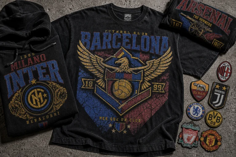
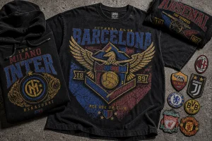
Walk down any block worth photographing right now and the same silhouette keeps repeating: boxy black tee, cracked-vinyl logo across the chest, worn slightly too long, paired with something technical underfoot. Zoom into the feeds and it holds – the algorithm is feeding everyone the same nine or ten reference points, remixed a thousand different ways. That repetition isn’t accidental. It’s the clearest signal we’ve had in years of where t-shirt design trends 2026 are actually heading, and for anyone building prints for a living, it’s a map worth reading closely.
\n
What are the biggest t-shirt trends for 2026?
\n
 \n
\n
\nImage: Ape to Gentleman
\n
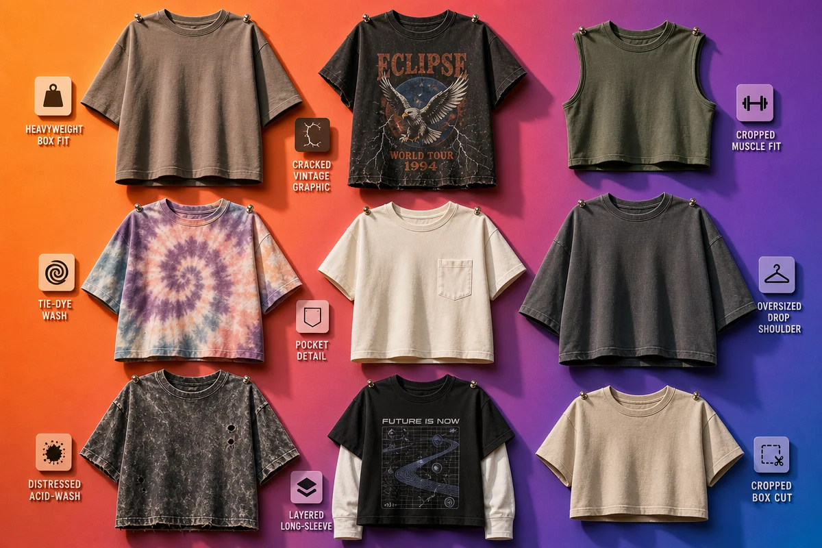
Menswear title Ape to Gentleman has mapped nine defining trends for the year, and UberPrints’ custom-design forecast fills in the production detail underneath them. The throughline: the tee has stopped being a blank backdrop and become the argument itself. Here’s the full breakdown, trend by trend, with the design call for each.
\n
1. Modern Gothic. Black logo tees have shed their rock-and-emo baggage and walked straight into luxury wardrobes, with Amiri, Balenciaga, Palm Angels, Rhude and Off-White all dropping black-on-black chest logos this season. Think metal-show merch meets front-row Balenciaga: same silhouette, wildly different room. Design direction: build your own wordmark in a distressed serif or gothic blackletter, print it tonal – black ink on a heavyweight black or charcoal tee – so the logo only reveals itself under raking light. A boxy fit and a slightly dropped shoulder sell the reference before anyone reads the type.
\n
2. Subverted Logos. This is the trend with the most immediate design upside. Take a recognisable mark and twist it – Palm Angels’ spray-paint treatment, Rhude’s vintage Marlboro-packet riff, Burberry’s frog motif – and the effect reads as knowing rather than counterfeit. Design direction: run your own brand mark through a “bootleg” filter rather than anyone else’s IP – aerosol drip edges, a faux-vintage cigarette-packet border, or a distressed halftone that looks lifted from a 90s tour tee. Keep the reference to your own logo and the joke stays copyright-safe.
\n
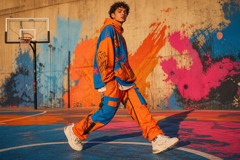
3. Muted, Faded Palette. The common misconception is that 2026 streetwear still means loud chest prints and neon. UberPrints’ data says the opposite: faded pastels and muted brights are replacing last year’s neons – dusty lavender, sage green and soft melon leading the shift. Design direction: swap your standard black/white/heather trio for a dusty-lavender or sage-green garment as the base colour, then print in a single tone-on-tone ink rather than a contrast colour, so the palette does the quiet-luxury work the graphic used to.
\n
4. Handwritten Doodle Graphics. Loose, sketchbook-style linework – single-line faces, scribbled hearts, marker-style annotations – is showing up as an antidote to overproduced streetwear graphics. It reads as personal rather than brand-manufactured. Design direction: commission or hand-draw a small doodle placement at the hem or sleeve cuff rather than dead-centre chest – scale matters here, oversized doodles lose the “found in someone’s notebook” charm that makes the trend work.
\n
5. Bold, Text-Only Typography. Sitting alongside the doodles is a harder-edged move: no imagery at all, just a single word or short phrase in a heavy sans-serif, filling most of the chest. Design direction: pick one word, set it in a condensed grotesque at maximum width, and resist adding a second colour or a logo underneath it. The restraint is the point – it’s minimalist typography territory, not maximalist streetwear. It is the same idea behind our Wordart tees: a single word, repeated and packed until it becomes the whole print.
\n
6. Vintage Football Shirt Revival. Balenciaga, Aime Leon Dore and Percival have all revived the genre despite fashion and football having a famously awkward relationship – proving restraint sells just as hard as spectacle when the reference is specific enough. Design direction: borrow the silhouette (crew collar, contrast trim, sponsor-block chest placement) rather than any actual club crest – a fictional sponsor name in a retro serif keeps it evocative and clear of trademark trouble.
\n
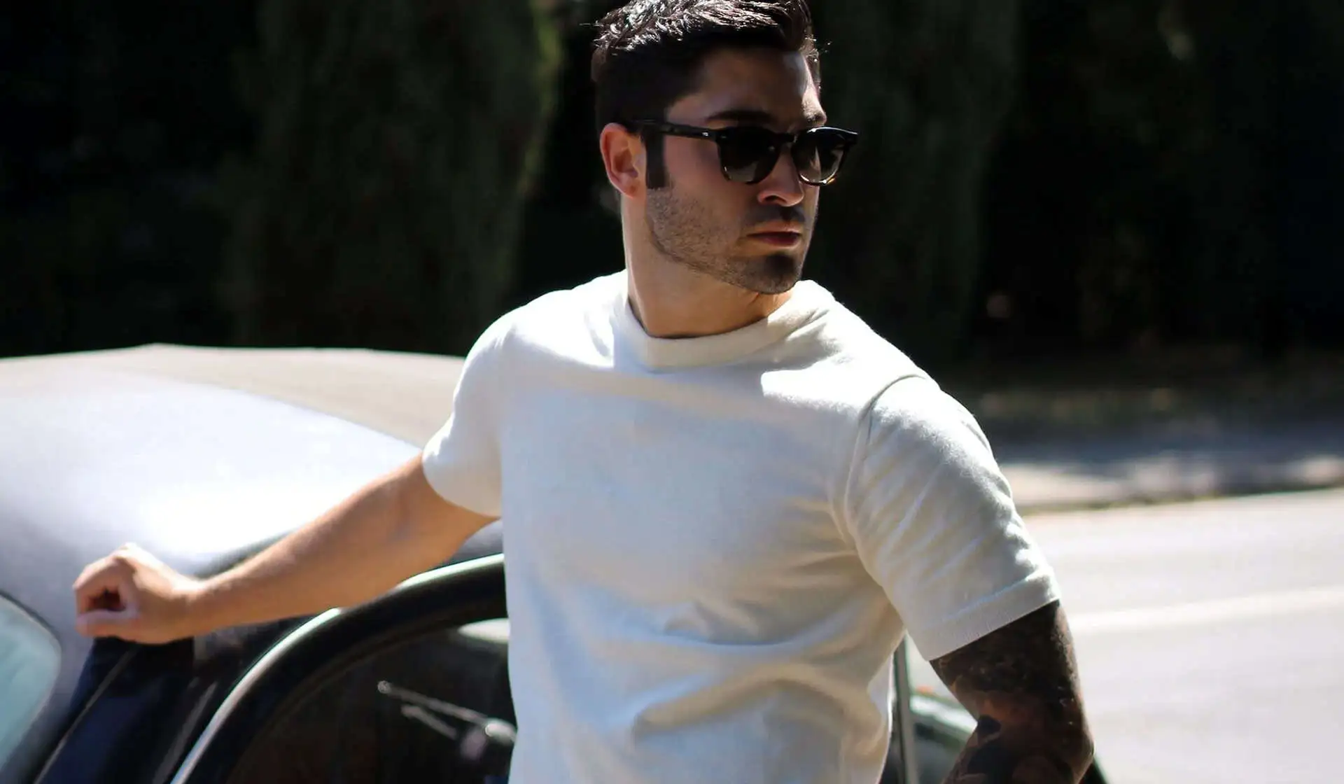
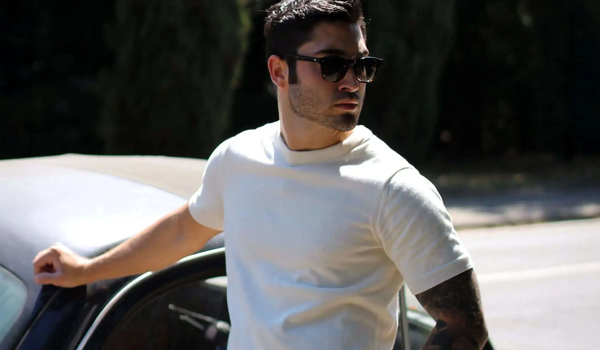
7. Knitted and Crochet Texture. Fine-gauge Merino, cotton-silk and linen-blend knits have become the elevated alternative to classic cotton jersey, which means texture itself is now a design decision, not just a production one. Design direction: if you’re not moving into actual knitwear, simulate the effect – a fine engraved or embossed print that reads as ribbing under certain light, or a garment-dye finish that mimics the slight sheen of cotton-silk, gives a cotton jersey tee some of that elevated hand-feel at print cost rather than knit cost.
\n
8. Sustainable, Certified Fabric. Patagonia, L’Estrange and ASKET have built their whole pitch around low environmental footprint, and GOTS-certified cotton is becoming a spec-sheet requirement rather than a nice-to-have for customers who’ll ask. Design direction: if your print-on-demand supplier offers a GOTS-certified blank, say so on the product page in the same breath as the design – “sustainably certified” is becoming a search term in its own right, not just a footnote.
\n
9. Techwear Performance Fabric. Stone Island Shadow Project, Outlier, Arc’teryx and Acronym are pushing lightweight performance fabric into the tee category, with Uniqlo’s Airism bringing the same idea to the high street. Material is arguably outpacing print as the thing customers feel first. Design direction: pair a technical-feeling blank (brushed poly-cotton, moisture-wicking finish) with a minimal, almost clinical logo placement – a small chest hit or sleeve tag rather than a full graphic – so the fabric story doesn’t get drowned out by the print.
\n
Why is the “subverted logo” aesthetic resonating so hard right now?
\n
Because it flatters people who already know the reference. A twisted logo only lands if you recognise the original underneath it, which makes the tee function as a badge of insider knowledge rather than a straightforward brand advert. Balenciaga gets credited as the early pioneer here, treating the t-shirt as its primary canvas for logo experimentation rather than a jacket or accessory. That’s a shift worth sitting with: for decades the tee was the cheapest, most disposable garment in a drop. Now it’s doing the heaviest conceptual lifting – and trends 3 through 5 above (muted palette, doodles, bold type) are really the same instinct in a quieter register: reward the customer who’s paying close attention rather than shouting at everyone else.
\n
What nuances are people missing about production?
\n
The trends most likely to get skipped over aren’t the graphic-led ones – they’re the ones that live in the garment blank and the print technique, not the artwork file. Getting a subverted-logo tee to read as “knowing” rather than “knock-off” is a placement and scale problem as much as a design one: keep it to a single chest hit at roughly the size of the original mark, avoid full-front takeovers, and steer clear of exact typefaces, colourways or proportions from the source brand – parody protection leans on the design being recognisably transformed, not a straight trace. Our own Bootleg collection works on that exact principle: borrowed shapes, rewritten underneath, nothing traced. On the fabric side, most print-on-demand catalogues now carry at least one GOTS-certified or Airism-style technical blank; testing a subverted-logo or Modern Gothic graphic on both a heavyweight cotton jersey and a lighter technical tee before committing to a single SKU is worth the sample order, because the two fabrics carry ink and light completely differently, and 2026’s customer is buying the hand-feel almost as much as the graphic.
\n
Build from your own design idea shortlist, lean on AI visualisation tools to test a subverted-logo concept on different blanks before committing to print, and treat the tee less as a canvas and more as nine separate arguments about what restraint can do.
\n
Frequently Asked Questions
\n
Q: What is the “Modern Gothic” t-shirt trend?\nA: It’s the move of black logo tees out of rock and emo subculture and into luxury fashion, with brands like Amiri, Balenciaga, Palm Angels, Rhude and Off-White all releasing black logo tees for 2026. For print-on-demand, the trick is a tonal print – black ink on a black garment – rather than a high-contrast logo.
\n
Q: What does a “subverted logo” t-shirt design mean, and is it copyright-safe?\nA: It’s a recognisable brand mark reworked or distorted – like a spray-paint effect or a vintage cigarette-packet treatment – so it reads as a knowing reference rather than a straight copy. To stay clear of infringement, apply the technique to your own brand mark rather than a third party’s logo, keep any parody clearly transformed in typeface, colour and proportion, and size it as a single chest placement rather than a full-front takeover.
\n
Q: Are t-shirt colour trends for 2026 bold or muted?\nA: Muted. Faded pastels and soft tones – dusty lavender, sage green, soft melon – are replacing the bright neons that dominated custom t-shirt design the previous year. Use the pastel as the garment colour and print tone-on-tone rather than in a contrasting ink.
\n
Q: Why are knitted and crochet t-shirts trending, and how do I get the look without switching to knitwear?\nA: They offer an elevated alternative to classic cotton jersey, with fine-gauge Merino, cotton-silk and linen blends providing better temperature regulation and a more premium feel. On a standard print-on-demand cotton blank, an embossed or engraved print technique can simulate a ribbed texture without the cost of sourcing actual knitwear.
\n
Q: What should print-on-demand brands look for when choosing sustainable t-shirt fabric?\nA: GOTS-certified cotton is the benchmark to look for, as brands like Patagonia, L’Estrange and ASKET have made minimal environmental footprint a core part of their appeal. Flag the certification on the product page itself – it’s increasingly a search and filter term for customers, not just supply-chain paperwork.
\n
Q: How does the techwear trend translate to a t-shirt, rather than a jacket?\nA: Brands like Stone Island Shadow Project, Outlier and Arc’teryx are applying performance fabrics – moisture-wicking, brushed poly-cotton – to the tee category, with Uniqlo’s Airism bringing the idea to the high street. Pair a technical blank with a minimal logo placement, such as a small chest hit or sleeve tag, so the fabric itself carries the “technical” signal rather than a busy graphic.
\n
Source: https://www.apetogentleman.com/best-mens-tshirt-trends
\n
This article was researched and written with AI assistance, then reviewed for accuracy and quality. Maya at Its.That. uses AI tools to help produce content faster while maintaining editorial standards.
\n