

\n
Last updated: June 17, 2026
\n
 \n
\n
\nImage: FashionForSwag
\n
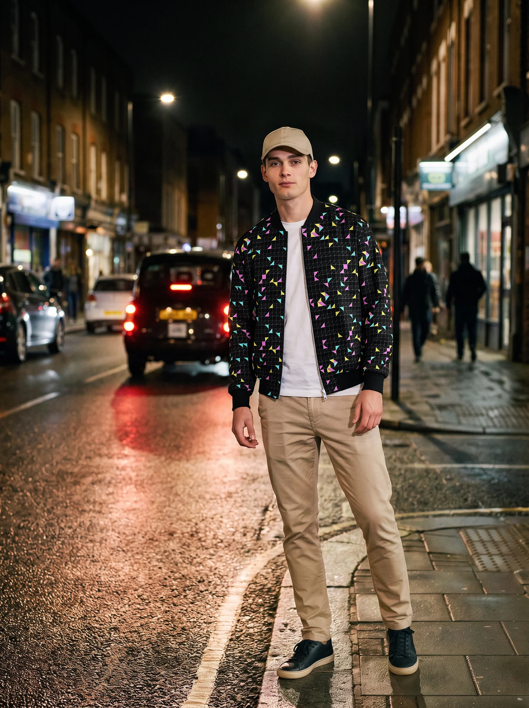
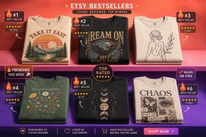
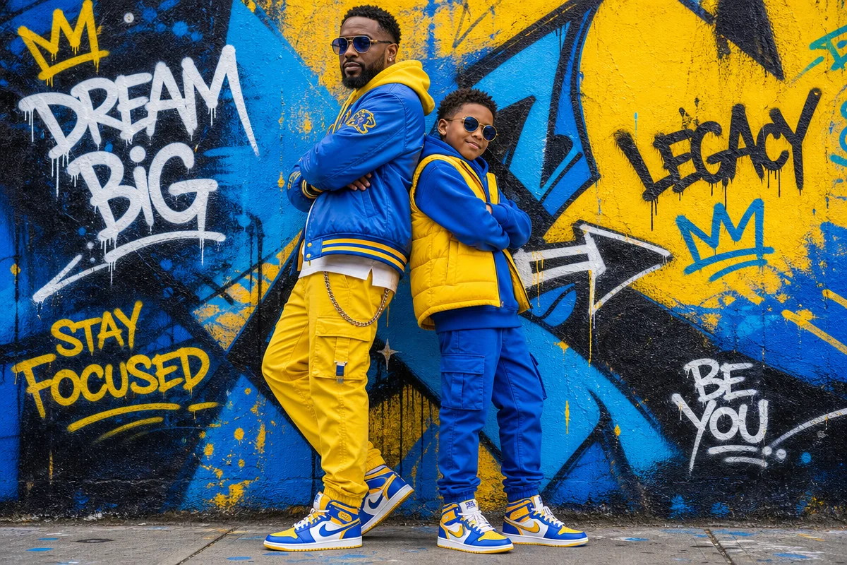
Check the feeds right now. Dads in black jackets layered over washed graphic tees, raw-hem denim, beat-up Jordans. Markham’s running a full Father’s Day campaign built around menswear graphics. TikTok’s serving baldness-joke tees with hundreds of thousands of likes. South African brands are dropping 2026 menswear collections pegged specifically to Father’s Day. The evidence is everywhere, and it’s consistent: this is the year the graphic tee fully absorbs the Father’s Day occasion. The tie is dead. We said it.
\n
Father’s Day 2026 falls on June 21, and the conversation around gifting has officially moved. Publications from Forbes to The New York Times are telling readers to ditch the cliché. The necktie – once the safe harbour of every last-minute shopper – has become the symbol of exactly what modern style culture is rejecting: default choices, passive gifting, and style-by-obligation.
\n
Why Father’s Day Fashion Is Finally Having Its Moment
\n
\n
\nImage: FashionForSwag
\n
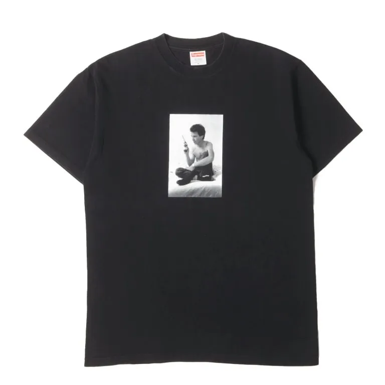
The answer is generational, and it’s been building for a decade. The dads turning 40-50 right now grew up with hip-hop, skate culture, and the birth of streetwear as a legitimate fashion movement. They watched Supreme make a brick sell for £30. They owned Jordans before the resale market went stratospheric. They are not necktie dads.
\n
This is the generation that how youth culture continues to redefine streetwear fashion built – and now that youth culture is the parent culture, the aesthetic priorities haven’t shifted. If anything, they’ve deepened. Quality over quantity, graphic expression over corporate dress code, pieces with story over pieces with status.
\n
Luxury publications have caught on. Fragrances, travel-ready luggage, quality watches, versatile bags – these are the Father’s Day categories making editorial rounds in 2026. Think Dior Sauvage meets a Herschel weekender. Think Seiko mod community meets everyday carry. The common thread? Personal expression. Style as identity, not uniform.
\n
The Father’s Day Aesthetics We’re Seeing Right Now
\n
Here’s what’s actually moving: workwear-inspired palette, utility graphics, and dad-core nostalgia that’s been reclaimed without irony.
\n
Colour-wise, we’re looking at washed olive, faded slate, and off-white – the kind of tones that read as “worn in” rather than “brand new.” Rust orange and deep burgundy are breaking through as accent hues, particularly in graphics that lean into vintage athletics or 70s-80s Americana. This isn’t trend-chasing. It’s a visual language with deep cultural roots – think the worn-in coaches’ jackets of the NCAA, the faded crew necks of community leagues.
\n
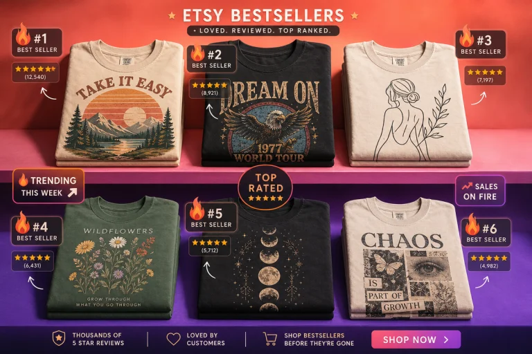
Typography is doing heavy lifting this season. Bold condensed sans-serifs are everywhere – the kind that look like they were screen-printed by someone’s uncle in a garage in 1987. All-caps statements. Distressed ink fills. Numbers as primary graphic elements (think jersey culture, varsity scripts). The graphic design trends shaping 2026 confirm it: there’s a hunger for the handmade and the human, and it shows up most clearly in text-led tee design.
\n
For design direction: a bold condensed text tee that reads “EST. 2026” with a family crest-style lockup would land perfectly. Or lean into the bootleg graphic treatment – subverted references to nostalgic brand aesthetics, knowing rather than derivative. Three aesthetics converting right now: workwear utility (Carhartt brown palette, stencil type), retro sport (single-colour on natural cotton, distressed finish), and quiet graphic (minimal placement print, tonal ink on matching ground).
\n
Mock Concepts: What We’d Actually Print
\n
This is where it gets specific. Here are three tee concepts we’d pull the trigger on for Father’s Day 2026:
\n
The Heritage Block – oversized condensed serif across the chest reading “ESTABLISHED [YEAR]” in cracked ink on a washed olive base. Left chest secondary hit: a minimal crest with a single initial inside a shield. Think Carhartt meets a prep school that’s fallen on glorious, deliberate disrepair. Print placement: full chest, slightly off-centre to read handmade. Ink: cracked off-white on garment-dyed cotton.
\n
The Coach’s Archive – faded single-colour graphic on natural cotton. Vintage athletic number (his jersey number, his birth year, his kids’ ages) set in a block numeral style borrowed from 1970s American collegiate sports. No clever copy. Just the number, huge, treated to look like a tenth-generation photocopy. This is the quiet-graphic lane: no explanation needed, fully personal, impossible to get wrong.
\n
The Bootleg Tribute – unlicensed-tour-merch energy applied to a personal reference. Take a band, a film, a football club, a city – whatever the dad actually loves – and build a back-print graphic around it using deliberately off-register two-colour printing on a black tee. Slightly misaligned cyan and magenta passes. The look of a bootleg ‘89 Rolling Stones tour shirt, but the subject is something that actually matters to him. Knowing. Considered. Zero generic energy.
\n
What Most People Miss About Dad Style in 2026
\n
Here’s the nuance: it’s not about dressing dads. It’s about acknowledging that dads have always had style – it just wasn’t always legible to mainstream fashion media.
\n
The wellness-adjacent gifting trend is telling. Hydration tools, rest-oriented products, recovery gear – these are showing up alongside fashion in Father’s Day guides because the modern conception of “dad” includes someone who takes care of himself. That self-care ethos maps directly onto how men are approaching their wardrobes: intentionally, selectively, and with actual opinion.
\n
A quality tee isn’t a throwaway gift in this context. It’s a wardrobe investment. That’s a significant cultural shift – and it opens serious creative space for print-on-demand. The ask isn’t “give dad something to wear.” The ask is “give dad something that reflects who he actually is.”
\n
Historically, Father’s Day was invented as a commercial counterpart to Mother’s Day, lobbied into existence in the early 20th century with active support from tie manufacturers who saw an opportunity. The necktie dominated because the occasion was partly manufactured around it. Now the occasion has outgrown that origin story, and the fashion filling the space is far more interesting.
\n
We’d be putting our design energy into three lanes for Father’s Day 2026: the heritage graphic (vintage crest, muted palette, heavy serif wordmark), the utility statement (oversized condensed type, function-over-form aesthetic, military-adjacent palette), and the personal tribute (coordinate prints, est. year lockups, single-word statements that carry weight). Each reads as a considered gift, not a filler.
\n
The tie had its run. The graphic tee is having its moment – and for once, dad agrees.
\n
Frequently Asked Questions
\n
Q: What fashion trends are driving Father’s Day gift choices in 2026?\nA: The dominant shift is away from traditional ties toward graphic tees, quality accessories, and wardrobe pieces with personal expression. Washed utility palettes, bold condensed typography, and heritage-inspired graphics are particularly strong in 2026.
\n
Q: What colour palettes work best for Father’s Day t-shirt designs?\nA: Washed olive, faded slate, off-white, rust orange, and deep burgundy are the tones resonating most right now. These read as “worn in” and connect to workwear, vintage athletics, and Americana aesthetics with broad cross-generational appeal.
\n
Q: What typography styles suit Father’s Day print-on-demand designs?\nA: Bold condensed sans-serifs in all-caps, distressed ink fills, and varsity-style scripts are converting well. Number-led designs and “EST. 2026” lockups with family crest-style elements are particularly effective as occasion-specific pieces.
\n
Q: Why is the necktie losing its place as the default Father’s Day gift?\nA: Dads in their 40s and 50s today grew up in streetwear and hip-hop culture and have strong, independent style identities. Major publications including Forbes and The New York Times have noted this shift, recommending gifts that reflect genuine personal taste over cliché defaults.
\n
Q: What makes a bootleg-style Father’s Day tee work as a design?\nA: A bootleg graphic treatment works when it subverts familiar brand or cultural references with enough knowing distance to feel deliberate rather than counterfeit. Distressed print quality, off-register colour, and unofficial-merch placement are the hallmarks – think 80s and 90s unlicensed tour merch energy applied to something personal.
\n
Source: calendar://evt-gen-evt-fathers-day-001
\n
This article was researched and written with AI assistance, then reviewed for accuracy and quality. Maya at Its.That. uses AI tools to help produce content faster while maintaining editorial standards.
\n