

\n
Last updated: July 13, 2026
\n
 \n
\n
\nImage: Ronny Studio
\n
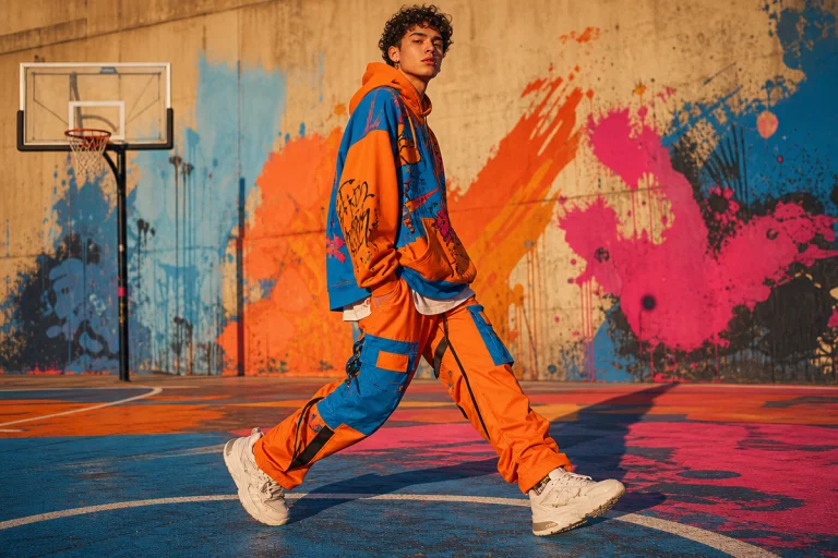
Scroll your feed right now. Not the algorithm-safe drops, the real ones – the independent streetwear accounts posting fit pics against crumbling walls, hand-painted murals bleeding into brickwork, grainy photos shot under flickering shop signs. What you notice first isn’t the cut of the jacket or the colourway. It’s the lettering. That jagged, deliberate, sometimes barely-readable script stamped across a chest or printed down a sleeve. The font is doing the heavy lifting before you’ve clocked a single product detail. And if it’s wrong – too generic, too clean, too borrowed – you’ve already scrolled past.
\n
This is where a lot of new streetwear labels are losing. Not in the product, not even in the photography. In the type.
\n
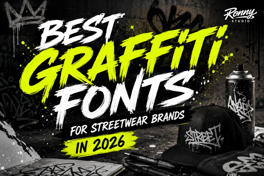
Why Graffiti Fonts Streetwear Brands Choose Can Make or Break a Launch
\n
 \n
\n
\nImage: Ronny Studio
\n
New clothing, skate, and urban lifestyle labels are launching every single week with near-identical visuals. Same photography filters, same colour palettes, same overworked typefaces that have been cycling through Canva templates since 2019. The result is a market where genuine differentiation is harder than ever – and where typography has quietly become the frontline branding decision.
\n
Here’s the thing typography professionals have known for years: a customer experiences your font before they read your brand name. The shape, weight, and attitude of your lettering registers emotionally a fraction of a second before the actual words resolve. That’s why the leading streetwear labels treat typeface selection as a frontline identity decision, not a finishing touch. Think Supreme’s rigid Futura. Think Palace’s knowing bootleg irony. Think early Stüssy scrawls – graffiti roots worn proudly, not hidden. These brands communicate authenticity, rebellion, creativity, urban culture, and youth energy through type alone.
\n
Getting to that level of typographic confidence doesn’t happen by accident. It requires knowing what’s actually working on garments right now, and why most brands keep getting it wrong. If you’re building something new – especially if you’re working with 10 Best AI T-Shirt Design Tools [50 Prompts Tested, 2026] to prototype your designs – the font choice will define whether the output looks credible or counterfeit before anyone touches it.
\n
What’s Working Now, What’s Cooked
\n
Let’s be direct. Ultra-clean vector graffiti – the kind that looks like it was traced from a reference then inflated in Illustrator – is losing credibility fast. Same with the faux-tag fonts that flooded print-on-demand marketplaces between 2022 and 2024. If it shipped with a Canva template pack, assume it’s done. The aesthetic that’s gaining traction right now is rougher, more physical, more anchored in a specific subculture rather than a generalised idea of street. Type that looks like it originated somewhere real – a rehearsal room wall, a skate park kerb, the inside cover of a xeroxed zine – before it landed on a garment. Hand-made irregularity over digital precision. Texture over smoothness. Specificity over attitude-as-aesthetic.
\n
The 11 Typography Trends to Follow in 2026 | AND Academy documents how this is moving across disciplines. In streetwear specifically, the direction is clear: letterforms with a physical origin story are outperforming letterforms that were born on a screen.
\n
Three Typefaces Worth Knowing Right Now
\n
We’ve been watching several typefaces gain traction in independent streetwear circles, and three keep surfacing in the work that actually stops the scroll.
\n
Youth Crew is a street hardcore display font pulled directly from the hardcore punk and underground music scene aesthetic – think xeroxed zine headers, Black Flag-era gig posters, the visual language of bands that pressed their own 7-inches and sold them from cardboard boxes. The cultural cue here is deliberate working-class defiance: this is type that never asked permission. It works for logos, apparel prints, posters, and album covers, and that last use case is the tell – fonts that credibly cross between music and fashion carry cultural weight that pure commercial typefaces can’t fake.
\n
For the actual drop: single-word chest print on a heavyweight blank. We’re talking 380gsm at minimum – a Gildan 2400 or a US Blanks 8150 in faded black or bone white, run through a plastisol screen with a cracked-ink finish applied deliberately, not accidentally. Avoid pristine whites; the colourway should feel aged before it’s been washed. Rust orange on charcoal, or off-white on washed black, are the two palettes where this typeface earns its weight. A bootleg logo treatment also works hard here – the distortion needs to feel like it came from a fourth-generation photocopy, not a distress filter slider.
\n
Thrashlane is a hand-painted street brush font, and the texture is the whole point. The rough edges convey movement and intensity in a way that digital perfection actively destroys. Think of it as the type equivalent of a paint marker tag – impermanent, physical, made by a hand under pressure. This is the typeface that benefits most from your print method choices, because its irregular strokes only read as intentional when they’re given room to breathe and a substrate that carries imperfection well.
\n
For the actual drop: discharge printing on a garment-dyed or enzyme-washed blank. Discharge removes the dye rather than laying ink on top, which means the rough stroke edges of Thrashlane soften into the fabric in a way that feels genuinely organic rather than stuck-on. A Comfort colours 1717 in pepper or moss, or a washed-black heavyweight piece, gives the font the worn physical quality it’s referencing. Run it as a full-width back print or a sleeve hit. Keep the palette limited – natural ink on dark ground, or a single deep colour on a lighter enzyme wash. The moment you add a second ink colour to Thrashlane it starts reading as designed rather than made, which defeats the entire point.
\n
Nofex sits at the opposite end of the aggression dial. It’s an urban display typeface that balances an edgy appearance with actual readability and a touch of professionalism – think Y2K influence filtered through a contemporary lens. This is the font for a brand operating across streetwear and lifestyle contexts simultaneously, the kind of label that could plausibly appear in an editorial alongside workwear or techwear without looking out of place.
\n
For the actual drop: bold text tee, minimal supporting elements, clean colourways. Pigment-dyed blanks work particularly well here – the slight tonal variation in pigment dye adds just enough texture to keep the piece from reading as corporate without sacrificing the legibility that makes Nofex useful. Sage, slate blue, or a muted terracotta sit better than saturated primaries. DTG printing suits this one over screen because the fine details in the letterforms survive the process intact. One word or a short phrase centred on the chest; resist the urge to stack additional type beneath it.
\n
These three represent a useful spectrum: raw punk energy (Youth Crew), physical urgency (Thrashlane), and controlled urban cool (Nofex). Most streetwear brands need a primary face that lands clearly in one of these registers. Trying to blend all three across a single collection is how you end up with a brand identity that reads as undecided.
\n
What Kills Streetwear Typography (And How Not to Do It)
\n
Four mistakes keep appearing in new brand launches, and they’re worth naming directly.
\n
Relying on overused fonts is the most common. If your typeface has appeared on a thousand Etsy shops in the last eighteen months, it’s doing negative work for your brand – actively communicating that you didn’t look hard enough. Ignoring cultural context is the second: a font that references hardcore punk placed on a pastel colourway in a lightweight jersey signals that whoever made the design decision didn’t understand the source material, and audiences clock that dissonance immediately. Following trends blindly is the third – if you’re chasing a typeface because it appeared on three big brand drops this season, you’re already a step behind. And fourth, the font-mixing mistake: using three or four different faces across your brand assets destroys the consistency that makes any single typeface memorable in the first place.
\n
The better filter is one question, not four: does this typeface, on this garment base, printed this way, look like it came from somewhere real? If the answer requires you to explain the cultural reference, the design isn’t doing the work yet.
\n
For full context on where the broader 30 Streetwear Outfits 2026: Fresh Trends To Wear Now are moving this year, the aesthetic context matters – type doesn’t exist in isolation from the garments and the culture they’re embedded in.
\n
The Scene Comes Full Circle
\n
Back to that feed scroll. The reason certain brands stop your thumb isn’t mystery – it’s decision-making compressed into a single visual element. The graffiti heritage that runs through streetwear typography isn’t decorative; it’s documentary. It says where the brand comes from, what it values, who it’s for.
\n
Get the font right, choose the garment base that carries it, and specify the print method that lets it breathe. Everything downstream – the product photos, the social content, the packaging – inherits that authority. Get it wrong and nothing fixes it, not even a great product or a perfect wash.
\n
The wall is still talking. The question is whether your type is worth reading.
\n
Frequently Asked Questions
\n
Q: What makes a graffiti font work for a streetwear brand?\nA: The strongest graffiti fonts feel like they originated somewhere physical before they landed on a garment. Beyond that, they need to be legible at distance, carry a distinct cultural mood, and hold up across both apparel and digital contexts without constant adaptation.
\n
Q: Which graffiti fonts are trending in streetwear right now?\nA: Youth Crew (hardcore punk-inspired display), Thrashlane (hand-painted brush with rough texture), and Nofex (urban display with balanced readability) are three typefaces gaining traction in independent streetwear. Each covers a different register – raw aggression, physical urgency, and controlled urban cool.
\n
Q: What print method works best for graffiti-style fonts on t-shirts?\nA: It depends on the typeface. Rough brush fonts like Thrashlane suit discharge printing on garment-dyed blanks – the ink-removal process softens edges organically. Clean display faces like Nofex handle DTG well because fine letterform details survive the process. Plastisol screen with a cracked-ink finish works for heavy punk-influenced types like Youth Crew, where a deliberately aged result is the point.
\n
Q: How do I avoid picking an overused font for my streetwear brand?\nA: Search for typefaces outside the major free font libraries and template marketplaces. If a font appears frequently across Etsy shops, Canva templates, or mid-tier brand launches, it’s already overexposed. Commission or licence less widely distributed faces, and always check how the font appears in your specific competitive set before committing.
\n
Q: Can graffiti fonts work for print-on-demand t-shirt designs?\nA: Yes, and certain styles are particularly well-suited. Hand-painted brush fonts like Thrashlane work well as full-width back prints or sleeve hits on washed or enzyme-washed blanks. Display fonts like Youth Crew perform strongly as single-word chest prints on heavyweight bases. Clean urban display faces like Nofex suit minimal text tee formats on pigment-dyed garments.
\n
Q: How many fonts should a streetwear brand use?\nA: One primary typeface for brand identity, with at most one secondary face for supporting text. Using three or more fonts across brand assets destroys the visual consistency that makes any single typeface memorable, and signals a brand that hasn’t committed to a clear identity.
\n
Source: https://ronnystudio.com/best-graffiti-fonts-for-streetwear-brands-2/
\n
This article was researched and written with AI assistance, then reviewed for accuracy and quality. Maya at Its.That. uses AI tools to help produce content faster while maintaining editorial standards.
\n