

\n
Last updated: July 31, 2026
\n
\n
\nImage: Atomm
\n
Walk down any market in Shoreditch or scroll Depop for ten minutes and the pattern is obvious: bad typography is killing otherwise solid t-shirt designs before they ever get a second glance. The silhouette is clean, the colourway is right, the concept is strong – but the font? Wobbly, washed-out, lifting at the edges after one wash. Which raises the question every print-on-demand seller eventually has to confront: do you actually know what makes the best fonts for t-shirts, or have you just been picking whatever looked cool on a laptop screen?
\n
The global print-on-demand market was worth $10.8 billion in 2025 and is tracking towards $57.5 billion by 2033. That is a lot of t-shirts. It is also a lot of competition, and typography is one of the fastest ways to separate product that looks professional from product that looks like it was assembled at midnight with a free Canva account.
\n
What Makes a Font Work on Fabric
\n
\n
\nImage: Atomm
\n
Three things separate a font that survives the production process from one that falls apart at every stage: bold weight, legibility, and weedability. Bold weight means the strokes are thick enough to read across a room – roughly six feet is the standard test distance. Legibility is about letterform clarity at a glance, not just at your desk. Weedability is the vinyl-cutter’s metric: thick, even strokes that do not tear when you pull the negative space away from HTV film.
\n
High contrast between text and shirt colour is the single biggest variable in legibility. A pale grey graphic on a white tee might look elegant in a mockup. On an actual garment, under actual lighting, it disappears. This is why the boldest streetwear graphics – think the oversized collegiate prints coming out of East London labels right now, or the washed-out bootleg aesthetics covered in our roundup of underground streetwear brands you need to know in 2026 (the same idea we work with in our own Bootleg tees) – almost always use extreme contrast as a starting point, then layer nuance on top.
\n
The two-font rule applies across the board. One hero font carries the impact; one support font handles secondary information. More than two and the hierarchy collapses. The eye does not know where to land.
\n
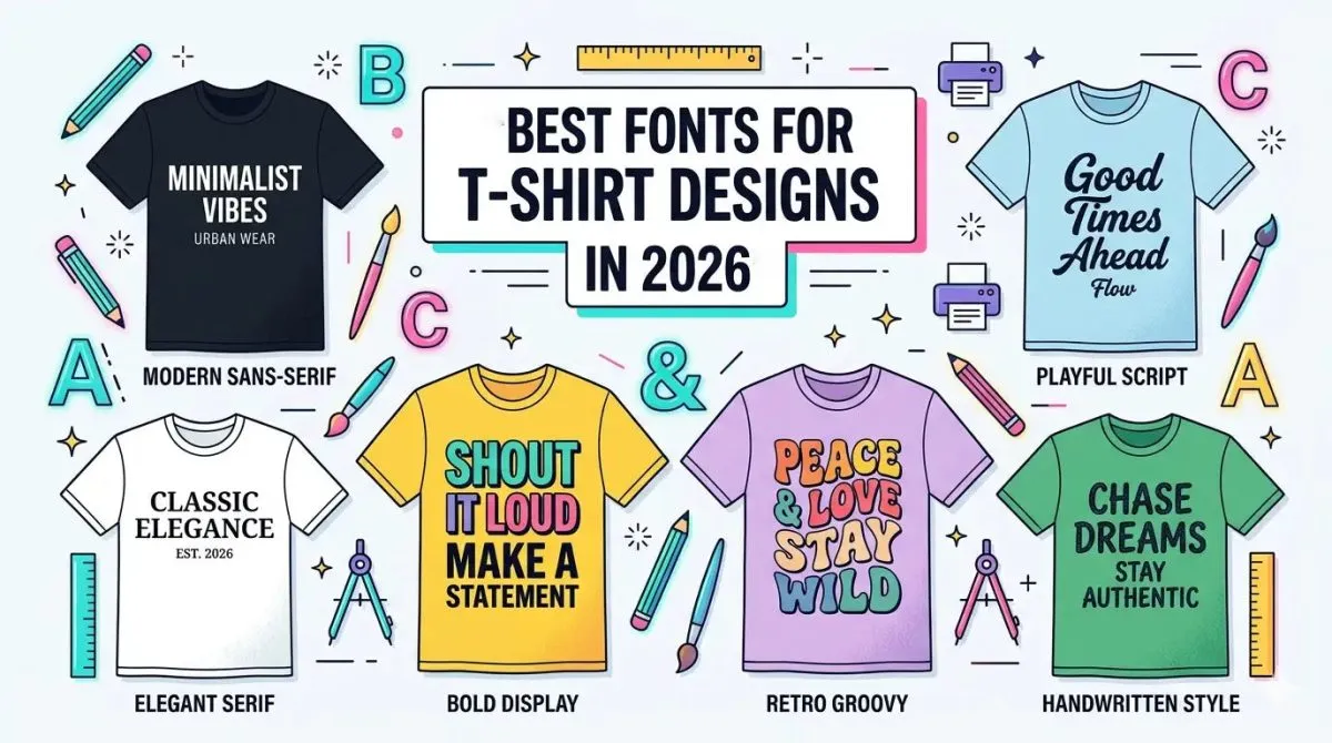
14 Google Fonts That Are Actually POD-Ready
\n
All 14 fonts in our recommended set are free on Google Fonts and carry commercial licences, which removes one of the most underestimated risks in print-on-demand: discovering mid-campaign that your chosen typeface requires a per-unit fee or prohibits use on physical products. That risk is real and the licensing terms on premium font sites are not always clear. With Google Fonts, you are covered.
\n
Bebas Neue – The cornerstone of every bootleg sports layout going. Think Supreme drop-day queues meets a mid-90s American varsity department, stencilled onto a heavyweight washed black blank. All-caps, stacked large, cracked white ink on faded olive. Pair it with Barlow Condensed for small-print secondary text. Do not pair it with anything script – the registers are completely opposed.
\n
Anton – Where Bebas Neue is architectural, Anton is blunt. Think Stüssy’s early catalogue after a week on the south side of Chicago. Works hardest on cardinal red or bottle green with bold white DTF, or as a single-word chest hit on a natural blank. Do not pair it with thin sans-serifs – the weight contrast turns ugly fast.
\n
Oswald – The one you reach for when you want collegiate without the joke. Narrower and more refined than the previous two, it sits between editorial and sportswear. Chrome-foil-on-black is the current move; we are also seeing it work in navy-on-cream for archive-brand aesthetics. Pairs cleanly with DM Serif Display. Avoid Lobster – the tone clash is instant.
\n
Montserrat – Architectural minimalism, full stop. Think Balenciaga campaign typography executed on a £25 Gildan Heavy – the aesthetic transfer is the entire point. Works best at generous sizes on washed grey or off-white, printed in a single ink with deliberate negative space. This is a luxury-adjacent play. Do not clutter it with secondary fonts or decorative elements.
\n
League Spartan – Montserrat’s more assertive sibling. Slightly heavier, with terminals that feel designed for scale. This is the one driving the clean geometric trend in sustainable streetwear right now – sand-tone blanks, forest green text, maybe a single small wordmark below. Pairs well with Raleway for an art-school two-font combination. It is the same territory as the geometry prints in our own Creativity collection.
\n
Raleway – Art deco credibility without the period-costume energy. The W is doing a lot of work here. This is your font for celestial, occult, and tarot-adjacent aesthetics – think dark navy or aubergine blanks with gold or silver DTF. Also strong for astrology merch, festival capsules, and anything sitting in the vintage-inspired design space. Do not pair it with Bebas Neue – the tension between elegant and blunt resolves badly.
\n
Abril Fatface – Editorial confidence at display size. The contrast between its thick stems and hairline serifs is where all the personality lives – which also means it demands DTF or screen print, never vinyl at small sizes. Think magazine masthead meets heavyweight tee drop. Chrome-on-red is the treatment we keep returning to: high-gloss finish on a saturated ground. Avoid using it below 36pt; the hairlines collapse.
\n
Playfair Display – The refined choice for elevated basics. Slower and more considered than Abril Fatface, with a slightly cooler editorial register. This is the font for the customer who wants something that reads expensive at a glance. Embroidery works surprisingly well here on contrast-coloured blanks. Pair it with Oswald for a sharp high-low contrast. Avoid anything geometric and heavy alongside it.
\n
DM Serif Display – Magazine masthead treatment dropped onto fabric. Wide, confident, with ink-trap-era serifs that survive DTG at scale. Works well as a single-word chest graphic on heavyweight earth tones – rust, bark, aged white. The current moment for this font is in the quiet-luxury-adjacent POD space, where the play is restraint rather than aggression. Do not push it into streetwear-aggressive colourways; it will not hold its register.
\n
Fredoka One – The outlier that earns its place. Rounded, warm, built for the retro-fun lane that is outselling a lot of more serious aesthetics on Etsy right now. Think 70s sportswear meets a Japanese convenience store sign. Aqua on white, orange on yellow, any combination that reads immediately happy. Pairs well with itself at different sizes. Do not put it anywhere near Abril Fatface – the tonal distance is too great.
\n
Lobster – Nostalgia delivered at volume. The 2012 internet font that has looped back around into genuine ironic currency. Airbrush-fade treatment on a washed black blank is the current revival move – think the bootleg band-tee aesthetic pushed through a retro diner filter. Keep it large and single-colour. Pairing it with anything geometric reads like an accident.
\n
Russo One – Military meets techwear. Geometric but with a harder edge than Montserrat, designed to hold shape under pressure. This is the font for tactical streetwear capsules, dystopian graphics, and anything channelling a utilitarian aesthetic. Works best in white or signal orange on black or olive. Pair it with Barlow Condensed for a functional, no-romance two-font system. Do not soften it with script.
\n
Barlow Condensed – The support player that makes every other font on this list work harder. Neutral, clean, reads at small sizes even on textured fabric. The default choice for small-print secondary information: sizing grids, care instructions made decorative, location tags below a logo. Works with everything. The only wrong move is using it as a hero font at large display sizes – it needs a bolder partner to anchor it.
\n
Big Shoulders Display – The one we have been watching climb. Brutalist proportions, condensed geometry, the kind of letterform that looks like it was cut from steel rather than designed on a screen. This is the font for the architectural streetwear moment – think brutalist estate aesthetics, East London urban photography as graphic reference, the intersection of workwear and high concept. Works hardest on oversized blanks in black, concrete grey, or raw white, with large-scale single-colour DTF. Pairs well with Barlow Condensed. Do not pair it with anything retro or warm – it will fight the register.
\n
The Production Details That Actually Matter
\n
Here is where most POD sellers lose money: the gap between a design that looks right in a digital mockup and a design that survives production. For vinyl and HTV cutting, mirror the design before you cut, weed slowly, and keep every letter at least half an inch tall. Below that threshold, the fine strokes do not have enough material to hold their shape when the carrier sheet peels away.
\n
Export formats matter more than most tutorials acknowledge. SVG is the correct format for cutting machines – it preserves vector paths so the blade follows exactly the right line. For DTG and DTF printing, a transparent 300 DPI PNG is the standard. Before you export for either method, convert all text to outlines. This locks the letterforms as shapes rather than editable type, which means the font does not need to be installed on the printer’s machine and the rendering is clean regardless of the production environment.
\n
The contrast principle from the opening applies here too. A font that passes every legibility test at 100% zoom on your monitor can still fail on fabric if the colourway does not support it. Test your designs on coloured backgrounds – not just white. The best fonts for t-shirts are the ones that hold their ground across the full range of garment colours you plan to offer.
\n
We keep coming back to the same fundamentals: weight, contrast, legibility at distance. The 14 Google Fonts on our list were chosen because they pass all three tests and clear the commercial licensing question in one move. The street is moving fast in 2026 – your typography should be the one thing that does not need to play catch-up.
\n
Frequently Asked Questions
\n
Q: What are the best fonts for t-shirts for print-on-demand sellers?\nA: The best fonts combine bold weight, strong legibility at six feet, and thick even strokes that survive cutting and printing. Free Google Fonts options including Bebas Neue, Anton, Montserrat, and Abril Fatface are all commercially licenced and perform well across HTV, screen print, and DTF production methods.
\n
Q: How many fonts should a t-shirt design use?\nA: No more than two – one hero font for the main text and one support font for secondary information. Using more than two fonts collapses the visual hierarchy and makes the design harder to read at a distance.
\n
Q: Do I need to buy a licence to use fonts on t-shirts I sell?\nA: It depends on the font. Many premium fonts require commercial licences for use on physical products. All 14 fonts recommended in this article are available free on Google Fonts and include commercial use licensing, which covers print-on-demand t-shirt sales.
\n
Q: What file format should I use for t-shirt printing?\nA: Use SVG for vinyl and HTV cutting machines, and a transparent 300 DPI PNG for DTG and DTF printing. Always convert text to outlines before exporting so the letterforms render cleanly without requiring the font to be installed on the production end.
\n
Q: Why does my t-shirt font look fine on screen but bad in print?\nA: Usually a contrast or weight issue. High contrast between text colour and shirt colour is the biggest factor in legibility on fabric. Fonts with thin strokes also struggle on textured materials – switch to a bolder weight and test your design on the actual garment colour, not just a white mockup background.
\n
Source: https://www.atomm.com/blog/2118-best-fonts-for-t-shirts
\n
This article was researched and written with AI assistance, then reviewed for accuracy and quality. Maya at Its.That. uses AI tools to help produce content faster while maintaining editorial standards.
\n