

\n
Last updated: July 11, 2026
\n
Here is the expanded article:
\n
\n
\nImage: PromptBase / @byteboy1
\n
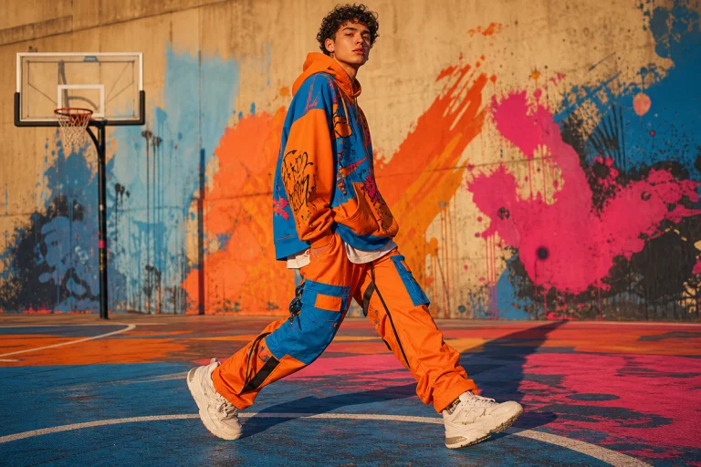
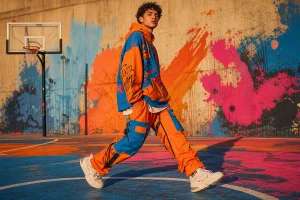
Walk the queue at any pop-up this season. Scan the back-print tees moving through the crowd at a sneaker fair. There’s a character there – always an animal, always draped in something oversized, always with lettering that looks like it was carved into a New York wall at 2am. Not on one person. On ten. The AI streetwear mascot tee has gone from experimental to ubiquitous in under eighteen months, and if you’re building a POD brand right now, you either understand exactly why this aesthetic is printing money or you’re already behind it. The global print-on-demand market is projected to surpass $45 billion by 2031. The brands eating into that share aren’t waiting for quarterly trend reports. Here are five things worth knowing about how AI mascot tools are reshaping how streetwear graphics get made – and where the opportunity still is.
\n
1. How AI Streetwear Graphic Generators Are Closing the Skills Gap
\n
\n
\nImage: PromptBase / @byteboy1
\n
Non-illustrators can now produce professional-grade mascot artwork in minutes, and the output quality is high enough for commercial print. Tools like the Streetwear Mascot Graphic Tees Generator on PromptBase, published by creator @byteboy1, are engineered specifically for this. It’s not a loose prompt you have to endlessly tinker with – it’s a turnkey app built around a consistent visual system: fashionable anthropomorphic animals, urban apparel styling, bold graffiti typography, oversized sneakers. Click an example output, load it into the generator, and you’re producing on-brand variations without starting from scratch.
\n
The old route was a freelance illustrator, a mood board, three revision rounds, and three weeks of waiting. That route still exists. It just isn’t the only one. If you want to understand the design principles worth knowing alongside these tools, our guide on Streetwear Design: Tips for Creating Trendsetting Looks covers the fundamentals.
\n
2. Anthropomorphic Animals: What’s Still Fresh and What’s Already Played Out
\n
Mascot branding built around animal characters has been central to streetwear DNA since the BAPE era. What’s shifted is the aesthetic register. The current wave pulling real attention favours characters that read as premium and attitude-heavy – think a silverback gorilla in a Supreme-adjacent colourway crossed with a Kidrobot vinyl figure, rendered with the linework weight of a vintage skate deck graphic. That specific corner still has legs.
\n
What’s tipping toward saturation: the wide-eyed cartoon rabbit in a pastel hoodie. We’ve seen it. The algorithm has seen it. Buyers have seen it. The characters that are cutting through right now lean harder into menace and texture – bears with heavy brow lines, bulldogs with gold chains, wolves with the silhouette proportion of a 1990s hip-hop album cover. Think Akira meets Futura 2000 rather than Looney Tunes meets Supreme.
\n
The myth is that AI-generated mascots look generic. The reality is the opposite when the underlying prompt is engineered correctly. A well-built generator bakes in the visual vocabulary – the stance, the sneaker proportions, the way typography wraps the character – so the output already carries brand weight. The generator does the heavy lifting. Your job is choosing which direction to push it.
\n
3. Graffiti Typography and Bold Lettering: Specific Direction for Actual Tees
\n
The typography embedded in this aesthetic is doing real work. Graffiti-inflected lettering, chunky outlines, layered drop shadows – these aren’t decorative choices, they’re signals. They communicate a specific cultural lineage: New York in the 1980s, the Bronx, walls before galleries. That lineage is part of what buyers are purchasing when they buy the shirt.
\n
For POD applications, the cleanest executions we’re seeing right now are:
\n
Front chest placement – the mascot character centred at approximately 9cm x 9cm, with a compact wordmark arced beneath it in a condensed gothic or blackletter face. Washed black garment with neon yellow or acid green detail. Works best on 240-280gsm heavyweight cotton where the ink sits rather than bleeding.
\n
Oversized back print – the full character running shoulder-to-hem, with the brand name in a thick, outlined varsity-adjacent font across the upper back. Vintage orange and cream on an off-black base is the palette direction that feels freshest here, as opposed to the all-over navy and white that’s gone flat.
\n
Bootleg logo treatment – knock the proportions of a heritage logo, replace the name with your own, pair it with the mascot at a diagonal offset. This sits naturally in the graffiti register and works on both front chest and left sleeve placement. Colour palette to try: deep forest green garment with off-white lettering and a rust accent on the mascot detail.
\n
4. Separating Your Graphic for Print: Placement and Garment Colour Decisions
\n
This is where most POD brands lose quality before a single shirt ships. An AI-generated mascot arrives as a rendered flat image. Before it becomes a print, it needs thinking applied to it.
\n
Garment colour separation matters because most DTG and screen-print setups handle dark garments and light garments differently. If you’re printing on a black tee, the graphic needs a white underbase, which means any element you want to appear on the shirt as true black actually needs to be removed from the print layer and let the garment show through. AI-generated artwork typically renders everything as a filled graphic. You’ll need to strip the background, identify which black tones are meant to read as shadow versus outline versus fill, and treat them accordingly.
\n
Placement guides for standard POD garments: front chest sits 3-5cm below the neckline seam, centred. Oversized front print typically runs 10-12cm below the collar on a unisex fit. Back prints need a minimum 2cm clearance from the collar seam and should stop above the hem fold to avoid distortion on standard presser setups.
\n
Spot colour efficiency: if you’re planning a screen-print run rather than DTG, pull the graphic back to three or four spot colours maximum. The mascot character in a two-tone treatment with a single accent on the sneakers, plus a one-colour type element, will print sharper and cost significantly less per unit than a full-colour render.
\n
5. POD Brands Can Move Faster by Treating the Generator as a Series Engine
\n
The smartest application of tools like this isn’t a single tee – it’s a series. Run the same generator across five different animal characters, hold the typography and colour palette consistent, and you have a coherent drop ready for a seasonal launch. That consistency is what makes a collection read as a collection rather than a random assortment of graphics.
\n
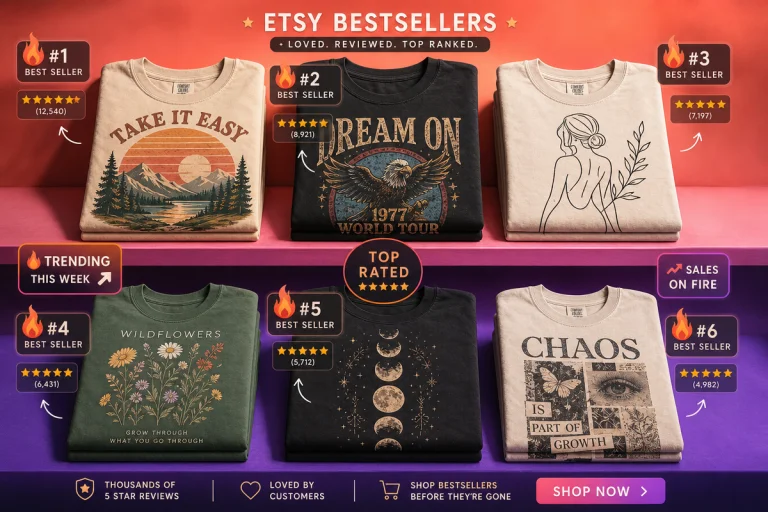
Easy-Peasy.AI’s supported image style categories already include t-shirt design, hoodie, mascot, and clothing design – which signals just how mainstream these apparel workflows have become. For anyone building a collection to sell through platforms like those you’d find on Etsy, this approach is worth taking seriously. The output is explicitly licenced for commercial use across clothing brands, stickers, posters, and modern streetwear collections.
\n
For timing your launch, our Summer Solstice collection launch strategy for POD outlines exactly how to sequence a drop for maximum visibility.
\n
The brands moving fastest right now have figured out something the slower ones haven’t: the creative work isn’t generating the image. It’s making the decisions that sit around it – which character direction still has cultural traction, how the graphic separates for your print method, which placement reads sharpest on the specific weight and colour of garment you’re stocking. The tool handles the render. The brand owner still has to handle everything else. That’s where the gap is, and that’s where the advantage lives.
\n
Frequently Asked Questions
\n
Q: Can I use AI-generated mascot graphics on print-on-demand products?\nA: Yes – tools like the PromptBase Streetwear Mascot app are explicitly licenced for commercial use, including clothing brands, POD products, stickers, and posters. Always verify the specific licence terms before printing and selling.
\n
Q: Why are anthropomorphic animal mascots so popular in streetwear right now?\nA: They carry a long lineage in hype culture – from BAPE’s ape graphics to Kidrobot vinyl figures – and translate well across tees, stickers, and social media. AI-generated versions now match commissioned illustration quality when the underlying prompt is well-engineered.
\n
Q: How does PromptBase work as a marketplace for streetwear prompts?\nA: Creators build and sell refined, tested prompts. Buyers purchase them and use them to generate consistent, on-brand output without building the prompt from scratch. The prompt itself is the product.
\n
Q: Which mascot styles are saturated and which still feel fresh?\nA: Wide-eyed pastel cartoon rabbits and cute-coded characters are tipping toward oversaturated. Characters with more attitude and texture – heavy linework, menacing proportions, references to 1990s hip-hop and vintage skate graphics – are cutting through. Think less Sanrio-adjacent, more Futura 2000 meets Akira.
\n
Q: How should I prepare an AI-generated mascot for actual print?\nA: Strip the background, decide how your blacks separate against the garment colour, and apply an underbase plan for dark fabrics. For screen-print runs, pull the artwork back to three or four spot colours. For placement, front chest sits 3-5cm below the neckline; oversized prints start 10-12cm down on standard unisex fits.
\n
Source: https://promptbase.com/app/streetwear-mascot-graphic-tees
\n
This article was researched and written with AI assistance, then reviewed for accuracy and quality. Maya at Its.That. uses AI tools to help produce content faster while maintaining editorial standards.
\n