

\n
Last updated: July 9, 2026
\n
 \n
\n
\nImage: Yellowbrick
\n
Scroll through any corner of Instagram right now and you’ll see it: oversized silhouettes layered over mesh underlays, washed-out graphics that look like they’ve been through a decade of laundry, heavyweight cotton tees stacked with hand-drawn lettering that feels like it was tagged on a wall somewhere in Hackney or East LA. The streets are talking, the feeds are listening, and the gap between what’s hot in a lookbook and what you can pull off on a print-on-demand platform has never been smaller. If you’re building a t-shirt brand right now, these streetwear design tips are your entry point into a conversation that’s already happening without you.
\n
How Streetwear Got Its Visual Language
\n
 \n
\n
\nImage: Yellowbrick
\n
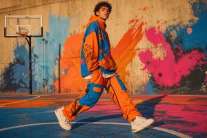
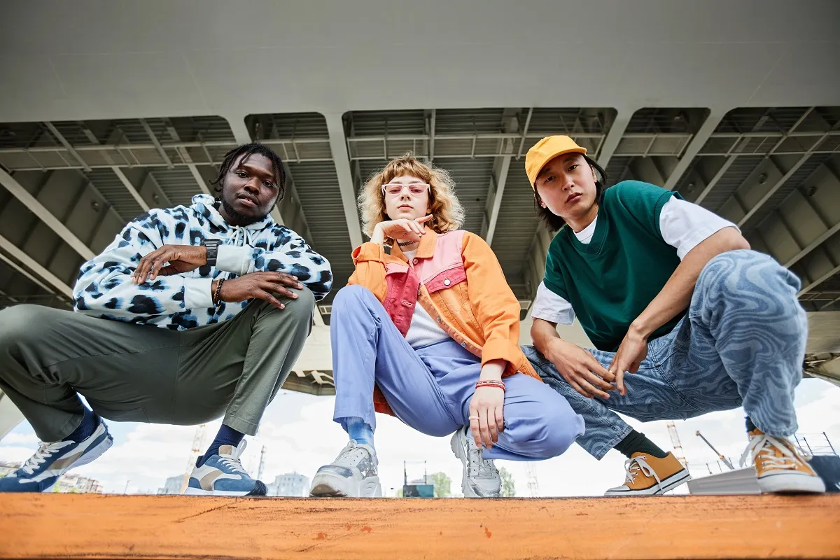
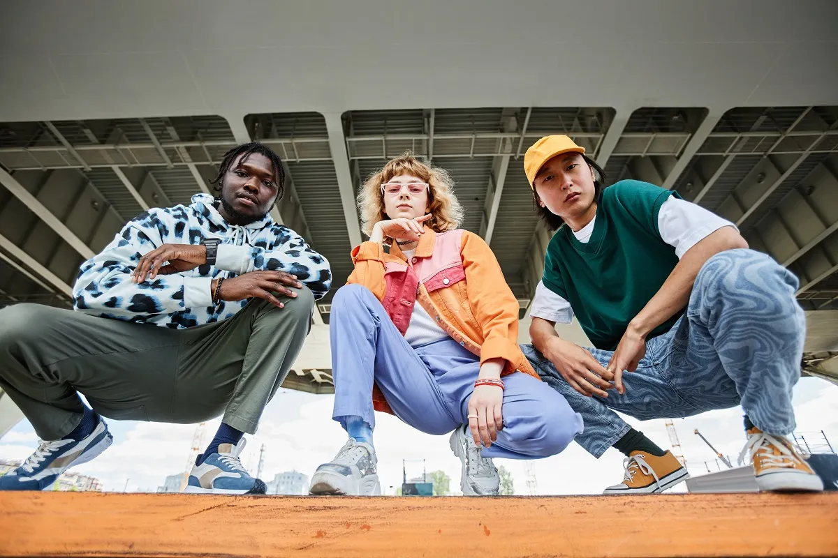
Streetwear didn’t emerge from a runway – it came up through hip-hop block parties, skate parks, and graffiti-covered underpasses. That origin story matters because it defines every design decision that followed. The aesthetic is casual, comfortable, and edgy by definition, rooted in a culture that valued authenticity over polish and attitude over access.
\n
Every strong collection in this space starts with a concept that means something. Music, art, current events, personal experience – these aren’t just mood-board ingredients, they’re the structural backbone of work that resonates. Think of the difference between a graphic that could have been generated by any algorithm versus one that feels like it was pulled from a specific moment in time. The latter stops the scroll. The former disappears into it.
\n
For print-on-demand designers, this is actually an advantage. We’re not managing a full supply chain – we’re managing ideas. A tight concept executed well on a single heavyweight cotton tee can carry more weight than an unfocused twelve-piece collection. Start there: one clear reference point, one visual world, one reason someone would wear this outside the house.
\n
The Colour Stories Driving 2026
\n
Colour is the first decision, not the last. In 2026, streetwear is splitting down two distinct lanes – and knowing which one to commit to matters more than hedging between them.
\n
The first lane is washed-out and muted: army sage, faded terracotta, dusty slate, off-white that reads more cream than clean. These tones carry the gorpcore-meets-archive energy that’s been building since technical outdoor gear crossed into everyday rotation. Think Carhartt duck brown washed three shades lighter. Think the colour of a vintage NATO pullover after a hundred washes. On a POD tee, this means choosing a garment colour that does half the work – a washed sage base with a single-colour off-white discharge print sits exactly in this moment. Place the graphic off-centre on the chest, slightly lower than you think, and let the negative space breathe.
\n
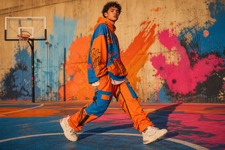
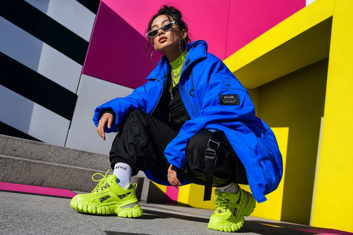
The second lane is the opposite: acid yellow, signal orange, cobalt, and an almost-neon coral that echoes late-80s sportswear without being retro costume. These hues are showing up on graphic panels and type-heavy chest prints where they need to punch through a crowd. The Y2K and 90s sport revival is the cultural engine here – the specific palette of a 1994 athletics kit reprinted in a context that knows its own references. For this lane, bold sans-serif type in a single saturated colour on a black base is doing the most work. All-caps, condensed, tracking pulled tight. Think Stüssy x a Continental Athletics programme from 1991 [citation needed].
\n
Neither lane is wrong. Mixing them without intention is.
\n
Streetwear Design Tips: Fabric, Texture, and Graphic Storytelling
\n
Here’s where the physical and the visual collide. Fabric choice shapes how a graphic lands – and while POD limits some of our material options, understanding the broader design logic helps us make better decisions within those constraints. Streetwear designers routinely mix traditional materials like denim, cotton, and fleece with unconventional choices – neoprene, mesh, leather accents – to create depth and tactile contrast. Think utilitarian meets luxury. Think workwear meets archive sportswear.
\n
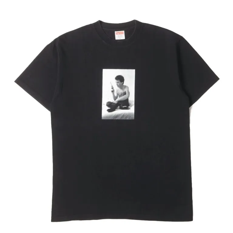
On the graphic side, the toolkit is well-established: bold logos, hand-drawn illustration, and typography that commands the chest. What separates the work that sells from the work that sits is specificity. A bootleg logo treatment done right – distressed, slightly off-centre, referencing something real without copying it directly – hits differently than a clean sans-serif slapped on a white tee.
\n
Typography right now is sitting in three places: condensed display faces that feel lifted from a 1970s league patch; stencil aesthetics with broken edges, the kind of thing that looks like it was sprayed through a cut-up cereal box; and mixed-weight lettering where one word goes thin and the next goes ultra-heavy, creating tension across the chest. Think Corteiz meets an Eastern European state athletics vest from 1987 [citation needed]. The latter format works particularly well when the secondary text is a location, a year, or a number – something that grounds the design in a real-seeming world rather than a brand-invented one.
\n
Rule of three for where the energy is sitting: worn-in collegiate graphics with intentional distressing and a washed garment to match; maximalist layered type in a two-colour print that reads like a tour poster made wearable; and minimal single-colour vector illustrations – a bird, a building outline, a piece of machinery – that carry cultural weight through specificity rather than complexity. Each of these translates directly to a POD workflow. Each requires a clear concept first.
\n
Placement is a decision, not a default. The standard left-chest logo position is neutral. Moving a graphic to the back yoke, or running type vertically down the left sleeve, or dropping a large print to sit across the lower half of the chest rather than centred at the top – these are the moves that signal you’ve thought about how a person actually exists inside a garment. Gorpcore’s influence on silhouette has pushed structured, slightly boxy fits to the foreground; designs that account for extra fabric across the chest and shoulder read better on those shapes than prints scaled for a fitted cut.
\n
Attention to craft detail matters even in digital design. The weight of a stroke, the decision to use a halftone screen versus a solid fill, the choice to leave registration marks visible as a design element – these signal whether you care or whether you’re churning.
\n
Building a Brand Identity That Holds
\n
A cohesive streetwear brand isn’t a consistent logo. It’s a defined point of view that shows up across every drop, every caption, every packaging decision. Consumers in this space buy into an attitude. Consistency across drops and visual language builds the trust that converts a first purchase into a return.
\n
Sustainability is increasingly the expected baseline. Eco-friendly materials and ethical supply-chain transparency appeal to a consumer base that’s paying attention. If your POD partner offers organic cotton or recycled options, that’s worth surfacing in how you talk about your product. For inspiration on how to tie a drop to a specific cultural moment without feeling opportunistic, our Summer solstice collection launch strategy for POD is worth a read.
\n
Functionality matters too. The best pieces work on a skate session, a coffee shop run, and a late-night set. Design with that range in mind.
\n
The Move Right Now
\n
Pick your colour lane. Pick a cultural reference specific enough that someone who knows it recognises it, and someone who doesn’t is still curious. Put the graphic somewhere it hasn’t been a thousand times. Choose your type treatment like it’s the loudest thing in the room – because on a well-executed chest print, it is.
\n
The feeds aren’t short of content. They’re short of point of view. That’s the gap. That’s where a single considered tee cuts through everything else scrolling past it.
\n
Frequently Asked Questions
\n
Q: What are the core streetwear design tips for beginners?\nA: Start with a strong concept rooted in a specific cultural reference – music, art, or personal experience. Apply it through bold graphics, considered typography, and a garment colour that works with the print rather than against it. Cohesion across a small collection beats a large, unfocused one every time.
\n
Q: What fabrics are most associated with streetwear aesthetics?\nA: Traditional streetwear leans on heavyweight cotton, denim, and fleece, with designers often mixing in unconventional materials like mesh, neoprene, or leather accents to add texture and depth. For print-on-demand, heavyweight cotton – particularly washed or pigment-dyed options – remains the most versatile base.
\n
Q: How important is brand identity in streetwear?\nA: Extremely important. A defined aesthetic, values, and visual language are what separate a brand from a collection of standalone graphics. Consistency across drops, tone, and type choices builds the trust that leads to repeat purchases.
\n
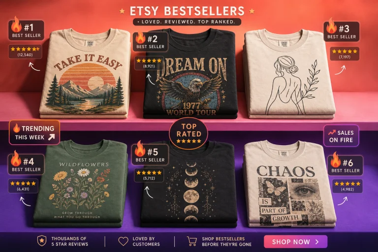
Q: How can print-on-demand designers compete in the streetwear market?\nA: By prioritising concept over quantity. A single well-executed graphic with clear cultural intent and precise typography will outperform a diluted catalogue. Treat each design as a drop with a reason behind it, and use platforms like Etsy to reach audiences who value specificity.
\n
Q: What typography styles are trending in streetwear design right now?\nA: Condensed display faces, stencil aesthetics with broken or worn edges, and mixed-weight lettering are leading right now. The direction favours type that looks like it has a real-world reference point – a league patch, a tour poster, a state athletics programme – rather than something built from a font menu alone.
\n
Q: What colour palettes are working in streetwear right now?\nA: Two distinct lanes: washed-out muted tones – army sage, faded terracotta, dusty slate – that carry gorpcore and archive energy; and saturated signal colours – acid yellow, cobalt, coral – rooted in Y2K and 90s sports revival. Commit to one. Mixing them without a clear reason is where drops lose focus.
\n
Source: https://www.yellowbrick.co/blog/streetwear/streetwear-design-tips-for-creating-trendsetting-looks
\n
This article was researched and written with AI assistance, then reviewed for accuracy and quality. Maya at Its.That. uses AI tools to help produce content faster while maintaining editorial standards.
\n