



\n
Last updated: July 21, 2026
\n
 \n
\n
\nImage: FashionBeans
\n
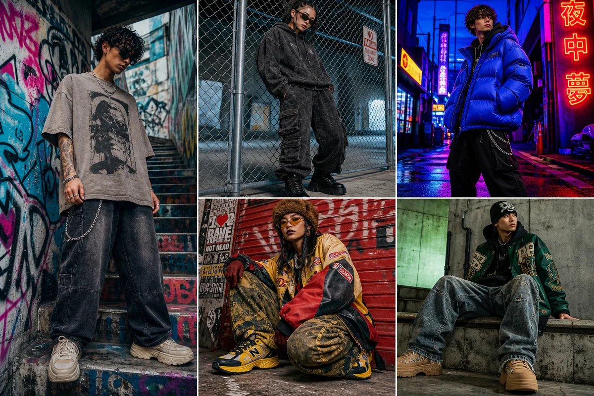
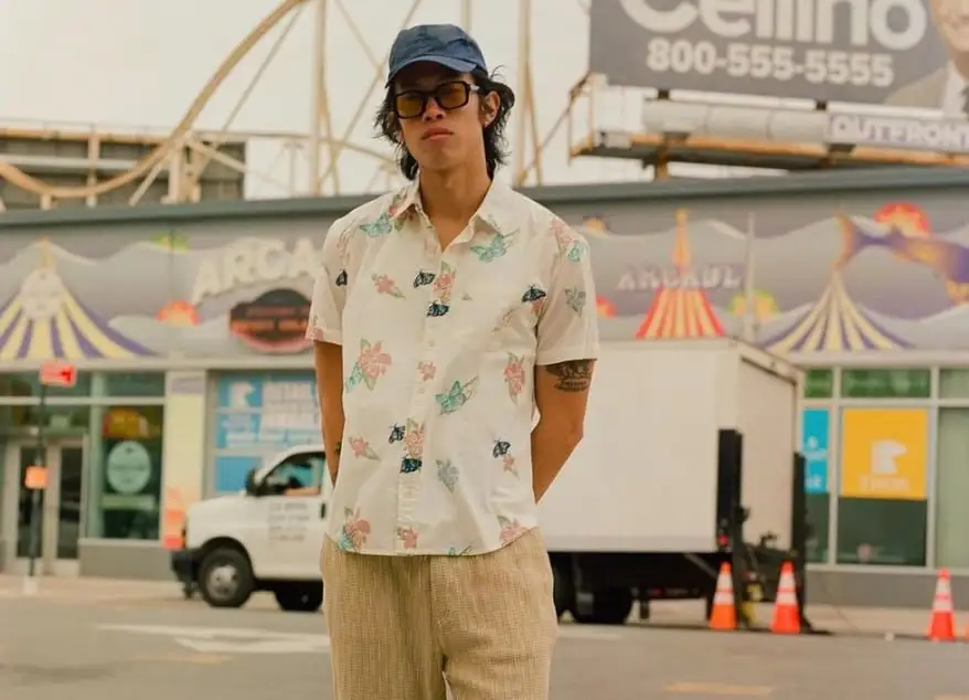
Walk down Brick Lane on a Thursday afternoon and you’ll see it immediately. A kid in M.C. Overalls workwear beside someone in Axel Arigato trainers and a hand-screened tee. A gorpcore vest layered over a vintage bootleg logo shirt. Nobody is following a single rulebook. The feeds look the same – Tokyo silhouettes next to South London staples, Copenhagen minimalism beside New York nostalgia. If you’re trying to understand the best streetwear brands right now, you need to stop looking for a centre. There isn’t one. That’s the point.
\n
For designers and print-on-demand sellers, this fragmentation is the most useful creative signal in years. The brands winning in 2026 are the ones that committed to a lane, built a visual language, and let culture catch up to them. Here’s what we’re learning from watching them.
\n
Workwear Grit: Honest, Heavy, and Hard to Fake
\n
 \n
\n
\nImage: FashionBeans
\n
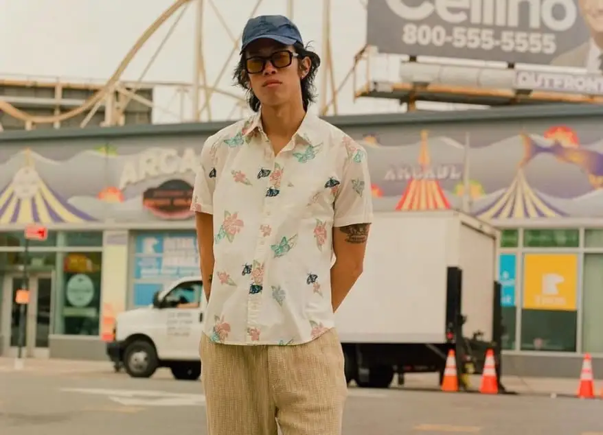
M.C. Overalls has been making functional clothing since 1908. That’s not a heritage story – that’s a position. The workwear revival running through the mid-2020s pulls directly from this lineage: canvas fabrics, utility pockets, honest construction. The visual grammar is equally specific. Think worn block lettering, faded union-bug stamps, condensed grotesks set tight in all-caps. Washed safety orange on a slate-grey base. A faded forest green that looks like it spent a decade in a factory locker.
\n
For POD, the move is a distressed single-colour chest print with a faux-stamp treatment – the kind of cracked plastisol that looks like it’s been washed fifty times before it ever left the factory. There’s a whole tradition of bootleg logo treatments that pull from exactly this aesthetic – bootleg serif flips on institutional-style text, souvenir back prints that reference trades rather than tourist destinations. A tee that looks like it was issued, not bought.
\n
Tokyo Deconstruction: Strange, Specific, Impossible to Copy
\n
Undercover has been making work this specific since the nineties. Jun Takahashi doesn’t chase – he accumulates. Thirty years of strange, and the cult following that never needed mainstream validation has outlasted every hype cycle. Tokyo streetwear in 2026 is doing the same thing: deconstructed seams, inside-out construction, type collage that borrows from DIY zines and early web aesthetics in equal measure. Think photocopied found imagery layered under a condensed gothic headline. Think a graphic that looks like it was assembled by hand and then reassembled by a different hand. The Stratasys J850 TechStyle printer – now adopted by Tokyo textile houses – is pushing the technical edge further, but the visual language is still rooted in deliberate imperfection.
\n
The POD direction is type collage: stack mismatched fonts, let the grid break, run a line of text on an angle. One strange idea executed with full commitment beats a busy design trying to reference everything at once.
\n
Clean Luxury Minimalism: The Anti-Logo That Is Still a Statement
\n
Axel Arigato doesn’t have a century of heritage. Founded in 2014, it built an identity from attitude alone – clean Scandinavian geometry, restrained colour palettes (bone, slate, sand), typographic confidence that reads equally well on a sneaker box and a gallery wall. It is close to the territory our own Creativity geometry prints work in. Percival operates in similar territory: creatively reinterpreted wardrobe staples, elevated through production quality, no loud logos, no hype drops.
\n
This is the anti-logo as statement. Restraint signals literacy – it says you don’t need the logo because you already know. The POD direction here is confident negative space: a single well-set word in a tight Grotesque on a heavyweight tee, a micro chest hit instead of a full-bleed print. For font inspiration, check our guide to best fonts for t-shirts – Axel Arigato’s clean aesthetic translates directly.
\n
But here’s the tension worth exploiting: logo mania and anti-logo minimalism are both winning right now. Corteiz dropped its entire World Cup collection exclusively through pop-ups around the world – no online release, no restock, no apology. The Alcatraz logo on a plain tee carries more weight than any graphic because of the scarcity ritual around it. These are opposite strategies with the same underlying logic: give people something to signal with. Whether that signal is restraint or recognition, the visual commitment has to be total.
\n
Gorpcore Utility: Technical Fabric as Cultural Shorthand
\n
Tropicfeel sits at the crossover between functional performance design and streetwear aesthetics – backpacks and technical jackets that work at a trailhead or a weekend market. This is outdoor-as-identity: earth tones, topographic references, technical fabric textures rendered as print. Muted olive, slate blue, off-white. A compass rose that looks hand-drawn. A grid reference that means something, or at least looks like it does.
\n
The POD translation: utility vest graphics transposed onto a heavy cotton tee. Think technical spec callouts in racer fonts – the kind of condensed sans-serif you’d find on a carabiner or a Gore-Tex label. A souvenir back print that maps a specific place with a topographic line illustration. Gorpcore isn’t going anywhere – it’s the most durable macro-trend in the category because it’s rooted in function, and function doesn’t go out of fashion.
\n
Sustainability as Aesthetic, Not Afterthought
\n
Løci’s sneakers – fully vegan, made from recycled ocean plastic – don’t sell on guilt. They sell because the material story is baked into the visual identity. Ocean-adjacent blues and greens, material-transparency messaging that reads as design rather than disclaimer. The process is the aesthetic. Our own Neutrals range follows a similar logic: a recycled poly jersey in earth tones, built to be worn together rather than shouted about. For POD, that direction is a back-neck print listing materials, or a graphic that references its own production – a diagram of a supply chain rendered as illustration, or a tee that names its weight and composition in the same font as its logo.
\n
What to Take Back to Your Studio
\n
Go back to Brick Lane in your head. That kid in M.C. Overalls workwear isn’t just wearing old clothes – he’s making an argument about authenticity and duration. The person in Axel Arigato trainers isn’t just buying into minimalism – they’re signalling cultural literacy through restraint. Every outfit is a position.
\n
The brands that build longevity understand this. They give their audience something to signal with. Not a trend, not a collab, not a drop – a consistent point of view that sharpens over time. Undercover has been strange for thirty years. Noah has been principled for decades. M.C. Overalls has been functional for over a century. Corteiz has built a mythology around scarcity in a fraction of that time.
\n
Pick your lane. Workwear grit, Tokyo deconstruction, clean luxury minimalism, gorpcore utility – each one has a distinct visual language and a specific POD move. One obsessive idea, executed with cracked plastisol or a souvenir back print or a condensed grotesk micro hit, is worth more than twelve trend-chasing graphics. Make it specific enough to mean something. Let the right people find it.
\n
Source: https://www.fashionbeans.com/article/best-streetwear-brands/
\n
This article was researched and written with AI assistance, then reviewed for accuracy and quality. Maya at Its.That. uses AI tools to help produce content faster while maintaining editorial standards.
\n