

\n
Last updated: July 29, 2026
\n
 \n
\n
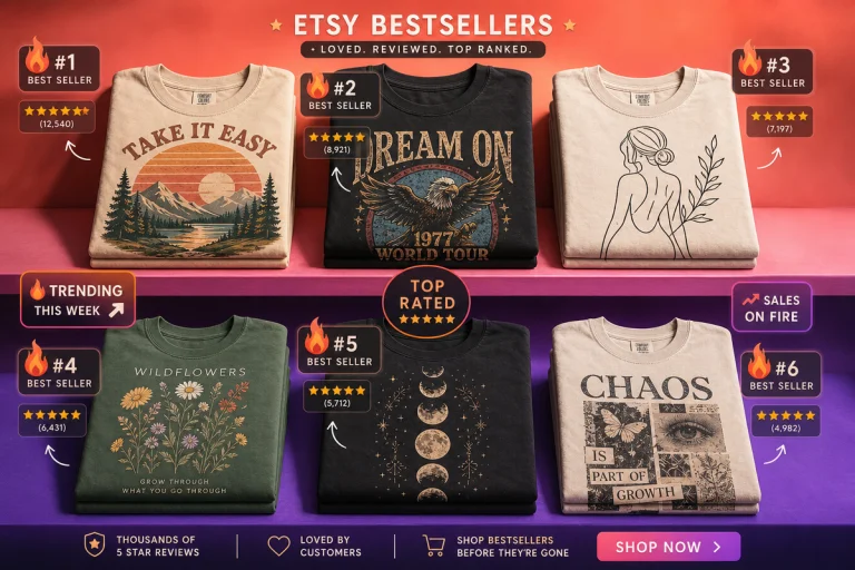
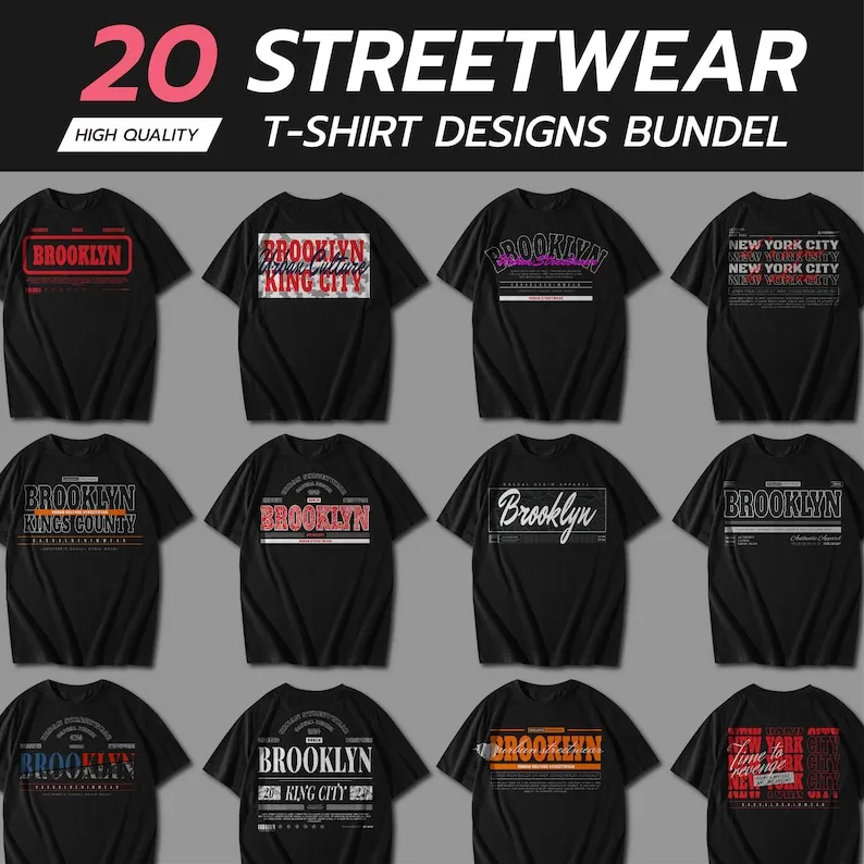
\nImage: Etsy seller listing (urban typography streetwear bundle)
\n
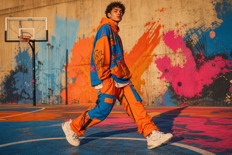
Walk into any independent streetwear pop-up right now and something catches the eye immediately: the typography is doing work. Condensed block letters stacked so tight the words feel pressurised. Borough names set in the exact weight that appeared on the actual transit signage. Proclamations printed so large the chest becomes a billboard. The question worth asking is this – do you need a design degree, a studio retainer, and six months to build that kind of visual language? Or has something shifted in how indie labels actually execute it?
\n
The answer starts with a vector file on Etsy and ends on a heavyweight oversize cotton tee. Here’s the version we’d actually run with.
\n
What AI Typography Bundles Actually Give Streetwear Designers
\n
 \n
\n
\nImage: Etsy seller listing (urban typography streetwear bundle)
\n
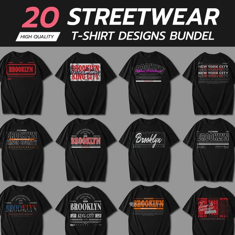
Professional scalability without professional overhead. A well-built urban typography pack in AI (Adobe Illustrator) and EPS formats hands you something no raster JPEG can match: artwork that scales to any dimension without degrading, colours that swap in seconds, letterforms that can be distorted, layered, reversed, or broken apart and rebuilt entirely.
\n
For print-on-demand, that matters at a technical level – print-ready files need clean bleed lines, controlled colour separation, and enough resolution to hold detail across a 4500×5400 pixel area. A vector source file handles all of that natively. A PNG lifted from a mood board does not.
\n
Think Heron Preston meets a Xerox machine on a New York fire escape. That texture – overlapping urban information, structured chaos – comes from editable vector architecture, not a locked image.
\n
Three Typography Directions That Are Actually Moving Product
\n
Most design bundles skimp on type. Illustrations get the craft, patterns get the polish, and the letterforms get a centred Helvetica drop-in and nothing else. A dedicated urban typography pack flips that hierarchy. Here’s what’s resonating right now, and our honest take on each.
\n
Brutalist condensed sans-serif. One word. One colour. Maximum point size. Vertical stack or full-bleed chest placement. Monochrome execution – washed black on off-white, or signal orange on black. This is the direction that screenprints best: two colours, zero gradients, nothing that complicates a spot-colour separation. TRUSS archive and the harder end of the independent London scene have been holding this note for two seasons [citation needed]. It isn’t softening.
\n
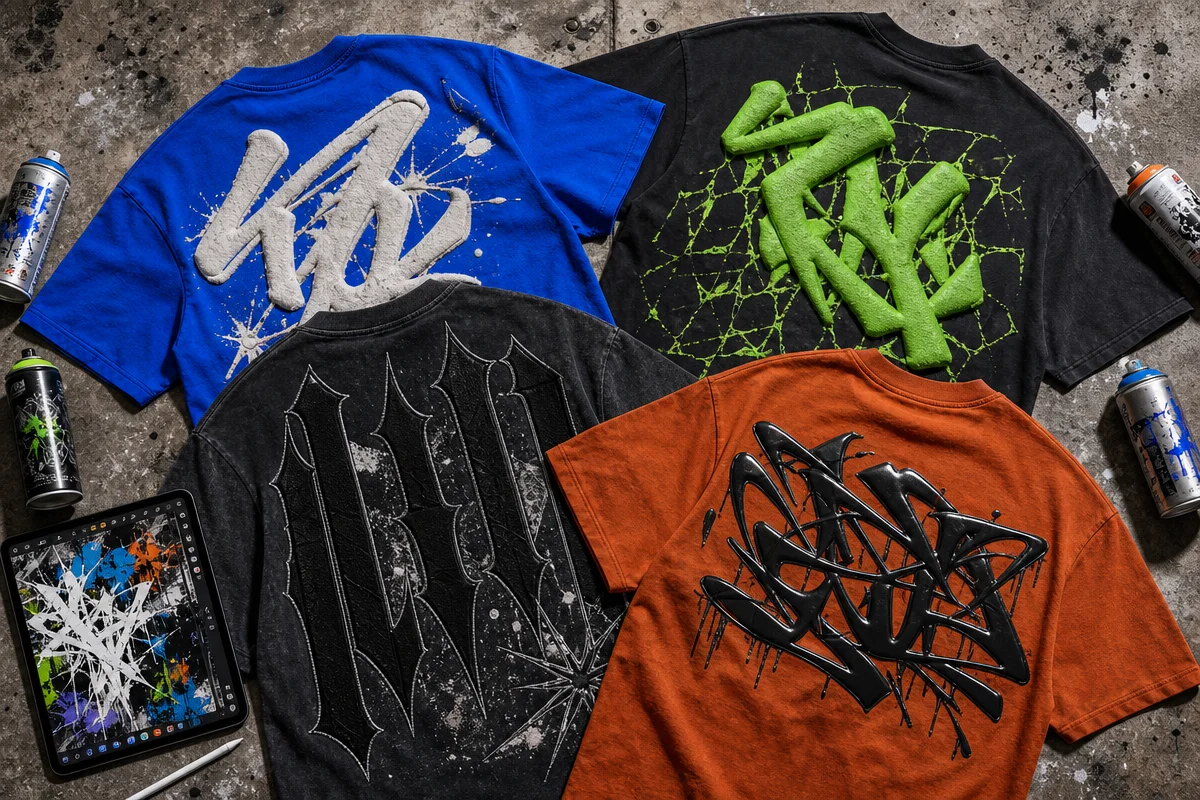
Archive distressed serif. Type that reads like it’s survived a screenprint, a wash cycle, and thirty years of storage. Cracked ink edges, uneven weight distribution, the kind of letterform that implies a backstory. The Comfort colours acid-wash market has created a perfect base for this – a garment already carrying age signals pairs naturally with type that carries the same grammar. Run this as DTG on a vintage-dyed tee and the two textures read as one intentional decision. Colour call: charcoal base, aged parchment type, nothing brighter.
\n
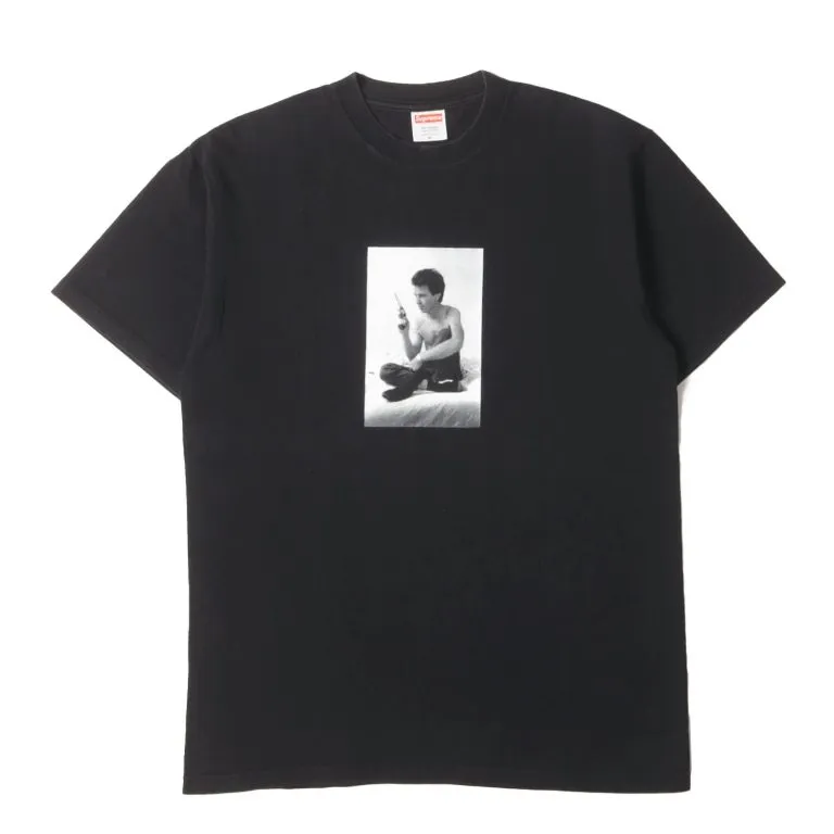
City-language graphic. Street sign references, transit grid layouts, borough names set in the actual municipal typeface. This is Supreme’s box-logo logic applied to civic infrastructure – text as location badge, as scene membership card. Works best on a heavier oversized cut where the composition has room to breathe across the chest and wrap slightly toward the side seam. Layer two or three type styles at different weights and let the overlap be intentional rather than accidental.
\n
The cultural current underneath all three is identical to what powered streetwear in the early 1990s: text as identity signal. The production pipeline is different. The top 10 streetwear brands everyone should know in 2026 are setting visual benchmarks that independent sellers are increasingly expected to match, and the vector pack is one of the few tools that closes that gap affordably.
\n
Placement, Silhouette, and Print Method – The Decisions That Actually Matter
\n
Typography direction and garment silhouette aren’t separate decisions. Brutalist condensed type on a fitted ribbed crew reads aggressive and intentional – good. That same composition scaled onto a boxy heavyweight tee risks losing its tension; pull it tighter, raise the placement to the upper chest, and let the negative space do the framing work.
\n
The archive serif direction belongs on a relaxed, mid-weight garment – a 6.5oz or heavier Comfort colours blank, pre-washed, with some drape. Oversized but not swimming. Chest placement for the main text, with a smaller secondary element at the hem or sleeve if the vector pack includes component pieces.
\n
City-language graphics need real estate. A 240gsm oversized cut, dropped shoulders, longer body length. Full-chest composition that extends edge to edge. This is DTG territory when the design uses multiple overlapping elements – screenprint gets expensive fast when you’re managing three or four spot colours across a large print area. DTG on a pre-washed heavyweight cotton holds the detail and keeps the cost per unit manageable at lower run sizes.
\n
Palette call across all three directions: washed black base, off-white or aged parchment type, one accent from the safety register – signal orange, caution yellow, emergency red. High contrast. Zero gradients. Nothing that complicates the production method you’ve chosen.
\n
The One Licence Detail You Actually Need to Check
\n
Commercial licensing needs to explicitly permit selling on physical products – not just “free for commercial use,” which is a vague claim that can unravel the moment a shop starts generating revenue. Read the licence documentation as carefully as the design previews. A clean, explicit commercial licence on a high-quality vector pack protects a seller when the shop converts. Ambiguous terms don’t.
\n
This connects to where AI-assisted design is heading – a trajectory our piece on top 20 graphic design trends for 2026 maps in detail, and one that intersects with how AI-assisted art direction is changing fashion visuals at a production level too.
\n
What We’d Actually Drop Right Now
\n
One condensed sans-serif text tee. Black 240gsm boxy cut – something in the Gildan Softstyle Heavy or Stanley Stella ROCKER range. Off-white ink, full-chest, single word printed at maximum scale. Spot-colour screenprint if the run justifies it; DTG if you’re testing quantities below fifty units [citation needed]. Keep the back clean.
\n
One archive serif piece on a Comfort colours 1717 or similar acid-wash blank – charcoal or pepper colourway. Distressed type across the chest, slightly off-centre. DTG to preserve the cracked-ink texture. No sleeve hit, no back print. Let the garment carry half the visual weight.
\n
One city-language oversized graphic – heaviest blank in your range, DTG, full-chest composition. This is the piece that photographs well flat-lay and shows the vector pack working at full complexity. Three type styles, two weights, intentional layering. The complexity is the point.
\n
The barrier to a professional drop has dropped significantly. The question is no longer whether an indie designer can build this – it’s whether the files they’re building from are print-ready, licenced cleanly, and matched to a silhouette that actually does the typography justice.
\n
Source: https://www.etsy.com/listing/1635405196/urban-typography-t-shirt-designs
\n
This article was researched and written with AI assistance, then reviewed for accuracy and quality. Maya at Its.That. uses AI tools to help produce content faster while maintaining editorial standards.
\n