


\n
 \n
\n
\nImage: Numéro / Balenciaga press image
\n
Scroll Instagram right now and you’ll see it everywhere: canvas duck fabric, reinforced seams, triple-stitched logos – draped over runway silhouettes that cost more than your rent. The workwear aesthetic is not just surviving in 2026, it’s running the conversation. And the reason it hits different this season is because the labels doing it best are not copying each other. They’re colliding.
\n
The streetwear collaborations 2026 has delivered are not the lazy logo-swap cash-grabs we’ve grown tired of. According to Numéro’s round-up by Louise Menard and Nathan Merchadier, the collabs that still excite are the ones that actually surprise. Sacai x Carhartt WIP is the clearest proof of that – and for anyone building print-on-demand designs with a pulse, this capsule is required study.
\n
What the Sacai x Carhartt WIP Capsule Is Really Telling Us About Streetwear Collaborations 2026
\n
\n
\nImage: Numéro / Balenciaga press image
\n
Luxury wants working-class credibility. Workwear wants elegance. The Sacai x Carhartt WIP Spring/Summer 2026 capsule – shot by Tim Elkaim – fuses Chitose Abe’s signature deconstructed layering with Carhartt’s raw utilitarian DNA. Pleated tailoring meets canvas duck. Asymmetric hems cut from the same cloth as a Detroit construction site. It reads like a genuine language merge, not cosplay.
\n
Carhartt has been making work clothes since 1889 – family-owned, Michigan-rooted, and carrying the kind of heritage that luxury houses can’t manufacture. The 2023 Marni collab set the template; the Sacai link-up is the natural next chapter. The design language being built across these pairings is becoming its own genre: post-utility luxury, where function and cost exist on the same garment without irony.
\n
On resale and in feeds, the response is telling. The pieces moving fastest are not the tailored hybrids – they’re the tees and outerwear that carry Carhartt’s original garment-tag typography redrawn in Sacai’s proportions. That’s the signal. Condensed grotesque fonts are only the start of the typography story here; what’s actually resonating is stencil-style block lettering that references industrial signage – the kind of type you’d find on the side of a shipping container or stitched into the collar of a workwear jacket. Raw, functional, completely devoid of flourish. Pair that with the colour palette from this capsule – raw canvas, dried clay, cold black, a trace of faded olive – and you have a design system that feels earned rather than assembled.
\n
The Wider Pattern – When Totally Different Worlds Merge Better Than Expected
\n
KidSuper and Mercedes-Benz closed their extended partnership with a runway show at Nu Stadium in Miami on 25 June, timed to Mercedes-Benz’s 140th anniversary and World Cup energy. Colm Dillane designed exclusive looks for the seven World Cup-winning nations – Brazil, Uruguay, Germany, Argentina, France, England, Spain – landing in stores this autumn. What made the show land was the staging: children in actual football kits walking alongside models in the final procession, collapsing the distance between replica kit culture and runway fashion completely. The collection draws directly from early 2000s football graphic language – the era of oversized squad numbers, embroidered federation crests, and polyester-print nation badges that every kid had on their bedroom wall. Dillane reinterprets that archive rather than replicas it, which is exactly the distinction that separates good bootleg-adjacent design from actual bootlegging.
\n
Artist JR partnered with Parisian outdoor retailer Le Vieux Campeur on a capsule drawn from his Pont-Neuf installation. T-shirts, sweatshirts, K-Ways, caps, bandanas – urban exploration kit filtered through monumental public art. The aesthetic is photographic contrast print meets expedition utility. Art-documentary imagery on streetwear is having a serious moment, and it’s no longer ironic – it’s showing up on grailed listings and in editorial flatlay feeds with the same frequency as legacy streetwear archive pieces.
\n
Gabriela Hearst and Paul Smith took a quieter route – a capsule incorporating nature photographs taken by Paul Smith’s father in the 1950s and 1960s. Archival imagery on garments carries a different kind of weight than contemporary photography: the grain, the faded tones, the sense that the image survived something. On tees, it creates an instant patina that no filter can fully replicate.
\n
What Most People Are Missing in the Luxury-Meets-Workwear Shift
\n
Here’s the nuance most trend roundups skip: the Manolo Blahnik x Balenciaga collab tells you everything about where fashion’s centre of gravity is moving. Creative director Pierpaolo Piccioli’s post-Demna pivot pulls completely away from exaggerated proportions toward couture cocktail shoes – heeled mules and slingbacks in silk-satin with hand-embroidered crystal leaf ornaments from archival Manolo Blahnik designs. That is the opposite direction to workwear. And yet it is part of the same story.
\n
2026 is not about one aesthetic winning. It’s about design logic winning – the collabs that cut through are the ones where there’s a real reason two worlds are meeting, something you can feel in the garment rather than just read in the press release. The work is not in the announcement. It’s in whether the output makes sense when it’s actually on a body.
\n
Three Tee Directions Worth Building Now
\n
Every one of these collabs points toward a concrete design language. Here’s how we’re thinking about each of them.
\n
Utility label type, Sacai x Carhartt WIP. Think stencil-cut block lettering in off-white on raw canvas or faded black – the kind of type that reads like a product spec, not a brand name. Secondary text in a smaller condensed grotesque, mimicking the care-instruction label or the garment-code stamp. Distressed screenprint finish that suggests the tee has been through something. Palette: canvas, clay, black, worn olive. No gradients, no glow, nothing that couldn’t have been printed with two screens in 1994.
\n
Bootleg crest systems, KidSuper x Mercedes-Benz. The early-2000s football graphic archive is wide open and mostly underworked on POD. Squad numbers in the oversized serif typefaces used by federation kits of that era – the ones with the slight italic lean and the thick stroke weight. Deconstructed crests reduced to their geometric core: a shield outline, a star count, a colour band. Run it on heavyweight white tees or in a washed-out blue and red colourway that nods to international kit culture without directly lifting any specific badge. What’s selling on resale right now in this lane is the treatment that feels plausibly official without being traceable to any real federation.
\n
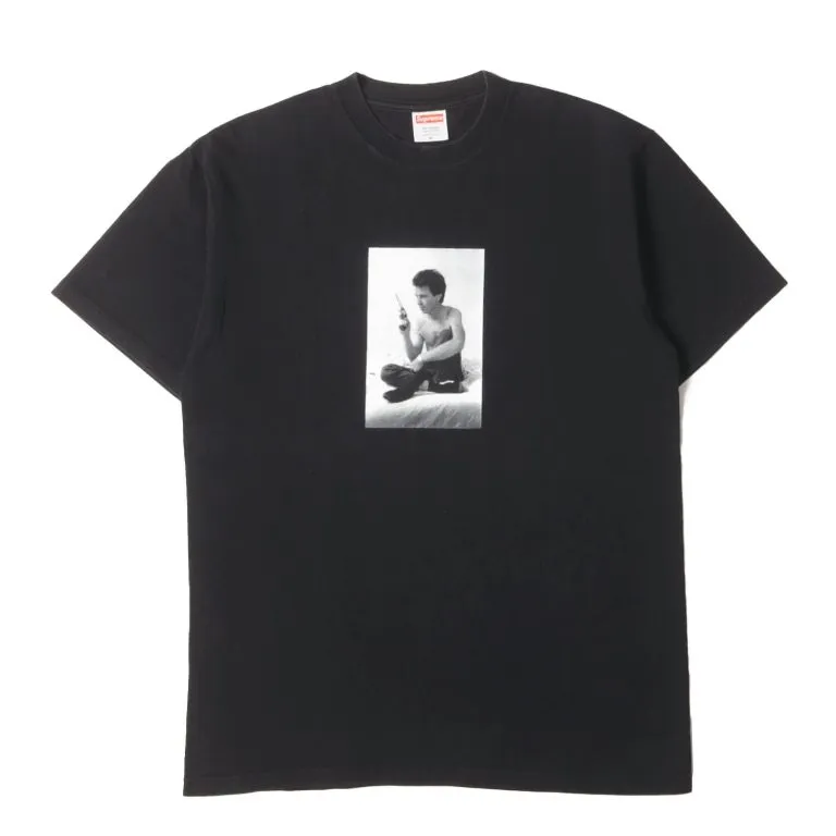
Grainy archival photo-type, JR or Paul Smith. High-contrast monochrome photograph – something with visible film grain and a slightly blown-out sky – printed across the chest, with a single line of utilitarian sans-serif type running along the bottom hem or across the image like a caption. The type should feel like it belongs to the photograph’s era, not designed on top of it. Buff or off-white tee ground rather than stark white, which brings the image temperature down and makes the whole thing read like a found artefact rather than a graphic tee.
\n
Three collabs, three distinct moods – but they’re all pointing at the same underlying shift. In 2026, the tees that earn a second look are the ones that look like they came from somewhere real.
\n
\n
Source: https://numero.com/en/fashion/fashion-collaborations-2026/
\n
This article was researched and written with AI assistance, then reviewed for accuracy and quality. Maya at Its.That. uses AI tools to help produce content faster while maintaining editorial standards.
\n