

\n
Last updated: July 21, 2026
\n
 \n
\n
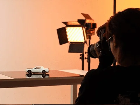
\nImage: GVM Official Site (gvmled.com)
\n
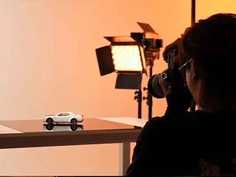
Picture a perfume bottle on a white surface. One light warms the glass from the left – amber, golden, almost honeyed. The background holds a cool, clinical blue. The bottle does not look placed. It looks desired. Nothing in that image happened by accident. The camera is incidental. What made the shot was a deliberate decision about colour temperature – warm key against cool background – and understanding precisely why that contrast manufactures feeling.
\n
That single variable separates professional images from amateur ones more reliably than any lens upgrade ever will. We are going to use this perfume bottle as our guide, and by the end of the piece we will know how to recreate that mood, adjust it, and apply the same logic to any subject in any space.
\n
What Photography Lighting Colour Temperature Actually Does
\n
 \n
\n
\nImage: GVM Official Site (gvmled.com)
\n
Colour temperature is measured in Kelvin (K) and describes the warmth or coolness of a light source. It is counterintuitive at first: lower numbers are warmer. A tungsten bulb sits around 3200K – orange, intimate, the light of late evenings and old photographs. Daylight near 5200K-5600K reads as neutral, faithful to how we perceive the world on a clear afternoon. Push above 6000K into the range of overcast skies and certain LED panels, and the light becomes cool, even cold – blue-edged and precise.
\n
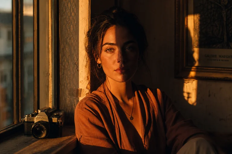
The myth worth correcting immediately is that warm always flatters and cool always alienates. Neither is true. The Dutch Golden Age painters – Rembrandt, Vermeer, de Hooch – understood this better than almost anyone who has followed them. They used warm candlelight as a key precisely because the surrounding shadow went cool and dark, and that contrast made their subjects glow. Wong Kar-wai built entire films around the same principle: warm sodium lamps against cool neon, intimacy pressed against alienation. Film noir did the same thing in monochrome. The contrast is the meaning.
\n
For our perfume bottle: the key at 3200K makes the glass look precious, liquid, almost edible. The background panel cooled to 6500K pushes it further back and sharpens the product’s silhouette against it. One light warms; one light separates. Together they manufacture desire.
\n
The Warm-Cool Contrast – Why It Works
\n
Colour theory calls this simultaneous contrast – our eyes amplify the difference between adjacent colours, making warm tones appear warmer and cool tones appear cooler when placed alongside each other. It is the same visual principle at work in a Turner seascape, where the orange boat sits against a blue-grey sky and seems almost to vibrate.
\n
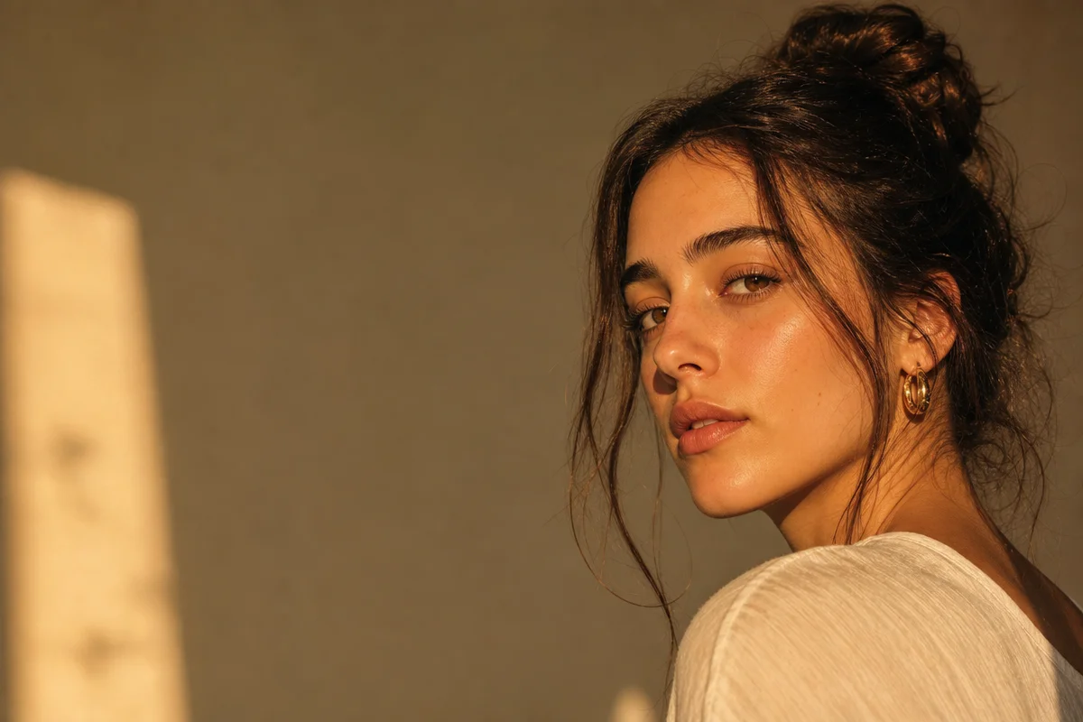
In photography, we can think in terms of a split between the emotional registers each temperature occupies. Warm light (3000K-4500K) reads as intimate, sensual, nostalgic. It suits leather, skin, aged wood, anything that benefits from a sense of richness or time. Cool light (5500K-7000K) reads as clinical, modern, precise. It suits skincare products that signal purity, steel surfaces, glass architecture. A 6500K panel on a moisturiser does not feel cold – it feels scientific. That is the correct emotion for the product.
\n
Neither is better. Both are decisions.
\n
For portrait work, Natural light portrait photography – Canon UK offers a useful grounding in natural daylight near 5500K as a neutral benchmark – the reference point from which we calibrate everything else. Starting from neutral and shifting deliberately in one direction is almost always more controlled than reaching for warmth or coolness without a baseline.
\n
Choosing Your Light Source
\n
Continuous LED panels have become the default for most content creators and small studio work, and the reason is practical: we see the result in real time. There is no test firing, no interpretation between flash and monitor. What the eye reads during the shoot is what the camera records.
\n
The particular advantage of a bi-colour LED panel is adjustable colour temperature. Rather than reaching for coloured gels to modify a fixed light source, we dial the Kelvin value directly on the unit. This transforms how we work in mixed-light environments. If a window is contributing 5600K daylight from one side, we match the fill panel to the same value and the room becomes cohesive. If we want the warm-cool split from the perfume bottle example, we set the key to 3200K and the background panel to 6500K, and the contrast is instant and controllable.
\n
Speedlights and studio strobes still have their place – for high-power freeze-motion work, outdoor shoots, or situations where power draw matters. But as a starting point for building a controlled colour temperature workflow, continuous LED removes an entire layer of technical uncertainty.
\n
A Practical Sequence: From Subject to Final Image
\n
Here is the sequence we follow, using our perfume bottle as the example. Apply the same steps to any product, portrait, or still-life subject.
\n
Step one: choose the subject and decide the mood. Before touching a light, we ask: should this feel warm or cool? Precious or precise? For a perfume bottle suggesting luxury, we want warmth in the subject and cool separation in the background.
\n
Step two: set the key and background colour temperatures. The key light – positioned at roughly 45 degrees to the subject, slightly above eye level – goes to 3200K. The background panel or second light goes to 6500K or higher. If we only have one light, we can approximate the cool background with a piece of blue card or a practical daylight window behind the set.
\n
Step three: place the key at 45 degrees. This is not an arbitrary angle. Light from directly in front flattens a subject by eliminating side-shadows; light from the side creates dimension and texture. 45 degrees is the classic portrait position – close enough to fill the face, angled enough to reveal form. For a product, the same rule applies: we want the light to reveal the object’s surfaces, not simply illuminate them.
\n
Step four: set white balance on the camera or phone. This step confuses more beginners than any other, because it is easy to assume the camera will handle it automatically. Auto white balance (AWB) will try to neutralise whatever colour cast it sees – which means it may partially cancel the warm-cool contrast we have deliberately built. We set white balance manually instead.
\n
On a camera with manual controls, navigate to the white balance menu and set a custom Kelvin value. Set it to match the key light – in our case, 3200K. The key subject will now read as neutral-to-warm, while the cool background will read as distinctly blue. On a phone, most camera apps have a white balance or “colour temperature” slider in manual or pro mode; some require a third-party app like Halide or Camera+ to access it. Lock the value, then expose. If we leave AWB engaged, the camera will average the warm and cool tones and produce a muddy compromise.
\n
Step five: expose on camera or phone. With the white balance locked and the lights in position, expose for the subject. In a controlled studio environment this is rarely complicated – the subject is stationary, the lights are constant. Use manual exposure if available, or tap-to-expose directly on the subject in a phone camera app. The background may clip slightly brighter or darker than the subject; this is desirable. The eye should read the product first.
\n
Step six: shape the mood in editing. Even a precisely set white balance leaves room for refinement. In Lightroom, Capture One, or any RAW editor, we reach for the temperature and tint sliders first – small pushes of 100K-200K warm or cool make perceptible differences at this stage. We can also use the HSL panel to shift the specific hue of the background independently of the subject. A graduated filter cooled towards the background and warmed towards the subject replicates the intentional warm-cool split in editing if we did not fully achieve it in camera. Top 10 Product Photography Tools for E-Commerce Growth 2026 covers the editing software end of this in more detail.
\n
Building a First Home Setup
\n
A functional home studio does not require significant space or cost. The classic three-light logic – key, fill, and hair/separation light – applies to almost every shoot, but we can achieve excellent results with two lights and a reflector.
\n
For product work: a bi-colour COB key light with a 24-inch softbox, a white reflector bouncing fill from the opposite side, and blackout curtains managing any window spill. This covers the vast majority of small-product work at a total investment under £500. The subject does not move, so we have time to refine before we ever touch the shutter.
\n
For portraits on the same budget: the key light positioned at 45 degrees, a fill panel or reflector at a lower output ratio on the shadow side, and a separation light behind the subject to lift them off the background. The fill should be 2-3 stops below the key – enough to open shadows without flattening the light.
\n
One thing to avoid regardless of budget: the built-in pop-up flash. Its position directly on the lens axis produces flat lighting with no side-shadows to reveal form, hard shadows falling directly behind the subject, and the occasional red-eye. It has no role in a deliberate colour temperature workflow. Treat it as a last-resort safety net, not a tool.
\n
For those extending the workflow into AI-assisted post-production, Z-Image Turbo ComfyUI offers relight capabilities in post that can augment rather than replace a considered in-camera approach.
\n
Return to the perfume bottle. The amber at 3200K pulls warmth into the glass. The background panel at 6500K makes the product read sharper by contrast. White balance locked to the key so the warmth registers correctly. Exposed on the bottle, not the background. A small push warmer in editing to deepen the amber. The composition did not manufacture that mood. The colour temperature did – step by step, decision by decision.
\n
Learn to read light in Kelvin and we stop chasing shots. We start building them.
\n
Frequently Asked Questions
\n
Q: What is photography lighting colour temperature?\nA: Colour temperature describes how warm or cool a light source appears, measured in Kelvin. Lower values (around 3200K) produce warm orange tones associated with tungsten bulbs; higher values (6000K and above) produce cool, blue-tinged light. Daylight sits around 5200K-5600K and serves as the neutral reference point [citation needed].
\n
Q: What colour temperature is best for portrait photography?\nA: There is no single best value – it depends on mood. Warm light between 3000K and 4500K creates an intimate, flattering feel. Cooler light near 5500K-6000K produces a clean, editorial look. Many portrait photographers use a daylight-balanced key light and introduce warmth selectively during editing to keep the result controllable.
\n
Q: Why should I set white balance manually rather than use auto?\nA: Auto white balance attempts to neutralise colour casts in the scene. When we have deliberately built a warm-cool contrast – a warm key, a cool background – AWB will average the two and partially cancel the effect we intended. Setting a manual Kelvin value matched to the key light preserves the contrast we built. On phones, the manual or pro mode slider is the equivalent control.
\n
Q: Do I need colour-correction gels if I use an LED panel?\nA: Not if the panel is bi-colour. Bi-colour LED lights allow us to adjust colour temperature directly on the unit, eliminating the need to swap physical gels when matching ambient light sources or shifting mood between shots. Fixed-colour panels still benefit from gels for colour correction.
\n
Q: What is a good beginner lighting kit for colour temperature control?\nA: A two-light kit under £500 is sufficient for most early work – a bi-colour COB key light and a fill panel. Blackout curtains to control window spill and a white reflector to bounce fill complete a functional home studio setup without significant additional cost.
\n
Q: Why does built-in flash make photos look flat?\nA: Pop-up flash sits directly on the lens axis, which means light hits the subject straight-on. This eliminates the side-shadows that create dimension and texture, and produces hard shadows directly behind the subject. An off-camera light or continuous LED panel at 45 degrees will produce noticeably more dimensional results.
\n
Source: https://gvmled.com/types-of-photography-lighting-2026-guide/
\n
This article was researched and written with AI assistance, then reviewed for accuracy and quality. Talulah at Its.That. uses AI tools to help produce content faster while maintaining editorial standards.
\n