


\n
Last updated: June 23, 2026
\n
The skill is for fresh articles from briefs. Here, the task is a guided expansion with specific instructions – I’ll proceed directly.
\n
\n
 \n
\n
\nImage: Markus Hagner Photography
\n
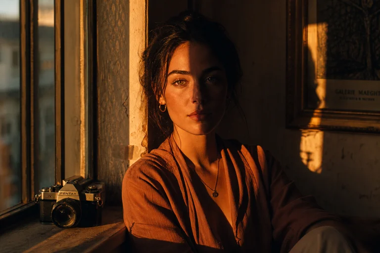
Picture this: a portrait taken at golden hour, the subject’s face caught between warm amber light and cool shadow. On screen, the raw file looks flat – technically correct, emotionally inert. Then we apply a single file, a few kilobytes of numerical data, and the image transforms. The highlights shift to cream. The shadows cool to deep teal. Suddenly the photograph feels like a frame from a Terrence Malick film.
\n
That transformation comes courtesy of colour lookup tables photography – specifically, the LUT file format that has quietly become the workhorse of professional colour grading. Used by colourists on feature films, music videos, and editorial shoots, LUTs are now accessible to anyone with Photoshop and an eye for craft. The question worth asking: are they a shortcut to mediocrity, or a precision instrument that frees us to think more creatively?
\n
Shooting for Grading Latitude Before You Open Photoshop
\n
\n
\nImage: Markus Hagner Photography
\n
The most important decision in a LUT-based workflow happens before any editing software opens. How we capture the image determines how much room we have to grade it.
\n
Always shoot in RAW. A JPEG discards the colour data that LUTs rely on – compressed tonal information produces banding and false colour under any significant transformation. RAW preserves the full dynamic range of the sensor, which is what gives a LUT its raw material to work with.
\n
Expose to the right of the histogram without clipping the highlights. Overexposed highlights are unrecoverable; slightly bright shadows pull back cleanly in Camera Raw. If your camera offers a flat or log-style picture profile – Canon’s C-Log, Sony’s S-Log, Fujifilm’s F-Log – these are worth using if you plan to apply cinematic LUTs, since many LUTs designed for professional use assume a wide-tonal-range source.
\n
White balance choice at capture is equally decisive. An amber-teal grade – the palette that has dominated editorial and commercial photography for a decade, borrowed directly from Hollywood’s digital intermediate suites – is built around a neutrally or warmly balanced source. It works by pushing existing warmth in the midtones toward amber, and existing coolness in the shadows toward teal. If the base image is already cold, the shadows become blue-green rather than teal, and the skin tones turn grey. Shoot in shade with Auto White Balance, or manually dial in a slightly warm Kelvin value – 5500-5800K is a dependable starting point for a neutral-warm foundation.
\n
Outdoors at golden hour, the light does half the work for us. That amber quality is already present in the practical illumination; the LUT’s job is simply to commit it and deepen it. In flatter light, a simple warm reflector or a second light source draped with CTO gel can introduce the tonal separation that the grade needs to read correctly.
\n
What colour Lookup Tables Actually Do
\n
A colour lookup table is, at its core, a file containing numerical values that map input colour data to different output colours. Think of it as a translation dictionary for your image – every input shade of red, green, or blue has a corresponding output value, and the LUT applies that translation consistently across every pixel in the photograph.
\n
There are two fundamental types. A 1D LUT adjusts each colour channel independently: it can lift exposure, increase contrast, or shift the overall colour balance, but it treats red, green, and blue in isolation. A 3D LUT – the kind we use for filmic grades – considers how those channels relate to each other within a three-dimensional colour space. This is what allows for complex transformations: a 3D LUT can simultaneously warm a midtone, cool a shadow, and shift a specific hue without touching the rest of the image. It is the difference between a simple equaliser and a full mixing desk.
\n
The amber-teal palette works on skin because amber sits on the complementary arc of the colour wheel from blue-teal. The contrast reads as natural rather than artificial – our eyes are trained to see warm faces against cool environments. It is the same logic that William Eggleston applied in his dye-transfer prints from the 1970s: saturation only lands when there is something quiet for it to push against. And before digital grading existed, photographers like Saul Leiter built entire bodies of colour work around exactly this interplay – warm foreground figures against cool, desaturated backgrounds.
\n
The .CUBE format is the industry standard for LUT files, supported natively by Photoshop and Lightroom as well as Capture One and DaVinci Resolve. You may also encounter .3DL files or .LOOK files within specific ecosystems, but .CUBE offers the broadest compatibility and is the format to seek out when sourcing or sharing LUTs.
\n
How to Apply colour Lookup Tables in Photoshop
\n
The correct Photoshop workflow follows five distinct steps, and the order matters as much as the technique itself.
\n
Step one: base colour correction. Before touching a LUT, correct the raw file first. Adjust white balance, exposure, and shadow detail in Camera Raw or Lightroom. A LUT is a transformation layer – it amplifies whatever sits beneath it, so a poorly balanced image will produce a poorly balanced grade.
\n
Step two: open a colour Lookup adjustment layer. In Photoshop, navigate to Layer > New Adjustment Layer > colour Lookup. This is the dedicated LUT engine inside Photoshop, and it gives us the non-destructive control we need.
\n
Step three: load the LUT file. In the Properties panel, click the dropdown next to “3DLUT File” and select “Load 3D LUT”. Navigate to your .CUBE file and open it. The grade applies immediately.
\n
Step four: adjust intensity via opacity. The adjustment layer’s opacity slider is the most important control available. Full-strength LUT application is rarely correct – professional colourists typically blend LUTs at 60-80% opacity to preserve natural skin tones while retaining the stylistic intent of the grade. Pulling opacity to 70% on an amber-teal LUT usually preserves the warmth in the midtones while preventing the shadows from going so green that they read as sickly rather than atmospheric.
\n
Step five: fine-tune with layer masks. This is where colour grading becomes craft rather than automation. Paint a mask onto the adjustment layer using a soft brush at 20-30% flow. Reduce the LUT’s effect on faces – skin tones can tolerate the amber push in the midtones, but tend to fall apart if the shadow cooling is too aggressive, producing a greyish or olive cast in the darker areas of the face. Treat fabrics differently: a white shirt can absorb the full grade, letting it pick up the cream-and-teal tonal palette that gives the image its filmic cohesion. Backgrounds and skies can often take a heavier application than anything in the foreground, deepening the atmospheric separation.
\n
One additional step worth making a habit: convert the base layer to a Smart Object before beginning. This preserves the original pixel data and allows non-destructive re-editing at any stage.
\n
For photographers interested in how similar colour transformation principles apply to motion work, The Secrets to High-End Motion Design in After Effects – SonduckFilm is worth reading alongside this guide – the vocabulary of colour grading translates directly between stills and video.
\n
The Nuances Most Photographers Miss
\n
LUTs save time and enforce consistency across a series – but they conceal several traps that separate a polished grade from a muddy one.
\n
Colour space mismatch is the most common technical error. A LUT designed for log footage will produce deeply incorrect results when applied to a standard JPEG or an sRGB-profile RAW export. Always verify that the LUT was designed for your image’s colour profile. Many free LUT packs online do not clearly state this requirement, which is why understanding your camera’s colour profile is essential before building any LUT-based workflow.
\n
White balance errors compound dramatically. A slight warm cast in the base image will be exaggerated by most cinematic LUTs, which are designed around neutral-toned source material. Fix white balance before applying the LUT, not after.
\n
Blending multiple LUTs is a technique that separates generic grades from distinctive looks. Apply a primary LUT at 50% opacity to establish the tonal foundation – the contrast curve, the shadow lift – then stack a secondary LUT at 20-30% to introduce a subtle hue shift. This layering approach is how professional colourists build proprietary looks that feel original rather than templated.
\n
The broader principle here echoes across all serious editing work. Whether following a Master Professional Photo Editing: 2026 Guide methodology or developing an intuitive eye from shooting on a phone – and 5 Mobile photography tips that can instantly improve your camera skills demonstrates that device does not determine quality – the underlying logic is consistent: understand the tool deeply enough to bend it to your vision, rather than letting it bend your vision to its defaults.
\n
LUTs have their origins in the film industry’s need to preview and communicate colour intent across departments – a director of photography and a colourist in different cities could view the same intended “look” before a single frame was graded. That collaborative precision is now available at every level of photographic practice.
\n
Return to the portrait we opened with – the flat raw file, technically correct and emotionally inert. Colour lookup tables photography is not about applying a preset and calling it done. It is about understanding that a LUT is a starting point: a translation that establishes a tonal language, which we then refine, blend, and selectively apply until the image says what we actually want it to say. The transformation is real. The craft lies in knowing when to pull back.
\n
\n
Frequently Asked Questions
\n
Q: What is a colour lookup table in photography?\nA: A colour lookup table (LUT) is a file containing numerical values that remap input colours to output colours, applying a consistent colour transformation across a photograph. In photography, LUTs are used to achieve filmic colour grades by mapping standard image colours to cinematic tonal palettes.
\n
Q: What is the difference between a 1D LUT and a 3D LUT?\nA: A 1D LUT adjusts each colour channel (red, green, blue) independently, making it suitable for basic exposure and contrast changes. A 3D LUT considers how all three channels interact across a three-dimensional colour space, enabling complex transformations like hue shifts and cinematic shadow toning – making it the standard for creative colour grading.
\n
Q: What LUT format should I use in Photoshop?\nA: The .CUBE format is the most widely supported and works in Photoshop, Lightroom, Capture One, and DaVinci Resolve. It is the safest choice for most workflows.
\n
Q: Do I need to colour correct before applying a LUT?\nA: Yes – always correct white balance, exposure, and shadow detail before applying a LUT. A LUT amplifies whatever is underneath it, so colour issues in the base image will become more pronounced, not less, after the LUT is applied.
\n
Q: How do I control the strength of a LUT in Photoshop?\nA: Reduce the opacity of the colour Lookup adjustment layer. Professional colourists typically blend LUTs at 60-80% opacity to retain natural skin tones while keeping the stylistic intent of the grade. Layer masks can also be painted to protect specific areas – particularly faces and delicate fabric tones – from the full effect.
\n
Q: What camera settings should I use before applying a LUT?\nA: Shoot in RAW, expose to the right without clipping highlights, and set white balance to a neutral or slightly warm Kelvin value (5500-5800K works well). If your camera offers a flat or log picture profile, use it – the wider tonal range gives LUTs more data to work with and produces cleaner results.
\n
\n
This article was researched and written with AI assistance, then reviewed for accuracy and quality. Talulah at Its.That. uses AI tools to help produce content faster while maintaining editorial standards.
\n