



\n
Last updated: July 17, 2026
\n
 \n
\n
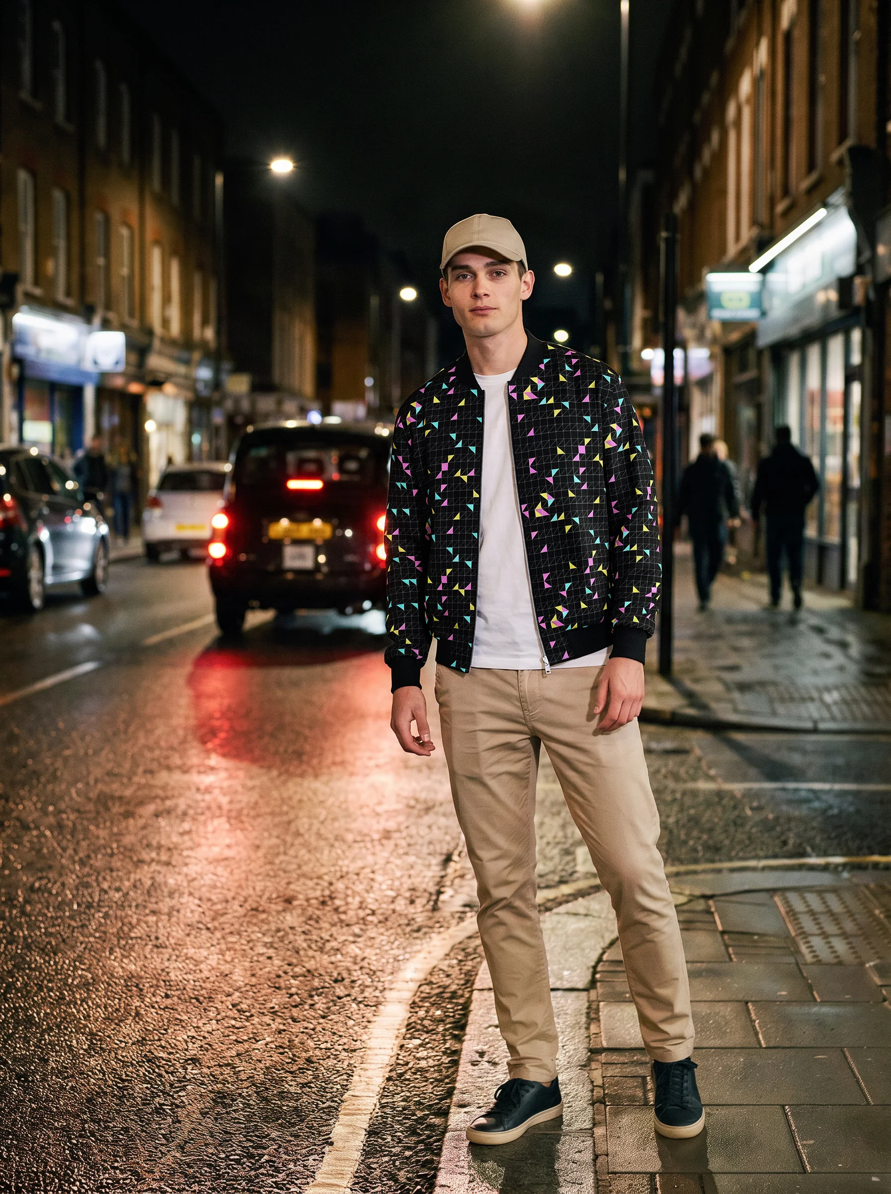
\nImage: TensorPix
\n
Picture this: a portrait shot on a grey afternoon. The subject sits near a window, light falling across one cheekbone, the opposite side dropping into shadow. The raw file is competent – well-exposed, neutral. Now we take that same image and press it through the visual logic of a 1970s Kodachrome slide. Shadows pool with amber. Skin tones go honeyed and warm. Grain settles into the midtones like dust on a summer road. Nothing about the subject has changed. Everything about how we feel looking at them has.
\n
That transformation – from competent capture to considered mood – is what AI image style transfer makes possible in 2026. And the craft question worth asking is not “how do I press the button?” but “how do we build a look worth pressing the button for?”
\n
This guide works through that from the beginning: what to think about before we shoot, how to choose a reference image with real artistic intention, and how to use TensorPix to apply and judge the result.
\n
What You Need Before We Begin
\n
\n
\nImage: TensorPix
\n
Three things: a photograph to transform (our content image), a reference image whose visual grammar we want to borrow (our style source), and access to TensorPix, which offers free weekly credits and requires no payment details to start. The tool runs entirely in-browser, so nothing needs installing.
\n
If you are working with product photography, it helps to complete basic retouching before applying any style. Our Product Photo Retouching: A Complete Guide for Beginners covers that foundation work.
\n
How Neural Style Transfer Actually Works
\n
Neural style transfer reads an image in two separate layers: content – the shapes, subjects, spatial relationships – and style – colour palette, texture, contrast ratio, tonal distribution. A convolutional neural network disentangles these layers independently, then rebuilds the content image using the visual grammar extracted from the reference. The subject is preserved. The atmosphere is borrowed.
\n
This approach traces its roots to a 2015 paper by Gatys, Ecker, and Bethge, which demonstrated that neural networks could separate artistic style from image content with surprising fidelity. Think of it as the difference between what a photograph shows and how it feels. Style transfer manipulates the second without touching the first.
\n
What matters for us practically is that the AI reads lighting character, colour temperature, and texture density from the reference. Which means the quality of what we give it – in both images – shapes everything that comes out.
\n
Shoot for the Style, Not the Rescue
\n
Before we open any editing tool, we need to think about what we want to carry through from capture. Neural style transfer enhances existing qualities; it does not fix poor foundations. A flat, harshly lit image processed through a painterly reference will read like a flat image with paint on top of it.
\n
Light direction is the first decision. Side lighting – a single window source raking across the subject from the left or right – creates the shadows and gradients that give style transfer something to work with. Rembrandt-style lighting, where the shadow side of the face catches a small triangle of light beneath the eye, produces the tonal depth that looks particularly strong through warm, filmic references. If you are shooting indoors with a phone, position your subject at roughly 45 degrees to the nearest window and turn off any overhead fills. The imperfect directional quality that results is exactly what the AI will read and amplify.
\n
Contrast in-camera matters. Dial back your phone’s processing aggressiveness if the settings allow, or shoot in the flattest picture profile your camera supports. We want tonal range preserved – highlight detail in the skin, shadow detail in the darker areas – so the style layer has room to work. A compressed, high-contrast JPEG leaves the AI less to recolour.
\n
Framing with intention. Negative space around the subject gives the AI room to carry the style’s mood into the background. Tight crops that fill the frame edge-to-edge tend to produce busier results when texture-heavy references are applied.
\n
A portable filming light is worth having if you shoot regularly indoors – the ability to set a single directional source at any angle regardless of available window light makes a meaningful difference to what comes out the other end.
\n
Choosing a Reference Image: Lighting Pattern, Palette, and Era
\n
This is where the creative direction begins. The reference image is not just a “look” – it carries an entire visual logic: the colour temperature of the light, the relationship between shadow density and highlight brightness, the texture of the grain or medium, the emotional weight of the palette.
\n
We find it useful to think in terms of three things when selecting a reference.
\n
Lighting pattern. Does the reference use hard, directional light that produces clean shadow edges – the kind you see in mid-century reportage work by photographers like Diane Arbus or the early fashion plates shot by Irving Penn? Or does it use diffuse, wrapping light that lifts shadows and flattens contrast, more typical of contemporary editorial work? The lighting pattern in the reference will be mapped onto our content image, so we want the two to share some underlying logic. A portrait shot in strong side light will take a hard-light reference convincingly. A portrait shot in soft, overcast conditions will fight it.
\n
Colour palette and temperature. Analogue film stocks each carried distinctive colour characteristics. Kodachrome pushed reds and yellows warm and slightly saturated. Fuji Velvia exaggerated greens and blues towards hyperrealism. Ilford HP5 pulled everything into a grained, high-contrast monochrome with long tonal gradation. When we use a film still or a scanned photograph from a specific era as our style reference, the AI extracts those colour tendencies and applies them. That means we can work with intention: warm analogue palettes for portraiture and lifestyle imagery, cooler, more clinical palettes for product work, desaturated and grainy references for documentary or street photography aesthetics.
\n
Era and movement. A reference pulled from 1970s cinema – the warm, slightly degraded look of a Robert Altman film or the muted earth tones of a Wim Wenders road picture – carries a mood that goes beyond just colour. The same is true of choosing a reference from 1990s grunge editorial photography, or from contemporary hypercolour fashion work. We are not reproducing a single image; we are borrowing the visual logic of an entire aesthetic tradition. The more we understand why a period or movement looked the way it did – what films were used, how scenes were lit, what the cultural mood was – the better our reference selections become.
\n
A reference image does not have to be a photograph. A painting works. An editorial spread works. Even a carefully selected frame from a film works, provided it carries the colour and lighting character we are after.
\n
Step 1: Upload Your Content Image
\n
Open TensorPix and upload the photograph we want to transform. Choose an image with clear subject definition, intentional light direction, and preserved tonal range across the highlights and shadows. The AI will have more to work with – and will produce more convincing results – when the base image already has the structural qualities that support the style we are applying.
\n
Step 2: Prompt and Upload the Style Reference
\n
Type a prompt such as “copy style from image 1 to image 2” and upload the reference image we have selected. TensorPix reads colour temperature, contrast, texture density, and tonal distribution from the reference and maps those qualities onto our content image.
\n
From here, we have three options: let the AI apply the style automatically, control intensity manually, or blend multiple references together. The blend option is particularly useful when the primary reference has strong graphic character – a heavily textured painting, or a very saturated colour palette – that we want to temper with a more neutral secondary source.
\n
Intensity is the most important control to understand. At full strength, style transfer is assertive – it will repaint the image aggressively, which can work with graphic, painterly references but often reads as over-processed with photographic ones. Dialling back to 60-70% usually produces results that feel considered rather than filtered: the content reads as photographed, the mood reads as constructed.
\n
For anyone following fashion photography trends in 2026, the intensity control becomes particularly relevant when working with the bold, saturated editorial palettes that characterise the current season – a little restraint goes a long way towards keeping skin tones credible.
\n
Step 3: Generate, Then Judge
\n
Hit generate. TensorPix outputs up to 4K resolution, which means results are print-ready and suitable for advertising placements. Before we commit to a result, we download and review at full size.
\n
Judging the output is a craft skill in itself. We are looking at three things: whether the tonal relationship between highlight and shadow still reads naturally on the subject’s face or form; whether the colour palette from the reference has been absorbed or merely applied (absorbed means it feels intrinsic, applied means it feels like a filter); and whether fine detail – hair, fabric texture, edge definition – has held up under the style mapping.
\n
If the result feels off, the cause is usually one of three things – which brings us to troubleshooting.
\n
Troubleshooting: Reading What Went Wrong
\n
The style overwhelms the subject. Reduce intensity. If the reference carries very strong graphic character – a Van Gogh, a Warhol, a heavily textured film still – the neural network may over-apply texture until faces become illegible. Blend with a more neutral secondary reference at lower intensity to moderate the effect.
\n
Output looks muddy or desaturated. Content and style images probably have conflicting colour temperatures. Convert the content image to a flat, neutral grade before upload, then let the style source recolour from that cleaner base. It gives the AI a less contested starting point.
\n
Fine details are lost. Upload at the highest resolution available. The AI preserves detail better when it has more pixel information to interpret. Upscaling after the fact rarely recovers what low-resolution input cost us.
\n
\n
From here, the most productive next move is building a reference library – a curated folder of images organised by era, lighting character, and palette, each tagged with notes on what it contributes. Cycle through references systematically on the same content image and compare the outputs side by side. Over time, we start to recognise which combinations feel coherent and which fight each other. That pattern recognition is where the creative control actually lives – not in the tool, but in the eye we bring to it.
\n
Frequently Asked Questions
\n
Q: Is TensorPix free to use for AI image style transfer?\nA: TensorPix replenishes free weekly credits at no cost and requires no credit card to start. Paid plans are available for higher-volume use.
\n
Q: What resolution can I export after applying style transfer?\nA: TensorPix supports output up to 4K resolution, making results suitable for print, advertising, and social media.
\n
Q: Can I use my own reference image as the style source, or am I limited to presets?\nA: You can upload any reference image as your style source. The AI extracts colour, texture, and tonal qualities from whatever reference you provide – film stills, paintings, editorial spreads, or your own photography.
\n
Q: Does style transfer work on product photography as well as portraits?\nA: Yes – the tool works across portrait, landscape, and product photography, and suits both personal and commercial projects.
\n
Q: How do I prevent the style from overpowering my subject?\nA: Reduce the style intensity slider to around 60-70%, or blend your primary style reference with a more neutral secondary source. This tends to produce results that feel photographic rather than heavily processed.
\n
Q: Does the quality of the base image actually matter?\nA: Significantly. Style transfer amplifies existing qualities rather than correcting problems. A well-lit image with preserved tonal range gives the AI more to work with and produces more convincing results than an image that is flat, poorly exposed, or heavily compressed.
\n
Source: https://tensorpix.ai/usecase/ai-image-style-transfer
\n
This article was researched and written with AI assistance, then reviewed for accuracy and quality. Talulah at Its.That. uses AI tools to help produce content faster while maintaining editorial standards.
\n