


\n
Last updated: August 5, 2026
\n
 \n
\n
\nImage: Mayumiotero
\n
Scroll your feed right now and you’ll see it: a drop that looks too clean to be a sample, a colourway too precise to have survived three rounds of physical proofing, a graphic that sits on the chest like it was pulled from a 1994 tour bootleg but rendered with surgical precision. Something has shifted in how streetwear concepts arrive in the world. The design stage – historically a months-long slog of hand-drawn sketches, physical samples, and expensive revisions – is collapsing. AI fashion design visualisation is why.
\n
We’re not talking about robots designing clothes. We’re talking about a workflow shift that lets a two-person POD operation iterate like a full studio.
\n
How AI Fashion Design Visualisation Actually Works
\n
\n
\nImage: Mayumiotero
\n
The short answer: you describe it, the model renders it, you tweak until it’s right – all before a single unit is printed. These tools read garment structure, simulate how fabric drapes and folds on a body, and surface design directions from text prompts or reference images. The useful part isn’t the magic – it’s the compression. You can compare five colourway variations, three placement options, and two graphic treatments in the time it used to take to brief a freelance illustrator.
\n
For POD specifically, the old bottleneck was commitment. You had to lock in a graphic, a colourway, and a placement before you could see anything real. Now you run the variations first and commit second. AI can also surface combinations that feel wrong on paper but land perfectly on screen – think a muted earth-tone base with a high-contrast single-colour print lifted from old safety signage, paired with condensed varsity type. That kind of counterintuitive pairing gets found faster when iteration costs nothing.
\n
For deeper inspiration on what’s actually selling, our 50+ T-Shirt Design Ideas That Actually Sell (2026) guide pairs well with this kind of rapid visual prototyping workflow.
\n
The Drop Directions Worth Running Right Now
\n
This isn’t a moment for safe mid-range graphics. The ability to prototype fast rewards designers who swing wide, because the cost of a bad idea is now measured in seconds rather than pounds.
\n
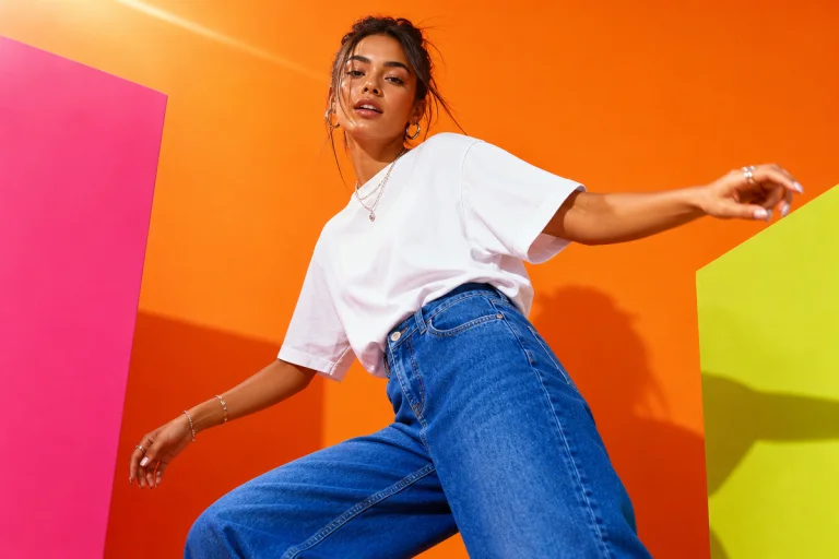
Industrial utility meets premium streetwear. Workwear orange on a heavyweight Bella+Canvas 3001 or Stanley/Stella Creator, single-colour screen print, minimalist condensed wordmark centred on the chest. No distressing, no fading – the contrast between the brutal colourway and the clean print treatment does the work. This reads immediately in the feed and translates directly to DTG on a mid-weight cotton. One colour means low print cost, high margin.
\n
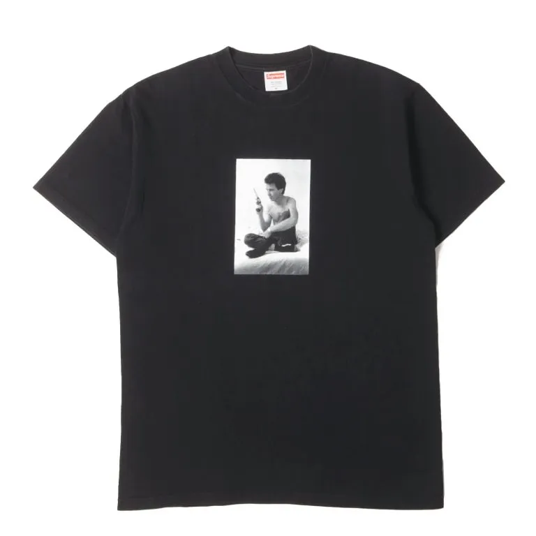
Bootleg logo treatment with intentional pixel degradation. Think a familiar logo structure pushed through a digital distortion filter – edges breaking apart, half-tone dots bleeding into each other. This works best as a DTF transfer on a washed black or vintage white, because the transfer medium preserves the fine detail that DTG can lose at small scales. The cultural reference here is the 90s bootleg market, but the execution is contemporary. Do it on an oversized Gildan Heavy or a Comfort colours 1717 for the pre-washed hand feel that makes the vintage reference land without looking costumey.
\n
Clean-text minimalism. AI tools handle this particularly well because you can rapidly test type scale and weight at actual print size before committing. Right now the move is a single line of condensed grotesque – something like Aktiv Grotesk Compressed or Dharma Gothic – printed large across the chest in a single muted tone. Dusty sage on stone, washed black on a sand base, or a cold lilac on off-white. Our minimalist typography pieces are a direct response to this same cultural appetite for restraint over noise.
\n
The colour story sits in three camps right now: warm neutrals pushed towards clay and ochre; washed-out vintage pastels that read as pre-faded from day one; and high-contrast black-and-white with a single unexpected accent – cold lilac, industrial yellow, or a flat sage. The third camp is the most repeatable on POD because the accent reads well across DTG and screen-print alike, and it gives you a colour story without committing to an expensive multi-colour run.
\n
For more context on where graphic tee culture is heading, our Graphic Tees piece traces the lineage that makes these aesthetics resonate.
\n
The Contrarian Take: Stop Generating Concepts Nobody Asked For
\n
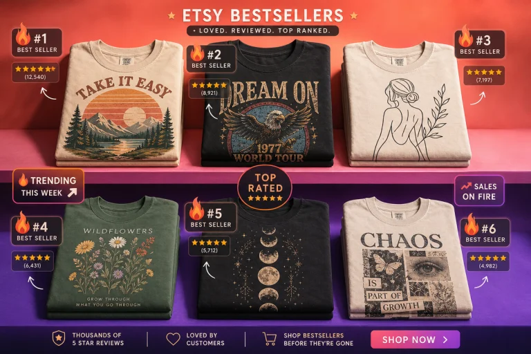
Here’s what we’re actually seeing too much of on POD feeds right now – the AI-assisted drop that is technically impressive and culturally empty. Botanical line-art on a sage Comfort colours. Distressed serif with a Latin phrase nobody requested. The “clean aesthetic” tee that references nothing and says nothing. These aren’t bad executions; they’re directionless ones. The tools accelerated the output but the brief was hollow going in.
\n
The oversaturation is already visible in the faux-vintage camp. Every third upload on the major POD marketplaces is a washed-out circular logo graphic on a vintage white, referencing some fictional 1987 sporting club. It worked eighteen months ago. Now it reads as a template, not a concept. If you’re still running that treatment without a genuine cultural anchor or a specific subculture you’re speaking to, the feed has moved past you.
\n
What Most POD Brands Are Still Getting Wrong
\n
Speed without direction produces volume, not quality. The nuance most teams miss is that AI works as a creative collaborator – it surfaces visual options, but the brand identity decisions, the cultural references, the call on what feels right for your specific audience – that stays entirely with the designer. You still need to know what you’re going for before you can direct the tool toward it. A sharp brief going in produces a usable concept in minutes; a vague one produces a technically polished generic.
\n
The cost reduction is real – fewer physical samples needed in early stages, revisions that require a few clicks rather than a new prototype run – but the saved budget only compounds if it’s redirected toward stronger creative briefs and better cultural references, not just more output volume. The winning move is using the speed to get sharper, not just bigger.
\n
We started this piece watching feeds full of drops that looked too clean to be early-stage concepts. Now we know why. The design cycle has collapsed to near real-time. The brands ahead aren’t generating the most options – they’re using that speed to commit faster to ideas with actual specificity. Blank selection, print method, colourway, cultural reference: all of it locked before the concept goes wide. That’s where the gap is opening up between the operators who understand these tools and the ones just running the defaults.
\n
\n
Frequently Asked Questions
\n
Q: What is AI fashion design visualisation?\nA: AI fashion design visualisation is the use of generative AI, computer vision, and 3D rendering tools to produce realistic digital concepts of clothing and graphics from text prompts or reference images – allowing designers to see and refine ideas before committing to physical production.
\n
Q: How does AI fashion design help print-on-demand brands specifically?\nA: POD brands benefit because AI removes the commitment cost of the early design stage – you can compare colourways, placements, and graphic treatments rapidly without ordering physical samples, which cuts both development time and upfront spend.
\n
Q: Does AI replace the designer in this workflow?\nA: No. It surfaces visual options, but decisions around brand identity, cultural references, and what resonates with a specific audience remain entirely with the human designer. A weak brief going in still produces a weak concept.
\n
Q: What aesthetics are performing well for streetwear POD in 2026?\nA: Industrial utility graphics with bold condensed type on orange or clay blanks, bootleg-style logo treatments with intentional pixel degradation on DTF transfers, and clean single-line minimalist text tees on mid-weight cotton. Washed vintage pastels and high-contrast black-and-white with a single accent colour are the most repeatable performers.
\n
Q: Which POD trends are already oversaturated?\nA: Faux-vintage circular logo graphics on vintage white blanks – the fictional 1987 sporting club treatment – are visibly saturated on major marketplaces. Botanical line-art on sage and distressed serif Latin-phrase tees are similarly played out without a genuine cultural anchor behind them.
\n
Q: How do AI design concepts translate to actual print methods?\nA: It depends on the treatment. Single-colour clean prints translate directly to screen print or DTG on any mid-weight blank. Fine pixel degradation and complex half-tone work preserve better on DTF transfers. Minimalist text graphics are low-risk across all methods, which is part of why they perform so consistently on POD.
\n
Source: https://mayumiotero.com/visual-technology/ai-fashion-design-visualisation/
\n
This article was researched and written with AI assistance, then reviewed for accuracy and quality. Maya at Its.That. uses AI tools to help produce content faster while maintaining editorial standards.
\n