Last updated: May 25, 2026
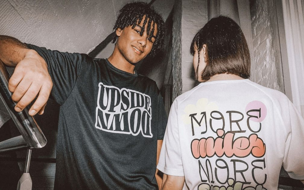
Image: Printful
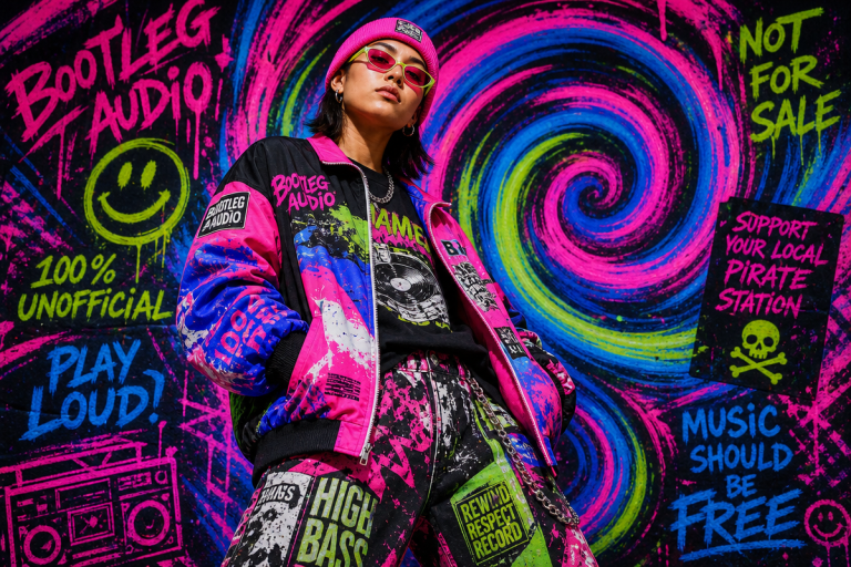
Scroll your feed for thirty seconds and the picture snaps into focus: the graphic tee is no longer dressed down. In Toronto alleyways and Vancouver skate parks, on Montreal feeds and in Calgary’s emerging streetwear boutiques, the best-dressed people in the frame have one thing in common – a t-shirt doing all the talking. Not a subtle, quiet tee. A loud one. One with intent. The t-shirt design trends 2026 are shaping up to be the most visually aggressive, culturally loaded, and commercially viable in years – and for Canada’s print-on-demand sellers, that’s exactly the kind of moment worth building around.
We’re not watching incremental colour shifts here. This is a full aesthetic reset, driven by converging forces from runways, social media micro-cultures, and a custom apparel market where graphic design commands a dominant share of custom T-shirt printing output – a figure that’s climbed steadily as consumers stop buying passive product and start buying point-of-view.
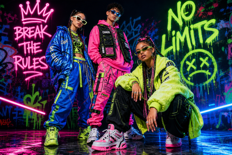
How Canada’s POD T-Shirt Scene Got Here
Image: Printful
The Canadian POD scene didn’t arrive at 2026 by accident. Over the past three years, a handful of structural shifts changed what it means to launch a t-shirt brand from scratch. Platforms like Printful democratised production – offering everything from DTG (direct-to-garment) and DTFlex to screen printing, embroidery, all-over print, and even knitting – with zero inventory commitment. Small sellers in Winnipeg or Halifax can now test five different trend aesthetics simultaneously without pre-ordering a single unit, matching production methods to the specific look each design demands.
The blank canvas got better too. Premium blanks from Bella + Canvas, Comfort Colours, and Champion elevated the standard expectation, while adidas and Under Armour gave streetwear and activewear crossovers genuine credibility. When the blank itself carries brand equity, the graphic becomes a collaboration between label and canvas – not just ink on cotton.
What spring 2026 menswear confirmed, via WWD’s coverage of the season’s collections, is that the wider fashion conversation has moved toward fluid silhouettes, artisanal textures, and bold, unapologetic colour. That shift doesn’t stay on the runway. It filters down to graphic t-shirts for men in oversized streetwear cuts within two seasons. We’re in that window right now.
The Aesthetics Actually Cutting Through in 2026
Here’s what we’re seeing move – think of it like a frequency dial, with certain aesthetics broadcasting loud and clear while others fade into static.
Dark, moody palettes are dominant. Black, deep crimson, grungy charcoal – these aren’t just colour choices, they’re attitude choices. Dark garments with screen-printed graphics feel expensive in a way that light tees with DTG prints sometimes don’t. The pairing that’s working hardest right now: bone-white or washed-yellow type on black, screen printed on a Comfort Colours 1717 heavyweight. The garment dye does half the work – that slightly uneven, faded surface tension gives even a clean design a lived-in credibility. Deep burgundy with off-white is the runner-up: worn, archival, European football programme energy. If you’re designing for this lane, lean hard into contrast and let the wash do the distressing for you.
Artisanal and hand-drawn aesthetics. Think irregular letterforms, sketchy line work, imperfect fills – the visual language of someone who drew it themselves, even if they didn’t. This is the anti-algorithmic backlash in wearable form, and it’s resonating precisely because it signals human intent. On the type side, we’re talking rough casual scripts with inconsistent baseline pressure, or a chunky slab serif that looks like it was set in a small-run print shop in 1987. Not clean. Not optimised. Intentionally off. A rough hand-lettered slogan in a bold condensed face, slightly off-kilter, reads as authentic in a way that polished vector work can’t replicate. AI image tools like Midjourney via Discord can generate textured reference imagery and distorted starting points that you then rough up and make yours – think of it as a sketch generator, not a finish line.
Maximalist graphic collage. Think archival skate zine meets editorial fashion spread meets Wrangler circa 1994. Layered imagery, mixed type scales, visual hierarchy that defies convention – a condensed display headline crashing into a hand-stamped graphic crashing into a paragraph of fine print nobody can read. All-over print is the natural production choice here – AOP lets the design breathe across the full garment rather than boxing it into a chest placement. Loud, dense, unapologetic. The colour palette that’s serving this aesthetic best is oxidised and earthy: forest green, washed terracotta, and that specific shade of faded gold you see on 1990s sports licensing. Not vibrant. Saturated but tired.
Bold sans-serif text tees. Single phrase. Giant type. Full stop. This is the quietest-loudest trend in the mix – visually minimal but conceptually maximal. The type choices here are everything: a wide-set grotesque with tight tracking (think the genre of Neue Haas Grotesk Condensed or Aktiv Grotesk Extended, not Impact) at near-full chest width is more striking than most illustrated tees. Placement matters almost as much as the type itself – drop it lower than expected, break the line in an unusual place, or wrap it around the hem. These work particularly well on a clean Bella + Canvas 3001 where the fit does half the work. Pair with washed slate or faded black rather than pure white; it keeps the minimal energy without reading as corporate.
Retro Canadiana and hyperlocal references. Vintage hockey typography, regional slang, neighbourhood codes – the kind of specificity that makes someone from that postcode feel seen and makes everyone else curious. This is the long tail of POD done right: micro-community designs that aggregate into something meaningful at scale. The streetwear style outfits and accessories playbook is shifting hard toward this hyperlocal specificity. Generic city-name tees are over; neighbourhood-coded graphics with real cultural weight are in. Think a distressed athletic-department typeface with a specific intersection rather than a skyline. Think a phonetic rendering of regional slang in a varsity serif. The design language is familiar; the reference is exclusive. That tension is the whole product.
What This Means for Your Store Right Now
The practical implication is straightforward: 2026 rewards specificity and production intelligence in equal measure. Picking the right trend is step one. Matching it to the right print method and blank is what separates a design that looks good on screen from one that commands attention in person. Dark palette with high-contrast graphic – go screen print on a garment-dyed blank. Maximalist collage – AOP on a mid-weight Champion. Bold type-only concept – DTG on Bella + Canvas where the fit is doing its job. Embroidery for anything with a logo or patch sensibility that needs texture your eyes can actually feel.
Printful’s integrated Design Maker and Mockup Generator let you prototype quickly – which matters when trends cycle faster than production calendars can follow. Build the dark-palette screen print concept. Test the hand-drawn serif text tee. Generate mockups across different blanks and colourways and push them to your audience before committing to a single unit. The POD dropshipping model exists precisely for this moment – eliminating inventory risk so you can iterate on trend aesthetics rather than guess which one will land.
Back to that feed. Those thirty seconds of scrolling are actually a diagnostic tool. What stops the thumb? What earns the save? In 2026, it’s the tee with a point of view – dark, loud, specific, or defiantly handmade. Not a tee that fits a trend. A tee that has an opinion. The market is saturated with product. It is not saturated with intention. The sellers who understand that distinction are the ones building something worth wearing.
Source: https://www.printful.com/ca/blog/design-trends
This article was researched and written with AI assistance, then reviewed for accuracy and quality. Maya Sinclair uses AI tools to help produce content faster while maintaining editorial standards.