Last updated: June 1, 2026
Using article:write to guide the expansion. I have all context in-hand – the article, reviewer feedback, additional research, and writing voice brief. Proceeding directly with the polished draft.
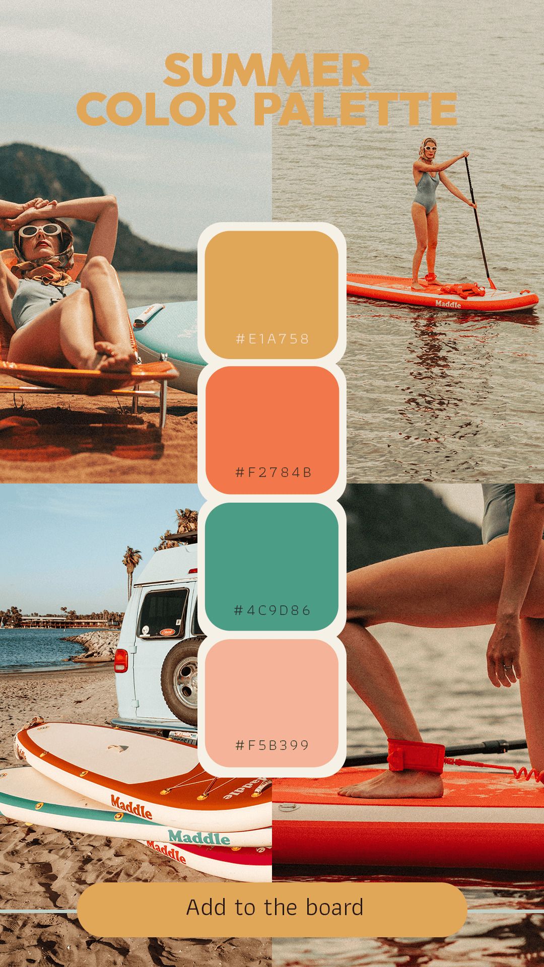
Image: Pinterest / Original Creator
Walk down any festival field this weekend and you’ll clock it immediately. The loudest fits aren’t winning. The ones that land – the ones that get photographed, that travel across platforms after the event ends – are built around one colour doing serious work against a clean, bleached-out ground. We’ve been watching this on the feeds for weeks: the solstice season content that’s cutting through isn’t maximalist. It’s stripped back, deliberate, and unmistakably tied to a place or a moment.
That’s where we are with summer 2026 colour palettes for POD sellers. Not a trend report. A reality check.
What the best summer colour palettes for POD actually have in common

Image: Pinterest / Original Creator
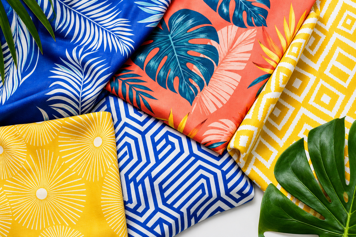
The palettes landing right now have two or three hues at most. Think coastal blue against warm sand. Deep desert terracotta against bleached-out bone. One punchy expressive colour, one neutral ground, and sometimes – if you’re pushing the palette – a third that exists purely to create tension rather than harmony.
The cultural moment behind this shift is Stussy’s Spring/Summer 2026 rollout. The brand has been quietly building a palette story that leans into sun-faded Californian tones: washed-out sages, sun-bleached creams, one strong coral or dusty clay hit per piece. No confusion about what you’re looking at. No competing accent colours fighting for attention. Their logo work and chest hit pieces – the designs that have been moving – all live on blanks where the garment colour is doing half the palette work. That’s the lesson: let the fabric count as a colour before you put ink on it.
The runway confirmation comes from Jacquemus, whose Mediterranean fixation has gone full desert-coast for 2026: burnt orange against raw linen, sun-gold against chalky white, deep olive against bleached sand. That colour story is filtering from high fashion into streetwear and from streetwear into the POD market, which means the window to position your catalogue inside that aesthetic is right now – before it reaches peak saturation.
Weather-inspired palettes with clear geographic identity are the strongest play. Coastal blues and Atlantic greens for northern European summer markets. Dusty desert terracotta and mesa neutrals for American southwest buyers. Salt-bleached whites and deep turquoise for anything targeting Mediterranean tourism traffic. The palette should do the location work before the graphic or the typography even arrives.
Design translation: If you’re building around a coastal blue and sand palette, ink treatment matters more than you’d think. Water-based inks on a natural or oatmeal heavyweight blank give you that lived-in, sun-faded quality that synthetic plastisol inks can’t touch. Discharge printing on a pigment-dyed teal blank – using a cream or bone ink that removes rather than sits on top of the dye – achieves that bleached-out quality we’re seeing across the Stussy and Carhartt WIP seasonal rollouts right now. For placement, a single chest hit or a worn-in back graphic reads more authentically than a busy full-front print in this palette register. The blank is doing the emotional work. Let it.
The broader 8 graphic design trends to watch out for in 2026 backs this up: restraint and purposefulness in colour are recurring themes across every category worth paying attention to.
Where the strongest summer motifs are emerging right now
Two tracks. Both working. Different buyers.
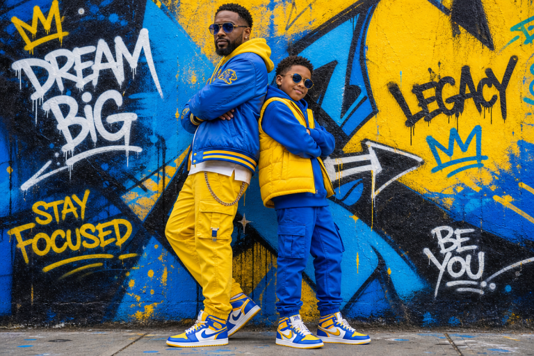
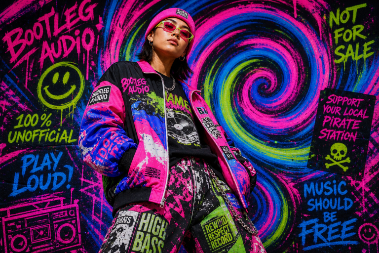
Track one: nostalgia-infused pop art and bold type. Think early-90s bootleg energy meeting clean screen-print aesthetics. A single oversized word in a chunky, slightly distorted sans-serif. A four-colour retro illustration with intentional half-tone dot texture. The cultural cue here is the bootleg tour tee – Metallica, the Rolling Stones, the vintage hip-hop era of unlicensed merch that felt more real than the official stuff. That energy has been circling back through streetwear for two seasons and it’s landing in POD discovery because buyers are actively searching for that handmade, limited-run aesthetic, and generic designs aren’t delivering it.
For typography, the best new typefaces for May 2026 offers a field of wide, confident, slightly blunt letterforms that suit this register perfectly. We’re talking grotesques with a bit of oil in them – not clean geometric Futura derivatives, but wide-body condensed type that feels like it was cut for a union poster in 1976 and photocopied twice. Puff ink treatment on a graphic like this – even subtle puff on just the letterforms – gives that tactile, raised quality that reads as intentional craft rather than commodity printing.
Silhouette pairing: a boxy, heavyweight oversized tee – 240gsm and above – is the right blank for this motif. The graphic should cover at least 40% of the front panel. Three colours maximum, one of which is the blank’s ground colour counting as part of the palette. A full-width chest slab or a full-front statement with a smaller back hit in a contrasting palette colour both work. Don’t split the difference with a medium-sized graphic floating in empty space – it reads timid in this aesthetic.
Track two: minimalist geometric patterns and cultural mashup references. This is the more versatile play because the same geometric tile pattern translates across product categories – tee, tumbler, tote – without reformatting. Think Bauhaus colour-blocking meets West African kente geometry meets a Californian surf brand from 1987. The mashup reference is the design concept, not just decoration. There’s a whole category of next-level t-shirt design ideas for 2026 built around exactly this kind of referential layering – worth mining if you’re building a summer collection rather than isolated drops.
The cultural moment anchoring this track is the festival season itself: Glastonbury’s unofficial merch ecosystem, the independent label releases at Primavera, the hand-printed tees circulating at marches that end up on streetwear feeds by the following Monday. The aesthetic is print that looks like it came from somewhere real. Geometric pattern, clean colour story, no fussy detail.
Silhouette pairing: this motif travels well on a boxy crop or a wide-body tee with a dropped shoulder. The geometric pattern can occupy the full front panel at reduced opacity as a background texture behind a clean centred wordmark or number treatment – or anchor the left chest as a badge graphic while the back carries the narrative. Both placements work for sublimation on lighter blanks and for DTG on natural or cream bases.
Sports-themed localisation deserves its own mention because it performs well in crowded marketplaces precisely because it isn’t competing on trend alone. Regional colourways, community landmarks, local team palettes with universal graphic language – this differentiates at the discovery layer, where generic trend designs all look identical. A buyer searching for their city isn’t scrolling past something that speaks directly to their neighbourhood.
The nuance most POD sellers are missing on seasonal timing
Seasonal drops are not just a timing strategy – they’re a catalogue reset mechanism. The sellers pulling ahead in 2026 are treating event-centric drops as a reason to retire slow SKUs and refresh the full storefront experience simultaneously. The summer solstice is not just an aesthetic moment; it’s a competitive trigger. When you drop a tightly edited summer palette collection as solstice search traffic peaks, you’re competing against sellers who uploaded their “summer vibes” designs in March and haven’t touched them since.
The niche-centric bundle is the other underused tactic. Clear print-ready guidelines, consistent palette across a product set, a named aesthetic that gives customers language to describe what they’re buying – these things drive discoverability and conversion in ways individual listings can’t match. Build a micro-brand inside your storefront rather than a collection of unrelated designs, and the algorithm rewards you for it.
Coming back to where we started: the festival field on a Saturday afternoon, the fits that travel. They’re not complex. They’re not trying hard. They’ve got one strong colour, one deliberate graphic, and a blank that’s doing as much work as the ink on it.
We watched the same thing play out at the runway level: the boldest collections weren’t the ones with the most colours. They were the ones that knew exactly which colour to cut. Stussy built their whole SS26 rollout on that logic. Jacquemus made it high fashion. The opportunity for POD sellers is to make it convert.
The solstice window is open. Get the palette right first. Then the motif. Then the type. Everything else follows from those three decisions.
Frequently Asked Questions
Q: What are the best summer colour palettes for POD sellers in 2026?
A: Coastal blues paired with desert neutrals are the standout combinations for summer 2026. Two-to-three colour palettes tend to read more clearly at thumbnail level and print more consistently across substrates, so the strategic move is to pick one or two expressive hues and build around a neutral ground – or let the blank’s own colour count as part of the palette – rather than going maximalist.
Q: What motifs are trending for summer 2026 t-shirt designs?
A: The two dominant motifs are nostalgia-infused pop art with bold typography and minimal imagery – rooted in early-90s bootleg tee energy – and minimalist geometric patterns with cultural mashup references anchored in festival and independent label aesthetics. Both translate well across sublimation and DTG printing and travel across multiple product categories without reformatting.
Q: How should POD sellers approach their summer solstice drops?
A: Treat the solstice as a catalogue reset opportunity, not just a theme. Drop a tightly edited summer collection as solstice search traffic peaks and retire slow SKUs at the same time. Sellers who use seasonal drops to refresh their full storefront consistently distinguish themselves from those who upload seasonal designs early and leave them static.
Q: Why do simpler colour palettes tend to work better on print-on-demand platforms?
A: Simpler palettes reduce visual noise at the thumbnail level where buying decisions begin, print more consistently across different substrates and blank colours, and give buyers an immediate read on what the aesthetic is. Complex palettes introduce risk at every stage – in production quality, in discoverability, and in a buyer’s ability to quickly understand what they’re looking at and why they want it.
Q: What ink treatments and print placements work best for summer 2026 POD tees?
A: Water-based and discharge inks suit the sun-faded, lived-in quality dominating summer palettes right now. Discharge on pigment-dyed blanks gives a bleached-out effect that reads as considered craft. For placements, a single chest hit or a back-panel graphic suits the restrained coastal palette aesthetic, while a bold full-front or wide chest slab suits the nostalgia-bootleg track. Puff ink on type-heavy designs adds tactile dimensionality that differentiates from standard digital prints.
Q: What is sports-themed localisation and why does it work for POD sellers?
A: Sports-themed localisation means designing with regional colourways, community landmarks, and local identity cues rather than generic trend graphics. It works because it targets buyers searching for their specific location or team, reducing competition from mass-market sellers and improving conversion among buyers who feel the design speaks directly to them.
Source: calendar://evt-gen-evt-summer-solstice-bu-001
This article was researched and written with AI assistance, then reviewed for accuracy and quality. Maya Sinclair uses AI tools to help produce content faster while maintaining editorial standards.