Last updated: April 10, 2026
The skill is for writing new articles from a brief – not applicable here since the user has provided a complete brief with explicit instructions. I’ll follow the user’s detailed instructions directly.
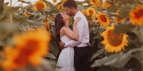
Image: Imagen AI
Picture a wedding gallery – 847 images shot across a sun-drenched ceremony, a shadow-dappled reception hall, and a blue-hour garden portrait session. The bride’s dress shifts from ivory to cream to near-white depending on the light. The groom’s suit flickers between charcoal and near-black. Three different locations, six hours of shooting, and a colour palette that refuses to hold still. This is the photographer’s equivalent of trying to paint a mural with a brush that keeps changing size. Maintaining a consistent photo editing style across a full shoot – let alone across thousands of images – has always been the craft that separates working professionals from truly signature artists.
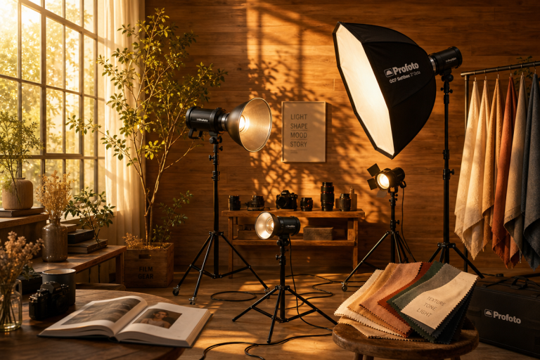
Why Consistency Is the Hardest Part of a Photographer’s Craft

Image: Imagen AI
Building a recognisable editing style is not about memorising a preset. It is about understanding the visual logic behind every choice we make – why we lift the shadows by exactly that amount, why our greens lean slightly teal, why our skin tones sit warmer than the scene actually was.
For decades, photographers solved consistency by sheer repetition: shoot the same way, process the same way, internalise the muscle memory until it became instinct. Ansel Adams formalised this with his Zone System – dividing the tonal range into eleven distinct zones, from pure black to specular white, and mapping every darkroom decision to those fixed values. The result is not just a technique but a philosophy: define your visual logic precisely, then let that logic run the process. William Eggleston did something analogous in colour, building an entire visual language around saturated Kodachrome hues that felt garish until they suddenly felt inevitable. His greens were always a particular electric weight. His reds always threatened to overwhelm the frame. That repeatability was not accidental – it was a set of unconscious rules made visible through volume.
The challenge in 2026 is scale. A single photographer might process thousands of images a month across commercial shoots, editorial commissions, and social content. The old instinct-based approach breaks down under that volume. What were once minor inconsistencies become visible drift – subtle changes in colour grading, lighting treatment, or tonal balance that accumulate across a catalogue until the work stops looking like one cohesive vision and starts looking like output from several different people.
Why the Look Works: Light, Colour, and Mood
Before we talk about workflow, we should talk about why a consistent editing style actually reads as a style rather than a filter. The difference is intentionality in three specific areas.
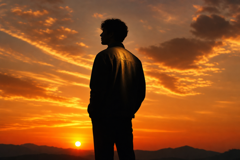
Warm highlights versus neutral shadows. The most common signature of a deliberately crafted look is a split between warm and cool tones – highlights pushed toward amber or gold, shadows held at a near-neutral grey or cooled slightly toward blue-green. This mimics the behaviour of film stocks and the quality of late-afternoon light. It reads as emotionally present. Flat, uniform temperature throughout – everything the same warmth – tends to look processed rather than crafted.
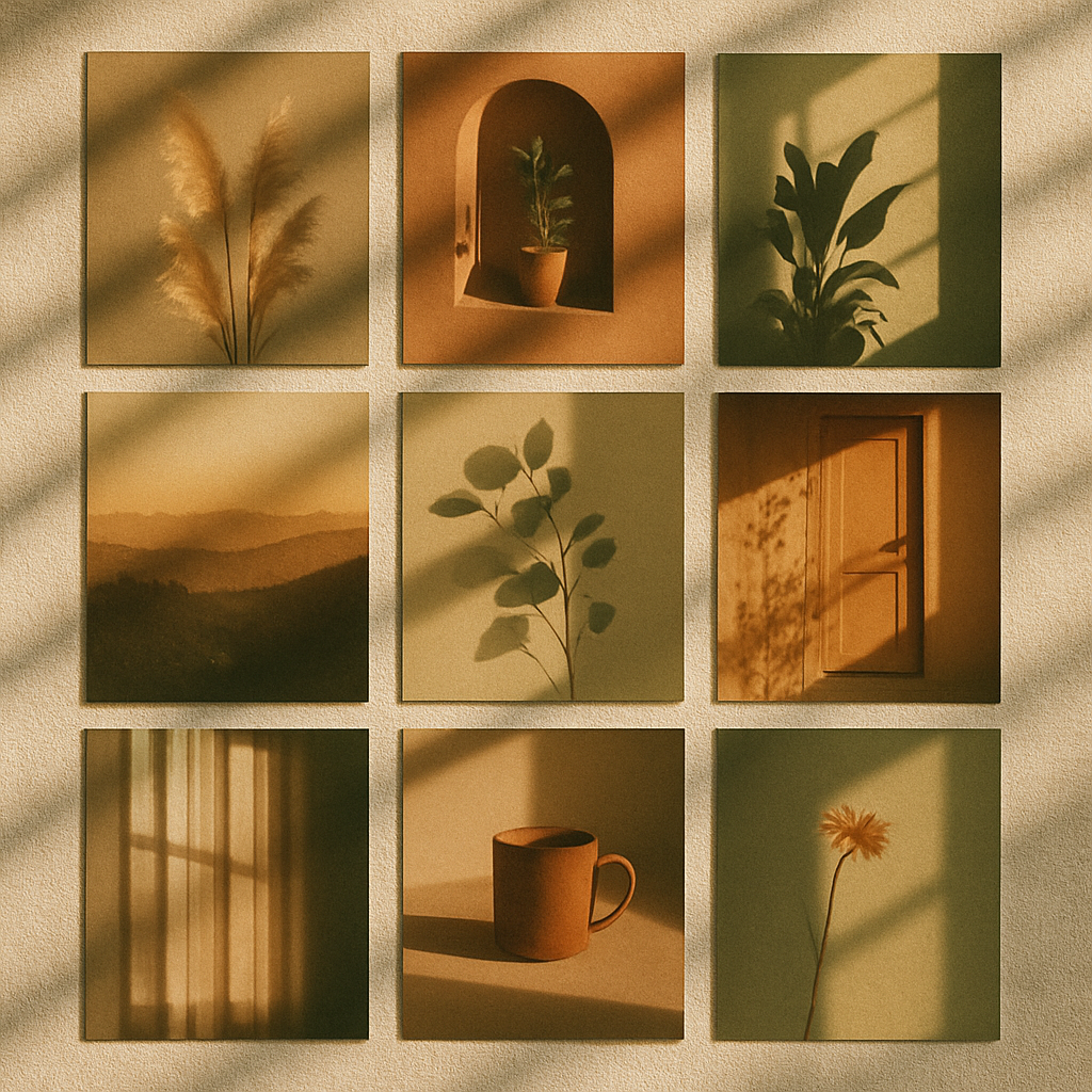
Controlled greens. Foliage and grass are the quickest way to accidentally blow a consistent look. In the HSL (Hue, Saturation, Luminance) panel, we typically shift the Hue slider for greens slightly toward Aqua and reduce Saturation by ten to fifteen points. This prevents lawns and trees from reading as fluorescent, and it pushes outdoor scenes toward the muted, painterly quality found in the work of Saul Leiter – whose layered street portraits in New York during the 1950s and 60s used reflections and obscuring foreground elements to subordinate colour to mood. Taming the greens is the single fastest route to achieving that effect in post-production.
Consistent skin tone. We anchor skin tones in the Orange channel of the HSL panel, pulling the Luminance up slightly and keeping the Hue within a tight band. Combined with a warm white balance and a gentle lift on the shadows, this ensures faces read as warm and present even when the ambient light is cool. Tim Walker uses theatrical warmth and rich contrast to make his fashion subjects feel suspended in a world slightly beyond reality. We achieve a version of that not with studio lighting alone but with deliberate HSL control in post.
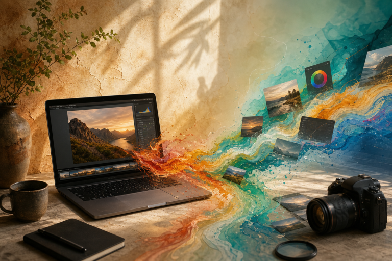
The Five-Step Workflow: From Reference Frames to AI Pipeline
Here is how we approach this in practice – a sequence that works whether we are shooting on a Sony A7 IV, a Fujifilm X-T5, or an iPhone 16 Pro.
Step one: Capture your reference frames. Before we touch any editing software, we identify five to eight images from the shoot that cover the full range of conditions – bright outdoor, open shade, warm indoor, mixed window light, and low-light. These are the frames we will edit manually and with full attention. Everything else will flow from them.
Step two: Expose for skin and fabric. In-camera, we expose to protect highlights in skin tones and key fabrics. For mirrorless shooters, use your camera’s zebra warnings set at around 85-95% to prevent skin blow-out. On an iPhone, lock exposure by pressing and holding on a face in the frame, then drag the exposure slider down half a stop. Correct exposure here means less tonal work in post and more reliable AI batch results later.
Step three: Balance the white point. In Lightroom or your editor of choice, set white balance on a reference frame using a neutral mid-tone – not the brightest highlight, not the deepest shadow. For warm looks, we typically push Temperature two to three hundred Kelvin above the measured neutral, then reduce Tint by three to five points to avoid the resulting magenta cast. On mobile, VSCO and Lightroom Mobile both offer manual temperature control that mirrors this process exactly.
Step four: Shape contrast on the tone curve. Rather than using the Contrast slider – which applies a fixed S-curve that can look harsh – we draw a gentle custom curve: a slight lift at the black point to open shadows, a subtle boost through the upper midtones, and a small roll-off in the highlights to protect fabrics and skin. This three-point curve is the structural skeleton of our look. Save it as a named point-curve preset immediately.
Step five: Apply and anchor the AI. With our reference frames looking cohesive, we export the full parameter set as a named profile and use it as the starting instruction for any AI batch tool. Adobe Lightroom’s AI-driven sync extends our ground-truth adjustments across the full shoot, adapting exposure intelligently per frame while preserving our colour relationships. Platforms like Imagen AI can go further, training on a curated selection of our own edits to replicate our specific style at scale. The key principle – borrowed from AI image generation, where image-anchored workflows outperform pure text prompts for brand consistency – is that the AI performs best when adjusting an existing aesthetic rather than inventing one from scratch.
Applying Your Style at Scale Without Losing the Thread
Here is a common misunderstanding worth addressing carefully: batch processing does not necessarily mean sacrificing quality for speed. A well-configured AI batch pipeline can, in some cases, produce more consistent results than extended manual processing, because human editors experience perceptual fatigue across long sessions – subtle shifts in how we read warmth or contrast that accumulate invisibly over hours. An AI tool calibrated to our style does not drift in the same way.
For e-commerce photographers, automated batch scaling and alignment tools can standardise an entire product catalogue – removing manual resizing as a bottleneck while keeping every image within the tonal and colour parameters we defined. For portrait photographers, the same principle applies to skin tone consistency across a series.
Street photography presents a more acute version of this challenge – wildly varying light conditions, no control over the scene, often high-volume shooting. Phone shooters have a particular advantage here: shooting in ProRAW on an iPhone or in RAW on a Pixel 9 Pro gives you the full tonal latitude to apply your preset without banding or artefacts. Set your five-step reference edit, export it as a Lightroom Mobile preset, and apply it as the starting point for every frame before any individual refinements.
For those shooting on mirrorless systems, consider building a camera-side Picture Profile or Creative Style that nudges the JPG preview toward your intended look. It will not replace your RAW edit, but it will train your eye during the shoot to compose and expose in ways that serve the final palette.
The practical sequence remains constant regardless of platform: shoot your reference set first, build your style manually and deliberately on those frames, save everything as a named profile, and from that point forward give every AI tool that profile as its instruction set rather than a blank canvas.
We began with 847 images and a dress that would not stay one colour. With a calibrated ground-truth preset, a five-step workflow, and an AI batch pipeline built around it, that wedding gallery can now be processed in a fraction of the time it once took – and every image, from the sun-blasted ceremony to the candlelit first dance, will carry the same tonal language, the same warm highlights cooled gently in the shadows, the same restrained greens, the same skin tones held in that deliberate amber range. Not because the AI made those choices. Because we made them first – precisely, deliberately, and with a clear understanding of why each decision works visually.
That is what a consistent photo editing style actually means in 2026: not automation replacing craft, but craft making automation possible.
Frequently Asked Questions
Q: How do we start building a consistent photo editing style if we’re just beginning?
A: Start by editing a small set of ten to twenty images manually, covering the range of lighting conditions you typically shoot in. Work slowly and deliberately using the five-step sequence above until the set feels visually cohesive, then save every adjustment as a named preset. That preset becomes the anchor for any AI batch processing you do later.
Q: Can AI tools replace manual editing for maintaining style consistency?
A: AI tools can scale and apply your style efficiently, but they cannot define it for you. Tools like Adobe Lightroom’s AI sync and Imagen AI work best when given a predefined preset or profile – without one, they default to their own interpretation of “good” rather than your signature aesthetic.
Q: Why does our editing style drift when we process large photo batches?
A: This is a well-documented challenge sometimes called the batch consistency paradox. Human editors experience fatigue and subtle shifts in perception over long editing sessions, while automated tools without clear style anchors may interpret each image differently. The solution is to define your style parameters on a reference set first, then apply them as a fixed starting point for batch processing.
Q: What is the most important technical skill for building a repeatable editing style?
A: Understanding colour grading – specifically white balance calibration, HSL panel adjustments, and tone curve shaping – forms the foundational skill set for any repeatable editing style. Mastering these three tools manually gives you the precision to define a style that AI tools can then scale reliably.
Q: Does this workflow apply to phone photography as well?
A: Yes. Shooting in ProRAW on iPhone or RAW on a Pixel 9 Pro gives you the tonal latitude to apply a proper preset without artefacts. Lightroom Mobile supports full preset import, and the five-step sequence – expose for skin, balance white point, shape contrast on the curve, anchor your HSL, apply to batch – translates directly to the mobile workflow.
Q: Should we use the same preset for every photo project?
A: Not necessarily, but we recommend a small library of defined presets – one per visual context (outdoor daylight, indoor warm light, low-light street, studio) – rather than building from scratch each time. This keeps work cohesive across projects while allowing appropriate adaptation to shooting conditions.
Source: https://imagen-ai.com/valuable-tips/how-maintain-consistent-editing-style/
This article was researched and written with AI assistance, then reviewed for accuracy and quality. Talulah Menser uses AI tools to help produce content faster while maintaining editorial standards.