Last updated: April 13, 2026

Image: abimanyu iwari / Behance
Here is what we are seeing right now: cracked black ink on an off-white blank. A gothic-condensed logo that looks like it was pulled from a photocopied flyer and blown up to chest-spanning scale. Slime green hitting the secondary colour slot where acid yellow used to live. Scroll TikTok, walk Brick Lane or Fairfax, open any Depop storefront doing numbers – the bootleg wrestling tee is everywhere in 2026, and it arrived with a visual grammar that is precise, considered, and very easy to get wrong.
This is not nostalgia for the 1990s. We are reaching for something those arena car-park shirts actually felt like: outsider energy, community recognition, deliberate imperfection. The aesthetic has become one of the most sought-after references in independent streetwear, sitting alongside archive band tees and vintage meme graphics as the design categories Gen Z is spending serious money on this year.
Why This Aesthetic Reads As Authentic Right Now
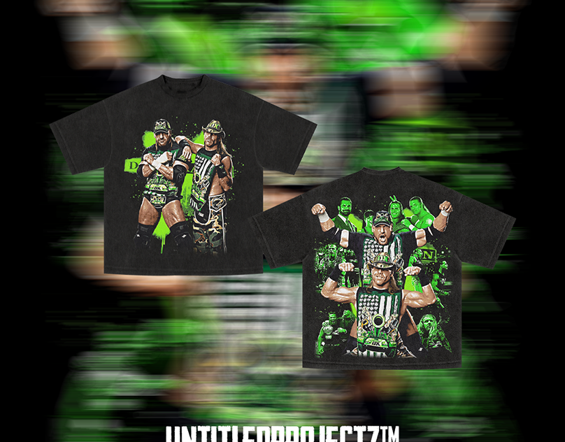
Image: abimanyu iwari / Behance
The bootleg wrestling tee taps into something that slick, corporate-approved merch simply cannot replicate: the feeling of being in on it. Think Stüssy meets a photocopied flyer. Think the energy of From the Streets to the Spotlight: Hellstar and Saint Vanity Leading … translated back into something grittier, less finished, more honest.
The tradition runs deep. Unlicensed wrestling tees date back to the 1990s, printed and sold outside arenas by vendors who understood that demand for a favourite wrestler’s face did not wait for an official licensing deal. Those shirts were raw, imperfect, and deeply human – which is precisely why they read as authentic to a generation raised on algorithmic perfection. When Jakarta-based designer abimanyu iwari published a bootleg D-Generation X t-shirt design on Behance on 28 March 2026, the project was tagged bootleg raptee, BOOTLEGDESIGN, tshirtdesign, and streetwear. That taxonomy tells you everything about where this aesthetic sits culturally: it is a deliberate, design-forward category, not an accident.
D-Generation X is a natural subject for this treatment. The DX logo – aggressive lettering, high contrast, unmistakable attitude – is built for the bootleg format. It already looks like contraband. Iwari built the design in Photoshop, working through layering and distressing processes that serious bootleg designers have been refining for years.
What the Bootleg Aesthetic Actually Looks Like
Here is the misconception we want to correct: bootleg does not mean sloppy. The best bootleg wrestling tees operate with a precise visual logic – they mimic the constraints of cheap 1990s screen printing while making deliberate compositional choices that feel intentional rather than accidental.
The colour palette is almost always restricted. Two or three colours maximum, leaning into the limitations of the format: cracked black ink, off-white or washed bone as the blank, then a single accent pulling from a slime green, deep red, or washed olive. That crack texture in the black – ink that has split along the cotton grain – is doing enormous cultural work. It signals age without costuming it. Typography is where the rest of the work happens. Typography in Design: What is It, Basics, Principles & Examples matters enormously here – the bootleg tradition leans on gothic-condensed serifs, hand-distressed display fonts, and stencil treatments that feel like they were set on a machine running low on ink. Then there are the chrome and photocopy treatments: halftone photo blow-ups, xerox-degraded portrait graphics, chrome-foil wordmarks deliberately knocked back with distress overlay so they read as worn-out rather than premium.
Brands like Guilty Kick Apparel have built entire labels around this sensibility, positioning “designs not everyone understands” as a selling point rather than a flaw. That is a genuinely interesting commercial insight. The opacity of the reference is the point.
What Most Designers Miss About the Bootleg Format
The silhouette is doing half the work, and most designers forget this. The oversized, boxy, dropped-shoulder cut is not a styling choice here – it is structural to the aesthetic. A bootleg wrestling tee on a slim-fit blank looks wrong. It reads as costume. Your design direction needs to account for the fit from the start, and that means briefing your blank choice before you open Photoshop, not after.
Placement confidence is the other thing people consistently underestimate. Bootleg tees from the arena era were printed larger than you would expect – centred high on the chest, scaling past what feels comfortable. Back graphics matched that energy: oversized, dropped low, occasionally wrapping the collar. Timid small-print placements undermine the whole project.
Concrete Design Routes for Print-on-Demand
For print-on-demand sellers, this translates to a set of actionable directions. We are not talking about vague vibes – these are specific executions that work right now.
Front-hit text tee: Bold gothic-condensed type, single colour on off-white, large-scale chest placement. Cracked texture overlay applied in Photoshop. No illustration needed – the type is the graphic.
Oversized back graphic: Full-back photocopy-style portrait treatment with halftone breakdown, secondary front hit kept small and high. This is where the chrome-degraded portrait approach lands best.
Misregistered logo flip: Take a strong wordmark or logo lockup and offset the colour layers two to four pixels in opposing directions, as if the screen shifted mid-print. Add a slime green or acid yellow as the offset colour against cracked black. This is one of the highest-signal executions in the format.
Washed vintage palette tee: Off-white or bone blank, two-colour print maximum, no distress effect – just clean restricted-palette work that references the era through restraint rather than texture. This route works particularly well if you are mapping out Spring Print on Demand Ideas for Etsy Sellers (2026) and want something that photographs cleanly for platform listings.
The print-on-demand market hit $15.19 billion in 2026. Within that, the vintage graphic tee and bootleg-adjacent category is pulling disproportionate energy from the Gen Z buyer who is spending on authentic-feeling pieces rather than mass-market output. Independent creators on Etsy and Behance are already active in this space, and the audience is genuinely underserved by sellers who understand the format at the level of execution rather than just the aesthetic surface.
Abimanyu iwari’s Behance project had 13 views and 2 appreciations when we looked at it – early-discovery territory. That is the bootleg aesthetic operating in real time: small signals, cult appeal, the feeling of finding something before it circulates. The designs that go wide in this category do not announce themselves. They move quietly until the right person shares them, and then they move fast.
The arena car park has gone digital. The aesthetic survived because the tension it represents does not age. We are not costuming it. We are using cracked blacks, off-white blanks, slime green accents, gothic-condensed type, and photocopy treatments to reproduce something that felt genuinely dangerous to wear. That feeling is entirely reproducible in 2026 – but only if you commit to the bit completely.
Source: https://www.behance.net/gallery/246581021/Bootleg-T-Shirt-Design-D-Generation-X
This article was researched and written with AI assistance, then reviewed for accuracy and quality. Maya Sinclair uses AI tools to help produce content faster while maintaining editorial standards.