Last updated: April 8, 2026
What if the most powerful design element on a t-shirt isn’t the graphic at all – but the letters?
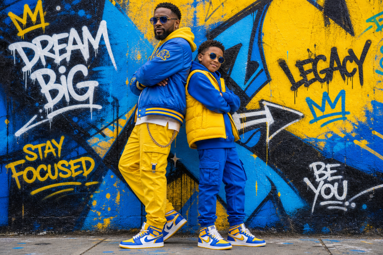
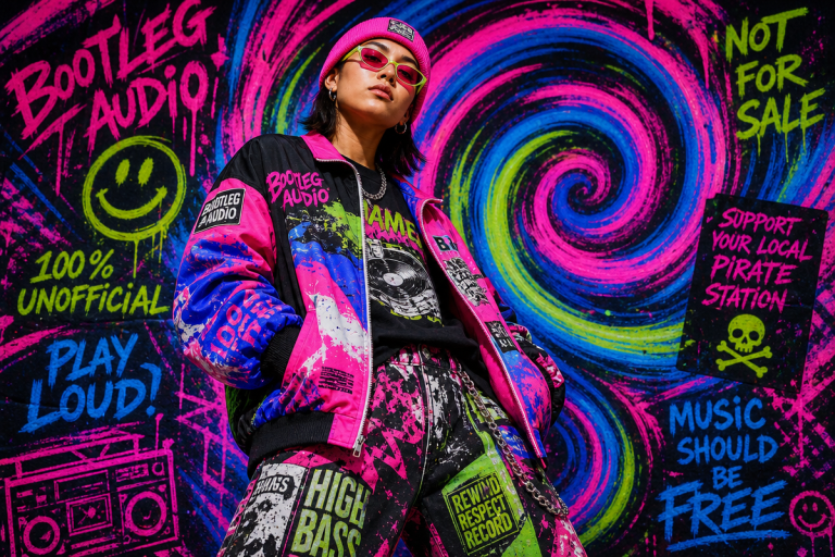
Scroll through any credible streetwear feed right now and you’ll notice it immediately. The graphics have quietened down. The big illustrated prints are stepping back. What’s pushing forward is type – raw, deliberate, sometimes brutal letterforms carrying the entire weight of a design. Typography t-shirt design has moved from supporting act to headline, and if you’re sleeping on this shift, your catalogue is already behind.
This isn’t a trend born in a vacuum. It’s the convergence of print-on-demand accessibility, variable font technology, and a generation of designers who grew up on Photoshop tutorials but are now reaching back toward longer-developed typographic principles. Here are the five movements reshaping what we’re putting on garments in 2026.
1. Brutalist Serif Revival – Tradition Used as Provocation
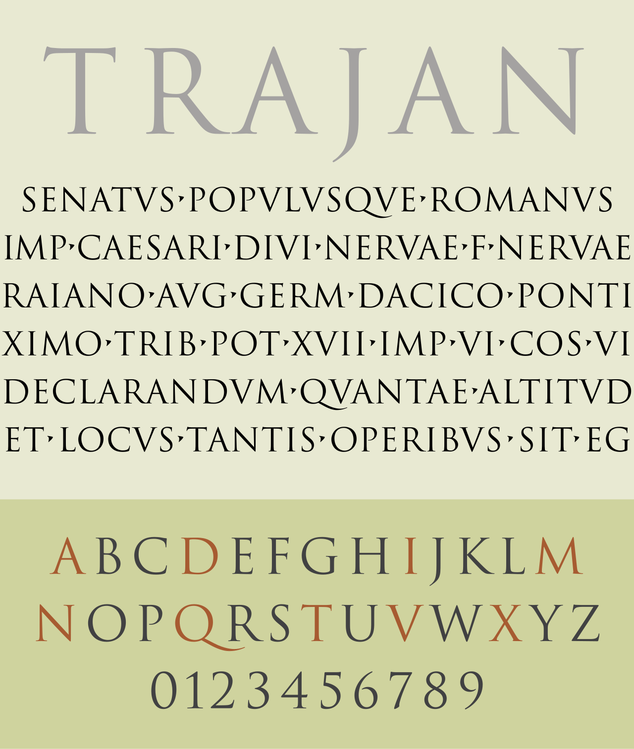
Image: Wikimedia Commons / Wikipedia
Serif fonts carry their heritage visibly. Those decorative flicks at stroke ends date back to the 1400s, and for most of design history they signalled institutions, newspapers, luxury houses. The assumption was that serifs meant restraint and formality.
The myth is that serifs are conservative. The reality is that when you blow a serif typeface up to 200pt, drop it washed-out on black, and kern it so the letters breathe aggressively, it reads as anything but safe. Think old money aesthetics meets downtown confrontation – the energy that made Palace’s text graphics so arresting, borrowing the visual language of a law firm and placing it on a skate graphic.
Right now we’re seeing this pushed further with intentional distress – serifs with ink-trap artefacts, letterforms pulled from a 1970s academic press run. Design direction: oversized single-word serif tees, off-centre placement, ink-bleed finish on a heavyweight 300gsm blank. The word should feel almost too serious for a t-shirt. That tension is the point.
2. Variable Font Morphing – Type That Refuses to Stay Still
Variable fonts are one of the genuinely underused tools in the print-on-demand toolkit. A single variable font file contains a full spectrum of weights, widths, and slants – meaning a designer can pull letterforms to extremes that a standard font family simply can’t reach. Ultra-compressed, ultra-extended, mid-morph states that look like type caught between two versions of itself.
On a garment, this translates to something that feels bespoke and technically strange in the best way. The aesthetic reads simultaneously futuristic and glitchy – exactly where cultural appetite sits in 2026 after years of clean minimalism.
Design direction: use variable font extremes for chest-hit wordmarks where the same word is set twice – once ultra-compressed, once ultra-wide – stacked directly above each other. The contrast reads as intentionally craft-driven rather than template-generated. Pair with a muted sage or industrial olive colourway for maximum differentiation from the neon-saturated competition.
3. Sans-Serif System Fonts – Corporate Aesthetics as Subversion
Sans-serif fonts built the visual language of tech: Google, Facebook, Netflix. Clarity, legibility, a deliberate erasure of personality in favour of scale. The assumption is that system fonts are bland – default choices, not design choices.
Streetwear has consistently known how to steal from corporate visual language and flip it. What’s gaining ground now is something subtle: genuine system fonts (Arial, Helvetica, Inter) used with such confidence and intention that their familiarity becomes the joke and the statement simultaneously. It’s the typographic equivalent of wearing a plain white tee that costs £180 – the lack of effort is the effort.
For print-on-demand specifically, this approach pairs well with minimalist design philosophy – a single phrase in 72pt Arial, perfectly centred, nothing else. The restraint does the work.
4. Ornamental Type – When Legibility is the Wrong Goal
Typography doesn’t have to communicate information. Type can function as pure decoration – as texture, as pattern, as visual noise that carries mood rather than meaning.
We’re seeing this surface in densely set paragraphs of repeated text used as background texture, in letterforms rotated and layered into abstract compositions, in type that references calligraphy or blackletter purely for its visual weight rather than any literal reading. The influence runs from Warhol’s text paintings through to the all-over print energy that currently dominates graphic t-shirt trends.
Design direction: all-over print using a single letter repeated at varying scales and opacities, creating topographic density across the garment. Choose a typeface with strong personality – a blackletter or display serif – and let the repetition do the compositional work.
5. AI-Assisted Custom Lettering – The New Hand-Drawn
Custom lettering has always been the premium tier of typography t-shirt design – the hand-drawn alternative to off-the-shelf fonts. The barrier was time and skill. AI generation tools have collapsed that barrier, making genuinely custom letterform construction accessible to designers working at POD speed and volume.
The important caveat: output quality depends entirely on the creative direction fed in. Understanding typographic principles – point size relationships, letter spacing, line height, the difference between a well-kerned word and a default export – remains essential. AI amplifies craft; it doesn’t replace the knowledge craft requires. Designers who’ve engaged seriously with these tools find that typographic literacy is precisely what separates compelling outputs from generic ones.
The aesthetic territory spans hand-painted signage revival, tattoo-style script lettering, and hybrid constructions that blend serif and sans-serif forms in ways no existing font family could contain.
What ties all five directions together is intentionality. Typography became accessible when the digital age opened it to non-specialists – but the most arresting type-driven garments in 2026 are made by people who understand that accessibility lowered the floor, not the ceiling. The craft is still there. The principles are still there. The designers winning in this space are the ones who went back and learned them.
Type is the design. Make it count.
Frequently Asked Questions
Q: What makes typography important in t-shirt design?
A: Typography controls how a viewer reads, feels, and responds to text on a garment. The choice of typeface, spacing, and scale can make the difference between a design that resonates and one that reads as generic. On a text-led t-shirt, type is the design.
Q: What typography styles are trending for streetwear in 2026?
A: The dominant directions include brutalist serif revivals, variable font extremes, system font subversion, ornamental all-over type, and AI-assisted custom lettering. Each prioritises intentionality over decoration.
Q: Are serif or sans-serif fonts better for t-shirt designs?
A: Neither is inherently superior – it depends on the cultural context and intended reading. Serifs can feel confrontational when oversized; sans-serifs signal modernity and work well for ironic or minimal approaches. The key is using either with confidence and a clear point of view.
Q: What are variable fonts and how can they improve print-on-demand design?
A: Variable fonts contain a full range of weights, widths, and slants within a single file, enabling extreme typographic states unavailable in standard font families. For print-on-demand, this means more distinctive, bespoke-looking designs without custom lettering commissions.
Q: Can ornamental typography work on a t-shirt if the text isn’t readable?
A: Yes – typography can function as pure decoration, creating visual texture and mood without legible communication. All-over type treatments using repeated letterforms at varying scales are a strong example.
Source: https://en.wikipedia.org/wiki/Typography
This article was researched and written with AI assistance, then reviewed for accuracy and quality. Maya Sinclair uses AI tools to help produce content faster while maintaining editorial standards.