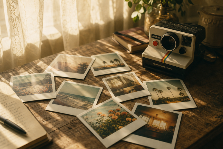
![What is Color Grading & How to Use It? - Easy Guide [2026] - Buying ...](https://itsthat.shop/wp-content/uploads/2026/04/Cinematic-Color-Grading.jpg)
Last updated: April 3, 2026
![]()
Image: Passion Fuels Ambition
Image: Passion Fuels Ambition
Picture this: a city street at golden hour, the shadows pooled in deep teal, a face glowing with warmth that feels almost tangible. The highlights roll off gently – no harsh clipping, no blown-out sky. The whole frame breathes. That is the 2016 cinematic look, and it remains one of the most emotionally resonant colour palettes in recent filmmaking history. If you have been searching for a cinematic colour grading LUT that captures this precise quality, you already understand why it has endured: it feels true without being literal, nostalgic without being sentimental.
The question is not whether this aesthetic holds up in 2026 – it does, more than ever. The question is how to achieve it with intention rather than accident – and that process begins long before you open an editing application.
What Made 2016 Cinema Look Different From Everything Before and After It
The 2016 palette was defined by three converging decisions that cinematographers made deliberately and consistently. First, the teal-orange contrast pushed further than it had in the early 2010s but stopped short of the garish extremes that would come later. Second, skin tones were protected with unusual care – midtones were treated as sacred ground, never allowed to drift into the surrounding colour shifts. Third, there was a warm analog quality threading through digital captures, a texture that recalled celluloid without pretending to be it.
Look at the reference films from that year. La La Land, shot by Linus Sandgren, used its teal-orange contrast to place Emma Stone and Ryan Gosling in perpetual golden warmth while the world around them cooled into blue-green distance. Moonlight, with James Laxton behind the camera, went further, casting its night sequences in purple-hued shadows that felt biological, almost bruised. Arrival, photographed by Bradford Young, stripped saturation back to earthy, desaturated tones that made the film feel like a document rather than a fantasy. None of these were accidents. Each was a conscious grading choice made at the level of production design and post-production pipeline.
The visual signature that unites them is observable rather than numerical: highlights that curve gently away rather than clipping to white, shadows that retain colour and detail rather than crushing to black, and skin tones that sit in their own protected warmth regardless of what is happening around them. The image holds information in both extremes, which is what gives it that characteristic depth without drama.
Getting It Right Before You Grade: On-Set Choices
The single biggest mistake we see in recreating this look is trying to manufacture it entirely in post. The cinematographers above were building the palette from the first moment of production. Here is how to start doing the same.
Light direction. The 2016 look thrives on sidelighting and backlighting rather than flat frontal light. Position your subject so that a warm light source – late afternoon sun, a practical lamp, even a phone torch bounced off a warm wall – wraps from the side or edges them from behind. This creates the natural shadow-to-highlight gradient that grading can enhance rather than invent. Frontal flash or overhead daylight flattens the image in ways that no amount of teal-shadow grading will convincingly correct.
Exposure. Expose to protect the highlights. If you are shooting on a DSLR, mirrorless, or even a modern smartphone in RAW mode, dial your exposure down by a third to two-thirds of a stop from what the metre suggests. The 2016 aesthetic is characterised by highlights that roll off softly – clipped highlights are unrecoverable, while lifted shadows are entirely workable. Think of it as protecting the ceiling and renovating the floor.
White balance in camera. Set a custom white balance to your actual light source rather than leaving it on Auto. The look is warm, but that warmth should come from deliberate grading – not from a mistaken AWB reading that has already baked orange into everything. Neutral starting points give you creative control. An already-warm capture limits where you can go.
Composition. The films that defined this era used negative space actively. Backgrounds were allowed to go soft and cool, foreground elements were kept minimal. When shooting portraits or street scenes, let the environment breathe around the subject – the teal-shadow grade will do its most powerful work in the out-of-focus areas and negative space around your subject rather than competing with detail.
How to Build a Cinematic Colour Grading LUT Workflow From Scratch
The order of operations matters enormously. Work in this sequence and you will avoid the circular adjustments that trap most beginners.
Step one: confirm your white balance is neutral. Before you reach for any creative tool, verify that neutrals – grey concrete, white clothing, off-white walls – are reading as genuinely neutral. Adjust if needed.
Step two: HSL or Colour Mixer for targeted control. Pull the orange and red luminance values slightly upward to preserve the natural glow of skin while you begin shifting other hues. This is your skin tone protection step, and it happens before anything else.
Step three: split toning or colour wheels. The teal-shadow signature comes from pushing your blues toward teal specifically in the shadows. Use split toning or a dedicated shadows colour wheel and shift the hue toward cyan-teal, keeping that shift contained to the shadows and away from your midtones. If your midtones start to look green, pull back. Skin tone protection is the whole game here.
Step four: apply your LUT at reduced opacity. Film emulation LUTs – such as Kodak 2383, one of the most widely used foundations for this era’s look – should be applied at roughly 70% opacity rather than 100%. At full strength they dominate. At 70% they contribute. Think of a LUT as a foundation layer in the same way a painter uses an underpainting: it establishes the tonal key and colour temperature before you make deliberate choices on top.
Step five: calibration panel tweaks. In Lightroom, the calibration panel is underused for this purpose. Adjusting Blue Primary saturation downward makes the overall colour palette feel more natural and film-like without touching any of your primary adjustments.
A Phone-to-Lightroom Workflow
This same sequence is fully achievable on a phone. Shoot in RAW using your native camera app (iPhone ProRAW, Lightroom Mobile’s DNG capture, or similar), import directly into Lightroom Mobile, and follow the same five steps above. The panels are identical to the desktop version. For the LUT step, Lightroom Mobile supports creative profiles – several free and paid options in the Kodak emulation family are available within the app. Film grain can be added under the Detail panel. The only step that differs is halation, which requires blending a separate layer and is easier on desktop – on mobile, a subtle warm tone added to the Highlights colour wheel in split toning approximates the effect well enough for most purposes.
If you are still building your foundational skills around colour and light, Photography Classes | The Complete Guide to Learning Photography in 2026 covers the underlying principles that make these decisions make sense.
The Details Most People Overlook When Recreating This Look
Saturation is the most common failure point. The 2016 aesthetic used restrained saturation – particularly in skin tones – compared to the oversaturated extremes that became common in later digital grading. When you push saturation globally to make a colour grade pop, you are doing the opposite of what these films did. Pull your global saturation back, then selectively restore it in specific hues like the teals in the shadows or the warm golds in the highlights. The restraint is the point.
The second overlooked element is analog imperfection. Digital sensors do not natively produce halation – that soft, warm glow that bleeds around bright light sources on film – or the organic texture of grain. Both must be added in post. Add film grain at a fine level and apply halation as a subtle warm glow layer around highlights using a blend mode like Screen or Add at low opacity. These are finishing details, not the foundation, but they are what separate a technically correct grade from one that actually feels like 2016.
There is a historical parallel worth noting here. When colour photography displaced black-and-white in commercial work during the 1960s and 70s, the first generation of colour photographers often over-saturated to prove that colour was doing something. It took another decade before photographers like Stephen Shore and William Eggleston found the power of restrained, natural colour – the recognition that colour does not need to shout to be felt. The 2016 cinematic moment was a version of that same correction, pulling back from the oversaturated digital excess of the mid-2000s toward something that felt considered. This same discipline applies whether you are grading a short film, a fashion shoot, or ProductAI | Clothes Photoshoot Ideas: Clothing Flat Lay Photography for an e-commerce brand – restrained colour reads as quality.
For those working across moving image as well as stills, the principles translate directly. The same teal-shadow split toning, the same highlight roll-off, the same grain overlay – these work in video exactly as in photography. Why Motion Graphics Is 2026’s Most In-Demand Creative Skill offers useful context for how colour grading fits into the broader visual language of contemporary motion work.
The 2016 cinematic look was never about nostalgia for its own sake. It was a set of technical and aesthetic decisions made by cinematographers who understood that restraint communicates trust – trust in the audience’s eye, trust in the image itself. When we recreate it now, we are not chasing a trend. We are reaching for a grammar of colour that proved its depth over the decade since. Build your workflow in the right order. Start on set, not in post. Protect your skin tones. Add your imperfections last. The image will do the rest.
Frequently Asked Questions
Q: What is the best cinematic colour grading LUT for achieving the 2016 film look?
A: Film emulation LUTs such as Kodak 2383 are a strong foundation for the 2016 cinematic aesthetic. Apply them at around 70% opacity to let the LUT contribute character without overwhelming your image, then build your specific teal-shadow and skin-tone adjustments on top.
Q: How do I protect skin tones while applying teal-shadow grading?
A: Work in your HSL or Colour Mixer panel to raise the luminance of orange and red tones before applying any shadow colour shifts. Push blues toward teal only in the shadows using split toning, and watch your midtones carefully – if skin starts looking green or grey, pull back the shadow shift until warmth returns.
Q: What should my image look like tonally before I start grading?
A: Aim for highlights that curve away gradually rather than clipping to white, and shadows that hold colour and detail rather than crushing to black. This retained information in both extremes is one of the most distinctive visual signatures of the era – and it begins with correct exposure on set, not with lifting shadows in post.
Q: Do I need expensive software to achieve this colour grade?
A: No. The core workflow – white balance, HSL adjustments, split toning, calibration panel tweaks – is available in Lightroom, Capture One, and DaVinci Resolve, with free tiers available for the latter two. Lightroom Mobile brings the same tools to your phone. Film grain and halation overlays can be added with free plugins or built manually using blend modes in most editing tools.
Q: Why does my teal-orange grade look artificial compared to 2016 reference films?
A: The most common cause is over-saturation. The 2016 aesthetic used restrained saturation, particularly in skin tones. Pull global saturation back, then selectively restore it in teal shadows and warm highlights rather than boosting everything uniformly. If you are also starting from flat, frontal lighting on set, no grade will fully compensate – the look depends on sidelight and backlight creating natural shadow gradients before you open your editing application.
Source: https://www.passionfuelsambition.com/2016-cinema-look-colour-grading-guide-2026/
This article was researched and written with AI assistance, then reviewed for accuracy and quality. Talulah Menser uses AI tools to help produce content faster while maintaining editorial standards.