

\n
Last updated: July 17, 2026
\n
\n
\nImage: Beam
\n
Picture this: a portrait lit entirely from one side, the kind of raking sidelight that turns a face into a study of shadow and planes. The background is warm charcoal – not black, not grey, but the deep amber-brown of old varnish on a Dutch interior. The subject’s clothing dissolves slightly into that dark ground the way Rembrandt’s sitters do, the figure emerging from darkness rather than posed against it. That is the image we are going to build today, using a photograph taken on a phone and a ComfyUI workflow we load in under two minutes.
\n
The darkroom analogy holds here. A well-built workflow is every enlarger, timer, and chemical bath wired together in sequence – one switch and the whole system moves, the image blooming up through the paper. But craft does not live in the plumbing. It lives in the choices made before the chemicals touch: the light, the framing, the source material we bring to the process. The templates are the lab. We are still the photographer.
\n
Recipe 1: Painterly Portrait with Img2Img
\n
\n
\nImage: Beam
\n
The look: A single-subject portrait rendered in the manner of late-nineteenth-century oil painting. Think John Singer Sargent’s fluid brushwork or Joaquín Sorolla’s confident slabs of warm light – not photorealistic, but not illustrative either. Presence without polish.
\n
Source image prep: We want sidelight and contrast in the original. A phone shot taken near a single window – subject turned so the light catches one cheekbone and drops the other into shadow – gives us the tonal structure the diffusion process will preserve and amplify. Overcast-sky light, which is beautiful for product photography, flattens the shadows we need here. Turn off overhead lights. Get close to the glass.
\n
Aspect ratio: 3:4 portrait, cropped to include shoulders and negative space on the shadow side. The empty dark side is compositional material, not wasted space. Caravaggio understood this; so does the sampler.
\n
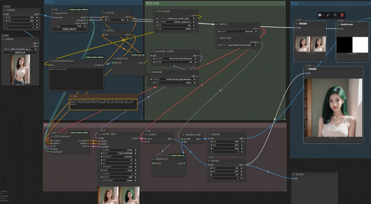
Loading the workflow: Open the built-in template browser via Workflow → Browse Workflow Templates and select Img2Img. The graph assembles: Load Image → VAE Encode → KSampler → VAE Decode → Save Image. Drop our window-light portrait into the Load Image node.
\n
Settings that matter:
\n
- \n
- Denoise strength: 0.65 to 0.72. Below 0.6, the model barely touches the image – the photograph wins. Above 0.8, it loses the structural information we captured in that window light. The sweet spot preserves the shadow geometry while adding paint texture and palette shifts.
- Prompt: “oil painting portrait, Sargent style, warm ochre shadows, muted umber background, painterly loose brushwork, chiaroscuro lighting, dark ground, impasto highlights”
- Negative prompt: “photograph, smooth, digital, plastic skin, overexposed, flat lighting”
- Steps: 25-30. Rushing this at 15 steps produces muddy midtones.
- CFG scale: 7. Higher values push the prompt harder but lose the naturalism we want.
\n
\n
\n
\n
\n
\n
Colour palette notes: The Sargent tradition works in a warm limited palette – cadmium yellow light, burnt sienna, raw umber, and titanium white for the hit of light on a forehead or collar. Ask for this in the prompt and the model tends toward it. If you want cooler Impressionist skin tones in the manner of Berthe Morisot, shift to “cool lavender shadows, pearlescent highlights, broken brushwork” and drop CFG to 6.
\n
\n
Recipe 2: Inpaint for Product Photography
\n
The look: A product sitting in a surface that it did not originally occupy. We shot our perfume bottle on a kitchen counter; we want it resting on a slab of pale Nordic marble, soft diffused light from above, the kind of styling that reads immediately as editorial rather than catalogue.
\n
This is the workflow for iterative refinement – when a photograph is eighty per cent right and twenty per cent wrong. Inpaint lets us select a region and regenerate it while the rest of the frame holds still.
\n
Source image prep: Phone photography works well here if shot overhead or at a low angle to eliminate background clutter. Studio captures give us better shadow control, but a clean kitchen counter with natural window light will read as neutral ground the inpainting can work from. Avoid busy backgrounds in the region we plan to repaint – the model reads context from surrounding pixels, and a complicated tile pattern will bleed into the replacement.
\n
Settings that matter:
\n
- \n
- Denoise strength: 0.80 to 0.95 for full region replacement. If we want the replacement to subtly blend with existing edges – say, we are retouching one corner rather than swapping the whole surface – drop to 0.55.
- Prompt the material explicitly: “Nordic white marble surface, fine grey veining, soft diffused studio light, shallow depth of field, editorial product photography, clean and minimal”
- Mask feathering matters more than most tutorials admit. A hard mask edge produces a visible seam. Feather the mask by 20-30 pixels and the replacement bleeds naturally into the original.
\n
\n
\n
\n
When to use phone versus studio: Studio for anything where the product is the hero – commercial work, e-commerce. Phone for context shots, lifestyle images, anything where we are more interested in the mood than the product detail. Inpaint forgives a lot of source imperfection because we are replacing the problem area entirely.
\n
\n
Recipe 3: LoRA for a Consistent Style
\n
The look: A series of images that share an unmistakable aesthetic – the grainy, high-contrast monochrome of Daido Moriyama’s street photography, or the washed-out saturated palette of nineties disposable-camera documentary work. A LoRA fine-tuned on a specific style teaches the model a visual dialect; once applied, everything we generate speaks in that dialect.
\n
Loading the workflow: The LoRA template extends the basic Img2Img graph by inserting a Load LoRA node between the model loader and the KSampler. The weight slider on that node is where the creative decision lives.
\n
Settings that matter:
\n
- \n
- LoRA weight: 0.6 to 0.8 for strong style influence. Drop to 0.4 if we want the LoRA to inflect rather than dominate – useful when blending a style with a photographic source that has its own strong character.
- Denoise strength: 0.55 to 0.70. We want the source image’s composition and subject to survive; the LoRA handles the aesthetic translation.
- Prompt minimally when the LoRA is doing heavy lifting. “street photography, 35mm, grain” is enough if the LoRA is Moriyama-trained. Over-prompting competes with the LoRA’s learned vocabulary.
\n
\n
\n
\n
Colour palette and mood: The Moriyama approach leans into high-contrast black and white with crushed blacks. If we are working from a colour source image, add “monochrome, black and white, high contrast, deep blacks” to the prompt and switch the output to greyscale in post. The grain structure that makes this aesthetic compelling comes partly from the LoRA and partly from a touch of denoising at lower step counts – 20 steps rather than 30 introduces a pleasing roughness.
\n
\n
Recipe 4: Outpaint for Wide-Format Composition
\n
The look: A tightly composed portrait or product image that we need to extend for a landscape banner – social media header, wide-format print, editorial double-page spread. The original frame becomes a detail within a larger scene.
\n
The craft problem outpaint solves: A portrait cropped to face and shoulders has no room for a headline. We could shoot wider, but the intimacy of the tight crop is the point. Outpaint extends the canvas while respecting the light and atmosphere of the original.
\n
Settings that matter:
\n
- \n
- Extend in one direction at a time. Extending simultaneously left, right, and below introduces compositional inconsistency – the model invents context without enough reference pixels on multiple edges. Start with the direction that matters most compositionally, review, then extend further.
- Denoise for outpainting: 0.90 to 1.0 in the extension region. We want the model to generate freely here rather than inheriting artefacts from a half-remembered edge.
- Aspect ratio targets: 16:9 for YouTube headers and desktop backgrounds; 3:1 for Twitter/X banners; 4:5 for Instagram portrait posts where we need vertical breathing room.
\n
\n
\n
\n
Composition notes: Outpaint tends to introduce symmetry and expected environments – if our subject is in a studio, the model extends to more studio. To push the composition toward something less literal, prompt the extension region explicitly: “atmospheric environmental portrait, soft bokeh background, golden hour light, natural environment” guides the model toward a more cinematic frame.
\n
\n
Recipe 5: 2-Pass Pose ControlNet for Figure Work
\n
The look: A figure in a specific pose – a dancer mid-movement, a fashion editorial body position, a character gesture sketch brought to life. This is the workflow borrowed directly from concept art pipelines, where gesture sketches precede finished illustrations.
\n
The source: We need a reference pose. This can be a quick phone snapshot of ourselves or a collaborator in the desired position – it does not need to be well-lit or artistically composed. It needs to be clear. The ControlNet depth map reads the skeleton geometry, not the surface detail. A blurry photo taken in a hallway is sufficient source material if the pose is readable.
\n
Settings that matter:
\n
- \n
- ControlNet weight: 0.8 for strong adherence to pose structure. Drop to 0.5 if we want the model to interpret loosely – useful for expressive, gestural figure work in the manner of Egon Schiele rather than precise anatomical positioning.
- First pass at lower resolution (512×768), second pass upscaling with SUPIR or ESRGAN. The first pass establishes gesture and proportion; the second pass adds detail and surface quality. Do not try to generate fine fabric texture or facial detail at the first pass – that is not what the first pass is for.
- Denoise on the second pass: 0.35 to 0.45. We are adding detail, not reinventing the figure.
\n
\n
\n
\n
\n
Troubleshooting: Why Workflows Break
\n
The overwhelmingly common reason a community workflow fails to run is a missing model or checkpoint – not a configuration error. Before diagnosing anything else, ask three questions in sequence: Is every referenced checkpoint present in the correct directory? Are all custom nodes installed and current via ComfyUI Manager? Does the .json file version match the ComfyUI build we are running?
\n
ComfyUI Manager is the practical tool for this – install it, run a missing-nodes scan on the broken workflow, and it surfaces exactly what needs downloading. Treat community workflows the way we would treat an inherited recipe from another cook’s kitchen: read the ingredient list before we start, not after the water is already boiling.
\n
For anyone building toward more complex production pipelines, both Stable Diffusion 3.5 Large and Flux integrate naturally into ComfyUI graphs, and the community template ecosystem reflects both architectures extensively. For motion work, LTX video generation offers a comparable open-pipeline approach to the Cosmos video template.
\n
One more thing worth knowing: many ComfyUI example images carry the full workflow metadata used to generate them. Drag such an image onto the canvas and ComfyUI reconstructs every node, every parameter, every connection. The image carries its own DNA. If we have ever admired a generated image and wished we could reverse-engineer how it was made, that is the answer – drag it in and read the graph.
\n
\n
Frequently Asked Questions
\n
Q: What are ComfyUI workflow templates?\nA: Reusable node graphs saved as .json files that define an entire generative AI pipeline – model loading, sampling, upscaling, post-processing. Loading a template lets us run complex workflows without building the node graph from scratch.
\n
Q: How do I load a workflow template?\nA: Three methods: the built-in browser via Workflow → Browse Workflow Templates; drag a .json file onto the canvas; or drag an image with embedded workflow metadata onto the canvas to reconstruct the full graph automatically.
\n
Q: What is the best starting workflow for beginners?\nA: Img2Img with a strong sidelit source image and denoise strength around 0.65. It teaches the relationship between source material and output quality faster than any other workflow, and the parameters are immediately readable from the result.
\n
Source: https://www.beam.cloud/blog/top-comfyui-workflows
\n
This article was researched and written with AI assistance, then reviewed for accuracy and quality. Talulah at Its.That. uses AI tools to help produce content faster while maintaining editorial standards.
\n