Last updated: May 13, 2026
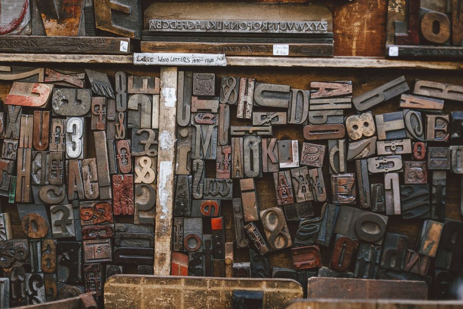
Image: Printful
Scroll TikTok for thirty seconds and count the text tees. We’ll wait. Whether it’s a stark varsity serif running chest-to-hem, a blown-out grotesque that looks like it was photocopied twelve times in 1994, or a razor-thin editorial wordmark sitting quietly at the left chest, typography is carrying the entire aesthetic load right now. No graphic, no illustration – just type, fabric, and intent.
The question for print-on-demand designers is never simply “does this font look good on screen?” It’s “does this font sell on a £22 unisex tee shipped to a stranger in Aberdeen?” Finding the best fonts for t-shirts in 2026 means navigating trend cycles, print physics, licensing law, and platform algorithms simultaneously. Here’s what we’re seeing, why it’s resonating, and how to translate it into designs that actually move units.
How Streetwear and Luxury Rewrote the Typography Rulebook
Image: Printful
The cultural backdrop matters here. In 2026, streetwear and luxury fashion are operating on genuinely equal footing – not the awkward one-sided celebrity endorsement model of the early 2010s, but actual creative exchange, with each side borrowing the other’s visual language freely. That shift has pushed apparel typography toward bolder, more expressive typefaces. Brands that once leaned on quiet minimalism are now going loud. Brands that once went loud are experimenting with the kind of restrained editorial type you’d find in a 1990s Italian fashion magazine.
Layered on top of that is Gen-Z’s current obsession with recent-decade aesthetics – think Y2K distortion, early-2000s skate graphics, and 1990s rave flyers, but filtered through a 2026 proportional sensibility. The small-top/big-bottom silhouette dominating runways this season has a direct typographic equivalent: oversized, compressed letterforms sitting heavy at the bottom of a composition, or micro-text details high on the chest paired with an aggressive type treatment lower down. Typography mirrors silhouette. Always has.
Printful’s curated list of 28 recommended fonts for t-shirt design heading into 2026 [citation needed] reflects this dual pull – you’ll find both the clean grotesques that perform beautifully in DTG printing and the expressive display faces that suit allover print or DTFlex treatments. The breadcrumb trail from runway to Etsy storefront is shorter than it’s ever been.
Best Fonts for T-Shirts in 2026: What’s Actually Moving
The confident grotesque. Think Neue Haas Grotesk or Aktiv Grotesk, uppercase, tightly spaced, no apology. It’s Helvetica energy but with the roughness sanded back. Colourwise, this mood runs on washed-out naturals – stone, ecru, clay – with single-colour ink in off-black or a deep forest green. Think Supreme’s box logo discipline meets an independent zine’s cropped layout. The POD execution: a back-print manifesto tee, three to five short declarative lines stacked flush-left, printed at 90% chest width so the text hits like a billboard when the wearer turns around. Clean lines and bold shapes are ideal for screen printing [citation needed] and the technique rewards fonts with confident strokes and minimal interior detail.
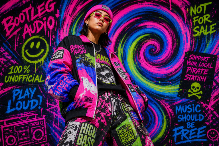
The distressed serif revival. Not the polished vintage-inspired serif you’d use on a craft beer label, but something with deliberate texture baked in – letterforms that look like they’ve been through a wash cycle a few dozen times. The palette here is faded burgundy on ash grey, or cracked white on vintage black, anything that reads like a bootleg tour shirt rescued from a charity shop rail in 2019. This aesthetic speaks directly to the bootleg logo treatment that’s been circulating since 2023 and shows no sign of cooling off. For POD specifically, these work best at larger placements – full front, full back – where the texture has room to breathe. The execution we keep coming back to: a distressed collegiate lockup, fake sports team name, fake year, arched across the chest, executed in a deliberately misregistered two-colour print. Wordmark-style fonts in this category maintain legibility even at small sizes like left-chest placements, which makes them versatile across product types.
The editorial condensed. Tall, narrow, the kind of letterforms you’d see on a 1990s magazine cover or an early-era Helmut Lang campaign. Think Bodoni compressed, or anything with extreme contrast between thick and thin strokes. The colour story here is stark: black-on-white or white-on-black, occasionally interrupted by a single accent – electric cobalt, acid yellow, or the kind of arterial red that reads immediately in a feed thumbnail. This is the high-fashion/street contrast pair playing out in real time – luxury heritage type sitting on a £25 tee from a three-person POD brand. The visual tension is the point. Concrete execution: a left-chest micro wordmark in condensed italic, barely 4cm wide, paired with a full-back treatment in the same face at 800% scale. That scale contrast is the whole joke, and it lands every time. If you’re designing for storefronts across Etsy, Shopify, or Amazon, condensed editorials photograph beautifully in flat-lay formats and cut through crowded search thumbnails.
The luxury-meets-rave treatment. This is the fourth bucket that’s been building quietly – think early 90s rave flyer typography (ransom-note cut-and-paste energy, clashing weights, nothing aligned) running alongside the kind of serif you’d find on a Maison Margiela tag. The palette is fluorescent on black: acid green, hot pink, UV white. The execution is a full-front composition where a thin serif wordmark sits uncomfortably close to a blown-out sans at triple the size. It shouldn’t work. It does.
The Legal and Technical Realities That Will Cost You If You Skip Them
Here’s where the sales reality diverges sharply from the mood board fantasy. Font licensing has become a genuine minefield for creators in 2026 – fonts are typically treated as software in most jurisdictions, and many EULAs (End User Licence Agreements) explicitly restrict commercial use on physical products. That gorgeous display face you found on a free font aggregator site may well prohibit you from printing it on merchandise. It’s worth checking before you build a range around it.
The good news is that the landscape is more navigable than it used to be. Adobe Fonts explicitly permits use on printed merchandise including t-shirts, whether you’re making one for a friend or running a commercial storefront [citation needed] – a significant advantage if you’re already in the Creative Cloud ecosystem. Envato Elements has its own carve-outs around on-demand products [citation needed], so read those terms specifically if you’re pulling assets from there. And a growing number of foundries now offer dedicated merchandise licences, often at reasonable flat rates. Treat font acquisition like any other business cost. Budget for it.
Different print techniques also impose real constraints. Embroidery requires fonts with sufficient stroke weight – delicate thin serifs simply can’t be digitised faithfully at small sizes. Allover printing rewards intricate type layouts that would be impossible to execute with screen printing economics. DTG handles gradients and texture well but rewards designs with clear contrast. Knowing which technique maps to which aesthetic is the difference between a mockup that looks good and a garment that delivers.
We’re back to that TikTok scroll. The text tees winning right now aren’t just font-forward – they’re technically sound, properly licenced, and designed with the print method’s constraints baked in from the first keystroke. The aesthetic is just the entry point. And if you’re curious how AI tools are beginning to influence the design generation side of this workflow, that pipeline is evolving fast too. But the type? The type still needs a human making a call.
Frequently Asked Questions
Q: What are the best fonts for t-shirts in 2026 from a sales perspective?
A: Bold grotesques (clean, uppercase sans-serifs), distressed serifs with built-in texture, editorial condensed faces, and luxury-meets-rave treatments are the strongest performers in 2026. Each suits different print techniques and customer aesthetics, so the best choice depends on your brand positioning and target platform.
Q: Do I need a special licence to use a font on a print-on-demand t-shirt?
A: In most cases, yes. Many font EULAs restrict commercial use on physical products – though some foundries are more permissive. Adobe Fonts, for example, explicitly allows commercial merchandise use. Always check the specific licence terms before building a range around any typeface, and factor in a dedicated merchandise licence if needed.
Q: Which font styles work best for embroidery versus screen printing?
A: Screen printing rewards bold, clean shapes with minimal interior detail. Embroidery requires fonts with sufficient stroke weight – thin serifs and intricate letterforms often cannot be digitised accurately at small sizes. DTG printing handles more complexity, including texture and gradient effects.
Q: How do I choose a font that reads well at small sizes, like a left-chest placement?
A: Wordmark-style fonts with clean, open letterforms perform best at smaller print sizes. Avoid decorative faces with thin strokes or tight spacing – these lose legibility quickly when scaled down. Test your design at actual print dimensions before finalising.
Q: Does the same font work across different e-commerce platforms like Etsy and Shopify?
A: Visually, yes – but consider how your designs photograph. Condensed editorial typefaces tend to stand out in flat-lay thumbnails on crowded marketplaces. If you’re distributing across multiple storefronts, choose fonts that photograph with strong contrast and clear silhouette at small image sizes.
Source: https://www.printful.com/blog/best-fonts-for-t-shirts
This article was researched and written with AI assistance, then reviewed for accuracy and quality. Maya Sinclair uses AI tools to help produce content faster while maintaining editorial standards.