Last updated: April 5, 2026
Walk through Soho on a Saturday. Scroll Hypebeast’s Instagram for ninety seconds. Sit front row at any emerging label’s presentation this season. What you will see – on backs, feeds, and runway racks alike – is garment graphics that feel like paused video. Not finished artwork. Mid-motion. A morphing blob frozen at peak warp. Chrome type caught mid-rotation. A loading bar, three-quarters full, printed across a chest in phosphor on black. The most interesting visual energy of 2026 is not originating in studios or galleries. It is bleeding directly out of app interfaces and onto cotton.
We have been deep in Muzli’s curated collection of 60+ motion design examples, updated as recently as April 2026 and used as a reference by over 800,000 designers worldwide. Here is what is hot, why it translates, and exactly how to execute it as a print-on-demand drop.
1. Micro-Interaction Energy – the New Print Detail
Image: Abduzeedo / Muzli
Micro-interactions are those small, purposeful animations that acknowledge a user action – a progress bar that breathes as it loads, a toggle that springs into position, a cursor that blinks back at you. According to research compiled by Free Frontend, the 2026 wave of micro-interactions is being built with CSS SDA, WAAPI, and GSAP [citation needed], pushing toward natively smooth 3D and state-driven effects that feel almost tactile.
For print, this translates as “state-change graphics” – designs that imply motion through sequence thinking. Three frames of a loading bar frozen mid-fill across a chest. A blinking cursor rendered in high-contrast block print. The aesthetic reads terminal meets heavy-duty workwear, tech-literate without being cringe.
POD execution: Bold sans-serif text tee on a boxy heavyweight blank. Chest placement only – keep it tight and deliberate, not all-over. Palette: electric lime on washed black, or muted phosphor green on military olive. Typography: monospaced fonts, deliberately mechanical. Space Mono or Courier derivatives work perfectly here. Screen print in one or two colours for that flat, no-frills terminal look – DTG will lose the crispness you need on the type.
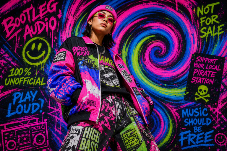
2. Liquid and Organic Motion – Fluidity as a Graphic Language
The 2026 Muzli examples lean heavily into liquid and organic motion – shapes that stretch, morph, and breathe rather than snap between states. Health and wellness apps are leading this aesthetically, using water as a visual metaphor: responsive, continuous, never quite the same shape twice. Think Calm’s visual language crossed with a mid-period Arca album cover.
Translated to a static graphic, this is the warped, melting geometry that has been creeping into top streetwear fashion trends for a couple of seasons – but now with a more credible reference behind it than generic “digital art”.
POD execution: This is your all-over print opportunity. Morphing blob graphics in earthy terracotta and raw sand for the wellness-adjacent read, or high-saturation acid palettes – electric violet bleeding into safety orange – for something more aggressive. The key is rendering edges with enough clarity that the result does not read as generic wallpaper. Anchor the abstraction with a condensed serif – the liquidity of the shape against the rigidity of the type is where the tension lives. TypeTasty’s 2026 report on organic serif trends names expanded grotesque-serif hybrids as the move for exactly this kind of contrast pairing. Try a dropped back print at A3 scale on a relaxed fit, with a minimal chest hit in the complementary accent colour.
3. 3D Everything
One visual register dominates across the Muzli 2026 examples: depth. Real, rendered, light-catching 3D. Fintech dashboards, e-commerce product reveals, gaming landing pages – all using three-dimensional motion as a primary communication tool, not decoration. Chrome surfaces. Iridescent gradients. Sculpted letterforms that look like they cost something.
3D in motion design is fundamentally about spatial relationships and implied physics. A static print borrows this by capturing the right single frame of implied rotation – and the right frame feels expensive in a way 2D flat graphics rarely do.
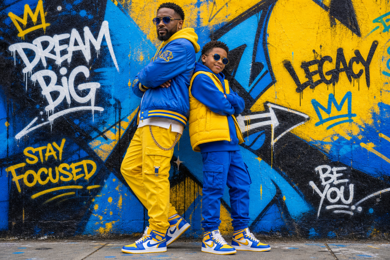
POD execution: Chrome bootleg logo treatment on a black or slate tee – rendered 3D letterforms with specular highlights, dropped onto a minimal background that implies a larger world off the edge. This reads equally well as an oversized chest graphic or a right-shoulder sleeve hit on a coach jacket. For print method, consider foil transfer or high-opacity silver screen print over DTG for the metallic read – or generate the chrome render digitally and execute via DTG on a heavyweight 230gsm blank where the surface quality earns it. Colour complement: cool silver against deep navy, or chrome on washed burgundy for the runway-to-tee translation that labels like Carne Bollente and GmbH have been playing with.
4. Narrative Sequencing on Cloth
Animated onboarding flows use sequence and timing to tell a story across multiple screens. Easing curves determine whether the whole thing feels premium or clunky – a slow ease-in followed by a sharp ease-out reads considered; a linear transition reads like a spreadsheet.
The streetwear translation is sequential graphic design across garment surfaces. Front panel, back panel, inside label, sleeve hit – each element tells part of a story, like frames of an animation you assemble in your head. Brands exploring AI-generated fashion are starting to think this way, using generative tools to build coherent visual sequences across a drop.
POD execution: Compress the sequence onto a single garment. Small cryptic element on the chest – a frame counter, a loading percentage, a single abstract glyph. Full reveal on the back, larger and contextualised. Detail hit on the hem or left cuff. The inside-neck label as a final frame. It rewards the person wearing it and the person examining it up close. On a relaxed-fit tee in off-white or natural, the sequencing reads premium without the premium price.
5. Human Imperfection Over Polish
Here is the counter-trend hiding inside all the technical brilliance: the 2026 motion design space is actively pushing back against mechanical perfection. Designers are deliberately introducing organic irregularities – hand-drawn elements, slightly off-grid compositions, analogue texture – to avoid what one Kittl report called “perfect but soulless” design. TypeTasty’s organic serif trend report echoes this exactly, pointing to deliberately rough-edged typefaces and misregistered letterforms as a defining 2026 visual gesture.
This is where AI T-shirt design tools become most interesting – not as a replacement for aesthetic judgement, but as a way to generate base material you then deliberately degrade. Introduce grain. Offset the registration by three pixels. Let edges breathe. Add a halftone pass over a clean vector. The motion design world achieves this with intentional timing irregularities; we achieve it with texture, print process choices, and controlled distress.
POD execution: Distressed screen-print simulation via DTG on a pre-washed garment – the slight bleed of ink into the fabric adds to the effect rather than working against it. Pair misregistered type (two-colour, slightly offset) with a cracked or faded graphic underneath. Works on vintage-washed black, faded olive, or natural unbleached cotton. Typography direction here is the opposite of the micro-interaction trend: look at 2026’s organic serif revival – TypeTasty cites irregular weight contrast and hand-tooled letterforms as key signals. Set a word or short phrase in one of these, then rough it up further in post.
The boundary between digital UI design and physical graphic design is eroding, season by season. Motion design – built on timing, spatial logic, state changes, and feedback – is teaching static designers to think in implied frames rather than finished images. The best garment graphics this year will feel mid-motion. Capture the moment between frames and you have something nobody else is printing yet.
Frequently Asked Questions
Q: What are the biggest motion design trends 2026 that translate to print design?
A: The key trends are micro-interactions rendered as state-change graphics, liquid and organic morphing shapes, high-fidelity 3D object renders, sequential narrative layouts across garment panels, and deliberately imperfect human-feeling textures.
Q: How do motion design principles apply to t-shirt graphics?
A: Motion design thinks about implied states, spatial relationships, and timing – a static graphic borrows this by capturing a single frame of implied movement, using depth and staging to suggest a larger world off the edges of the print.
Q: What colour palettes are trending in 2026 motion design?
A: Electric lime or phosphor green on washed black for micro-interaction work, terracotta and raw sand or acid violet-to-orange for organic/liquid styles, and cool chrome against deep navy or washed burgundy for 3D-influenced graphics.
Q: What typography works best for motion design-inspired tee graphics?
A: Monospaced and mechanical fonts for the tech-terminal aesthetic, condensed serifs or grotesque-serif hybrids to contrast against organic shapes, and deliberately misregistered or rough-edged organic serifs for the imperfection trend.
Q: Where can designers find current motion design inspiration for POD work?
A: Muzli curates 60+ motion design examples updated regularly and used by 800,000 designers worldwide – a reliable reference for what UI and digital brand designers are actually building right now.
Source: https://muz.li/inspiration/motion-design/
This article was researched and written with AI assistance, then reviewed for accuracy and quality. Maya Sinclair uses AI tools to help produce content faster while maintaining editorial standards.