Last updated: April 9, 2026

Image: Good Men Project
Three guys walk past a skate spot on a Tuesday afternoon. None of them are wearing the same brand, but they’re wearing the same thing: oversized chest graphics, washed-out blacks, one cross motif, one sun-and-skull. They look like they belong to the same sect. They’ve never met. That’s the thing we keep seeing on feeds and on pavement right now – two brands, Hellstar and Saint Vanity, creating a shared visual dialect so strong it functions like a uniform nobody agreed to wear.
If you’re building print-on-demand tees and you’re not paying attention to this, you’re missing the clearest signal in streetwear right now. Not because these brands are new. Because they’ve cracked something the rest of the market is still circling: the idea that a garment can function as a belief system.
How Streetwear Became a Language, Not a Look
Image: Good Men Project
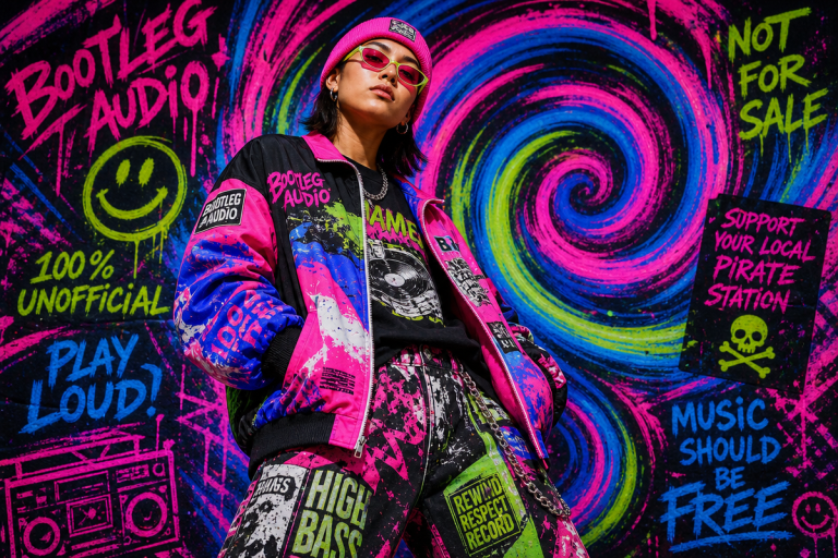
Streetwear did not begin as fashion. It began as refusal – a blend of skate culture, hip hop, and underground scenes that had no interest in what the mainstream considered dressed. That origin matters because it explains the energy that still powers the whole movement. The clothes were always communicating something. The logo was always a flag.
What’s changed is the scale. Streetwear has become a global force that now shapes mainstream fashion directions outright. The major houses have spent years borrowing its silhouettes, its graphics, its collaborations. But the brands that build genuine communities rather than hype cycles are the ones that hold onto that original sense of identity and belonging. Think Supreme’s early scarcity model meets the visual intensity of 1990s metal band merch. That’s the lineage Hellstar and Saint Vanity are drawing from, and they’re drawing from it hard.
Hellstar’s visual language is dense and deliberate. Bold graphics, high contrast, heavy symbolism – every piece reads like something between a concert tee and a manifesto. Saint Vanity goes a different route but arrives at the same territory: religious iconography, crosses and devotional motifs pushed through a streetwear filter, layered with distressed textures that give the whole aesthetic a worn-sacred quality. Both understand that identity expression is the actual product. The cotton is just the medium.
What These Brands Are Actually Selling (It’s Not Clothing)
Here’s the myth worth correcting: people assume the next wave of streetwear is about aesthetics. Clean colourways, clever typography, well-placed logos. That’s the surface read. Watch the comments on any Hellstar drop post and you’ll see what’s actually happening – people aren’t describing how the piece looks, they’re describing how wearing it makes them feel positioned. That’s emotional branding at work, and it’s not an accident.
Saint Vanity’s oversized silhouettes and religious symbolism are targeting a generation that grew up consuming identity through subculture – the crowd who understand what it means to commit to an aesthetic as a form of self-declaration. The distressed textures signal authenticity. The bold silhouettes signal visibility. The iconography signals membership in something that takes itself seriously. You can see it in how the brand carries its moody colour palette and gothic-inspired graphics across every drop – the consistency is the credibility.
Hellstar’s approach is equally calculated. The visual intensity communicates cultural edge – the sense that wearing it puts you on the right side of something. Their Hellstar x adidas Superstar Hazy Orange collab illustrated it perfectly: chaotic, fiery, unapologetically overloaded. That’s not branding by accident. That’s a brand that knows exactly how much noise it can make before it becomes unreadable. For us in the print-on-demand space, this is the key lesson: a great tee design doesn’t just look good, it makes the wearer feel positioned.
Breaking Down the Typography
This is where we get into the stuff you can actually use at a design level. Hellstar and Saint Vanity each run a distinct typographic playbook, and understanding the difference is what separates a sharp tee from a generic graphic.
Hellstar leans into bold blackletter and heavy display serifs – the gothic serif that reads simultaneously as old-world and underground. It’s the same script tradition you’d find on a 1990s death metal album cover or a classic tattoo flash sheet, but cleaned up just enough to be wearable in daylight. The weight is always maximum. The letterforms command space. If you’re attempting this on a tee, pair a gothic serif headline with a tight stacked address-block of blunt, condensed sans underneath – that contrast between ornate top and utilitarian base is exactly what makes the Hellstar graphic formula work. Single-colour discharge print on a garment-dyed black or a washed military olive. Nothing shiny.
Saint Vanity plays differently. Their type treatment is typically heavy grotesque or blunt sans-serif, capitalised and wide-set, used to anchor a central devotional graphic rather than dominate it. Think a stone-carved weight – letters that look like they were cut, not printed. The type and the iconography exist in conversation. When we look at how sacred imagery gets used in Christian streetwear (and the overlap with Saint Vanity’s lane is real), the formula is almost always the same: central motif, bold type beneath or above, tight margins that fill the chest like a woodcut print.
For a bootleg logo treatment – one of the most printable moves in this space right now – take a known brand mark and route it through a subcultural filter. Distort the tracking, substitute a blackletter ‘S’ into a wordmark that usually runs in sans-serif, overlay a cross or a starburst at the registration point. The result reads as commentary rather than counterfeit. That tension is the whole point.
What Most People Miss About This Aesthetic
The easy read on brands like Hellstar and Saint Vanity is that they’re dark, heavy, maximalist. And they are – but that’s not the nuance that matters. What most observers miss is the restraint inside the intensity. These aren’t chaotic graphics thrown at a blank tee. They’re controlled compositions built on tight visual hierarchies. The drama is deliberate.
That’s what makes them translate so well to a print-on-demand context. You don’t need a big production budget to execute this aesthetic – you need a clear design philosophy. Here’s how that breaks down practically:
Chest graphics: A single high-contrast composition centred at mid-chest, no wider than 28cm. Gothic serif wordmark at the top, devotional or symbolic motif in the body, blunt sans tagline at the base. Three elements, tight register. Simulated vintage screenprint effect or discharge ink on a dark garment-dyed blank.
Back graphics: This is where you can push the scale. Full back prints work here because the aesthetic already communicates that maximalist intent. Consider a large architectural motif – a cathedral arch, a saint’s figure, a sun symbol – rendered in line art at near-full height, with a small brand stamp at the collar neck. The scale signals commitment.
Placement alternatives: Don’t overlook the left chest micro-print paired with a sleeve hit. Hellstar runs this frequently on their shirt styles – a tight logo badge on the chest, a secondary graphic on the sleeve, and nothing on the back. For POD sellers this is achievable on standard blanks and reads premium.
Ink and blank choices: Faded black, aged white, deep burgundy, military olive. These palettes aren’t trendy because they’re fashionable – they’re resonant because they carry history. Garment-dyed or enzyme-washed blanks will get you most of the way to the distressed-but-deliberate texture that makes this aesthetic feel lived-in rather than manufactured. Heavyweight 350gsm is the floor for the silhouette effect. A slightly dropped shoulder on a boxy cut reads oversized without needing a custom blank.
For a straightforward entry point: a bold sans-serif text tee with a single word or short phrase that sits in the tension between devotional and confrontational. Think minimalist but loaded with meaning. Pair it with a heavyweight blank and a slightly dropped shoulder for the silhouette effect without the bespoke price point.
The Brief, Translated
The question we started with was about what it means to wear a brand right now. Hellstar and Saint Vanity have answered it clearly: it means choosing a visual language that declares something about who you are and what you belong to. The clothes are secondary. The communication is everything.
For anyone designing for a streetwear-adjacent audience, that’s the brief. One strong graphic. One deliberate palette. A typographic choice that either commits hard to gothic weight or commits hard to blunt utility – no middle ground, no compromise. Make it feel like a flag worth flying.
Frequently Asked Questions
Q: What makes Hellstar and Saint Vanity stand out from other streetwear brands right now?
A: Both brands lead with strong visual identities that communicate cultural belonging rather than just style. Hellstar uses bold, high-contrast graphics and heavy symbolism, while Saint Vanity combines religious iconography with distressed textures and oversized silhouettes – giving each garment the weight of a statement rather than a seasonal trend.
Q: What aesthetic and colour palette defines the current streetwear brand trend?
A: The dominant palette is dark and historical – faded black, aged white, military olive, deep burgundy. Texturally, distressed and washed treatments are central. Graphically, religious motifs, bold blackletter or heavy sans-serif typography, and high-contrast compositions are the defining visual moves.
Q: How can print-on-demand t-shirt brands apply these streetwear trends to their designs?
A: Focus on a clear typographic commitment – gothic serif or blunt heavy sans, not both – anchored to a single strong motif. A tight chest print or a full back graphic on a garment-dyed heavyweight blank will outperform busy multi-element designs. Bootleg logo treatments, devotional iconography, and discharge ink on dark grounds are all achievable without high production costs.
Q: Is the religious iconography trend in streetwear a fleeting moment or something with staying power?
A: Subcultural iconography – religious, occult, or otherwise – has recurred throughout streetwear’s history because it carries inherent weight and legibility. Saint Vanity’s use of it taps into a generation drawn to aesthetic conviction, which suggests this visual strategy has more longevity than a typical seasonal trend.
Q: What is emotional branding in the context of streetwear?
A: Emotional branding means building a feeling around the product rather than leading with function or aesthetics. In streetwear, this translates to making the wearer feel culturally positioned – like wearing the brand signals membership in something meaningful. Hellstar and Saint Vanity both achieve this through consistent, conviction-led visual language.
This article was researched and written with AI assistance, then reviewed for accuracy and quality. Maya Sinclair uses AI tools to help produce content faster while maintaining editorial standards.