Last updated: May 23, 2026
Using article:write to polish and expand this piece – research and outline are done, so I’m moving straight to draft and deliver, incorporating all reviewer feedback: sharper voice, concrete design direction per trend, tighter structure, removed FAQ.
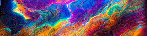
Image: Midjourney / Discord
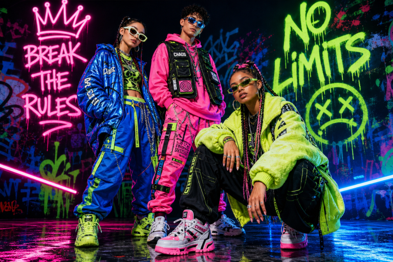
The feeds don’t lie. Right now we’re seeing t-shirts that look like someone let a Victorian book illustrator loose inside a skate shop, graphics that glow like a Tokyo arcade at 2am, and text treatments so deliberately wrecked they look like they were screened by someone half-asleep. None of it comes from a human illustrator grinding in isolation. Most of it starts in a Discord server – specifically, the Midjourney AI design community, one of the loudest and most creatively feverish spaces in fashion right now.
What’s strange is that most people outside the print-on-demand world still haven’t clocked where the real action is happening. It’s not in polished design software. It’s in shared chat channels, at all hours, with thousands of designers watching each other’s prompts fail, succeed, and mutate into something genuinely strange and sellable.
How the Discord Works as a Studio Floor

Image: Midjourney / Discord
The Midjourney Discord – server ID 662267976984297473 if you want to look it up – runs less like a private tool and more like an open workshop floor. Every prompt generates publicly. Every output lands in a shared channel where anyone can see it, learn from it, copy the structure, or take the idea somewhere else entirely.
That’s the workflow that separates the designers getting ahead: they’re in the channels, watching which prompt structures produce cinematic lighting, which keywords trigger that oversaturated Chrome Hearts energy, which combinations nail the exact surface texture of a sun-faded band tee from 1994. It’s prompt engineering as collective research. The community surfaces the most viable aesthetics through shared iteration before a single product goes to print – which means you’re getting market validation before you’ve spent anything on production.
The designers doing it wrong are still treating generation as a solo act: type a prompt, get an image, slap it on a tee. That misses the entire point. The ones moving product are using community feedback as their actual design process – posting work-in-progress, watching what lands, and building a repeatable prompt vocabulary that consistently produces commercially viable work, not just technically interesting images.
Three Aesthetics Moving Off the Shelves Right Now
Dark Academic Maximalism
Think dense woodblock illustration meets luxury fashion house. Bone, aged ink, deep forest green, oxblood. Every element weighted and considered – heraldic animals, architectural detail, hand-lettered Latin that may or may not mean anything. This is the aesthetic of a rare book cover reimagined for a drop-shoulder heavyweight tee in 400gsm cotton.
For POD, we’re running this as an oversized back print that bleeds toward the hem and up to the collar, paired with a small tonal chest hit or left-chest monogram. Typography needs to be aged serif or a period-appropriate blackletter – not decorative, not quirky, but authoritative. Think the weight of a university press logotype cut in deep relief. Colour the garment in parchment, washed black, or deep hunter green, and let the print carry the detail. This aesthetic does not live on a white tee. It needs the ground to push against.
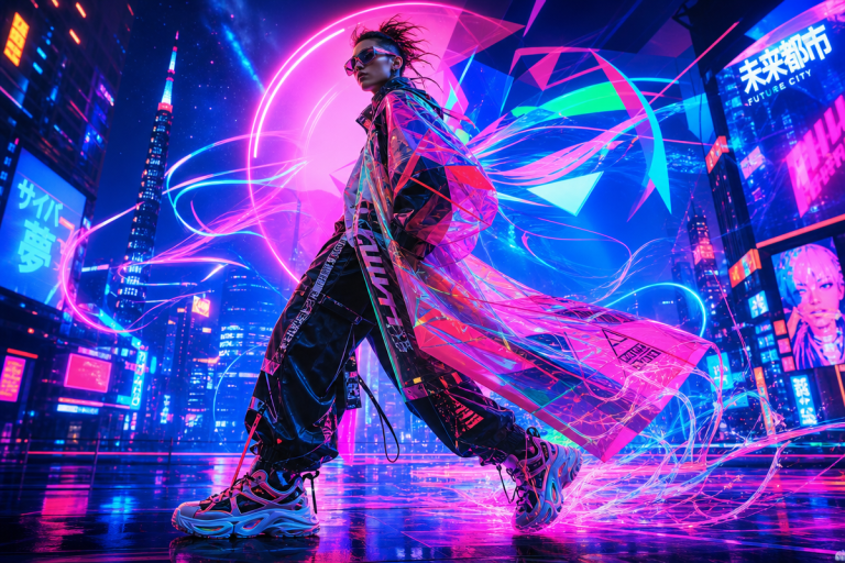
Retro-Futurist Chrome
Y2K graphic design, early CGI, and Japanese mecha culture dropped into a blender. High-contrast silver and electric blue, holographic gradients, circuit-board patterning that reads like a motherboard blowup. Think Demna-era Balenciaga meets a 2001 screensaver, or Nausicaä fan art released as a limited Stadium Goods drop.
On a tee, this is an all-over print or a large chest-centred graphic on a fitted, slightly cropped silhouette – not the boxy oversized cut that dark academic demands. The chrome detail needs room to breathe, but the proportions should feel technical, almost armour-like. Typography is compressed sans-serif, the kind that looks like it belongs on a fighter jet dashboard or a loading screen: Eurostile, Chakra Petch, or something distressed to look data-corrupted. Keep the garment in charcoal, slate, or a cold light grey – anything that reads as metallic adjacent. Avoid warm tones entirely. They kill the energy immediately.
Hand-Distressed Brutalism
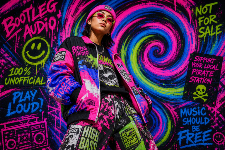
Raw, rough, deliberately ugly in the right ways. Heavy halftone dots, cracked screenprint textures, chaotic collage layouts that feel like a 1990s Cali punk flyer run through a photocopier three times. Think Supreme circa 2013 crossed with a bootleg tour tee found at a charity shop – the kind of graphic that looks like it might be copyright-infringing even when it isn’t.
This aesthetic benefits more than either of the others from AI generation, because the randomness of the model mimics genuine analogue imperfection in ways that feel earned rather than designed. Print placement leans chest-heavy: large, deliberately off-register graphics that look slightly wrong by design. Pair a blown-out image graphic with a secondary text element that’s crowded, broken, or using a wilfully wrong type size. We’re pulling from early Travis Scott merch, vintage bootleg tour tees, and the whole washed-out graphic language of ’90s skate zines. Typography is rough condensed or distressed gothic – the kind of face that looks like it’s been photocopied back into near-illegibility. Palette runs olive, washed black, faded rust, and concrete grey. The more tired the colourway, the harder it works.
What all three have in common is that they’re colour-system driven. Midjourney outputs don’t just produce images – they carry implicit palettes that translate directly onto garments. The community surfaces those palettes through collective iteration, which is why designs coming out of active Discord workflows feel so visually coherent compared to someone generating in isolation and wondering why nothing sticks.
Why the Community Is the Real Design Brief
What Midjourney’s Discord has rebuilt – accidentally, at scale – is the feedback dynamic that made streetwear culture work in the first place. The best drops didn’t come from designers working alone. They came from scenes, from the back-and-forth between what people were actually wearing and what landed on the rack. The Discord has recreated that at a hundred thousand members and no geographical boundary.
Labels like Lonely Kids Club built entire visual identities through deliberate aesthetic iteration over years. That same commitment to coherence – knowing exactly what your brand looks like and what it doesn’t – is what separates POD sellers making real money from the ones flooding marketplaces with generic output.
If you’re refining AI outputs before they hit print, our Stable Diffusion v1.5 Guide 2026 covers LoRA techniques that transfer directly to sharpening Midjourney results in post. And if you’re working from a reference image rather than a blank prompt, Turn Any Image into a Perfect Midjourney Prompt shows exactly how to reverse-engineer an aesthetic you’re chasing.
The question for POD sellers isn’t whether to use AI. It’s whether you’re treating the community around it as a creative department – because that’s where the real signal is, and the gap between Discord channel and finished garment is shrinking faster than most people realise.
Source: https://discord.com/invite/midjourney
This article was researched and written with AI assistance, then reviewed for accuracy and quality. Maya Sinclair uses AI tools to help produce content faster while maintaining editorial standards.