

\n
Last updated: June 9, 2026
\n
 \n
\n
\nImage: Kittl
\n
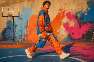
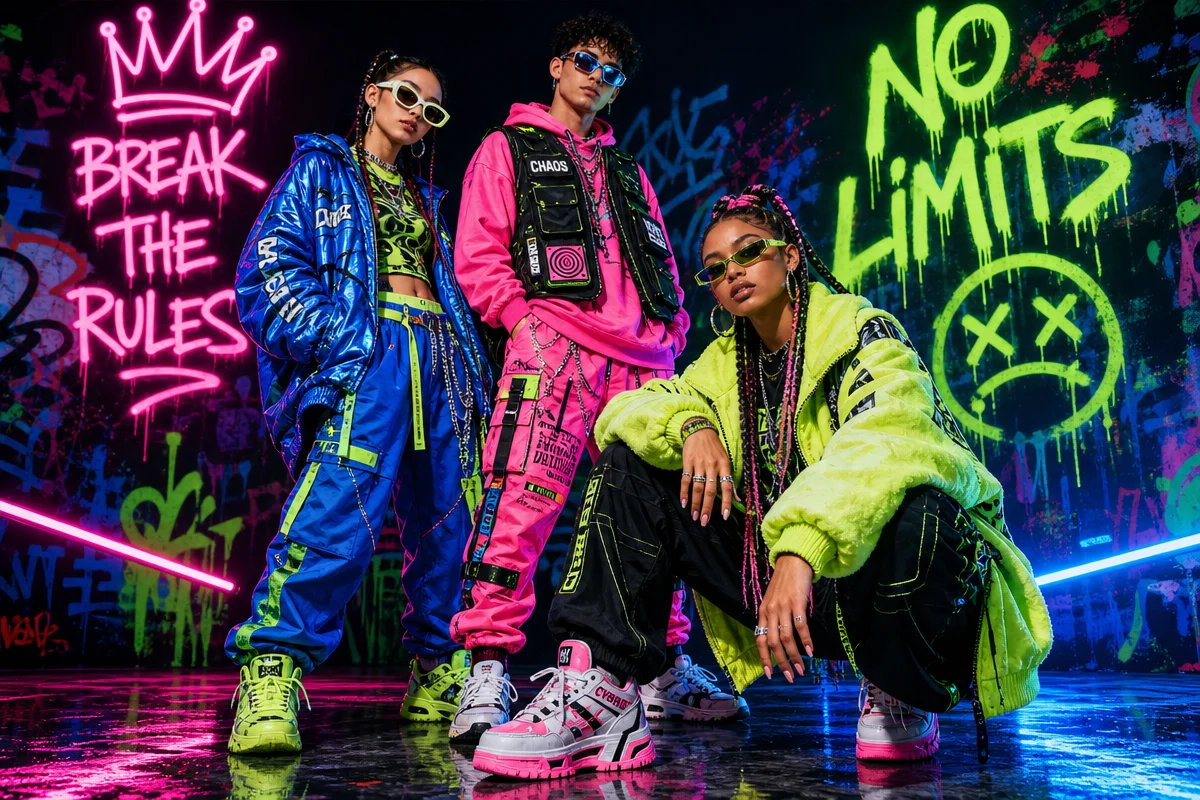
Outside the venue at midnight: a baby tee tucked into low-rise denim, a thrifted blazer over a band tee for a band that probably doesn’t exist, a cap with a logo that’s deliberately slightly wrong. Open the feeds at any hour and it’s the same visual argument, repeated across every city in every timezone. Gen Z fashion trends in 2026 aren’t just clothes – they’re a coded visual language that signals exactly who you are and what you reject. For print-on-demand designers, that language is both the opportunity and the test. Get it right and you’re selling out runs. Get it wrong and you’re the brand that doesn’t get it.
\n
Here’s what we’re reading on the feeds, the streets, and in the club queues – and how to design for it.
\n
1. Y2K Is No Longer Nostalgia – It’s the Default Setting
\n
\n
\nImage: Kittl
\n
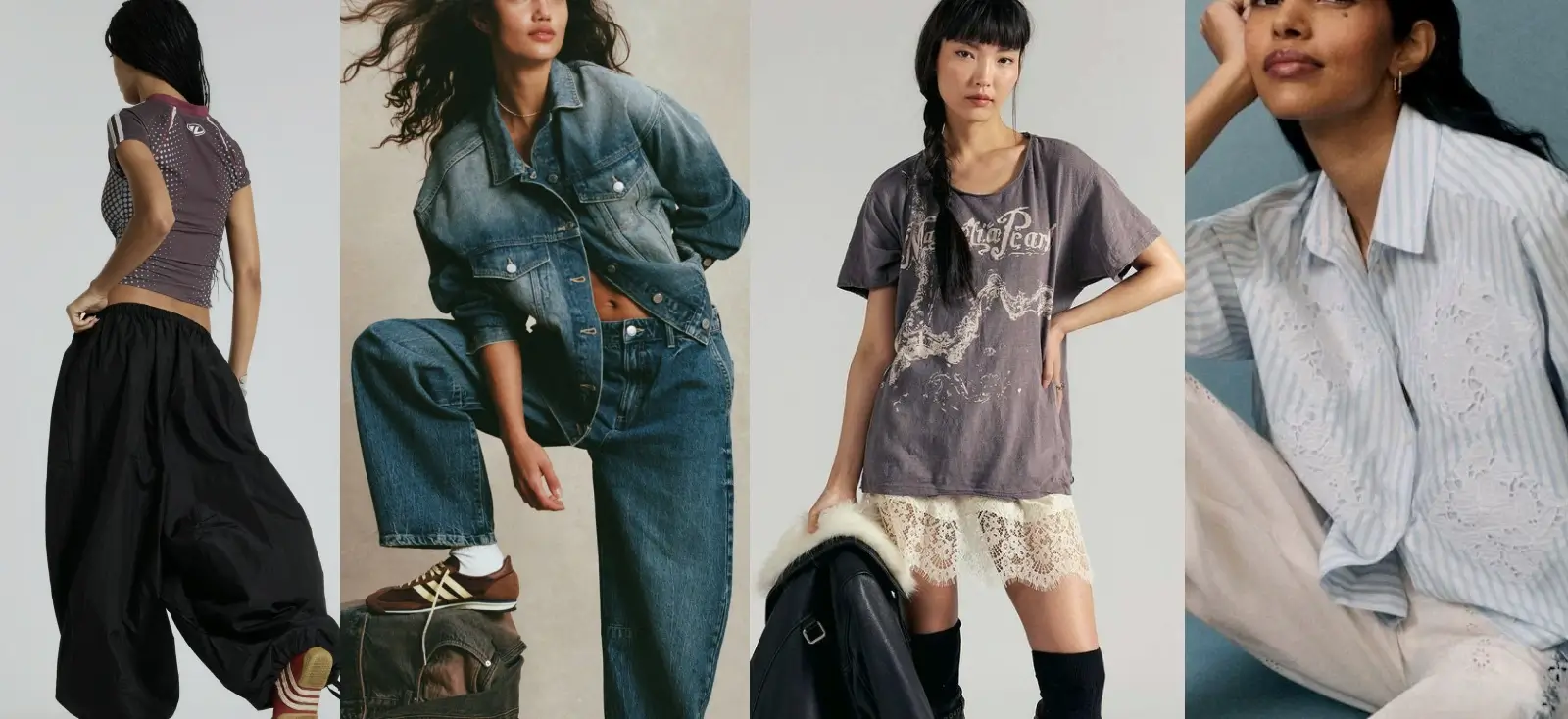
The Y2K revival has completed its arc: irony to niche to mainstream. PacSun and Abrand are shifting volume on slouchy double denim, low-rise baggy jeans, and baby tees – not as throwback pieces but as everyday staples for teenagers who weren’t born when these silhouettes first peaked. It’s not retro anymore. It’s just clothes.
\n
For POD, the baby tee is your canvas: tiny fit, slim crop, retro colourways, distressed printing finishes. Think washed-out pastels and Y2K-era pink and baby blue – or push further into lavender, sun-faded coral, and dirty cream. Butterfly motifs, early-internet typography, and anything that looks like a mid-2000s Hollister graphic recontextualised with self-awareness. Bold condensed serifs with heavy distress work well. Ditto chunky collegiate numbers in contrasting tones. The typeface needs to feel slightly aged – as if it survived a tumble dryer cycle in 2003.
\n
Design direction: A retro sport graphic on a baby tee in dusty rose or ice blue, printed to look faded from the start. Or a bootleg logo treatment of a late-90s brand reference – deliberately off, deliberately knowing. Silhouette-wise: keep the tee itself fitted and cropped. The graphic does the heavy lifting.
\n
2. The Indie Sleaze Comeback
\n
Indie sleaze is hitting harder than the Y2K wave because it’s ideological. The early-2010s aesthetic – greasy maximalism, flash photography, band tees under blazers, American Apparel cuts – is resurging as a direct rejection of the polished, filter-heavy look that defined the early 2020s. The aesthetic says: we stayed up late, we don’t care that you noticed.
\n
Vogue Business’s TikTok Trend Tracker credits creators who coined the “indie sleaze” microtrend with essentially building a new visual vocabulary for a generation. Think Ecco2k meets a 2009 blogosphere – designer references mangled into streetwear, vintage mixing with grunge utility.
\n
For designers, this translates to texture and attitude over polish. Screen-print aesthetics that look hand-pulled, slightly misregistered, ink-heavy – like the squeegee ran out of pressure on the last pass. Typography should feel like a zine or a flyer: xerox-distorted sans-serifs and raw hand-lettering. Rough, fractured letterforms beat anything too clean. Our Typography Trends 2026-2027 piece covers exactly this: letterforms that feel alive, imperfect, and human.
\n
Palette: off-whites, brick reds, muddy greens, and washed black. Not muted for luxury – muted because the garment’s been through things. Heavyweight unisex tees with drop shoulders work best here; the silhouette should read lived-in, not fitted.
\n
Design direction: A four-colour screen-print tee referencing an imaginary 2009 music festival – fictional band names, deliberately chaotic layout, a palette of off-whites, brick reds, and muddy greens. Stack three type sizes that don’t quite align. That’s the point.
\n
3. The Luxury Collector Is Younger Than You Think
\n
More than 80% of Gen Z report money-related stress, yet they’re turning up at auction houses. Sotheby’s luxury sector hit $2.7 billion in revenue in 2025, with Millennials and Gen Z accounting for nearly half of participants. Younger buyers are entering through handbags and collectibles, treating fashion as investment – and that aspiration bleeds directly into what they wear every day.
\n
The design opportunity here is the aspirational graphic: pieces that reference luxury codes without being counterfeit. Tonal monogram-inspired prints, heritage colour combinations (forest green and tan, navy and cream, camel and black), understated typography that implies rather than shouts. Think Bottega Veneta’s quietness – no logo, nothing screaming – applied to streetwear’s silhouette and volume.
\n
Typeface matters enormously here. Tracking-heavy serif logotypes, small-cap arrangements, the kind of lettering you’d find embossed on a leather interior. Nothing condensed, nothing distressed. The graphic should look like it belongs on a luggage tag, not a festival flyer.
\n
Design direction: A tonal embroidered-look chest logo on a heavyweight tee, muted colourway, zero irony. Or a vintage collegiate graphic that nods to old-money crest aesthetics without cosplaying a school you didn’t attend. Forest green on ecru. Navy on pale gold. Restrained.
\n
4. DIY Volume Beats Seasonal Cohesion
\n
Streetwear brand COLD CULTURE is running hundreds of active Meta ads simultaneously, shipping roughly 42 new creatives per week – not a unified seasonal theme, but pure volume and variety with DIY aesthetics that feel raw rather than art-directed. It works because it mirrors how Gen Z consumes content: fast, fragmentary, responsive to micro-moments. The collection-as-concept is a legacy fashion idea. The single-graphic drop is the new unit.
\n
For POD designers, the takeaway is to stop waiting for a coherent range and start shipping individual designs fast – test what resonates, iterate, kill what doesn’t. Rough edges and hand-drawn elements read as authentic rather than under-resourced. Marker-on-cardboard energy. If you’re using AI image generation tools to speed your workflow, lean into output that looks human-made – textured, slightly chaotic, not AI-clean. A washed garment with a rough-transfer graphic finish can do more work than a technically perfect four-colour halftone.
\n
Design direction: A rough hand-lettered slogan tee with visible texture and imperfection baked in. Use a mid-weight tee in natural or off-white – nothing structured. Let the type breathe unevenly. Print on the back if the front feels too deliberate.
\n
5. Micro-Aesthetics and the End of Trend Seasons
\n
Fashion aesthetics are splintering. There’s no single season anymore – instead, hundreds of micro-aesthetics circulating simultaneously on TikTok, each with its own visual vocabulary and community. Gorpcore meets blokecore meets dark academia meets coastal grandmother, and the list regenerates weekly. Gen Z is projected to account for 40% of global fashion spending by 2035, and they’re the generation that made this acceleration necessary.
\n
Community-specific graphics – designed for a specific niche, a specific reference set, a specific inside joke – outperform generic trend-chasing every time. The designers winning right now aren’t trying to serve everyone. See our Top Streetwear Brands 2026 breakdown for who’s cutting through and why. The pattern is consistent: a clear aesthetic point of view, released quickly, without apology.
\n
Gorpcore wants topographic trail-map illustrations in slate blue and pine. Dark academia wants archaic Latin, crests, and midnight ink on aged parchment. Blokecore wants terrace graphics, retro badge treatments, and the visual grammar of a 1993 away kit. Each of these is a deep well. One designer going deep beats ten designers going wide.
\n
Design direction: Pick one micro-aesthetic and commit. A blokecore football graphic with British terrace references – thick serif type, shield motif, faded red on white. A dark academia crest with genuine archaic Latin and muted jewel tones. A gorpcore trail-map tee in topographic illustration style, forest green on natural. Specificity is the point – the design should feel like it was made for one person who will immediately send it to twelve friends exactly like them.
\n
\n
Across Y2K defaults, indie sleaze energy, aspirational luxury codes, DIY volume, and micro-aesthetic splintering, there’s a single thread: this is the most visually literate generation that’s ever bought a t-shirt. They grew up reading brand personality as fluently as language – they know the difference between Chanel’s timeless elegance and Bottega’s quiet confidence, and they know when a graphic is trying too hard to signal either. The brands that win aren’t decoding Gen Z from the outside. They’re designing from inside the references: fast, specific, and without apology.
\n
\n
Frequently Asked Questions
\n
Q: What Gen Z fashion trends should print-on-demand designers focus on in 2026?\nA: Y2K revival (baby tees, distressed retro graphics), indie sleaze (raw DIY aesthetics), micro-aesthetic community graphics, and understated luxury-coded designs. Fast iteration and niche specificity outperform broad seasonal collections.
\n
Q: What colour palettes are resonating with Gen Z in 2026?\nA: Dusty pastels, Y2K-era baby blue and pink, lavender and faded coral; off-whites, brick reds, and muddy greens for indie sleaze; muted forest green, navy, and cream for aspirational luxury. Washed and distressed finishes read as authentic across most aesthetics.
\n
Q: How do I design for Gen Z without chasing trends too broadly?\nA: Pick a specific micro-aesthetic and design from inside its references. A graphic that’s clearly made for one niche community outperforms a generic design aimed at everyone. Specificity drives word-of-mouth.
\n
Q: How important is typography in Gen Z-targeted t-shirt design?\nA: Critical. Gen Z reads typeface choices as cultural signals. Zine-style lettering and raw hand-lettering work for indie sleaze; bold condensed serifs with distress for Y2K; tracking-heavy serif logotypes signal luxury codes. Getting the font wrong can undermine an otherwise strong graphic.
\n
Source: https://www.kittl.com/blogs/gen-z-fashion-trends-style-guide-dsi/
\n
This article was researched and written with AI assistance, then reviewed for accuracy and quality. Maya at Its.That. uses AI tools to help produce content faster while maintaining editorial standards.
\n