Last updated: May 8, 2026
Picture this: a portrait bathed in amber light, skin tones warm as late afternoon, shadows pooling in deep teal at the edges of the frame. The colours feel deliberate, cinematic – like a still from a film that hasn’t been made yet. This is what colour grading does. It doesn’t just edit a photograph; it builds a mood, declares an intention, and transforms a technically correct image into something emotionally true.
Here is the fact most beginners miss: the Camera Raw Filter inside Photoshop is not a simplified tool. It is the full Adobe Camera Raw engine – the same one professional photographers use on their RAW files – available on any layer, at any point in your workflow. You don’t need a RAW image to use it. You don’t even need a photograph. You need to know where to find it, and what to do once you’re inside.
How the Camera Raw Filter Became Photoshop’s Essential Colour Tool
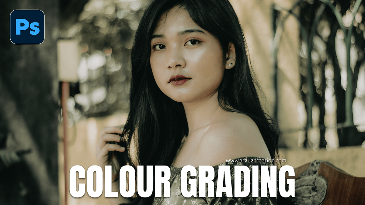
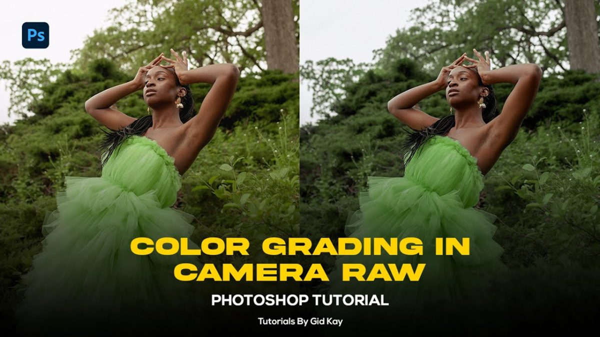
Image: Arzuz Creation (409KB)
Adobe introduced Camera Raw as a separate utility for processing RAW files. For years, it sat outside Photoshop proper, a doorway you walked through before the real editing began. Then, quietly, they embedded it as a filter – and everything changed.
The Camera Raw Filter gives us access to tools that simply don’t exist elsewhere in Photoshop. The Tone Curve. The Colour Mixer. The Calibration panel. And most crucially for our purposes: the Colour Grading panel, which replaced the older Split Toning interface and now lets us push individual hues into shadows, midtones, and highlights independently. This is the same colour science that makes Hollywood colourists reach for tools like DaVinci Resolve – the principle of splitting a tonal range and pushing it toward a deliberate colour temperature.
Think of it like mixing paint for different parts of a room: your shadows might receive a cool blue-green, your highlights a warm gold, and your midtones sit in a neutral zone that keeps skin tones believable. The result reads as cohesive because the colours are in dialogue with each other. This is colour theory in practice – analogous palettes, complementary tensions, the same logic that Vermeer used when he laid warm candlelight against cool shadow on those extraordinary Dutch interiors.
Colour Grading Photoshop 2026: A Step-by-Step Workflow
The workflow is straightforward. Start on a new layer – or better, convert your layer to a Smart Object first (right-click > Convert to Smart Object). This keeps the Camera Raw Filter non-destructive, so every adjustment you make can be revisited and revised without re-editing from scratch.
Open the filter via Filter > Camera Raw Filter, or press Shift + Ctrl + A on Windows, Shift + Cmd + A on Mac. You’ll land in the Basic panel.
Work in this order:
Step one – Sort your exposure. Use Exposure, Highlights, Shadows, Whites, and Blacks to achieve a balanced tonal range. Don’t aim for perfection yet – aim for clarity. You want to see into both the shadows and the highlights before you start colouring anything.
Step two – Shape the contrast. Open the Tone Curve panel. A gentle S-curve – lifting the highlights slightly, pulling the shadows down – adds the kind of contrast that makes an image feel grounded. Film photographers know this instinctively; it echoes the characteristic curve of analogue emulsions.
Step three – Refine individual colours. The Colour Mixer (formerly HSL) lets you adjust Hue, Saturation, and Luminance for each colour channel independently. Want to make foliage feel richer without touching skin tones? Pull down the green saturation and shift the hue. Want skies that feel closer to dusk? Drop the blue luminance. This panel rewards patience and a careful eye.
Step four – Apply the grade. Open the Colour Grading panel. You’ll see three colour wheels: Shadows, Midtones, and Highlights. Each wheel lets you push that tonal range toward a chosen hue. A classic cinematic grade pushes shadows toward teal and highlights toward amber – the complementary tension between cool depth and warm light. Adjust the Blending slider to control where shadows end and midtones begin; adjust Luminance to keep the brightness balanced as you add colour.
Step five – Calibrate. The Calibration panel at the bottom of the stack is underused and powerful. Shifting the Red Primary Hue slider can warm or cool the overall image with extraordinary subtlety – useful for making colour grades feel embedded in the image rather than painted on top.
This same approach applies whether you’re working on landscape photography, editorial portraiture, or product shots. If you’re building e-commerce visuals, the same principles of controlled colour temperature apply – How to Edit Product Photos with AI (2026) explores how AI-assisted workflows sit alongside these manual techniques. For fashion and editorial work, the interplay between skin tones and background colour grades is especially critical – The Ultimate Guide to Fashion Image Editing covers that territory in depth.
What Changes When You Can Grade Confidently
Colour grading fluency changes three things at once: how you shoot, how you edit, and what you notice in other people’s work.
When you understand that shadows can be pushed cool, you’ll start to expose your subjects with that in mind – placing them in natural light that has warmth in the highlights and depth in the shade. When you know how the Colour Mixer works, you’ll start noticing that overly saturated skies or muddy skin tones are fixable at the channel level, not by reaching for the global Saturation slider. And when you watch a film or scroll past editorial photography, you’ll begin reading colour grades the way a musician reads chord progressions – understanding the logic underneath the feeling.
Street photography benefits from this fluency too. The low-contrast, slightly desaturated grades popular in contemporary documentary work – reminiscent of photographers like Viviane Sassen or the cool reportage tones of the New Topographics movement – are constructed choices, not accidents. They push the image toward a particular emotional register. If you’re working on staying discreet in street photography, the edit should match the quiet observation of the capture.
The Camera Raw Filter is, at its core, a translation tool. It translates what your camera recorded into what you intended to say.
Return to that amber portrait in your mind. The warmth in the highlights isn’t an accident. Neither is the teal that gathers in the shadows. Someone made a series of deliberate choices – in the Colour Grading panel, in the Tone Curve, in the Calibration sliders – to build that mood. With the workflow above, those choices are now available to you, on any image, in any session, without guesswork.
That’s the work. Begin there.
Frequently Asked Questions
Q: What is the Adobe Camera Raw Filter in Photoshop and how do I access it?
A: The Camera Raw Filter is the full Adobe Camera Raw engine embedded inside Photoshop as a filter, available on any layer – not just RAW files. Access it via Filter > Camera Raw Filter, or press Shift + Ctrl + A (Windows) or Shift + Cmd + A (Mac).
Q: What is the difference between the Colour Grading panel and the old Split Toning panel?
A: The Colour Grading panel replaced Split Toning and adds an independent Midtones colour wheel, a Blending slider to control tonal range overlaps, and a Luminance slider per range – giving far more precise control over where colour is applied across the tonal spectrum.
Q: Do I need to shoot in RAW format to use colour grading in Photoshop 2026?
A: No. The Camera Raw Filter works on any layer in Photoshop, including JPEG images, composites, and retouched files. Converting your layer to a Smart Object before applying the filter keeps all adjustments non-destructive and fully editable.
Q: What is a classic cinematic colour grade and how do I recreate it?
A: A classic cinematic grade pushes shadows toward teal and highlights toward amber – a complementary colour contrast that creates visual depth and warmth simultaneously. In the Colour Grading panel, nudge the Shadows wheel toward blue-green and the Highlights wheel toward orange, then adjust the Blending slider to taste.
Q: How do I prevent colour grading from ruining my skin tones?
A: Use the Colour Mixer panel to monitor and protect skin tone channels (usually orange and yellow hue ranges). Apply global grades subtly via the Colour Grading panel, and use the Calibration panel’s Red Primary Hue slider for fine overall temperature adjustments that feel more embedded in the image than overlay-style grading.
Source: https://arzuzcreation.com/2026/04/01/colour-grading-adobe-camera-raw-filter-2026/
This article was researched and written with AI assistance, then reviewed for accuracy and quality. Talulah Menser uses AI tools to help produce content faster while maintaining editorial standards.