Last updated: March 29, 2026
Image: ordnur.com
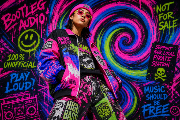
We’re on a packed street corner. Washed black tees pass like a film reel – cracked portrait prints, condensed serif tour text, tiny nape‑hits peeking under jacket collars. Feeds show the same: bootleg‑style graphics selling out in hours, resale listings spiking, and small brands turning cultural detritus into coveted drops. The look reads lived‑in. The production reads intentional. That combination is the 2026 bootleg revival: homage graphics engineered to feel like found artifacts, printed with precision and shipped fast.
Short calls. Bold moves.
DTF for complex gradients.
Heavy blanks, not flimsy throwaways.
One arresting typographic or photographic call per tee.
Why this moment? The cultural logic
Bootleg and homage tees tap three forces. Nostalgia fuels desire; resale economics validate scarcity; and social feeds compress trends into hours. The late‑80s/90s unlicensed rap tee aesthetic – dusty halftones, off‑register ink, misaligned type – once signaled hustle. Now it signals taste. When a 1993 flea‑market tee sells for £180, the visual code flips from thrift to status. Brands that deliberately recreate that worn authenticity, but with modern durability and placement finesse, win.
How production tech meets aesthetic need
Screen printing has its virtues. But it’s slow for viral drops: screen burning and setup takes weeks. Direct‑to‑Film (DTF) transfers change the calculus. DTF eliminates setup time, supports full‑colour photographic gradients, and delivers soft‑hand prints that stretch without cracking on heavyweight cotton or poly blends. For vintage bootleg and retro‑futurist chrome effects (think metallic gradients and 3D reflections), DTF’s 100% colour accuracy is a must. It lets us move from file to finished transfer in hours – ideal for just‑in‑time drops and gang‑sheet testing.
Practical DTF notes every brand should know
– colour vibrancy on dark garments depends on white underbase opacity. Always confirm supplier white density; weak white yields dull prints on black.
– DTF handles unlimited palettes and subtle gradients that screen separates struggle to replicate. Use it for smokey portraits and airbrushed chrome.
– Gang sheets: arrange multiple designs/colorways on one sheet to test variants cheaply before scaling. This is how we identify winners without inventory risk.
– Handfeel: high‑quality DTF transfers can be soft and durable; sample washes are essential to confirm retention. Don’t skip it.
Design language – palettes and typography that sell
The visual grammar is exact. Work from that grammar instead of “generic vintage.” Key palettes:
– Washed black base (not pitch black) + nicotine cream accents.
– Oxidised red and tobacco for racetrack and merch vibes.
– Forest green + ochre for collegiate/heritage treatments.
– Airbrushed chrome + electric highlights for premium retro‑futurist pieces.
Typography signals era and authenticity:
– Condensed slab serifs and tight‑tracked collegiate text for tour and racing motifs.
– Distressed varsity lettering with visible registration drift for that off‑press feel.
– Ransom‑note sans (mismatched letterforms) for bootleg subversion.
One rule: less is more. A single strong typographic element reads more authentic than clutter.
Three print directions we’d back right now
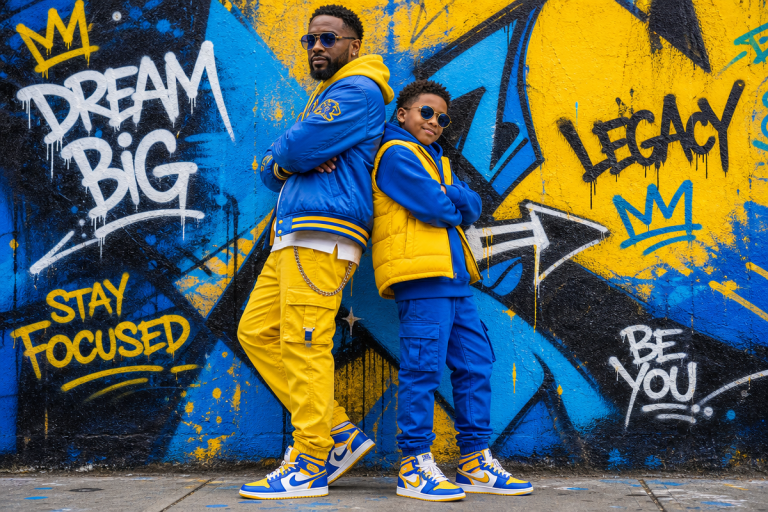
1) Archive rap tee flip – photographic halftone portrait, tight crop, condensed serif tour text on the back. This reads collector’s piece, not costume.
2) Bootleg sports‑logo rework – shield/pennant system reimagined with fictional team names, oxidised palettes, distressed edges. Modular and legal.
3) Airbrushed chrome statement – a single chrome word or short phrase with subtle shadow on washed black; premium price, high margin.
Placement and detail tactics that mark quality
Small placements and details sell credibility. Trends we see converting:
– Nape hit: ~2‑inch print below the back collar – feels private, like a collector’s tag.
– Sleeve vertical text: a slim, tactile edge detail that reads editorial in lifestyle shoots.
– Inside neck custom labels: sewn tags or printed labels signal craft and justify higher price points.
These touches cost little but communicate thoughtfulness.
Fabric and construction – where cheap homage fails
Homage fails when the blank betrays the art. Aim for 180-220gsm ring‑spun cotton, pre‑shrunk, enzyme‑washed where the worn look is desired. Heavyweight blanks hold shape and age well. Cheap thin tees pill and fade unpredictably, killing resale value and brand trust. If discharge printing or screen is in the toolkit, use them for soft vintage looks; if DTF is used, dial back saturation to avoid a “digital” sheen and proof to garment ICC profiles.
Print method decision map
– Use DTF when: photographic detail, many colours, quick turnarounds, small batches.
– Use screen/discharge when: you want a true vintage hand, long rub/wash life, or very limited premium runs.
– Hybrid approach: DTF for test drops and colour‑heavy runs; screen or discharge for hero pieces and scaled drops.
POD and production playbook
We treat tribute tees as productised assets: design once, scale across SKUs (tees, hoodies, mugs, caps). For POD sellers:
– Sample to bulk: always order samples on the intended blank and run wash tests.
– Gang sheet testing: print multiple variants in one go to gauge market response.
– SKU planning: one hero artwork across 3 sizes, 2 colorways, 1 placement test minimizes risk.
– Supply caveat: confirm white underbase opacity for dark garments and insist on wash tests; underbase failures turn rich colours into mud.
Styling and photography – make heritage feel modern
The homage tee works best against contrast: modern silhouette + retro graphic. Oversized tee tucked into wide‑leg denim. Tee under an open overshirt with low‑profile sneakers. For shoots, show pieces in contemporary contexts – tailored trousers, clean sneakers – so the vintage graphic reads deliberate. Product photos should include hero lifestyle, detail macro (ink hand and texture), and flat/white‑bg shots for marketplaces.
Legal and creative boundaries – play smart
Bootleg aesthetic is about visual language, not copying IP. Recreate the visual system (grid, palette, typographic tone), not a protected logo or mark. Originality keeps us safe and creative. If in doubt, alter key elements (type treatment, fictional team names) until the reference becomes homage rather than reproduction.
Testing and go‑to‑market tactics
– Tease: release mockup + close‑up of texture; let the feed speculate.
– Drop small: use DTF gang sheets to run 30-50 units and test on social.
– Iterate: identify best seller, scale with screen/discharge for hero production runs.
– Scarcity: numbered runs, limited colorways, and inside‑neck serial tags increase secondary market value.
Common mistakes we see
– Overcomplication: too many graphics on one tee dilutes the homage vibe.
– Cheap blanks: kills resale, returns, and brand credibility.
– Ignoring white underbase: leads to dull dark‑wear prints.
– Delay: viral moments vanish; DTF’s speed is strategic advantage.
Quick checklist before you press PRINT
– Sample on final blank? Yes.
– White underbase verified for dark garments? Yes.
– Gang sheet planned to test variants? Yes.
– Placement tests run (nape, sleeve, inside neck)? Yes.
– Photography plan: hero + macro + lifestyle? Yes.
We’re not chasing an accident. We’re engineering it. The bootleg revival is about intentional ruin: choosing the right palette, the right fabric, the measured misalignment, and the tech that delivers it at speed. DTF gives us colour depth and velocity. Premium blanks and smart placements give us longevity and resale credibility. A single strong typographic or photographic call makes the piece collectible, not costume.
If we get those choices right, the tee looks like it survived a decade it never lived through – exactly the cultural signal buyers are paying for.
This article was researched and written with AI assistance, then reviewed for accuracy and quality. Maya Sinclair uses AI tools to help produce content faster while maintaining editorial standards.