

What Makes a Great Portrait? Meaning, Technique & Emotional Impact
2026-04-28
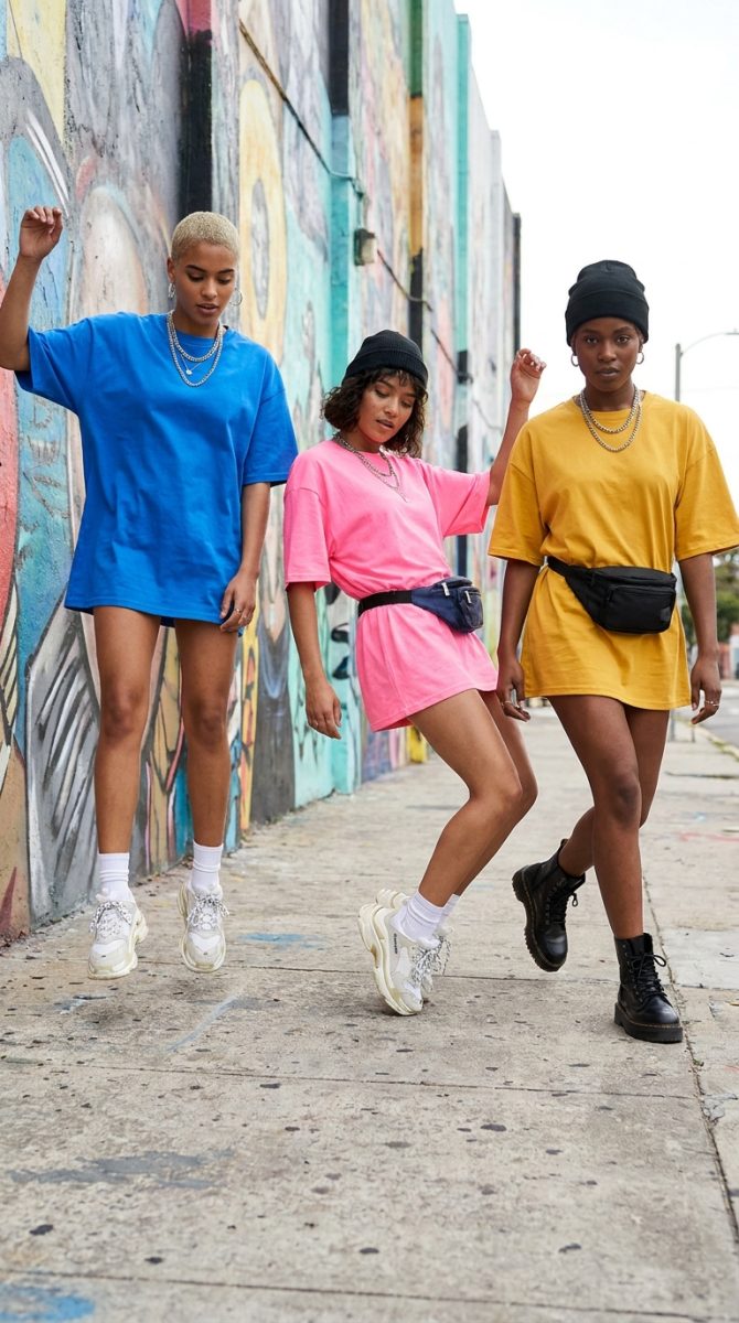
Bootleg T-Shirt Design in 2026: How Freelancers Are Selling Retro Streetwear at Scale
2026-05-03![Top 10 Underground Streetwear Brands [Updated for 2024]](https://itsthat.shop/wp-content/uploads/2026/04/Kozy-2023-Hoodie-Drop-1024x798-1.jpg)
Last updated: April 21, 2026
The feed doesn’t lie. Scroll past the usual suspects – the big box drops, the reseller bait, the collab fatigue – and something else is happening in the margins. Hand-stitched tags. Off-register screen prints. Fonts that look lifted from a 1994 skate zine. Colours that shouldn’t work together but absolutely do. Indie streetwear brands are quietly building something that the majors can’t buy their way into: credibility earned one drop at a time.
We’re not talking about the brands with celebrity co-signs and a PR agency on retainer. We’re talking about the labels running operations out of bedrooms in Peckham, garages in East LA, and shared studios in Shimokitazawa. The ones whose drops sell out in fourteen minutes to a community that found them organically – no paid media, no influencer gifting, just word of mouth and a well-timed TikTok posted at midnight.
How Indie Streetwear Brands Built Their Own Economy
![Top 10 Underground Streetwear Brands [Updated for 2024]](https://itsthat.shop/wp-content/uploads/2026/04/Kozy-2023-Hoodie-Drop-1024x798-2.jpg)
Image: backwardfashion.com
It started long before TikTok made it look effortless. The infrastructure for independent streetwear culture was laid in the early days of Depop and Etsy [citation needed], where designers sold hand-painted denim jackets and custom screen-printed tees to people who were actively trying to opt out of fast fashion. Those early sellers weren’t running brands – they were running experiments. Testing aesthetics. Finding their people.
What happened next was less a trend and more a slow accumulation of trust. The designers who stayed consistent, who kept their runs small and their quality high, built audiences that felt more like crews than customer bases. Think early Supreme before it became a commodity, but smaller, weirder, and with better taste. The community-first model isn’t a marketing strategy for these labels – it’s genuinely how they survive. No budget for returns, no warehouse for overstock. Every piece has to count.
Geography shaped the aesthetics in ways you can still read clearly. London labels lean into a kind of bruised romanticism – muted palettes, gothic serif type, references to council estate architecture and rave culture. LA independents go harder on sun-bleached washes and West Coast slang rendered in distressed varsity lettering. Tokyo micro-labels layer technical utility wear with hand-drawn illustration, often in runs of fifty or fewer. NYC basement operations are still doing the most interesting work with bootleg logo treatments – taking recognisable corporate type and corrupting it just enough to make a point. For a broader look at where streetwear sits culturally right now, the overview at Karmaloop is worth a read.
Why the Work Hits Harder Without Corporate Backing
The absence of budget forces decisions that end up looking like creative choices. When you can only afford one ink colour per run, you learn to make that colour do everything. When you’re hand-printing in a kitchen, registration drift becomes a signature. This is the indie streetwear paradox: the constraints that should limit the work end up defining it.
Think of it like lo-fi music production. When Bon Iver recorded in a cabin on a four-track [citation needed], the limitations weren’t bugs – they were the whole aesthetic. The hiss and the grain were the emotion. Independent streetwear labels operate on the same principle. The imperfection is the flex.
What this means for print-on-demand design is significant. The aesthetics coming out of the indie space right now are extraordinarily translatable. Bold, single-colour graphic tees with intentionally rough registration marks. Zine-style typography set in condensed grotesques or distressed serif typefaces at extreme sizes – think full-bleed text that runs off the edge of the garment. Colour palettes built around terracotta, washed sage, off-white bone, and industrial grey. The kind of palette that looks genuinely considered rather than trend-chased. This would translate brilliantly as a heavy-weight text tee in a single oversize Helvetica Neue Bold treatment, printed slightly askew.
The cultural references being pulled are equally specific: pirate radio, zine libraries, DIY gig posters, early internet aesthetics (complete with pixel fonts and low-res imagery). One direction we keep coming back to is the bootleg academic look – collegiate crests redrawn by someone who never went to university, rendered in cracked plastisol ink on a heavyweight garment-dyed blank. The dissonance is the point. For designers thinking about generating assets for these aesthetics, tools that allow high-resolution custom output – like workflows covered in this ComfyUI guide for native high-res image generation – are worth exploring.
What Happens When the Underground Goes Mainstream
The honest answer is: most of the time, the underground moves on. The brands that maintain integrity through growth are rare, and the ones that figure it out tend to do so by doubling down on what made them interesting in the first place – scarcity, community, specificity. When a label grows, the question isn’t whether to scale the product. It’s whether to scale the trust.
For print-on-demand operators watching this space, the opportunity is in reading the direction of travel. The aesthetics filtering out of independent streetwear right now – the zine fonts, the washed palettes, the deliberately imperfect graphic work – will land in mainstream consciousness in twelve to eighteen months. Getting ahead of that curve means studying what’s being made in East London print studios and Tokyo small-batch operations right now, not what’s already on the shelves at Urban Outfitters.
Motion and animation are also creeping into how these brands present themselves – short-run lookbooks shot on grainy digital cameras, animated logo treatments in the style of early web graphics. Designers thinking about how to present their work dynamically should consider what’s happening in the motion space, well-documented in this motion design inspiration guide for 2026.
Back to that feed. Scroll it again tomorrow and the faces will have changed – a new Peckham label dropping forty hoodies, a Boyle Heights screen printer whose risograph tees are already sold out. The pace is relentless. But the thread running through all of it is the same: made by hand, for a specific person, with something to say. The best indie streetwear has always worked like a well-written zine. It doesn’t need a wide audience. It needs the right one.
Frequently Asked Questions
Q: What makes indie streetwear brands different from mainstream labels?
A: Indie streetwear brands typically operate with small production runs, community-first marketing, and no corporate backing. Their credibility comes from authenticity and scarcity rather than advertising spend, which is why their work often resonates more deeply with dedicated audiences.
Q: Which cities have the strongest indie streetwear scenes right now?
A: London, Los Angeles, Tokyo, and New York remain the key hubs, each with distinct aesthetics – London leans into muted palettes and rave-culture references, LA favours sun-bleached washes, Tokyo layers technical utility with hand-drawn illustration, and NYC specialises in subversive bootleg logo treatments.
Q: What aesthetics from indie streetwear translate well to print-on-demand t-shirt design?
A: Bold single-colour graphics with intentional imperfections, oversized condensed typography, distressed serif fonts, and palettes built around terracotta, washed sage, and off-white bone are all strong directions. Bootleg academic crest designs and zine-style layouts are particularly effective on heavyweight blanks.
Q: How do indie streetwear brands grow their audiences without PR budgets?
A: Most rely on organic TikTok growth, community word of mouth, and Depop or Instagram presence. Limited drops create genuine scarcity and urgency, while consistent aesthetic identity builds recognition over time without requiring paid media.
Q: What colour palettes are indie streetwear labels favouring in 2026?
A: The dominant palette is earthy and deliberately understated – terracotta, washed sage, bone white, and industrial grey, often applied to garment-dyed blanks. High-contrast black and off-white two-tone combinations remain strong, particularly for text-heavy graphic pieces.
Source: https://madebycovl.com/indie-streetwear-brands/
This article was researched and written with AI assistance, then reviewed for accuracy and quality. Maya Sinclair uses AI tools to help produce content faster while maintaining editorial standards.

