

Flat Lay Photography for Ecommerce: Setup, Styling & AI Tips (2026)
2026-05-05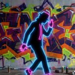
Bootleg Aesthetics Are Back: How Designers Are Reviving Vintage Rap Tee Culture
2026-05-09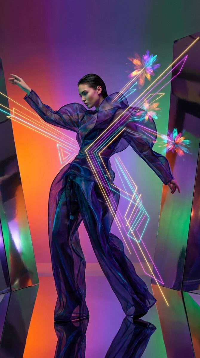
Last updated: April 25, 2026
Scroll your feed right now and you will see it: frames melting into each other, type that breathes, colour palettes lifted off a raver’s jacket circa 1994 and fed through a neural network. Motion design inspiration 2026 is loud, layered, and bleeding directly onto streetwear. The designers winning right now are building reusable After Effects workflows that let them ship polished work before a trend peaks and dies. Here is how.
1. Liquid Chrome and Fluid Metal – Translating Iridescence to Print
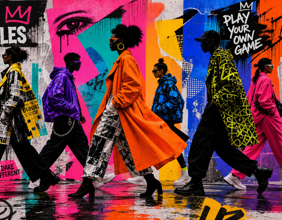
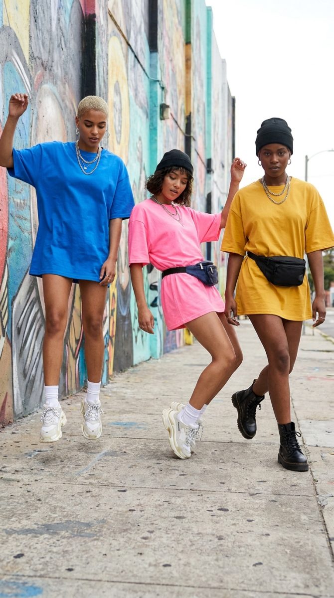
Image: c2fashionstudio.com
Liquid chrome is the dominant surface texture of 2026. Think Helmut Lang’s late-90s latex meets a Y2K screensaver on a modern GPU. Motion designers are animating metallic gradients shifting between silver, oil-slick purple, and acid green. The effect feels alive and expensive, appearing everywhere from luxury CGI adverts to TikTok motion reels.
The workflow trick is a reusable gradient map precomp in After Effects, keyed to a null object so colour shift is controllable without re-rendering the whole scene. Pair it with subtle lens distortion and you have a signature style that holds across multiple briefs.
For print-on-demand, this translates to foil-effect or holographic base shirts – a bold sans-serif wordmark in silver foil on black, with the type slightly warped as if mid-morph. The shirt captures a frozen frame from an imaginary animation. Steal the start: 10 graphic design trends 2026 by Kittl covers complementary graphic directions that sit well alongside this look.
2. Brutalist Grid Systems – Structure as the Aesthetic
Brutalist layout is having its fullest moment yet in motion. Designers build compositions where the grid is visible, intentional, and slightly wrong – columns bleeding off frame, row gutters used as design elements, type crammed into awkward cells. It references Swiss International Style, the early internet, and the raw HTML pages we grew up on.
The After Effects workflow is modular: each grid cell as an independent composition, assembled in a master comp. Revisions mean swapping a module, not rebuilding a scene. Motion designers who have systematised this report cutting revision cycles by roughly half.
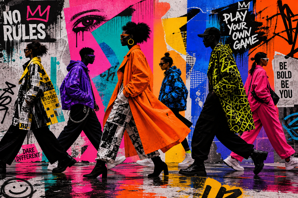
On a tee, this screams oversized grid placement – text in one cell, a logo fragment in another, intentional white space where you would expect a graphic. Take a brand name, break it across misaligned grid cells, print it large on a heavyweight garment. It reads as art. It reads as attitude. Streetwear Clothing, Footwear, and Accessories – Karmaloop.com has consistently championed this structured-chaos graphic language.
3. Glitch Realism – When the Frame Breaks on Purpose
Glitch aesthetics have cycled through design culture since the early 2000s [citation needed], but 2026’s version is more controlled and cinematic. Rather than chaotic pixel-sort, motion designers now use precision glitch – a single frame of chromatic aberration, a horizontal scan line, a brief moment of signal dropout that feels authored rather than accidental.
Build a library of pre-built glitch precomps: chromatic aberration rig, scan line overlay, digital dropout triggerable via expression. Build them once, save as assets, drop into any project. Expressions tied to audio amplitude make glitches feel reactive without manual keyframing – this kind of asset library is what separates designers who ship on time from those still rendering at 2am.
For tees, this is a natural fit for the oversized photo-print market. Take a portrait, apply a visible glitch treatment in post, print it full-chest. One colour way cutting through right now: desaturated base image with a single channel – pure red or pure cyan – shifted laterally by 8-10 pixels. Simple, striking, reproducible at any print scale.
4. Dimensional Type – Letters That Occupy Space
Type in 2026 motion work is extruded, inflated, and given physical weight. Letterforms cast shadows, interact with light sources, and feel like objects you could pick up. The reference sits between early 90s 3D CGI text and the balloon typography that dominated graphic design a couple of years back, now rendered at genuinely high fidelity.
For After Effects, Cinema 4D Lite or Element 3D handles true dimensional type, but careful use of drop shadows, bevel effects, and animated gradient overlays achieves much of this look natively. Build a style preset, save it, reuse it. For print-ready source frames, ComfyUI Workflow for Native 3.5-4K Images | Luca D’Amico posted … is a useful companion route.
On a shirt, puff print or embroidery adds physical dimension that matches the aesthetic. A flat print simulating extreme depth through tight highlight and shadow work reads as technically ambitious without premium print costs.
5. Retro Palette Revival – Earth, Neon, and Nothing In Between
The 2026 colour story in motion design is polarised. One camp: earth tones – raw umber, clay, moss, warm cream. The other: full neon – acid yellow, hot magenta, electric blue. Designers are choosing a lane and committing. The earth palette connects to a broader pull toward analogue warmth; neon is a direct lineage from rave flyers, skate graphics, and protest posters.
For After Effects, colour grading LUTs are the workflow asset to build and hoard. One LUT for your earth world, one for your neon world, applied as adjustment layers. For print-on-demand: earth tones on natural blanks for the premium streetwear customer, neons on black for the louder end of the market.
The connective thread across all five trends is systematisation. Motion designers shipping the best work in 2026 are building asset libraries, reusable rigs, and style presets that turn trend research into repeatable production. The same discipline applies to print design. Know your palette, build your templates, execute with confidence.
Frequently Asked Questions
Q: What is the dominant aesthetic in motion design inspiration 2026?
A: Liquid chrome and fluid metal textures, brutalist grid layouts, precision glitch realism, dimensional typography, and polarised colour palettes split between earth tones and neon – drawing from 90s CGI, rave culture, and Swiss graphic design traditions.
Q: How do you build a deadline-proof After Effects workflow around 2026 trends?
A: Build reusable precomps and asset libraries for each aesthetic – gradient map rigs for chrome effects, modular grid compositions for brutalist layouts, pre-built glitch overlays triggerable by expression. These assets save hours per brief once built.
Q: How does motion design inspiration translate to t-shirt print design?
A: Motion design frames are frozen moments of animation. A liquid chrome morph, a glitched portrait, a dimensional letterform – captured as a high-resolution static frame and adapted for print, these give t-shirt designs the depth and cultural currency of cutting-edge motion work.
Q: Which 2026 colour palettes are strongest for print-on-demand streetwear?
A: Earth tones on natural blanks serve the premium streetwear market. Neon palettes on black blanks are better for louder, more expressive customer segments. Both reflect distinct cultural moments rather than trend compromise.
Source: https://olafmotion.com/trends-inspiration/motion-design-inspiration-2026/
This article was researched and written with AI assistance, then reviewed for accuracy and quality. Maya Sinclair uses AI tools to help produce content faster while maintaining editorial standards.
