Last updated: May 5, 2026
Scroll your feed right now. Layered collages bleeding off the frame. Distressed serif fonts stacked three sizes too large. A product shot that looks like it was printed on actual paper. Between the algorithm-polished content and the raw DIY drops, something is shifting hard – and if you’re running a print-on-demand brand, you need to pay attention.
The graphic design trends 2026 is serving are not subtle. They are loud, intentional, and built for people who are done with clean minimalism. Two forces are driving everything: AI moving faster than most studios can keep up with, and a counter-reaction demanding real, human-feeling work. The tension between those two poles is exactly where the best POD designs are being born.
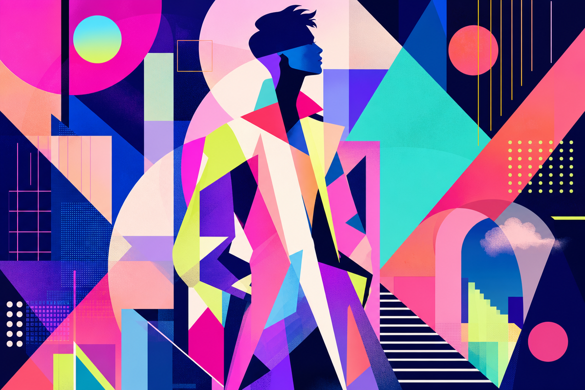
Graphic Design Trends 2026: The Big Shift Happening Right Now
Image: Erik McLean / Designerly
Minimalism had a long run. Clean lines, white space, one-colour logos on pastel grounds – it made sense when standing out meant stripping back. But the feeds are so full of that aesthetic now it disappears into the noise. The answer in 2026 is more. More colour, more layer, more texture, more type.
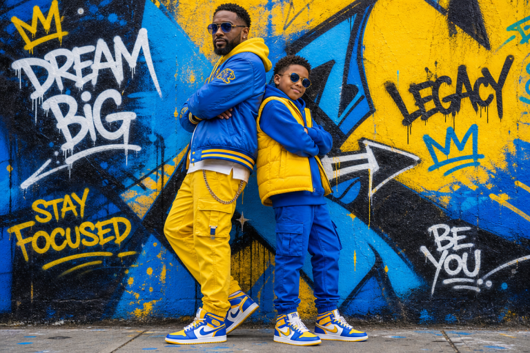
Maximalism is back, but not the chaotic kind. Think controlled chaos – bold colours and layered compositions that feel dense and alive, built on underlying grids that stop everything from collapsing. Vintage sportswear archives meets contemporary zine culture. The visual language is loud but not random. Every element earns its place.
For t-shirt applications, this translates directly. Collage-style compositions with photographic fragments, halftone overlays, and oversized type work beautifully on an oversized t-shirt design – the extra canvas gives the layout room to breathe while keeping the density that makes it visually interesting. Design direction: stack a bold condensed gothic over a grainy photograph, add a secondary colour block in chartreuse or rust, and let elements overlap at the edges.
Why the Imperfection Aesthetic Is Outselling Polished Work
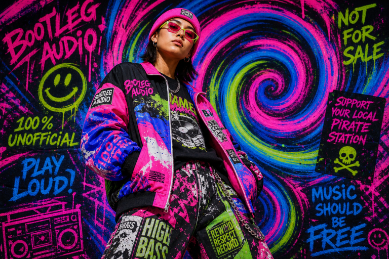
The demand for authenticity isn’t just an aesthetic preference – it’s a trust signal. In a landscape flooded with AI-generated perfection, grainy textures, uneven lines, and handwritten elements tell the viewer that a human made this. That matters to buyers now more than it did two years ago.
Designers are leaning into imperfection deliberately. Risograph-style grain. Photocopier artefacts. Screen-print registration that’s slightly off. Handwritten annotations dropped over geometric type. These are not mistakes – they are decisions, and buyers read them as craft.
The streetwear brands pulling the most engagement repeat the same three signals: texture, weight, and type with personality. Check the top streetwear brands people are following in 2026 and you’ll see it everywhere. For POD, this is genuinely accessible territory. You don’t need a screen-printing press – you need design files that fake the process convincingly.
Design direction: take a recognisable structural format – collegiate arch, sports team block, heritage badge – and distress it. Sand the edges in the file. Drop the opacity. Add a grain overlay at 40-60%. The result reads as found, earned, worn.
3D Type and AI-Assisted Ideation Are Changing the Starting Point
3D dimensional design has moved from website hero sections into print. Inflated bubble letters. Chrome extrusions. Dimensional type casting fake shadows on flat grounds. The Y2K revival pushed two decades forward – and it translates to t-shirts better than almost any trend on this list because it photographs well, reads small, and scales across products without losing impact.
The AI angle is worth being clear-eyed about. AI is not replacing the design process – it’s accelerating the ideation end of it. The brands winning with AI-assisted design use it for rapid compositional variations, then apply human judgement to refine for emotional depth and brand alignment. If you’re building a POD workflow with generative tools, using ComfyUI for creative control gives you the fine-tuned output control that separates original work from generic AI slop.
Design direction: a single inflated word – brand name, slogan, cultural reference – rendered in chrome or matte clay finish, centred on a washed-out earth-tone base. Simple. Wearable. High perceived value.
Text-First Design Is the Format That’s Converting
Text-driven shirt design is not new, but the complexity bar has risen. Simple brand name tees are plateauing. What’s moving now targets buyers who want wit, cultural specificity, and typographic craft.
The format that works: multi-weight type hierarchies, where a headline sits in a 100pt condensed black, a subline breaks to a lighter weight at half the size, and a third element – a date, a location, a fragment of text – drops into a monospaced or slab serif at small size. Gig poster logic applied to fashion. Contrast pairs do the heavy lifting: serif vs sans, black vs white, bold vs light.
Rule of three for what makes a text tee land in 2026: a message worth wearing, a typeface with actual personality, and a layout that rewards a second look.
Maximalism, imperfection, and dimensional type are not competing trends – they are the same cultural moment expressed through different formal choices. Buyers in 2026 want design that feels made, not generated. Your job as a POD creator is to give them exactly that.
Frequently Asked Questions
Q: What are the biggest graphic design trends for 2026 in print-on-demand?
A: The dominant trends are maximalism with controlled layering, imperfection aesthetics (grain, handwritten elements, distressed textures), 3D dimensional typography, and text-driven designs with complex type hierarchies. All translate well to t-shirt formats and are currently driving strong engagement on POD platforms.
Q: How does the imperfection aesthetic translate to t-shirt design?
A: Grainy textures, slightly misaligned elements, and distressed finishes signal craft and human authorship. Apply grain overlays, fake screen-print registration offsets, and choose washed-out palettes that feel worn-in rather than freshly rendered.
Q: Should POD designers be using AI tools in 2026?
A: Yes, but strategically. AI works best for ideation and rapid compositional variations. Human refinement is still essential – AI output without editorial judgement tends to read as generic.
Q: What typography styles are selling best on graphic tees in 2026?
A: Condensed gothic and black-weight sans-serifs in multi-weight hierarchies are performing strongly. Dimensional and inflated 3D letterforms – chrome or clay-finish renders on muted bases – are also converting well.
Q: What colour palettes are working for streetwear-adjacent POD drops right now?
A: Earthy, washed-out bases (rust, sand, army green, off-white) paired with high-contrast accents (chartreuse, acid yellow, electric orange). Monochromatic treatments with a single pop colour are also strong – they read as intentional and photograph well across social formats.
Source: https://designerly.com/10-graphic-design-trends-taking-over-2026-with-examples/
This article was researched and written with AI assistance, then reviewed for accuracy and quality. Maya Sinclair uses AI tools to help produce content faster while maintaining editorial standards.