

Portrait Photography Masterclass: Posing, Light & Psychology That Makes Portraits Feel Real
2026-05-17
2026 Graphic Design Trends Every POD Creator Needs to Know
2026-05-21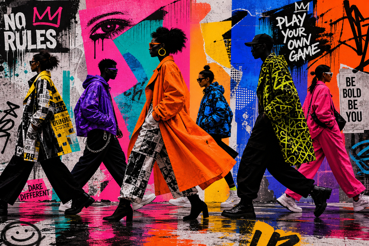
Last updated: May 3, 2026
Scroll the feed for thirty seconds right now. Go on. You’ll see it – a Corteiz puffer half-zipped over a vintage Stüssy tee, a pair of mud-caked New Balances, and a Supreme box logo cap tilted just enough to read as intentional. The outfit exists somewhere between a council estate and a luxury editorial. No one’s trying to explain it. Everyone already understands it.
That’s streetwear in 2026. Not a category. Not a market segment. A living language that moves fluidly through music, sport, internet culture, local scenes, and luxury fashion simultaneously – and the brands fluent in that language are the ones leading.
How the Streetwear Brands 2026 Landscape Actually Got Here
Image: Style Rave
The story starts earlier than most people admit. Stüssy was a small graphic tee brand launched in 1980 by California surfer Shawn Stussy – hand-scrawled logo, surf shop roots, zero corporate intent. What it accidentally invented was the template: limited runs, subcultural credibility, a logo with personality. Every brand on this list owes something to that lineage.
Supreme picked up that baton in 1994 on a SoHo sidewalk and turned it into a doctrine. Collaborations with Rolex and Louis Vuitton. Queue culture as marketing. The box logo as shorthand for an entire philosophy. Decades later, Supreme still holds – not because it’s chasing relevance, but because it’s become archive material. Cross-generational recognition, foundational scarcity mechanics, and a graphic identity model that the entire industry still reverse-engineers.
The shift into 2026 wasn’t a rupture. It was a slow realisation that younger consumers don’t follow brands – they follow credibility, attitude, community, and emotional resonance. Drop calendars mean nothing if the brand’s energy feels hollow.
The Ten Brands Actually Winning Right Now
Corteiz sits at the top of the pile, and the reason matters. It achieved rare scale without losing its anti-establishment edge. Every drop feels culturally loaded rather than mechanically commercial – there’s a tension to it, a sense that something’s at stake. Think grime meets guerrilla marketing meets community mobilisation, with roots planted firmly in North West London’s council-block aesthetic. For print-on-demand, Corteiz is a masterclass in text-weight balance: bold, compressed sans-serifs on washed-out cotton, with messaging that feels like it’s been lifted off a wall somewhere in Ladbroke Grove. We’d run a cracked ink chest hit on a heavyweight garment-dyed tee, or a hand-sprayed stencil slogan across the back in off-white on charcoal. The key is that the text carries attitude before anyone reads a single word.
Hellstar is the other name everyone’s talking about. Born in Los Angeles in 2020, it thrives at the intersection of darkness, spirituality, and celebrity culture – think occult iconography colliding with athletic silhouettes, already draped across half the artists moving serious streaming numbers right now. Major recording artists and athletes have made it their go-to graphic brand, and the cultural endorsement is genuine rather than paid. The colour palette runs deep: charcoal, washed black, blood red, occasional bleach hits. Typography is aggressive, almost devotional – large condensed lettering, distressed textures, celestial symbols used with genuine conviction. We’d execute this as a full-back oversized graphic on a heavyweight tee, something that reads like tour merch bootleg from a band that doesn’t quite exist. Think gothic serif slogan across the chest, cracked and faded, with a raw-edge planetary motif underneath. The washed black base is non-negotiable.
Stüssy, meanwhile, is having one of its quietest-loudest moments. The originator is being rediscovered by a generation that found it through vintage rails and styling culture – and that rediscovery is entirely genuine. We’re seeing it folded into archive luxury outfits alongside Loro Piana scarves and old-season Helmut Lang, which tells you everything about where its cultural positioning has landed. The appeal is the restraint. Clean script logo, earthy tonal palettes, nothing shouting. For designers, the lesson is that aged credibility is a design language of its own. A worn-down serif, a faded chest print, a colourway pulled from surf wax and Pacific Coast highway – dusty sand, sage, salt-bleached white – that’s the Stüssy frequency. Execute it as a tonal puff-print wordmark on a relaxed midweight, where the colour of the graphic barely separates from the base.
Palace brings British irreverence to the global conversation. Think Chapman Brothers meets a Brixton skate park – sharp wit, absurdist graphics, loud geometry. The Tri-ferg logo is one of the most replicated shapes in streetwear, and the brand’s DNA runs directly through UK skate culture, football terrace dressing, and the particular kind of lad-art humour that only makes sense if you’ve stood on a cold Saturday behind a goal at Selhurst Park. For t-shirt design, it’s a reminder that a strong, ownable shape beats a complex illustration almost every time. Bootleg logo remix territory is the play here: take a recognisable geometric form, push the colour hard – cobalt, acid yellow, safety orange – and let the shape do the work.
Fear of God Essentials continues to pull people who want streetwear’s cadence without the noise – muted earth tones, dropped shoulders, rubberised chest text. Think luxury basics that telegraph taste without announcing it. The cultural anchor here isn’t music or sport specifically – it’s the premium-casual crossover that’s taken over football player tunnel walks and post-match press appearances. The design direction is restraint: tone-on-tone prints, oversized fit, and a single word doing all the heavy lifting. Stone, warm grey, dusty sage, and pale ecru are the palette. A tonal puff-print wordmark in matching thread on a pigment-dyed base is the move – visible only when the light catches it.
Supreme earns its own paragraph because its influence in 2026 operates differently to how it worked a decade ago. We’re not talking hype. We’re talking foundation. The box logo is now as much a reference point as a Chuck Taylor or a Barbour jacket – something you invoke knowing its history will do half the work. The graphic register is clean, confident, and unapologetic: block colour, bold font, no decoration. For any print-on-demand range, the lesson from Supreme isn’t to copy the logo. It’s to understand that simplicity executed with conviction reads louder than complexity every time.
BAPE remains the template for maximalist camouflage done with conviction. The shark hoodie, the sta silhouette, the ape-head – all of it has seeped so deeply into streetwear’s visual vocabulary that we sometimes forget how genuinely strange and specific BAPE’s original world-building was. Think Tokyo consumer culture meets hip-hop maximalism, delivered in candy-bright colourways. The design translation for a tee: all-over print in a custom camo colourway, or a bold ape-adjacent mascot graphic in a loud two-colour scheme. Don’t be subtle. BAPE never was.
Off-White carries Virgil Abloh’s quotation-mark visual language forward, and the culture around it has evolved into something more sombre and considered since his passing. The industrial belt, the helvetica quote, the diagonal stripe – these are now archive codes that younger designers reference reverentially. The tee direction here is typographic: a single phrase in large helvetica, heavy quotation marks included, printed in white on black or black on white. No decoration, no illustration. The text is the graphic.
Kith operates at the luxury-streetwear crossover with a distinctly New York cadence – think premium retail experience filtered back into the product itself. The brand’s collaborations with everything from Major League Baseball to fine dining have built an audience that skews toward the culturally omnivorous. Tonal serif wordmarks, clean pastel colourways, and a general sense that everything is one degree more considered than it needs to be. The print-on-demand translation is a refined chest-hit serif logo on a garment-dyed heavyweight, in dusty lilac, faded rust, or washed marine blue.
Aimé Leon Dore rounds out the ten and represents something important: the Queensbridge-via-archive-luxury frequency that’s quietly become its own genre. Think 1990s New York basketball culture run through a Mediterranean colour filter. Rich chocolate browns, warm creams, olive, burgundy. The typography is clean and collegiate. We’d execute this as a vintage athletic-style chest print with a subtle stadium crest – the kind of thing that looks like it was made for a team that never existed but absolutely should have. This sits at the intersection of nostalgic sportswear and considered design, and it’s exactly where a chunk of the current market is looking.
What This Means If You’re Building a Brand Right Now
The brands winning in 2026 share one thing: specificity. They know exactly what they believe and who they’re for, and that conviction shows up in every graphic, colourway, and product decision. Vagueness is the only real failure mode in streetwear right now.
For anyone building in print-on-demand, the opportunity is real. AI-powered mockup tools have closed the production gap – we can prototype a Hellstar-adjacent dark spiritual graphic or a Corteiz-influenced stencil text tee and have a convincing visual in an afternoon. The differentiator isn’t production anymore. It’s the point of view behind the product.
Colour matters more than it’s getting credit for. Two distinct palettes are running in parallel right now. The Essentials-influenced register – stone, warm grey, dusty sage, pale ecru – is everywhere, communicating restraint and considered taste. Its opposite: oversaturated neon used sparingly and deliberately, a single signal-flare colour dropped onto an otherwise neutral base. Think acid yellow on washed black, cobalt on cream, safety orange on charcoal. Neither approach is wrong. Both are completely intentional.
The base garment matters too. Vintage fashion and streetwear are driving consistent demand for worn-in, faded tees – that pepper-soft, relaxed feel that signals the piece has lived somewhere before it landed on the rack. A crisp new blank undermines the graphic before the customer reads a word.
Typography is the other lever. Compressed sans-serifs for urgency – Corteiz, Palace. Distressed serifs for history and devotion – Hellstar, early Supreme. Clean collegiate scripts for community warmth – Stüssy, ALD. Gothic condensed for aggression and ceremony. The brands above don’t mix these randomly – they pick a typographic register and commit to it across every piece. We should do the same.
That Corteiz puffer and vintage Stüssy tee from the top of this piece? That combination isn’t accidental. It’s a studied conversation between two different eras of the same language – Ladbroke Grove and Laguna Beach, 2026 and 1984, volume and restraint, speaking to each other across a feed. Someone put real thought into that fit. Real thought is exactly what separates the streetwear brands genuinely dominating 2026 from the ones just filling rack space.
Frequently Asked Questions
Q: Which streetwear brand is most influential in 2026?
A: Corteiz currently tops most cultural conversation lists, recognised for achieving genuine scale while maintaining anti-establishment credibility. Supreme retains the highest overall brand equity, but Corteiz generates the most heat right now.
Q: Is Supreme still relevant in 2026?
A: Yes. Supreme’s relevance has shifted from hype driver to cultural foundation – it’s valued for archive credibility, cross-generational recognition, and its foundational role in shaping collaboration, scarcity, and graphic identity models that the entire industry still draws from.
Q: What makes streetwear brands successful with younger consumers in 2026?
A: Younger consumers follow credibility, attitude, scarcity, community, and emotional relevance rather than logos or drop calendars alone. Brands that feel specific and conviction-driven outperform those chasing broad appeal.
Q: What design trends from these streetwear brands translate well to print-on-demand t-shirts?
A: Key translatable trends include compressed bold sans-serif typography (Corteiz-influenced), dark spiritual and celestial graphics on distressed grounds (Hellstar), tonal earth-palette oversized prints (Essentials), bootleg logo remix shapes (Palace), and gothic serif slogans with cracked ink treatments. Ownable shapes consistently outperform complex illustrations.
Q: How did Stüssy influence modern streetwear?
A: Stüssy, founded in 1980 by California surfer Shawn Stussy as a small graphic tee brand, established the foundational streetwear template: limited runs, subcultural credibility, and a logo with genuine personality. Every major streetwear brand that followed owes something to that original model.
Q: What colour palettes are trending in streetwear for 2026?
A: Two registers are dominant. The first is the Essentials-influenced earth palette – stone, warm grey, dusty sage, pale ecru – communicating restrained luxury. The second is deliberate neon punctuation: a single oversaturated colour dropped onto a neutral base for maximum contrast. Both work. Both require commitment.
Source: https://www.stylerave.com/streetwear-clothing-brands/
This article was researched and written with AI assistance, then reviewed for accuracy and quality. Maya Sinclair uses AI tools to help produce content faster while maintaining editorial standards.
