Last updated: May 19, 2026

Image: Cambridge University Press
Scroll Instagram for thirty seconds right now. Go on. What do you see? Boxy fits. Washed-out text. Dropped shoulders sitting halfway to the elbow. Logos that look almost real – but not quite. The oversized silhouette has taken over, and it’s not going anywhere. It’s become the default shape of contemporary streetwear, and parody is one of the sharpest design lenses running underneath it.
We’re not talking about trend cycling. We’re talking about a fit that carries attitude before you’ve even looked at the print.
Why Oversized Is the Shape of Right Now

Image: Cambridge University Press
The numbers back this up, but your eyes already knew. Drops from Corteiz, Aries, and Awake NY all lean boxy. Saint Laurent’s recent runway shows sent oversized tees down the catwalk without apology. On TikTok, the most-shared outfit formats right now are fits where the tee swallows the wearer – tucked into wide-leg trousers, layered under an open shirt, worn alone with the hem hitting mid-thigh.
Oversized isn’t a size-up hack. It’s a silhouette with its own vocabulary.
The fit cues matter: drop shoulder seam sitting 4-6 cm off the natural shoulder, chest width running at least 10 cm wider than a standard fitted tee, hem length landing between hip and mid-thigh. The sleeve should have enough width to fold up once and still look deliberate. These proportions signal that the garment was designed this way, not accidentally purchased too large.
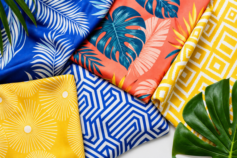
Fabric weight changes the read entirely. A 240 gsm tee in an oversized cut holds structure and reads premium. A 160 gsm cut in the same box shape goes limp and reads thrift. If you’re running POD, check your blank supplier’s weight options – that detail shows up in every lifestyle photo.
Parody as a Design Lens: Streetwear’s Oldest Tool
This is where parody enters. Not as the whole argument – as one way of thinking about what goes on the front of that boxy blank.
Cambridge Dictionary defines parody cleanly: writing, music, art, or speech that intentionally copies the style of someone famous or a well-known situation, exaggerating its features for humorous or critical effect. You can wear a parody, and you can parody something. That double function matters when you’re building a print.
What makes parody distinct from imitation is the exaggeration. You push the original past comfort, past recognition, past sincerity – until the gap between the source and the copy becomes the whole point. Think Supreme meets public-sector bureaucracy. Think Palace Skateboards meets British Rail signage. The cultural gap creates the joke, and the joke creates the desire.
The oversized silhouette is the perfect canvas for this because the proportions are already off. You’re already in the territory of the exaggerated, the slightly-wrong, the knowingly absurd. A boxy fit says: we’re not trying to flatter you. We’re trying to say something. The silhouette and the graphic reinforce each other.
Lonely Kids Club have been doing this brilliantly since 2011. If you haven’t looked at what Best Australian Streetwear Brand: Lonely Kids Club Since 2011 built, it’s required reading for anyone serious about text-forward, self-aware graphic tees.
Print Concepts That Actually Land in 2026
Here’s where we get specific, because vague design direction is useless.
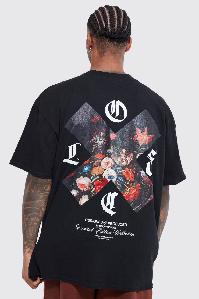
The fictional institution tee. Pick a made-up government body, regional sports authority, or corporate task force. Set it in condensed Helvetica or a near-identical substitute. Add a crests or a reference number. Print it on a stone-washed oat or sage blank. This format reads as commentary without needing to say anything explicit. It’s everywhere on feeds right now – the “Department of Overthinking” template energy, but executed with real graphic discipline.
The bootleg-sponsor tee. Fake brand logos in the style of genuine sports sponsorship arrangements. Think five fictional energy drinks running down a sleeve in the format of a Formula racing kit. Works in black-on-black puff print or a degraded four-colour screen print effect. The oversized cut gives you canvas for the vertical stack.
The archival reissue (that never existed). Design as if you’re reprinting a 1994 band tee for a band that didn’t exist. Faded tour dates. A city list that’s slightly wrong. A logo that’s been photocopied too many times. This aesthetic is performing well across Depop listings and GRWM content because it rewards people who look closely.
The self-parody drop. If you’ve been running a brand long enough to have recognisable tropes – do it to yourself first. Exaggerate your own logo, your own fonts, your own seasonal palette. The moment when a brand becomes a version of itself is a point of creative tension and real cultural credibility.
The Nuance Most T-Shirt Brands Miss
Cambridge’s definition includes a disapproving sense worth keeping in mind. A parody of a trial. A parody of leadership. Something that fails so obviously at its intended purpose that it tips into the absurd. This isn’t the funny kind of parody. This is the kind that stings.
The best streetwear tees live in that uncomfortable middle ground. The bootleg luxury logo isn’t just a gag – it’s a comment on who gets to wear the original, who gets excluded, and what the logo actually means when it’s stripped of its price tag. Know which register you’re working in before you start designing. Related vocabulary worth keeping straight: lampoon is angrier, spoof is lighter, caricature lives in visual exaggeration, travesty is so far from the source it becomes its own absurd thing. Each one points at a slightly different tone.
Typography is everything here. A parody of a serious institution needs a font that almost looks official. Bold serif for establishment parody. Condensed sans-serif for athletic or corporate mockery. Distressed lettering for anything touching nostalgia. The typography has to be close enough to the source to trigger recognition, then just wrong enough to signal intent.
Colour palettes for parody prints tend toward the degraded. Faded greens. Cracked reds. Off-whites that suggest age. The vintage-wash palette signals authenticity while the content signals its opposite – and that tension is exactly where the cultural energy sits. Think Champion bootleg meets Eastern European souvenir shop. Think 1990s corporate branding run through a photocopier fourteen times.
For AI-assisted design generation, this matters practically. The Stable Diffusion v1.5 Guide 2026: Prompts & LoRA Tips covers how to prompt for degraded, vintage aesthetics that suit parody-adjacent prints. And if you’re starting from visual reference rather than text, Turn Any Image into a Perfect Midjourney Prompt (Using Google … shows how to extract prompts from existing bootleg or archival imagery.
So Where Does This Leave Your Next Drop?
The opening question was: why is oversized everywhere right now, and why does parody keep showing up on it? The fit says something before anyone reads the print. And when the print knows it’s a joke, the combination becomes a full position – not just a graphic tee but a point of view.
Design direction for right now: bold, condensed sans-serif text or a degraded institutional graphic on an oversized boxy cut, minimum 220 gsm, in a washed or overdyed tone. Pick a target – a fictional institution, a corporate format, a genre cliché – and push it 20% past comfort. Not so far it loses the reference, not so close it reads as sincere. That gap is where the work lives.
The oversized tee is the best current canvas for parody because the proportions already say something before anyone reads the chest print. Work with that. Be deliberate about your register – lampoon or spoof, travesty or caricature. And get the blank right first. The print can be perfect; if the fabric hangs wrong, the whole thing falls apart.
Frequently Asked Questions
Q: What is the definition of parody in fashion and streetwear?
A: Parody in streetwear refers to designs that intentionally copy and exaggerate the style of a recognisable logo, brand, or cultural reference for humorous or critical effect – the same principle Cambridge Dictionary applies to literature and art.
Q: What’s the difference between a parody and a bootleg in t-shirt design?
A: A bootleg replicates without comment; a parody deliberately exaggerates to make a point. The best bootleg-style tees are actually parodies – they use the source material to say something about the original, not just copy it.
Q: Why do parody prints work better on oversized silhouettes?
A: Oversized fits already operate in the territory of exaggeration and deliberate wrongness, which amplifies the parody’s visual intent. The silhouette and the graphic reinforce each other.
Q: What are the key fit details that make an oversized tee look intentional rather than just too big?
A: Drop shoulders sitting 4-6 cm off the natural shoulder, a chest width at least 10 cm wider than a fitted equivalent, and a hem landing between hip and mid-thigh. Fabric weight matters too – aim for 220-240 gsm to hold structure.
Q: What typography works best for parody t-shirt designs?
A: Match the font register to your target – bold serif for institutional parody, condensed sans-serif for corporate or athletic mockery, distressed lettering for nostalgia-based parody. The typography should be close enough to trigger recognition, then just off enough to signal it’s a joke.
Q: What does ‘self-parody’ mean in the context of brand design?
A: Self-parody occurs when a brand or designer’s work begins unconsciously or ironically exaggerating its own established style. In streetwear, it’s a point of creative tension – knowing your own tropes well enough to play with them.
Source: https://dictionary.cambridge.org/dictionary/english/parody
This article was researched and written with AI assistance, then reviewed for accuracy and quality. Maya Sinclair uses AI tools to help produce content faster while maintaining editorial standards.