Last updated: May 5, 2026
Most photographers spend years wondering why their edits look almost right but never quite theirs. The answer, almost always, is that they’re skipping a step – or worse, doing two things at once and calling it one.
Mastering photo colour grading techniques is not about finding the perfect preset and cranking every slider to eleven. It’s a two-stage discipline: first you repair, then you create. Get that sequence right, and your images will stop looking like edited photographs and start looking like a point of view.
Here’s what we’re building: a reliable, repeatable editing workflow that produces images with a consistent, intentional mood – whether you’re shooting on a mirrorless camera or a phone. By the end of this guide, you’ll understand exactly why your colour work has been falling flat, and how to fix it for good.
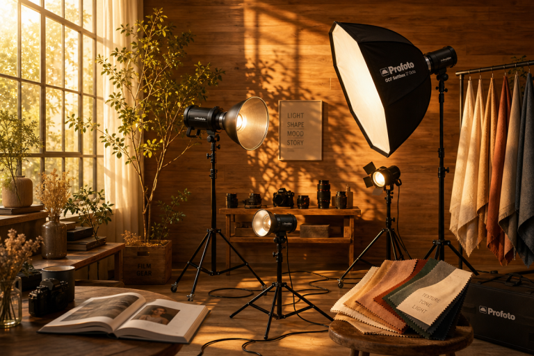
Prerequisites – What You Need Before You Start
Image: Affinity / Canva
You need an image editing application with Curves and HSL panels. Adobe Lightroom Classic, Lightroom mobile, Affinity Photo, and Capture One all qualify. Darktable is a capable free alternative. Phone editors including Lightroom Mobile (free tier) work perfectly well here.
Wherever possible, shoot in RAW format rather than JPEG. This single decision unlocks fully flexible white balance adjustment in post-production. JPEG locks white balance data into the file at the moment of capture – correct the colour later and you’re working against the grain. With RAW, you have the complete original sensor data to work from.
A basic understanding of how exposure works – highlights, shadows, midtones – will help, but we’ll explain each concept as we go.
Step 1: Correct White Balance – The Foundation Everything Else Rests On
White balance is the most foundational step in any editing workflow, and incorrect white balance cannot be fully rescued by later colour work. Get it wrong here, and every subsequent adjustment compounds the error.
White balance describes the colour temperature of your light source – daylight is cool and blue, tungsten indoor light is warm and orange. When your camera’s auto white balance misreads the scene (which it often does), skin tones look sickly, neutrals drift towards orange or green, and no amount of creative grading will salvage it.
In Lightroom or Affinity Photo, use the white balance eyedropper tool and click on a neutral surface in your frame – a white wall, a grey card, a piece of paper. The software will recalibrate all colour channels around that neutral. If the result looks too clinical, nudge the Temperature slider slightly warm – most scenes are more flattering with a touch of warmth. If you’re shooting portraits, read more about what is a portrait – meaning and significance to understand how colour temperature shapes the emotional register of a face.
Step 2: Fix Exposure with the Curves Tool
The Curves panel is the most powerful exposure tool available to us. It looks intimidating – a diagonal line over a graph – but the principle is straightforward: points on the left control shadows, the middle controls midtones, and the right controls highlights. Drag a point up to brighten that tonal range, down to darken it.
For the classic Hollywood contrast look, shape the curve into a gentle S: pull the shadow point slightly downward and the highlight point slightly upward. This deepens the darkest areas of the image while lifting the brightest, separating tonal detail across the full range. It’s the same principle a musician uses when they compress a mix – pulling the extremes towards each other to create definition and presence.
Address any clipped highlights (pure white, no detail) and crushed shadows (pure black, no detail) before moving to colour work. Once the exposure is technically correct, colour grading becomes far more responsive – you’re no longer fighting the image.
Step 3: Colour Correction – Neutralise Before You Stylise
Colour correction is not the same as colour grading. Correction fixes technical problems: a green colour cast from fluorescent lighting, a magenta shift from an overcast sky, skin tones that read as orange rather than natural. Grading, which comes next, adds deliberate mood and atmosphere to an image that is already technically sound.
Use the individual Red, Green, and Blue Curves channels for targeted correction. If your image has a green cast in the midtones, locate the Green channel curve and pull the midtone point slightly downward. This is surgical work – small adjustments measured in single digits, not sweeping moves.
The HSL (Hue, Saturation, Luminance) panel is equally precise. It isolates individual colours so you can adjust one without affecting the rest. Reduce the Saturation on the Orange channel to calm down overly warm skin tones. Increase the Luminance on the Aqua channel to lift the brightness of water without touching the sky. This specificity is what separates careful colour work from blunt-instrument editing.
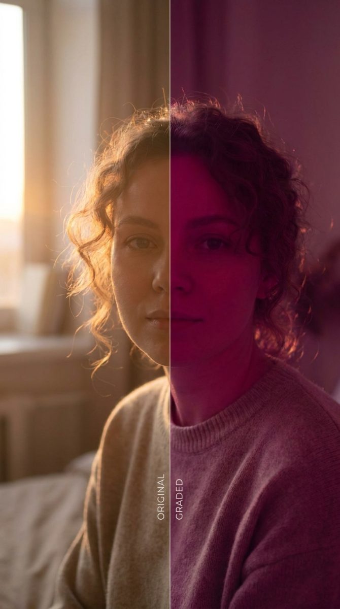
Step 4: Colour Grading – Add Your Creative Voice
Now the interesting part. With a technically clean image in front of us, every colour decision we make is a creative one.
The faded cinematic look – favoured by editorial photographers and film-inspired creators alike – is achieved by lifting the shadow values on the Blue channel Curves. Rather than deep blacks, the shadows resolve to a cool, muted grey-blue. This is the same optical quality you see in 35mm film stocks like Kodak Portra in underexposed conditions, and it’s present throughout the visual language of photographers like Tyler Mitchell and Gregory Crewdson.
For a warm, analogue-filmic feel, try adding a touch of orange to the highlights via the Colour Grading panel (in Lightroom) or through the Red and Green highlight channels in Curves. Pair this with desaturated greens in the HSL panel and you’ll be close to the warm, sun-bleached aesthetic seen across fashion editorial work. If you’re working on commercial imagery – for a clothing brand photoshoot for example – this grade conveys warmth and aspiration without veering into overcooked Instagram territory.
For cooler, more clinical moods, lift the Blue channel midtones gently and pull the overall saturation down by 10-15 points. This is the aesthetic of much contemporary documentary work and photojournalism.
The through-line across all of these approaches is restraint. Subtlety is not a compromise – it’s the whole point. Pushing sliders to their extremes produces caricatures, not photographs. The lightest touch is almost always the most powerful.
Step 5: Apply a Consistent Grade Across a Series
A single well-graded image is satisfying. A consistent body of work is a visual identity.
Once you’ve arrived at a grade you’re happy with, save it as a preset or style. In Lightroom, right-click the image in the Develop module and select “Create Preset.” Name it by mood or project, not by a generic descriptor. Apply it to a test selection of five or six images from different shooting conditions and check whether the grade holds. It almost never holds perfectly – you’ll need to adjust white balance and exposure per image – but the tonal quality and colour relationships should remain coherent.
If you’re exploring AI-assisted grading tools, models like UniStyleDiff are beginning to enable style transfer at the framework level, applying the character of one image to another with surprising accuracy.
Troubleshooting – Common Pitfalls in Colour Work
The grade looks great on screen but prints badly. You’re likely editing on an uncalibrated display. Colours that look saturated on a bright monitor appear flat in print. Invest in a display calibration tool, or at minimum, reduce saturation by 10-15% before sending to print.
Skin tones are shifting unpredictably when grading. You’ve probably applied global adjustments that are pulling the Orange and Red channels – where skin information sits – in unintended directions. Use the HSL panel to lock skin tones down after grading, checking the Orange and Red Hue and Saturation sliders.
The grade looks different on every photo even after applying a preset. Your source images aren’t corrected consistently before grading. The grade will always be fighting a different technical baseline. Return to Step 1 and standardise correction before grading.
Take the workflow – correct, then grade – and commit to it on your next ten images. Not as an experiment, but as practice. Visual style is not discovered in a single edit; it accumulates over hundreds of images made with intention. Come back to the HSL panel when you think you’re finished. Pull back by 20%. You’ll usually find the image was already there.
Frequently Asked Questions
Q: What is the difference between colour correction and colour grading?
A: Colour correction fixes technical problems in an image – incorrect white balance, exposure issues, colour casts – so the image is accurate. Colour grading is a creative step applied afterwards, adding deliberate mood, atmosphere, and style to an already technically correct image.
Q: Should I shoot in RAW or JPEG for colour grading?
A: RAW gives you fully flexible white balance adjustment in post-production; JPEG locks white balance in at capture. For any serious colour work, RAW is strongly preferable because the foundational correction step is far more effective with complete sensor data.
Q: How do I get the faded cinematic look in my photos?
A: Lift the shadow values on the Blue channel in your Curves panel so that deep blacks resolve to a cool, slightly grey-blue rather than pure black. Apply this subtly – a small uplift of 5-15 points on the shadow end of the Blue curve is usually sufficient.
Q: What does an S-curve do to an image?
A: An S-curve pulls shadow tones slightly darker and highlight tones slightly brighter, increasing overall contrast and tonal separation. It produces a classic film-like quality often described as Hollywood contrast.
Q: Why do my colour grades look overdone?
A: Most over-edited images are the result of pushing individual sliders too far. In colour grading, restraint produces the most professional results – push less than you think you need to, then pull back another 20%. The lightest adjustments carry the most visual weight.
Source: https://www.affinity.studio/blog/colour-grading-guide-that-gives-your-photos-character
This article was researched and written with AI assistance, then reviewed for accuracy and quality. Talulah Menser uses AI tools to help produce content faster while maintaining editorial standards.