Last updated: May 1, 2026
Now let me write the expanded article with the stronger street-level lens, punchier trend breakdowns, and POD translations for each trend.

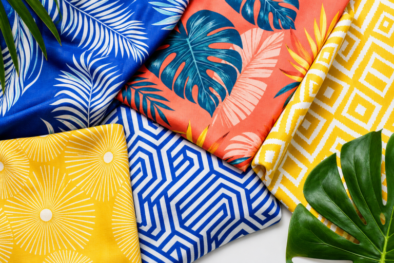
Image: Senhai Apparel
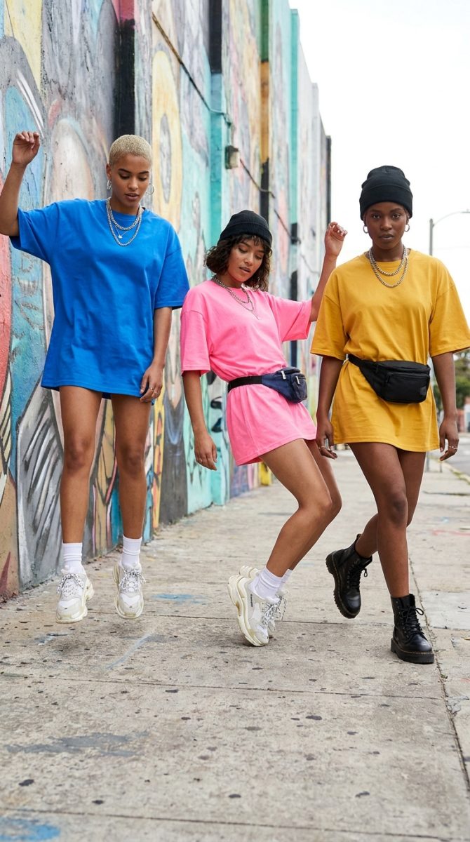
Open TikTok. Open Instagram. Walk down Brick Lane or Fairfax. What you’re seeing right now is the same thing everywhere – a specific silhouette, a specific weight of cotton, a specific attitude. Boxy through the chest, dropped at the shoulder, hem hitting somewhere past the hip. Not an XL pulled from a pile – an intentional shape worn with conviction. The brands making noise in 2026 are not sizing up. They’re rebuilding the whole canvas.
This is what oversized streetwear t-shirt design looks like when it’s done right. And here’s what’s actually moving.
Why the Oversized Silhouette Became the Default Design Space
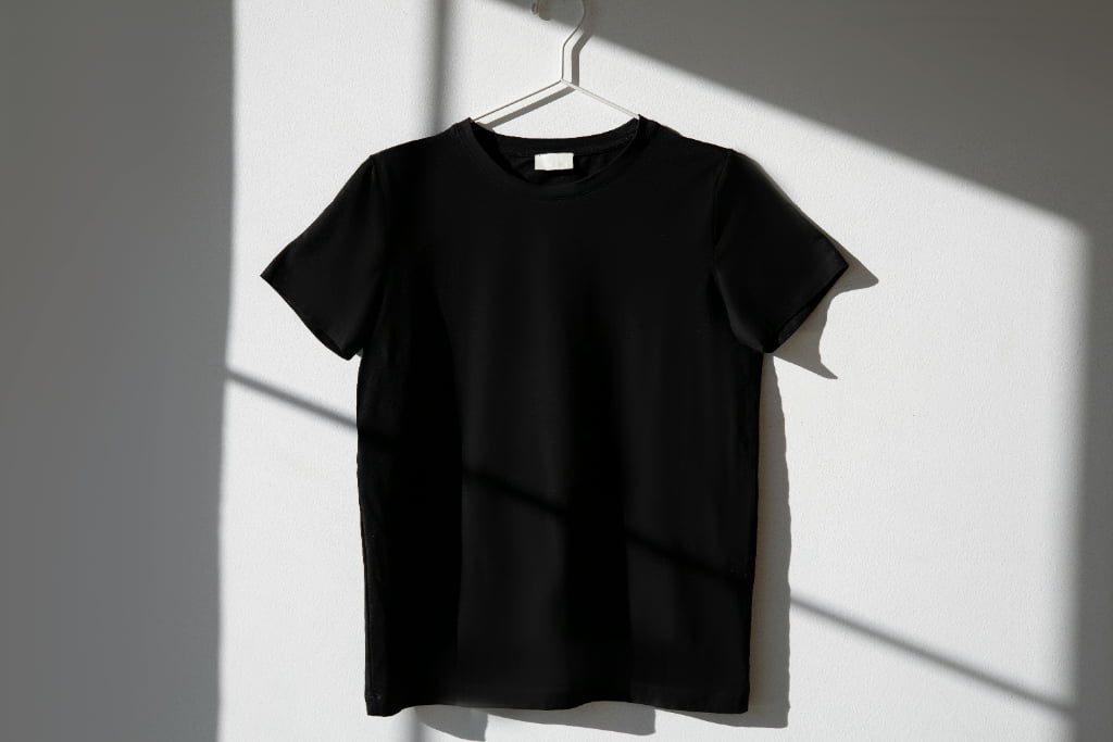
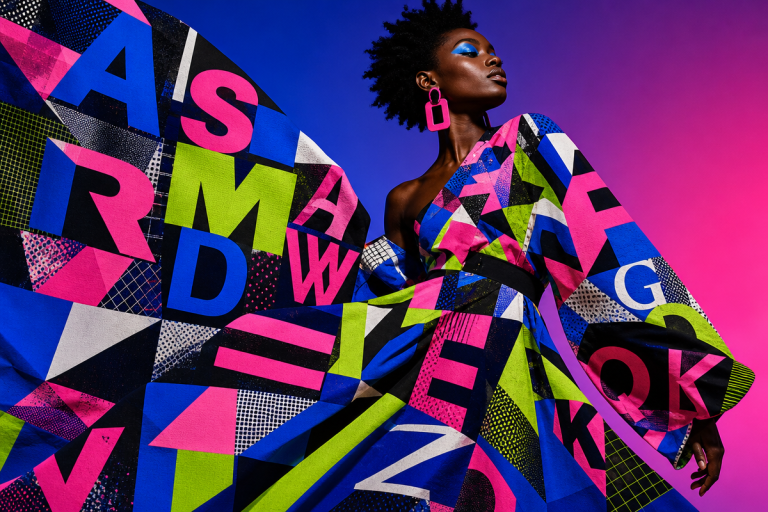
Image: Senhai Apparel
The short answer: more fabric means more creative territory. The longer answer reaches back into the comfort-first shift that Gen Z accelerated post-lockdown, and that’s now fully baked into mainstream taste.
Oversized silhouettes give designers something traditional fitted tees don’t – real estate. A dropped shoulder creates a natural frame. A longer back hem begs for a full-width graphic. The additional surface area enables what we’re seeing consistently from the strongest emerging brands: impactful large back prints paired with a restrained front logo, or layered graphic compositions that read differently depending on how the tee drapes on the body. Think Corteiz’s back-heavy graphics meets Japanese workwear proportion. That tension between structured graphic and relaxed fit is exactly where the interesting work is happening.
Fabric matters more than most print-on-demand brands realise. The shift to heavyweight fabrics – 240 to 300 GSM has become the de facto standard for premium oversized tees – isn’t just about durability. It’s about drape. A 200 GSM tee on an oversized cut looks deflated. A 280 GSM tee in the same silhouette holds its shape, photographs better, and immediately signals quality to anyone who picks it up. If you’re designing for POD and wondering why your mockups look sharper than the delivered product, fabric weight is usually the culprit.
What Oversized Streetwear T-Shirt Design Actually Looks Like Right Now
The Muted Earth Drop
The dominant colour story in 2026 is deliberate restraint. Beige, slate grey, washed olive, dusty clay – the muted earth palette has pushed out the saturated brights that dominated 2023 and 2024. It’s a more refined aesthetic that photographs cleaner on social, layers better, and appeals to a broader customer. Think tonal. Think the kind of colour that looks good under a Carhartt jacket or open over a white base layer.
POD translation: Source your blanks in heavyweight earth tones – natural, stone, slate, military olive. Print tonal or near-tonal graphics on top. The monochromatic effect reads as premium and intentional even at lower print budgets.
The Blunt Sans-Serif Text Tee
Typography is split between two distinct directions. The first is brutalist utility – stencil-cut block letters, oversized single-word graphics, all-caps sans-serifs treated like public signage. Think bold Helvetica Neue at 40% of the chest width, no decoration, no drop shadow: just weight and placement doing all the work. This one has roots in UK drill and grime aesthetics – the same visual language Skepta was using on stage graphics, now migrated onto cotton. It also picks up from early 2000s workwear and industrial stencilling. No frills. Pure function made into a statement.
POD translation: One word, full chest width, heavy sans-serif. Stack two words in contrasting weights. No gradient, no outline, no shadow. The restraint is the point.
The Bootleg Logo Remix
The second typographic direction is archival and worn – distressed collegiate lettering, bootleg logo treatments with intentional misspellings or swapped brand references, the kind of graphic that looks like it was pulled from a car boot sale box. This one borrows equally from vintage American collegiate culture and the bootleg tee scene that’s been circling through resale markets. The off-register print effect – where colours sit slightly misaligned, like a badly pressed screen – has moved from accidental to deliberate.
POD translation: Take a collegiate or institutional typeface, apply deliberate distressing, shift the colour registration slightly off. Pair with a washed or garment-dyed blank so the whole piece reads vintage-authentic rather than freshly made.
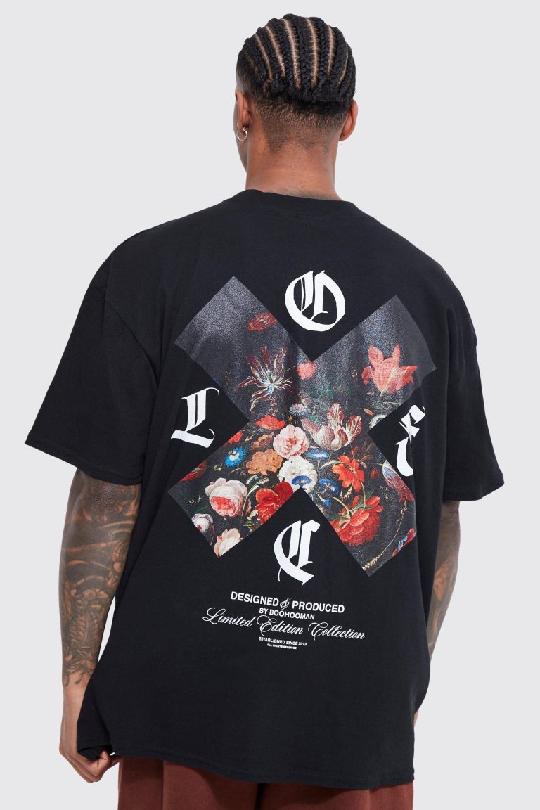
The Oversized Back Hit
This is the signature execution of the moment. Large graphic on the back – full-width, high-impact – with a minimal chest logo or no front graphic at all. The reveal happens when you turn around. Brands from Corteiz to emerging UK labels have made this the centrepiece of their drops, and it translates directly to feed content: the front shot teases, the back shot lands.
POD translation: Screen print the back with your statement graphic. Embroider a small logo at the left chest. The quality hierarchy – embroidery up front, screen print at scale – communicates craft without bespoke manufacturing at every stage.
The Washed Puff Print
The newest texture moment on feeds: puff ink on garment-dyed or washed blanks. The raised, tactile surface of puff ink sits differently on a washed fabric than on a standard jersey – it has a worn quality that feels archival and handmade. Think raised lettering on a faded olive base. It’s the intersection of craft and distress that streetwear has been circling for the last two years.
POD translation: Not every POD supplier supports puff ink, but those that do are worth the extra coordination. It’s a finish detail that justifies a higher price point and differentiates immediately from standard flat-print tees in the same market.
The Part Most Brands Get Wrong
Brand consistency. This is the mistake we see repeatedly from POD shops that are clearly tracking the right aesthetics but missing the connecting thread.
A strong oversized tee collection isn’t five trend-chasing graphics that happen to share a garment. It’s five graphics that feel like they were made by the same person, with the same reference points, for the same customer. The brands that build genuine communities around their product have a clear visual language – a consistent colour palette, a recurring typographic treatment, a defined point of view on what the graphic is actually saying. Successful designs reflect a clear brand identity rather than a random assortment of trending styles. That sounds obvious. It rarely gets applied.
Worth noting: the oversized hoodie has followed the same trajectory as the tee, moving from casualwear default to streetwear centrepiece in 2026. Gen Z’s comfort-first mindset combined with social media’s constant visibility on outerwear layering has made the hoodie the anchor piece in most strong drops. Designing your hoodies in parallel with your tees – same palette, same graphic language – pays dividends in cohesion and in how the range photographs as a set.
For designers looking to accelerate their graphic development workflow, GPT Images 2 in Dream AI via MyDesigns is worth exploring for rapid iteration on graphic concepts, particularly for distressed textures and archival treatments that are time-consuming to produce manually. Tools like AI for e-commerce product mockups have made it significantly faster to test graphic compositions before committing to a print run – worth building into your workflow if you haven’t already. And if you’re building out digital presentation assets for your drops, the motion design tools available in April 2026 have made scroll-stopping video content viable for small teams without a full production setup.
The question we started with – how do emerging brands stand out in a market this saturated? – resolves to something simpler than most people expect. It’s not about chasing the right trend. It’s about picking one of these five executions, owning it completely, and doing it in fabrics that feel as intentional as the graphic. The canvas is bigger in 2026. The brands that win are the ones who know exactly what they want to paint on it.
Frequently Asked Questions
Q: What GSM fabric weight is best for oversized streetwear t-shirts?
A: 240-300 GSM is now the standard for premium oversized tees. Heavier fabrics provide better drape, hold their shape on relaxed silhouettes, and signal quality at the point of touch – lighter fabrics tend to look deflated on oversized cuts.
Q: What colour palettes are trending for oversized streetwear t-shirts in 2026?
A: Muted earth tones are dominant – beige, slate grey, washed olive, and dusty clay. These colours photograph cleanly, layer easily, and have broader cross-demographic appeal than the saturated brights that dominated earlier years.
Q: What print method should I use for oversized streetwear tees in a POD setup?
A: Screen printing is cost-effective for bulk graphic runs, while embroidery delivers a premium signal on core logo pieces. Combining both – screen print for large back graphics, embroider the chest logo – creates a quality hierarchy that elevates the overall product without requiring fully custom manufacturing.
Q: How does an oversized silhouette change the design approach for t-shirt graphics?
A: The additional surface area creates significantly more creative space, enabling large back prints, subtle front logos, and layered graphic compositions. The dropped shoulder and longer hem also function as natural framing elements that interact with graphic placement in ways a fitted tee doesn’t allow.
Q: How important is brand consistency when designing an oversized streetwear range?
A: It’s the difference between a cohesive collection and a random assortment of graphics. The strongest emerging brands maintain a consistent colour palette, typographic treatment, and visual point of view across every piece – which builds recognisability and community around the product over time.
Source: https://senhaiapparel.com/oversized-t-shirt-design-ideas-streetwear/
This article was researched and written with AI assistance, then reviewed for accuracy and quality. Maya Sinclair uses AI tools to help produce content faster while maintaining editorial standards.