
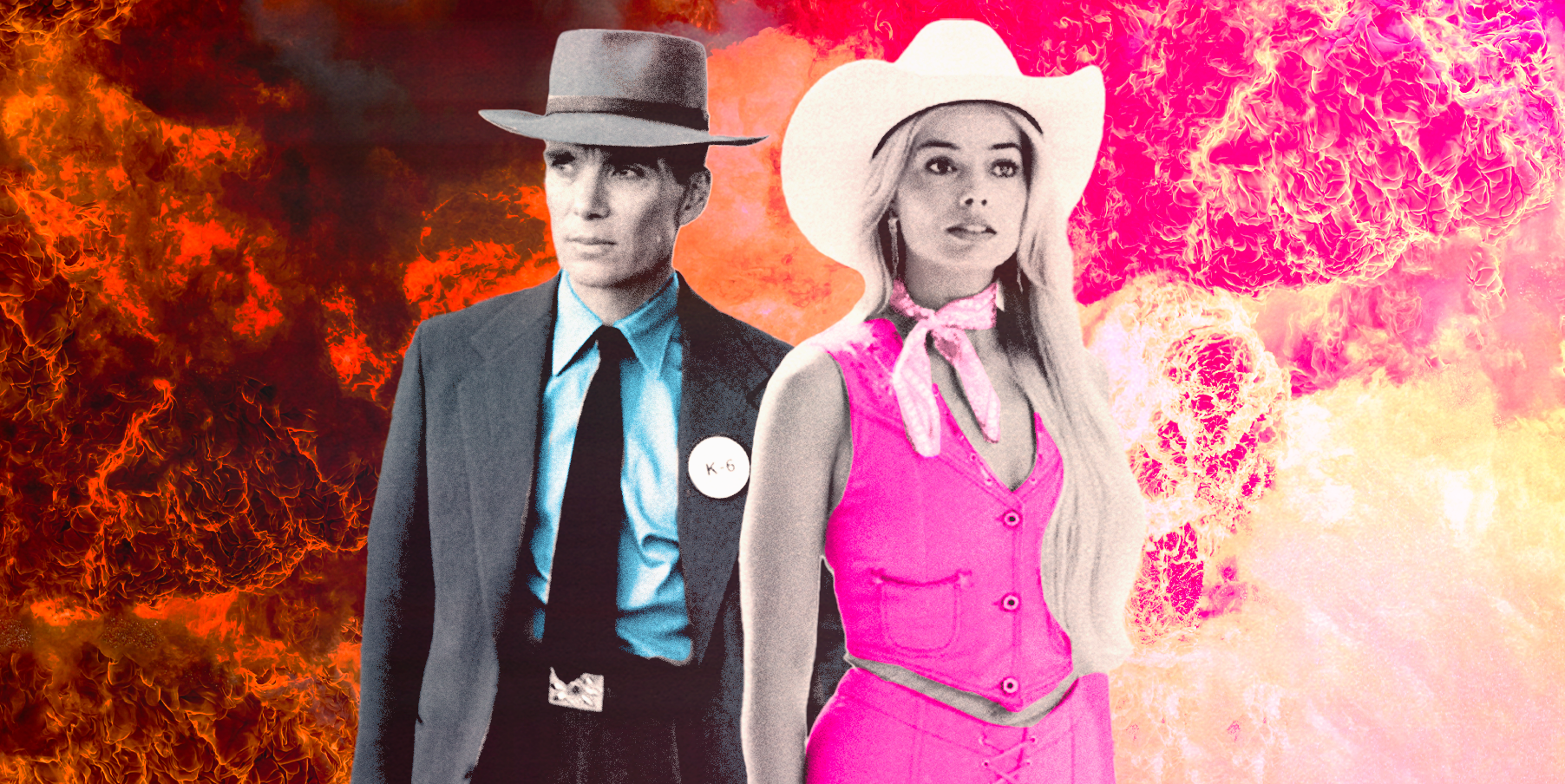
The Rise of Flop Cinema Amongst The Rarity of Barbenheimer
2023-08-12
How to photograph the March 2026 Blood Moon: gear, exposure recipes and composition tips
2026-03-23Last updated: March 23, 2026

Image: WGSN
Picture two tabs open simultaneously. In the first: A/W 26/27 runway footage. A Prada jacket with stained cuffs and intentional abrasions. An Altuzarra ink blot print that bleeds at the edge. Henrik Vibskov sending out shapes that look hand-basted. Every imperfection is deliberate. Every wobble is a statement.
In the second tab: a ResearchGate paper about running Stable Diffusion on degraded archival textiles — reconstructing lost geometric motifs from cultures whose pattern libraries are crumbling in museum storage — and producing clean, printable files from source material that hasn’t been commercially available since it was made.
Contradiction? We don’t think so. We think this is the most coherent signal fashion has sent in years. The rejection of AI polish and the use of AI as an archive key are the same idea from opposite ends: authenticity is the product. The tool doesn’t matter. Where you’re pointing it does.
Section 1: The runways are staging a protest and we’re here for it
WGSN’s A/W 26/27 catwalk trend analysis names it the Renaissance of Real — an anti-AI aesthetic movement where designers use visible craft, texture, and process as proof of human authorship. Hannah Watkins, WGSN Head of Prints & Graphics, puts it plainly: design is increasingly signalling human origin precisely because AI-generated visuals have become so widespread that the absence of flaws now reads as automated.
The runway evidence is specific. Altuzarra went with ink blot prints — organic, unpredictable, the kind of mark a machine would smooth out by default. Prada pushed worn finishes with stained cuffs and deliberate surface abrasions. Emilia Wickstead chose painterly florals with visible brushwork rather than clean vector blooms. ROKSANDA and Henrik Vibskov both leaned into #WorkInProgress aesthetics — looks that make the construction visible, that let you see the hands that made them.
Think early-90s Margiela energy meeting post-punk DIY, but arriving in 2026 specifically because we’ve spent three years drowning in Midjourney renders at 8K resolution. The contrast lands hard. A jacket that looks hand-basted feels rare now in a way it never did before generative AI.
This isn’t filtering down from high fashion on an 18-month delay — street-level creators were already building in this direction. The runway is validating what the underground was signalling. That’s the WGSN pattern: they track the convergence, and when runway and street arrive at the same aesthetic simultaneously, the mass-market acceleration is fast.
Your competitors are still rendering gradients. That’s the window.
What the anti-AI aesthetic looks like on a t-shirt
We’re not abstracting this into mood board territory. Here are the specific design moves that translate the Renaissance of Real into POD:
Hand-lettered logo hits. Left-chest hit in irregular hand-drawn type. Not wobble for wobble’s sake — confident letterforms with human proportions, the kind of kerning that implies someone who learned to set type from record sleeves and skate magazines, not InDesign’s optical spacing. Think screenprint shop stamp energy. Futura-era DIY meets punk fanzine. Single colour. Low print cost. High signal.
Distressed heritage graphics. Oversized back graphic with visible halftone breakdown and edge distress. Key distinction: real screen print distress has directionality. Ink cracks follow the fabric weave. Fake digital grunge doesn’t. The difference is immediately legible to anyone who’s worn ten-year-old band tees. Get it right by referencing actual worn screen prints rather than Photoshop distress brushes. A hand, a face, a simple object — processed to look like it was printed in 1997, worn twice a week since.
Craft-process text tees. A single phrase in confident hand-lettered type that references the act of making. Not a slogan. Not an affirmation. Something dry and specific — “Made by hand / for nobody in particular.” “This took longer than the AI version.” Bold sans with humanised stroke weight variation. Centred or left-aligned. The text is the graphic.
Construction reference graphics. More directional, but pay attention: garment pattern pieces, seam diagrams, stitch illustrations used as graphic elements. Margiela has owned this territory in RTW for decades — it’s barely been touched in the graphic tee space. Works beautifully in single off-white on black, or rust on aged white. The niche is the moat.
The common thread across all four: the visible mark of the person who made it. That’s the whole brief.
Section 2: Stable Diffusion as archive key — the heritage pattern pipeline
Now scroll back to that second tab.
New research published on ResearchGate evaluates Stable Diffusion specifically for reconstructing degraded and incomplete cultural heritage patterns — the kind of source material that lives in conservation storage, half-destroyed, inaccessible to commercial designers. Faded embroidery maps. Damaged geometric tiles. Textile weaves documented in photographs taken before the last practitioner died. The research provides an evaluation framework for assessing both the quality and the authenticity of the reconstruction output.
The academic application is digital preservation. The design application is a catalogue of source material that random Midjourney prompting will never produce — because this isn’t inspired by heritage, it’s reconstructed from it, using actual archival reference.
This is landing on the street because the appetite was already there. Gucci running campaign visuals that honour Chinese design heritage. Dolce & Gabbana putting Sicilian cathedral mosaic patterns on silk. Smaller streetwear brands sourcing from Andean weave traditions, Japanese katazome — the stencil-dyeing technique using rice paste that produces those distinctive resist-pattern geometrics — and regional folk art from places most trend decks have never named. High and low, the demand is identical: source material with actual roots in something.
Consumer behaviour backs this up. Research on apparel purchasing patterns among younger buyers consistently surfaces the same signal: they want to know where something comes from aesthetically, not just physically. A heritage pattern delivers that provenance immediately. It carries meaning before the brand even speaks.
The AI reconstruction layer does something genuinely new here: it makes previously inaccessible archives available to designers who don’t have museum research budgets or academic credentials. A degraded pattern that would have required a textile conservator and institutional access to study can now be reconstructed and iterated from. That’s a real shift in who gets to participate in this design space.
The context we can’t skip
Direct about this: using cultural heritage patterns commercially requires genuine engagement with origin. The Stable Diffusion reconstruction capability doesn’t change that. It makes the source material more accessible; it doesn’t make the ethics of using it simpler.
The framework: Is the source culture named and credited in the product description? Is there a direct commercial relationship with artisans or community organisations from that culture where it’s possible to build one? Does the application respect the original context — are you keeping sacred motifs out of inappropriate settings, or are you using decorative patterns that have historically moved through commercial contexts?
Brands like SixAtomic are building archive intelligence workflows that surface provenance information alongside the design file — so the context is built into the creative process rather than being a legal disclaimer added at the end. That’s the direction worth moving in. More considered design almost always produces better work. Provenance-aware design has an additional advantage: it’s a genuine story to tell at point of sale, which matters to the exact consumer demographic most likely to pay for heritage-coded aesthetics.
Cultural appreciation and cultural appropriation exist on a spectrum navigated by credit, context, and commercial relationship. Know which side you’re operating on.
Section 3: The synthesis — how to carry both signals at once
Here’s where it gets interesting for independent designers and POD brands: these two movements are not in conflict. They’re both pointing at the same thing from different directions.
The anti-AI runway aesthetic says: visible humanity is rare and valuable now. The heritage reconstruction research says: authentic cultural roots carry meaning that generic prompting can’t replicate. Both reject the frictionless, context-free visual production that defines most AI-assisted design in 2026. Both point toward slower, more intentional sourcing — whether that’s hand-drawing letterforms or researching the specific region a motif originates from.
The practical synthesis for your design calendar:
Use AI as an archive key, not a shortcut. Stable Diffusion for reconstructing specific historical references — a particular regional textile tradition, a documented pattern from a specific era — produces richer, more distinctive source material than “generate me a tribal pattern.” The research layer is the differentiator. Most designers won’t do it.
Apply hand-process finishing to AI-reconstructed source material. Take a heritage pattern reconstructed from archival reference and run it through a screen print simulation that introduces the visible process qualities the runway is demanding — ink spread, halftone breakdown, edge imperfection. You get cultural depth and craft-coded surface texture. Think Kyoto stencil meets West London market stall, executed in Affinity Designer with a distress pass applied by hand, not by filter.
Build the provenance into the product story. The consumer paying attention in 2026 wants to know where aesthetics come from. A product description that names the textile tradition, the region, the historical context — and does so accurately, with appropriate credit — is more compelling than “vintage-inspired geometric print.” It’s also more defensible.
Play the contrast directly. There’s a specific tee that writes itself here: a hand-lettered text element paired with an AI-reconstructed heritage motif, the whole thing processed through a worn screen-print aesthetic. Process-coded typography meets archival depth. Human mark and digital excavation, coexisting on the same garment. That tension is exactly what 2026’s visual language is working through.
We’re at a specific moment where the most interesting design isn’t happening at the AI-vs-human binary — it’s happening in the space where both are used with intention. The runway said it in February. The archive researchers are building the tools. The window for POD brands to get there first is right now.
This article was researched and written with AI assistance, then reviewed for accuracy and quality. Maya Sinclair uses AI tools to help produce content faster while maintaining editorial standards.
